
Montréal goes underground
Jacques Roy's 1963 logo for Montréal Métro.


The Canadian province of Quebec saw continuous economic growth in the decades following World War 2. The 1960 provincial election became a further catalyst for change as the Liberal Party were brought to power following a period of socio-economic and socio-cultural dissatisfaction. This movement, known as The Quiet Revolution, led to major changes in social policy, education, and healthcare.
Thanks to a surge of industrial design projects, Quebec’s leading city of Montréal underwent a period of revitalisation. Notably, the 1960 re-election of Mayor Jean Drapeau led to further modernisation for the city. Fulfilling a campaign promise, Drapeau initiated the construction of the city’s first underground rapid transport system.
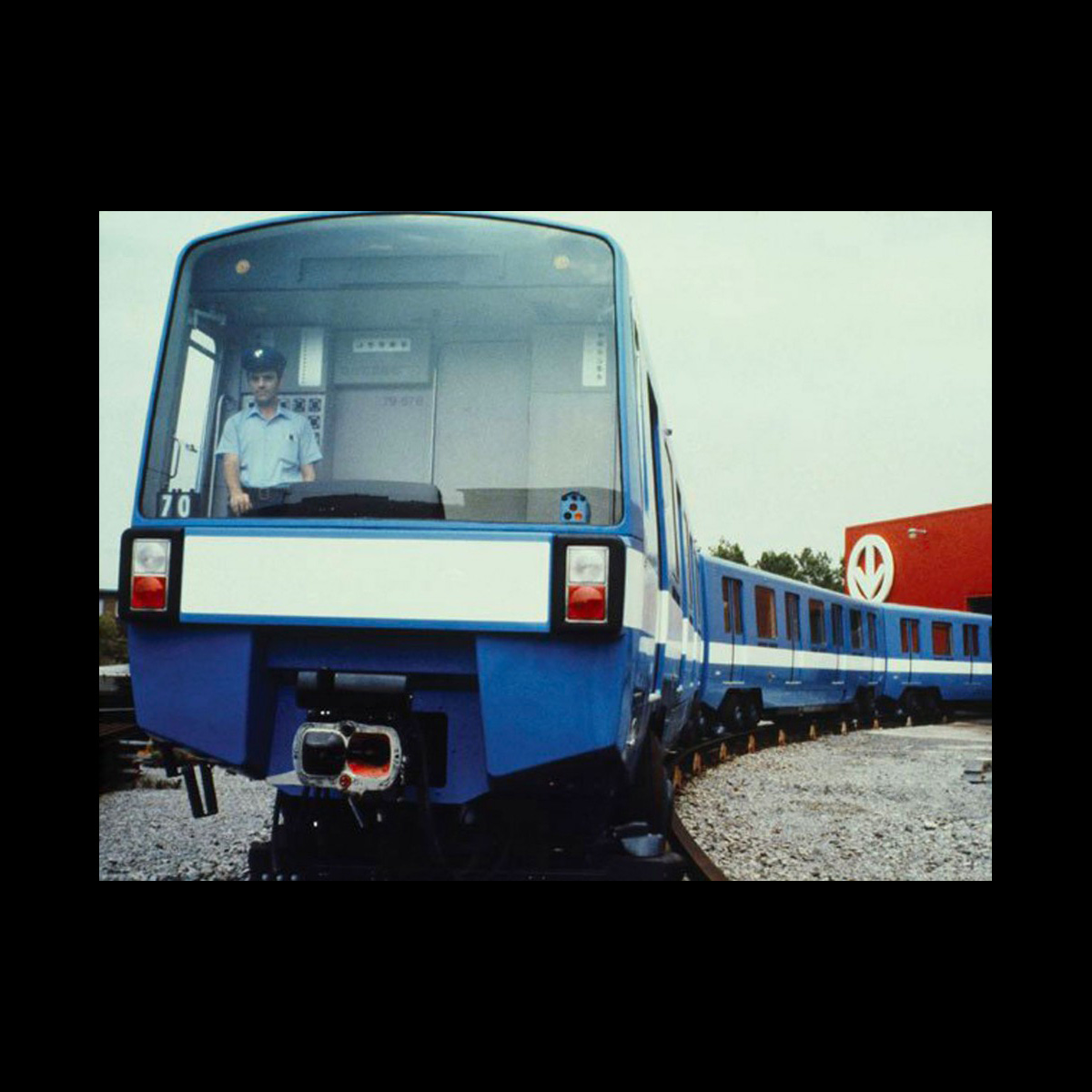
The proposal for the Montréal Métro was unveiled in 1961 and construction on the first two lines, Green and Orange, began in 1962. These were completed in 1966, with a third Yeollow line following in 1967. Serving these lines was a new train design created by Québécois design company Jacques S. Guillon & Associates, who were also responsible for the metro’s signage and logo design.

Jacques S. Guillon & Associates was founded and led by Jacques Silas Guillon, a pioneer of the industrial design industry in Quebec. One of the studio’s designers, Jacques Roy, was responsible for the design of the Montréal Métro logo, which was presented to city executives on January 10th 1963.

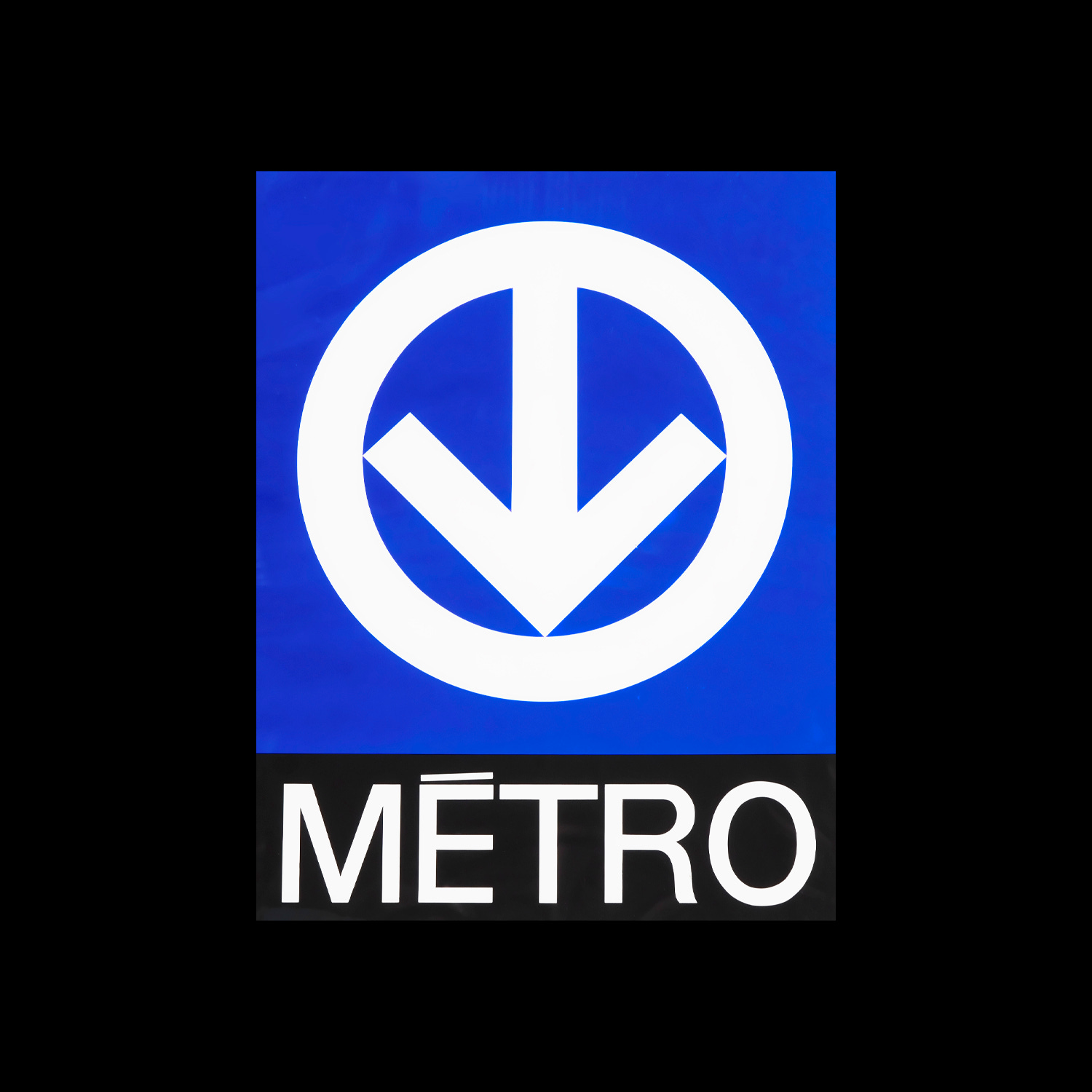
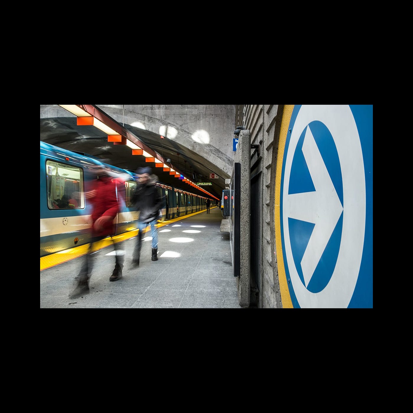
The logo consists of an arrow pointing downwards, and this is contained within a circle. The arrow not only demonstrates movement, but also refers to the metro being located underground. In addition, the logo’s circle is a alludes to the enclosed shape of the Metro’s tunnel.
The logo’s lines are of equal weight and were initially used in conjunction with many colours, depending on the context. However, it eventually came to be used exclusively white on a blue background. These two colours match those of the ‘Fleurdelisé’; the flag of Quebec, these were also used on the metro carriages which were painted blue with a thick white stripe.
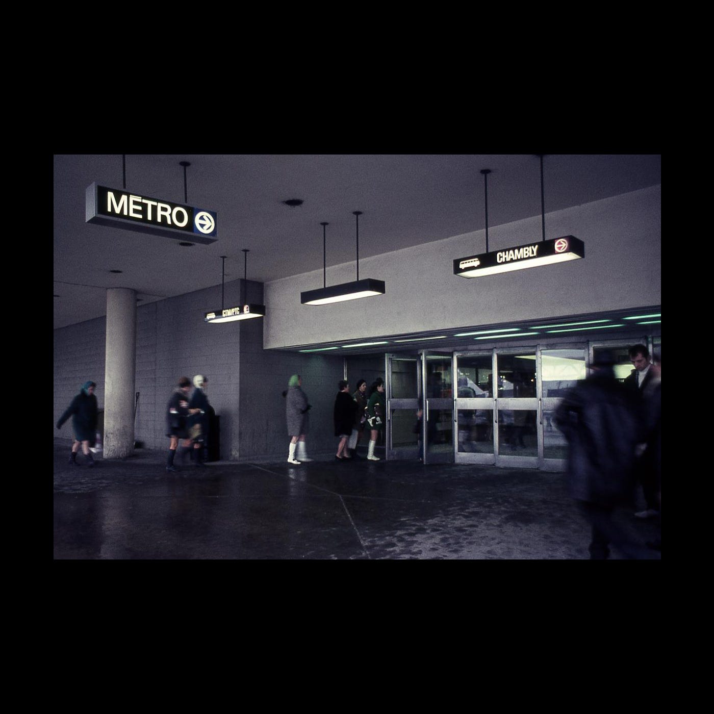
Whilst the designers’ intention was to display the symbol alone, the word ‘Metro’ was added (in a sans serif typeface), at the insistence of city executives. Furthermore, and at the insistence of Mayor Drapeau, an acute accent was placed on the ‘e’. This ensures that the French spelling of ‘Métro’ is used - French being the primary language of Quebec.
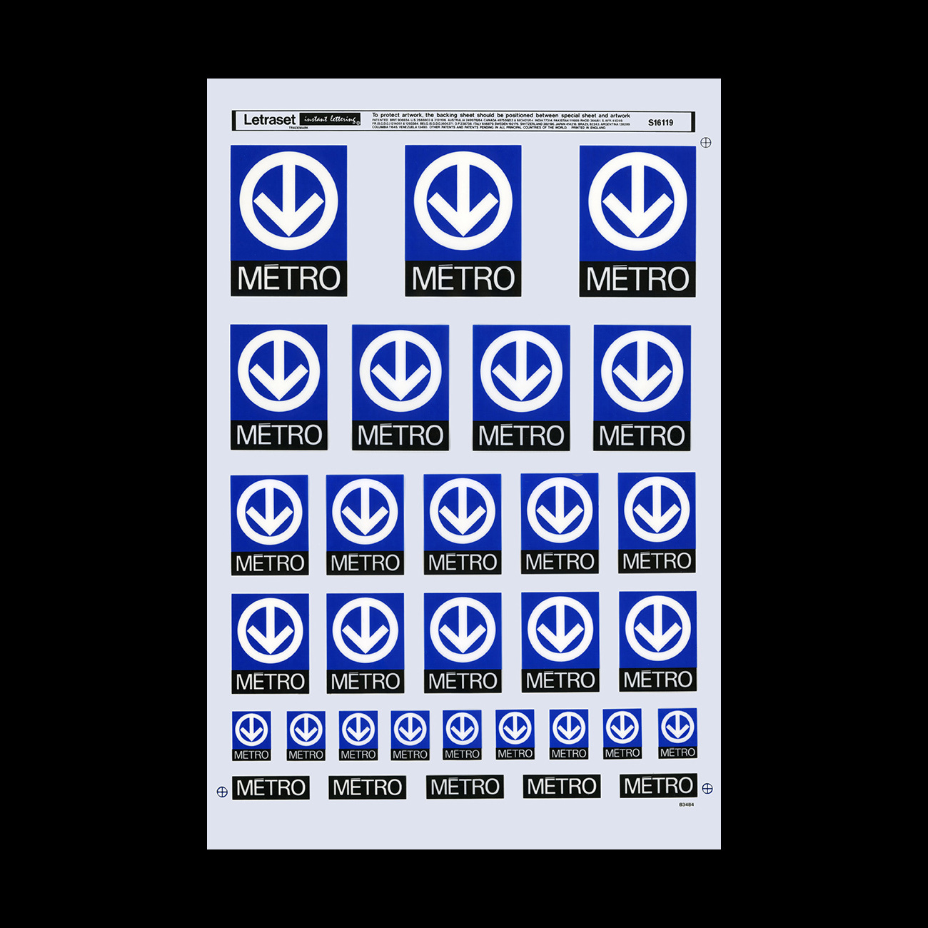
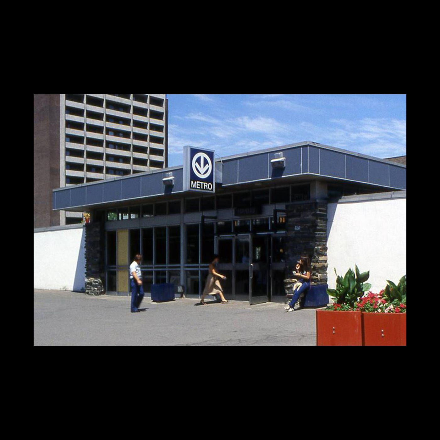
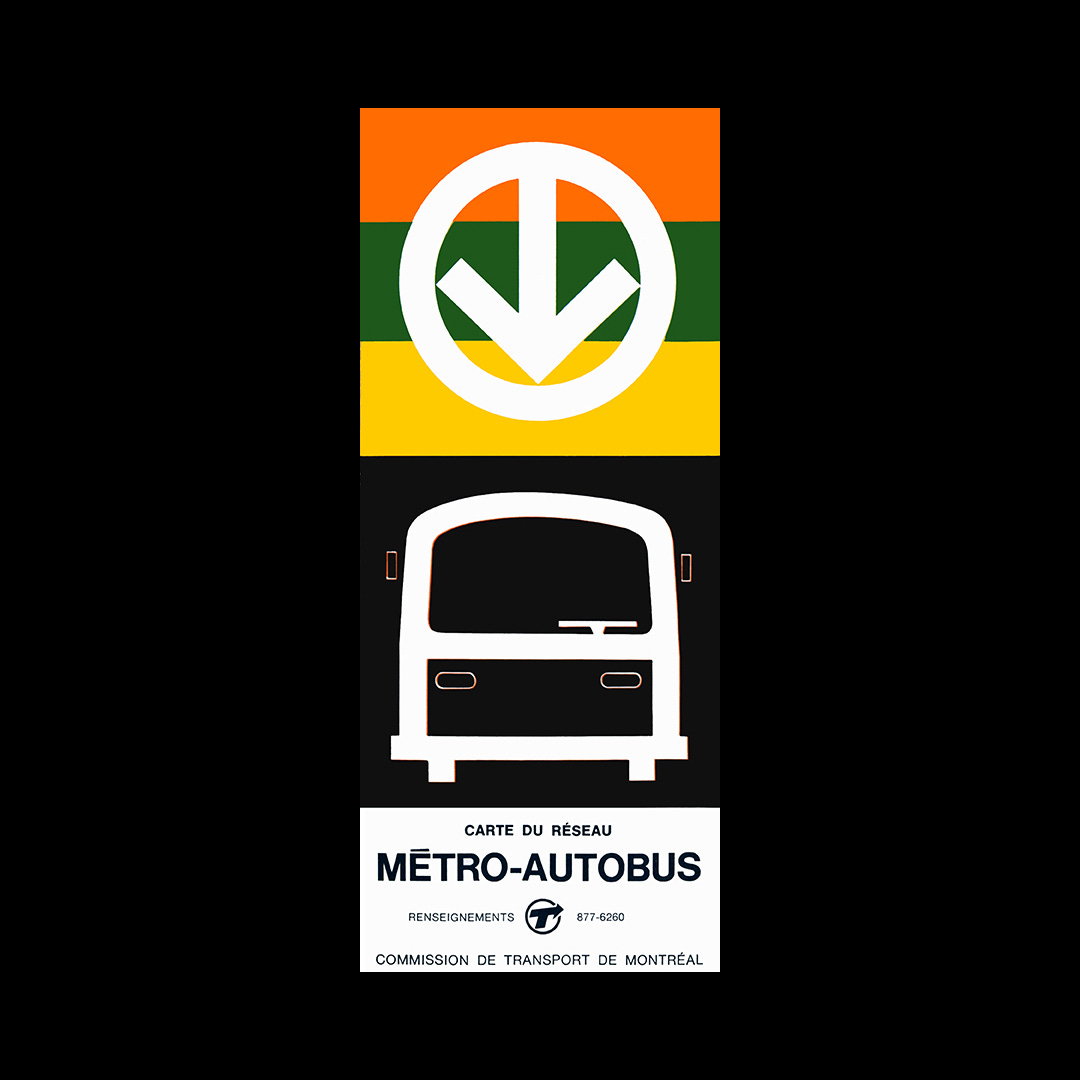
The designers had hoped that this logo would also be used on buses, however this idea was later rejected. Despite this, the simple design of the arrow is versatile and has been used by Montréal Métro in a range of colours, sizes, and materials. In 1978 the logo was built into a wall with an arrangement of bricks at Station Monk. The logo as a directional device was used throughout the wayfinding and can be seen on signs pointing in various directions and on a range of surfaces.
The Montréal métro opened on 14 October 1966, with Mayor Drapeau and Cardinal Paul-Émile Léger attending the inauguration of it’s first 20 stations. Roughly one million passengers rode the metro during its first weekend running.
The logo, which is now nearly 60 years old, remains timeless in its design and while small refinements have been made, continues to be used today.
Next week on Logo Histories: From all directions – Henry Steiner's 1983 logo for the HongKongBank. Don’t miss out on this by becoming a paid member.
Thank you for subscribing to Logo Histories. If you enjoy reading this short you may also enjoy these resources from the same team:
Brand Archive – Research tool for brand designers.
LogoArchive Website – Searchable modernist logo archive & research tool.
LogoArchive Shop – Vintage design books & LogoArchive Zines.
BP&O – Contemporary design editorial.