Sound in motion
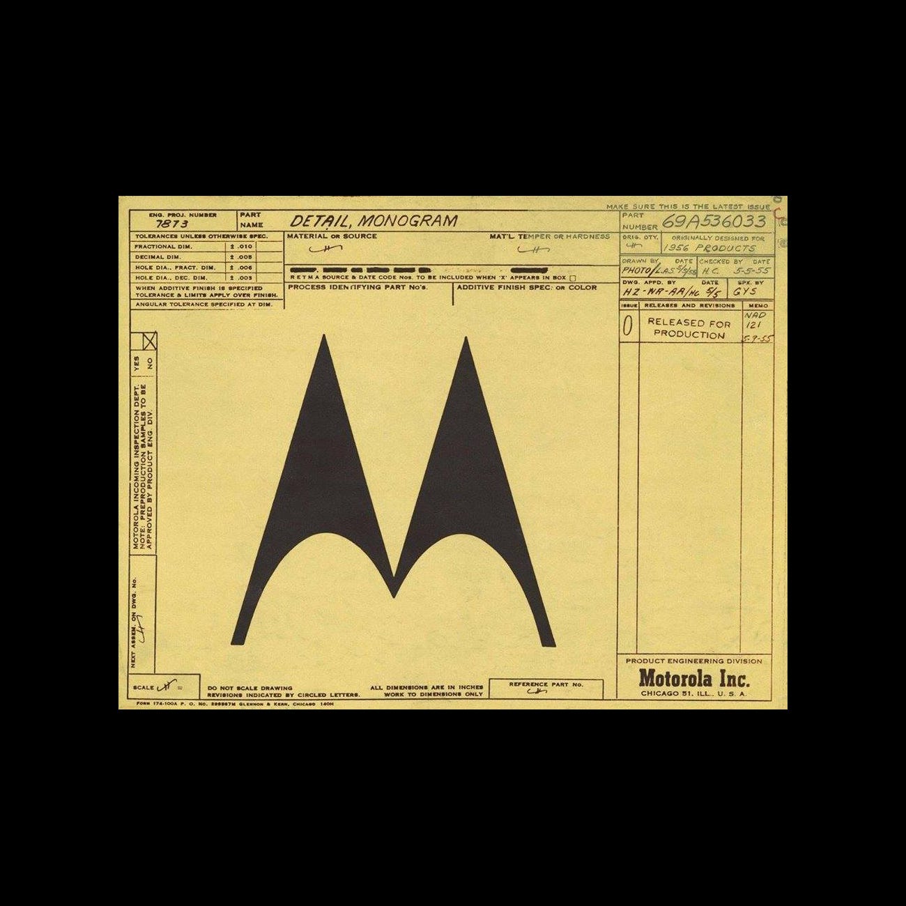
Thomas Miller's 1955 logo for Motorola.
This post is supported by LogoArchive – The home of historical logos. Discover over 4000 of history’s best designs from the world’s finest designers. Always find the logo inspiration you need for your next project here.
In the years following World War II Motorola had created its first television and had begun to expand production internationally. This post-war era marked an industrial surge across America and a rise in international trade. With this in mind, companies began to recognise a need for logos and corporate identities that would work well in a broad range of international markets.
Design, during this period, had also shifted, moving from a purely decorative gesture and towards a tool for supporting marketing and sales. Designers, emerging from formal education in the post-war period began to introduce a new era of corporate modernism. The new principles of logo design favoured sentiment and allusion, expressing the essence of a product or service and conveying notions such as trustworthiness.
Previous iterations of the Motorola visual identity had employed a variety of typefaces for the name, from scripts to slab-serifs, but had no clearly defined design policy. However, on its radios prior to 1955, Motorola had employed a simple M and waveform mark, an often overlooked detail.
Motorola’s first product was a car radio and its two-part name reflected this. By combining the elements ‘motor’ (car) and ‘ola’ (Victrola, a gramophone) the suggestion was ‘sound in motion’. This could be understood as a foundational principle of this early logo design.
In the 1950s, as Motorola embarked on a program of modernisation, it asked Morton Goldsholl Associates to redesign its logo. The Chicago-based studio, founded in 1955 by wife and husband Millie and Mort Goldsholl, was known for being progressive and forward-thinking. This was reflected in the a non-hierarchal structure of the company.
Also working on the Motorola project, and responsible for the now iconic logo, was Thomas Miller. Miller had studied at the Ray Vogue School of Art, receiving his degree in 1950. Following rejections from several design studios who weren’t willing to hire a black designer, Miller was invited to join Morton Goldsholl Associates in the same year.
"Morton Goldsholl told me, unlike the other people, that he wanted a designer. And he said that he wasn't hiring me because I was black and he felt sorry for me. He said he was hiring me because he needed a designer. That turned a corner for me."
– Thomas Miller.⠀
Morton Goldsholl Associates developed and introduced the distinctive ‘M’ designed by Miller as a reflection of the movement towards modernisation and as a flexible asset that would function well across a growing number of use-cases and international markets.
Known as the ‘batwing’, the logo is made up of two types of contrasting wave forms, the sine wave (the curves at the base) and triangle wave (the peaks). According to Motorola ‘the two aspiring triangle peaks arching into an abstracted "M" typified the progressive leadership-minded outlook of the company.’
The logo encapsulated sound and movement as well as expressing the future-facing nature of the Motorola brand, and was debuted at the Merchandise Mart showroom in Chicago in 1955. The “M” was used in a number of different containers, from a TV shaped form to a solid square and finally within a circle, which was used consistently from 1967 onwards.
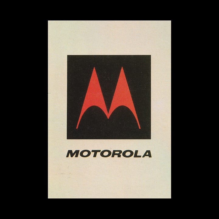
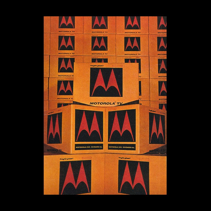
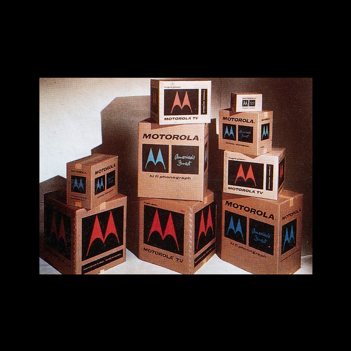
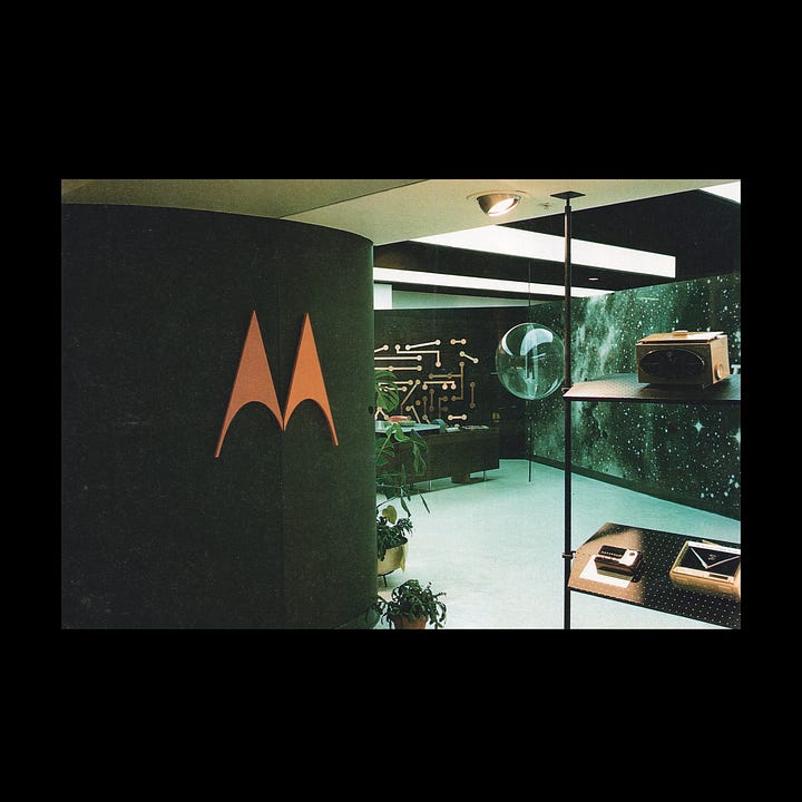
The Motorola “M” remains one of the most widely recognised logos to have been born from the modernist mid-century design period. Representing the innovative telecommunications company, the iconic ‘M’ proved to be so successful that it remained with Motorola for over 70 years, even following its split into two companies in 2011. Today, Motorola Solutions uses a blue version of the logo while Motorola Mobility uses red.
If you enjoy reading this you may also enjoy these resources from the same team:
Brand Archive – Research tool for brand designers.
LogoArchive Website – Searchable modernist logo archive & research tool.
LogoArchive Shop – Vintage design books & LogoArchive Zines.
BP&O – Contemporary design editorial.


