Munich '72 – The cheerful Games
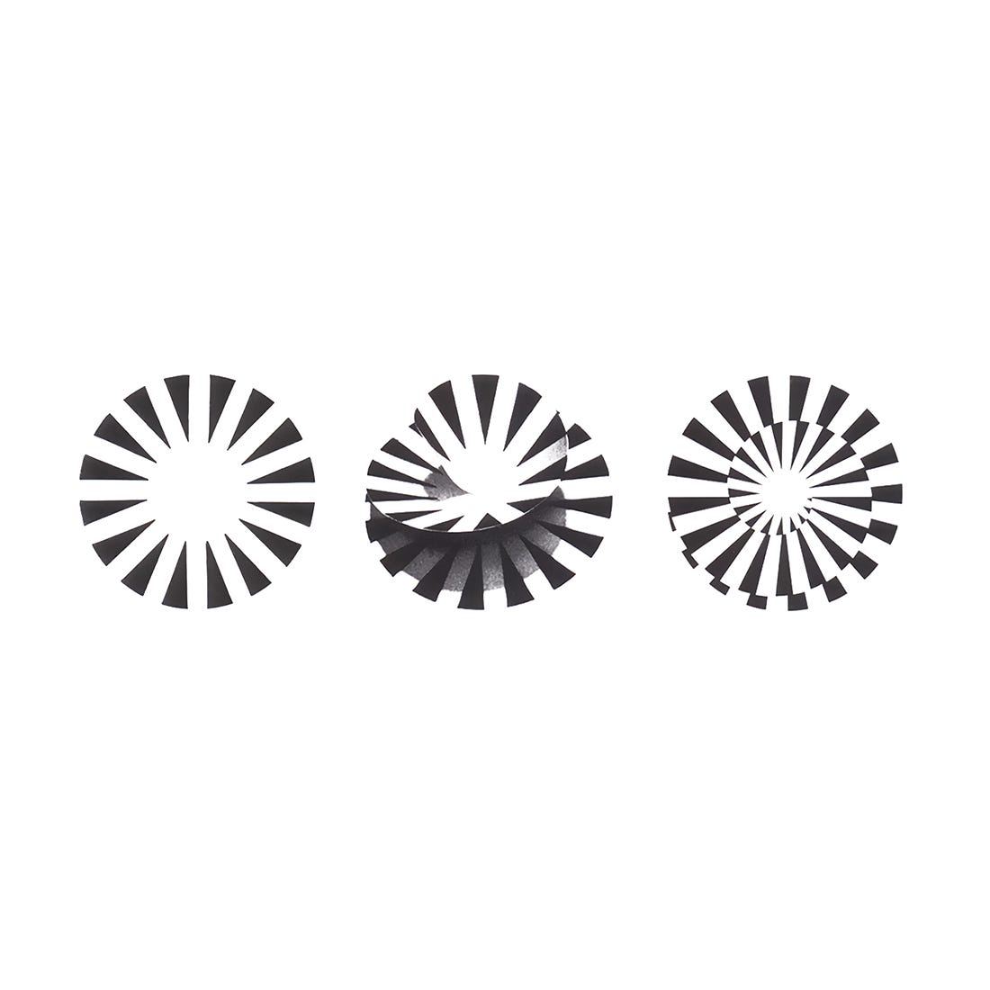
Coordt von Mannstein's 1968 logo for the 1972 Summer Olympics.
This post is supported by LogoArchive – The home of historical logos. Discover over 4000 of history’s best designs from the world’s finest designers. Always find the logo inspiration you need for your next project here.
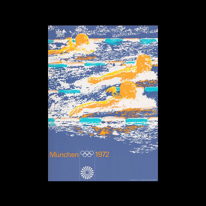
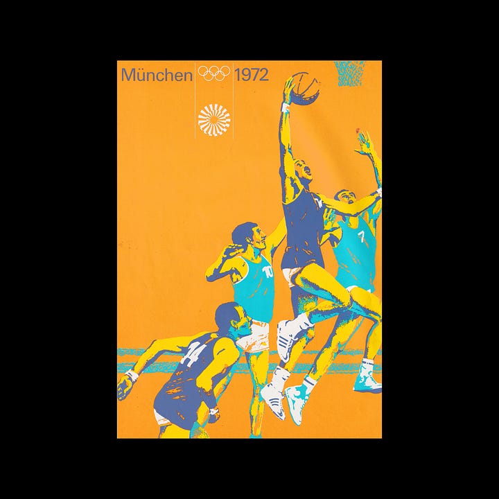
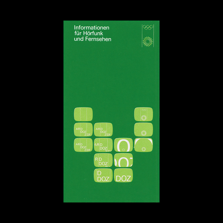
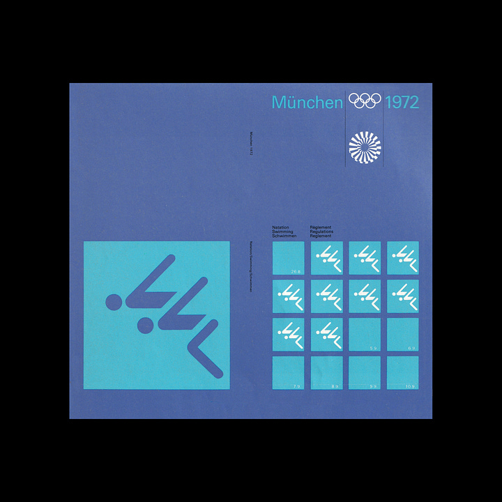
The first German Summer Olympic Games was held in Berlin in 1936. What followed was the tragic and global upheaval of WWII. Eager to repair the damage, the West German Government saw the Munich Olympics, to take place in 1972, as an opportunity to present a democratic and optimistic Germany to the world. The official motto, "Die heiteren Spiele" or "The cheerful Games" captured this sentiment, and was a guiding light in the design of the Games’ visual identity, developed by Otl Aicher’s Dept. XI and overseen by Willi Daume, president of the West German Olympic Committee. The design of the Munich ’72 emblem was not straightforward. It went on to involve many designers, took over a year and and cost 80,000DM.
The initial form of the emblem began as a proposal submitted by Otl Aicher. This represented a crown of light rays, symbolising the spirit of the Munich Games with a ‘light’, ‘fresh’ and ‘generous’ image. This was met with a mixed responses from the public [1] and contradictory reporting on whether the committee favoured or disfavoured this at the time. There was, however, a consensus that the proposal lacked the distinguishing qualities that would afford it a legally protectable status. Aicher went on to developed further ideas but these were also met with the same response.
In an attempt to drive the process forward, the design of the emblem was opened up to international graphic artists, with 2,332 designs submitted. But again, the results were unsatisfactory. “Even beer mats, radishes and hearts were formed into Olympic Rings by amateurish hands”. Looking for alternatives, four graphic artists were tasked with generating further ideas, and developing Aicher’s original design. These were Herbert Kapitki, Coordt von Mannstein, Klaus Winterhage and Zimmermann-Aussitzliche.
The guiding principle for the design was…
…the creation of a generally understandable, simple, archetypal sign that could be integrated into the formal code of the visual identity, which was already in development. Further, the design should arouse continuing interest in the viewer.
Mannstein’s proposal was selected as the winner, nearly a year after the first design was submitted. His proposal evolved Aicher's design. The introduction of a spiral was to, as described by Mannstein, make the emblem dynamic; suggesting a “Radiant Munich” and developing a sense of “tension” and “increased spring power”.
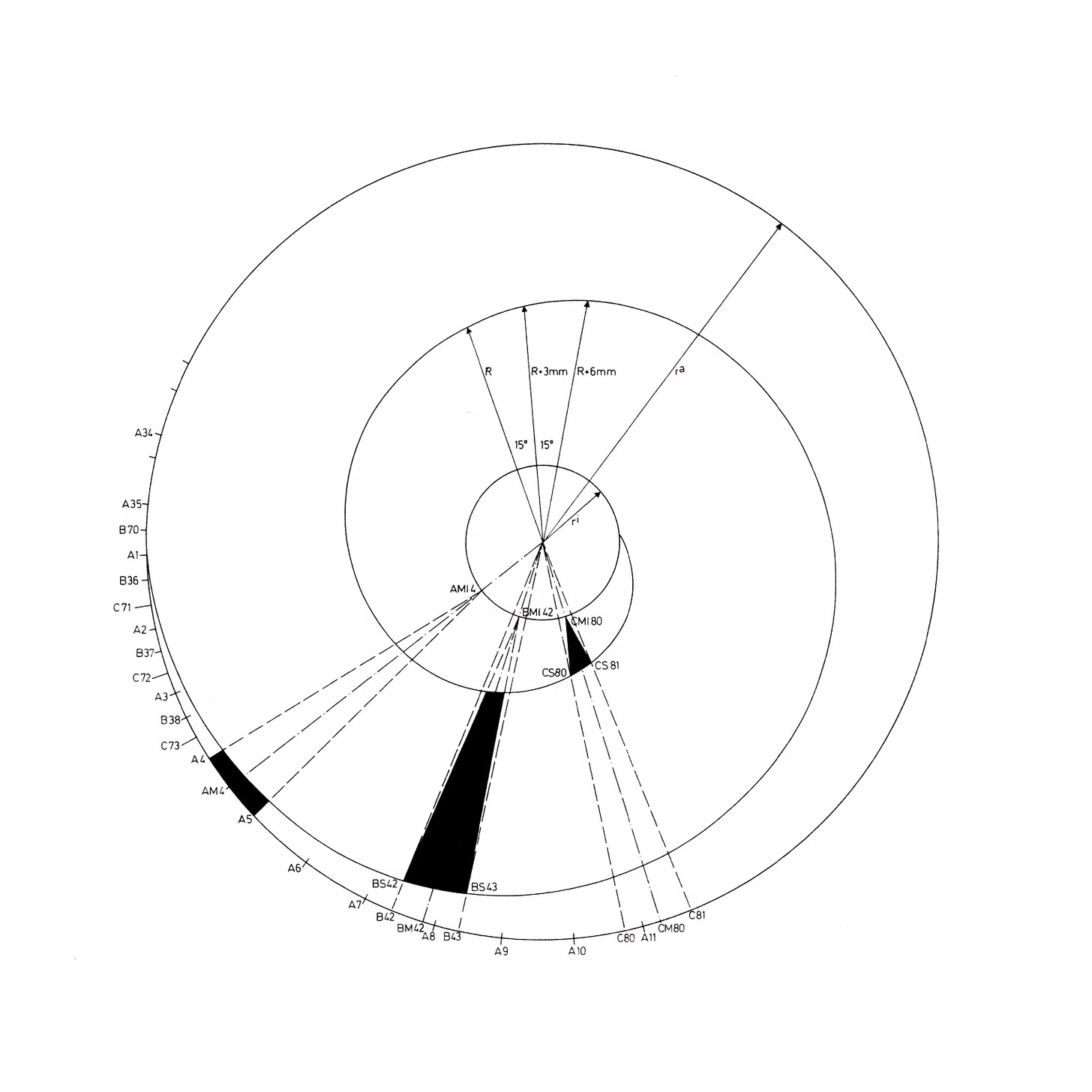
Peter Knopf, a student at the TH Karlsruhe at the time, by chance got to see a draft copy of the emblem, and had recognised that the ‘spiral was not exact, and could be be made even better’. Through an acquaintance, Knopf and Mannstein were put in touch, and Knopf, in a telephone conversation had expressed his criticism, and was subsequently asked to constructively revise the design, and applied the mathematical proportions laid out by Archimedes (above). This detail had been documented in a newspaper article published in 1968, but had been lost in countless articles and books that followed. The Munich Olympic logo now has a clear provenance, from Otl Aicher to Coordt von Mannstein and finally to Peter Knopf.
The final design, as explained in the Munich ‘72 graphic standards manual, “is based on three basic geometric figures: an exterior circle, an interior circle and an Archimedean spiral whose radius is enlarged by an angle size of 15° at a consistent rate. The wedges that taper towards the inner circle result from a complicated division of the exterior circle into 35 ⅔ segments.”
Coordt von Mannstein’s “Graphicteam Cologne”, which consisted of Hans Buschfeld, Siegfried Himmer, Winfried Holtz and Heinz Lippert refined the emblem, adding the Olympic rings, formalising its composition and usage so the emblem could be legally protected. On June 16th 1968, the final design was presented to the public.
This article drew information from historical German newspaper articles from 1967. German translation was done by Essel Etetere.
Key Takeaways
The Games identity and the work of Aicher and Dept. XI was characterised, not just by its warmth of colour inspired by the Bavarian landscape, but also by what has come to be known as a German precision. This precision would also extend to the emblem with Universität Karlsruhe (TH) formalising its mathematical properties. The intersection of design and maths set a tone of optimism and efficiency.
While Aicher’s initial proposal was conceptually well-founded, it was felt that its ‘generic’ properties would prevent it from being legally protected. Sport and commerce were, even at that point, inextricably linked. Being able to license the logo and control its usage was a key requirement. A subtle twist provided just enough to give the emblem a distinctive and ownable character that could be trademarked.
To help fund fund the Games, the state-run lottery “Glücksspirale" or “spiral of luck” was launched, and carried with it the logo of the Games. The lottery still exists today, as does the logo. So while the Games has ended, the emblem lives on.
Thank you for subscribing to Logo Histories. If you enjoy reading this you may also enjoy these resources from the same team:
Brand Archive – Research tool for brand designers.
LogoArchive Website – Searchable modernist logo archive & research tool.
LogoArchive Shop – Vintage design books & LogoArchive Zines.
BP&O – Contemporary design editorial.






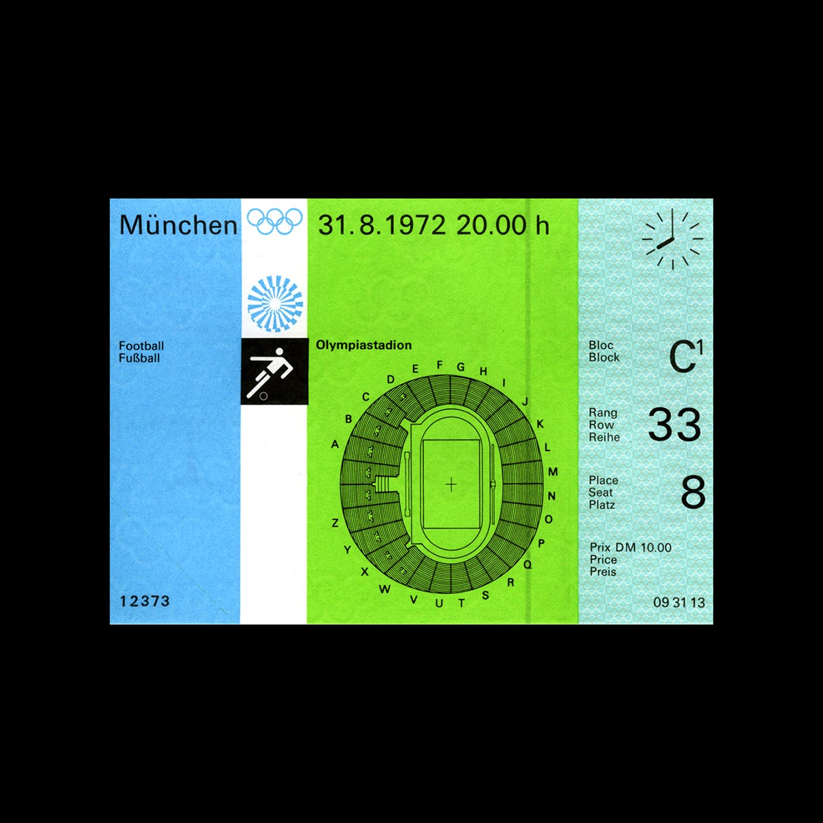
My parents and I used to live in Munich during the 1972 Olympics. I have fond memories of collateral material that my parents collected during the games with this iconic logo on it. I am wracking my brain, trying to think of where it all might be today. Which box? Which folder? The logo combined with the graphic representations of each sport with that blue color is etched into my mind and this article was a good reminder of younger days. Thank you.
This one was a great story to write up. There's plenty of great resources to learn more from, such as Mark Holts book and a reprint og the standards manual. Please drop your recommendations below for future stories, or any additional insight you might into the Munich 1972 design.