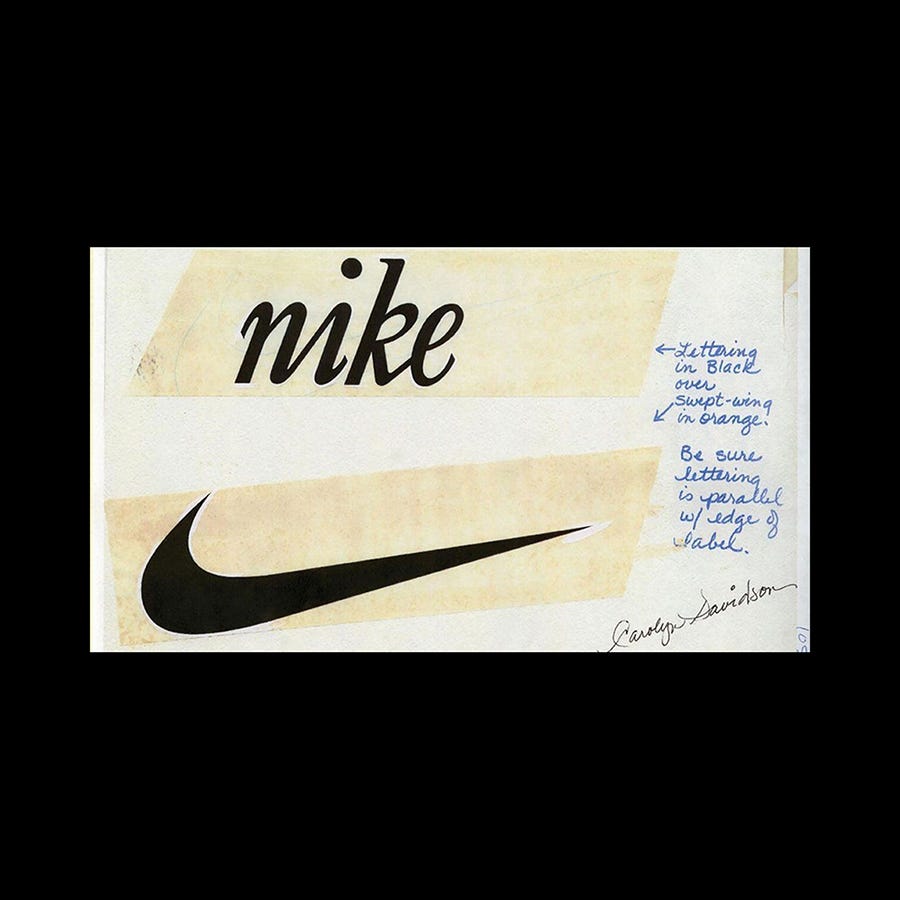
The swept-wing of Nike
Carolyn Davidson's $35 logo for Nike
This post is supported by LogoArchive – The home of historical logos. Discover over 4000 of history’s best designs from the world’s finest designers. Always find the logo inspiration you need for your next project here.
The first version of the Nike logo was created in 1971 by Portland State University student Carolyn Davidson. The requirement was to create a logo that conveyed motion, would differentiate it from the stripes of Adidas and fit the profile of a running shoe. For this, Davidson received a fee of $35.
Davidson met Phil Knight, co-founder of Nike (at the time Blue Ribbon Sports) at PSU where he taught. He had overheard Davidson mention she was unable to afford another class (she was studying journalism and would later move to graphic design), and offered her work as a part-time graphic artist producing graphs and charts. This relationship led to the commissioning of a new logo as Blue Ribbon Sports moved from distribution to design and manufacturing and became Nike.
As Davidson would later recall, although the “wing” was her favourite there wasn’t much of an initial reaction to this idea, so continued to present a handful of other ideas. Conversation circled back to the wing, and although Knight had commented that he didn’t love it, felt that it might grow on him.
An annotation by Davidson reveals that the Nike “Swoosh” was initially described as a “swept-wing”, making a connection with the mythological Nike, a Greek Goddess that was typically depicted as being winged.
Although, due to production scheduling there wasn't time to revise the first version, Davidson would later develop a wordmark and revise the wing, creating the version of the logo associated with the brand today. It was revealed in an interview with Nike co-founder Knight that, a decade later, Davidson was compensated further for her work on the logo with a few hundred shares of Nike stock.
Like this? Also check out:
The interrelationship of type and wing was realised early on. Above, a lowercase calligraphic wordmark in black sits over a white Swoosh knocked out of a striking orange. Nike's colour would eventually be changed to red as an expression of passion and energy.⠀
In 1976, as Nike began to rapidly scale, the visual identity and design policy was handed over to John Brown and Partners who would also be responsible for some of Nike’s most iconic advertising. The wing was refined and at this point likely took on the “Swoosh” moniker. This was then was paired with a new corporate typeface, Futura Condensed Extra Bold. By 1980, Nike had taken over 50% of the US athletic shoe market and by the end of the year would go public.
It has been 50 years since Carolyn Davidson designed the first versions of the Nike Swoosh. The version used today remains largely the same, with only small refinements.
In 2021, designer Virgil Abloh featured the first version of Davidson’s “swept-wing” on the cover of his book “Something’s Off”, a fitting return to the past for a designer who imagined a new future for Nike with his now iconic collaboration with the brand.
If you enjoyed reading Logo Histories also check out these projects:
Brand Archive – Research tool for brand designers.
LogoArchive Website – Searchable modernist logo archive & research tool.
LogoArchive Shop – Vintage design books & LogoArchive Zines.
BP&O – Contemporary design editorial.


