
Looking at the world
William Golden's 1951 logo for CBS Television Network.


This post is supported by LogoArchive – The home of historical logos. Discover over 4000 of history’s best designs from the world’s finest designers. Always find the logo inspiration you need for your next project here.
In under a decade, television ownership in the United States went from 20 to 90%. This potential for significant growth was evident, even in the early part of the 1950s. Recognising this, Columbia Broadcasting System split into two dedicated networks for television and radio, and directed to do everything possible to create their own distinct identities.
When CBS Television Network (CBS) debuted the first documentary series "See It Now” and captured the broadcasting spotlight when it premiered "I Love Lucy" CBS President Frank Stanton saw an opportunity to capitalise on this new interest by introducing a new corporate identity. The responsibility for developing this fell to William Golden. Golden had started his career in the CBS Radio promotion department in 1937 and, by 1951, had worked his way up to creative director of advertising and sales promotion.
The introduction of a new logo intended to help separate CBS Network Television from the CBS Radio Network, clearly differentiate the network from other television networks and was part of a broader effort to develop the overall impression of CBS as a place to see quality images.

Three logos were presented by Golden in a meeting in which a dozen stakeholders where invited. Reflecting back on this meeting, Golden felt that none of his ideas, including the ‘eye’, were received with ‘uncontrollable enthusiasm’. However, one man's reaction was immediate and decisive. And that was the reaction of CBS President Frank Stanton.

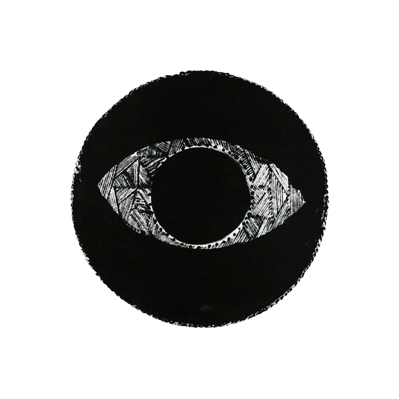
The now-iconic ‘CBS Eye’ was designed with the help of graphic artist Kurt Weihs, and was inspired by hex symbols drawn on Shaker barns to ward off evil spirits. Kurt Weihs later recalled that the eye was specifically influenced by a piece of Shaker art included in the article ‘The Gift to Be Simple: Shaker design’. This article had featured in the first issue of Alexey Brodovitch's ‘Portfolio’ magazine which included 8 pages of shaker illustrations.
"Among the illustrations was an eye symbol. Golden picked it up and used it for a CBS sales portfolio. Then he felt there was more to it and used it for an ad. We had done eyes before. Everybody had done eyes; but this one was something that really worked. I felt the eye could have become the corporate symbol. We saw the eye as symbolizing CBS 'looking at the world'.

The CBS logo was conceived primarily for on-the-air use and made its first appearance in 1951 as a still composite photo of the logo and a cloud formation. There was some controversy over this, as it appeared similar to Magritte's painting The False Mirror. This was displayed at the Museum of Modern Art not far from the CBS offices. Magritte considered legal action and although later deciding against it, CBS ceased to use the combined image of clouds and eye, instead, using just the eye.


Three other variations of the logo were created to ‘ward of monotony’, and this was extended to over ten. This included variations with the letters ‘CBS’ in the centre, a version that clicked open and closed with a camera aperture and another version where the eye was placed within a container shaped like a television screen. However, due to practicalities, this was later reduced down to fewer with the variation with a solid pupil being favoured as it could be used more consistently.

The logo was applied extensively, sometimes as a principal image and focal point and at other times used as a small detail. It appeared on studio marquees, trucks, mobile units, cameras and theatre curtains, on the exterior of the studio buildings and applied in metal, concrete and in a stencilled form. Smaller instances included matchboxes, ash trays, neckties, cuff links, press release forms, rate cards and show tickets.

Later, reflecting on his work, Golden noted that, ‘hardly a month goes by without someone suggesting a new use for it. But we try to avoid forcing it where it doesn't belong, and even in printed advertising it is omitted whenever it conflicts with the rest of the design.’
‘It is used so often that it sometimes seems like a Frankenstein to me, but I am grateful it is such a versatile thing that there seems to be no end to the number of ways it can be used without losing its identity.’
A year after the CBS logo had been implemented, Golden suggested replacing it, influenced by the ever changing nature of ’show business’ and the temptation to ‘change for the sake of change alone’. However, Stanton reminded Golden of an old advertising axiom. ‘Just when you're beginning to get bored with what you have done is probably the time it is beginning to be noticed by your audience.’

Didot later replaced the original condensed sans-serif and was used as the main type style for CBS promotional materials. As this typeface was not widely available in the United States at that time, CBS staff designers George Lois and Kurt Weihs were assigned the task of ‘Americanizing’ the font, redrawing every character from an enlargement that was provided by Golden.
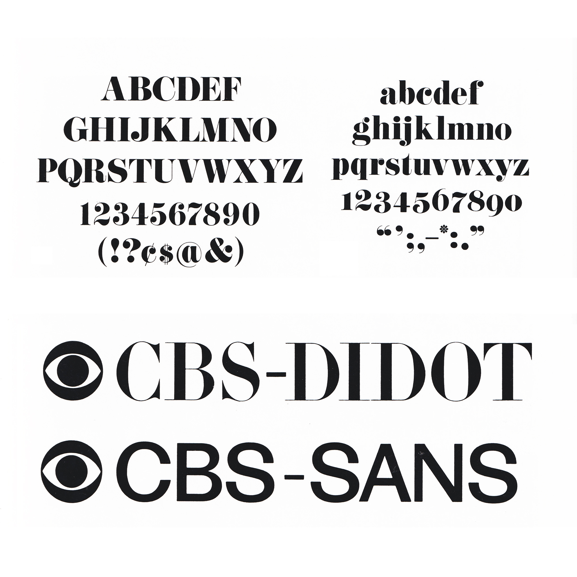
Following the death of Golden in 1959, Lou Dorfsman became the Creative Director at CBS Television and hired typographer Freeman Craw to apply the finishing touches to the work began by Weihs and Louis.

Golden attributed the success of the CBS Eye, not to the work he, George Lois and Kurt Weihs did, but to that simple the decision by Stanton to keep it. The logo remains in use today, largely thanks to the simplicity of its realisation, but also to the extent and creativity of its use by Lou Dorfsman who worked with and built to iconic status Golden’s logo over the following four decades.
If you enjoy reading this you may also enjoy these resources from the same team:
Brand Archive – Research tool for brand designers.
LogoArchive Website – Searchable modernist logo archive & research tool.
LogoArchive Shop – Vintage design books & LogoArchive Zines.
BP&O – Contemporary design editorial.