As sound as a bell
Saul Bass & Associates 1969 logo for AT&T.
This post is supported by LogoArchive – The home of historical logos. Discover over 4000 of history’s greatest designs from the world’s finest designers. Always find the logo inspiration you need for your next project. Start here.
The Bell Telephone Company was founded by Alexander Graham Bell, Thomas Watson and Gardiner Greene Hubbard, following the filing of the patent for the telephone in 1876. Looking to build a long-distance network with this new invention, a dedicated subsidiary was founded – the American Telephone and Telegraph Company (AT&T).
To clearly identify this long-distance service it was decided that a sign be established that would “compare favourably with the emblems and trademarks of other first-class businesses and institutions”. This task was given to a selection of architects, artists and designers. A Greek cross, a shield and a flying figure were put forward, however, these were felt to be unsatisfactory. Angus Hibbard, general superintendent to the company, took to the streets for inspiration, studying signs and marks of all kinds. Back in his office, as his biography describes, he took all the samples at hand, a large pad of paper and tried to study the question from the bottom up. “We wanted a sign for Alexander Graham Bell's telephone”. With this as the ‘fundamental’ he sketched a bell, a simple and sound decision.
The American company was reorganised not long after, with AT&T becoming the parent company and elevating the bell from service to corporate status.
By the 1960s versions of the bell logo had been in use for over 50 years and had become a recognisable and key graphic element. There was, however, little in the way of a uniformity, or a consistent design policy across the regional companies. And these had also adopted wildly different typographic directions. It was time for something new.


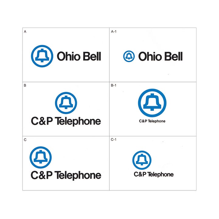
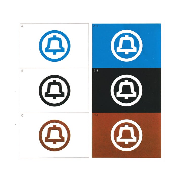
The 1960s saw tumultuous social change, and it was felt, that a different look was necessary for AT&T to remain relevant. Known for his groundbreaking corporate logo designs, Saul Bass (Minolta, United Airlines, ALCOA) was invited to work on the project and within a year, had created one of the most simple and iconic logos. This new version saw the bell reduced down to only the most essential elements, a silhouette and circle rendered with a uniform line weight.
The new rational and formalised version of the logo–the sixth since the first bell was adopted in 1889–improved scalability across the many emerging applications as the business grew, and making it easier to unify the 23 AT&T subsidiaries. Further, it was intended that this new logo would help develop the image of the company, moving it towards one that was perceived as being modern and forward-looking while retaining a direct link to its history and maintaining some form of equity through continuity.
The new logo was part of a wider system revamp, created to not only to stand out but to keep up with the changing cultural and technological landscape, and compete with other businesses who had begun to roll out modernised brand images.
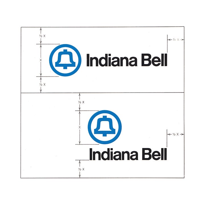
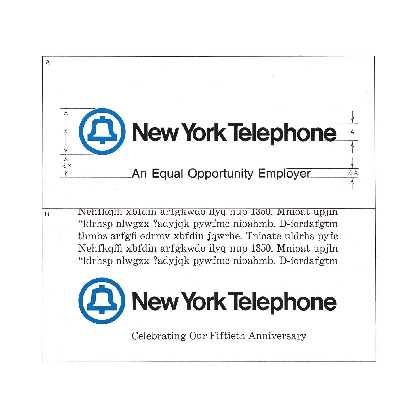
Selected for its legibility and contemporary character, the logotype was based on Helvetica, with modified letter-spacing and adjustments depending on the scale of its application. Continuing the consistent use of blue throughout AT&T’s history, the preferred colour treatment was the symbol in ‘Bell Blue’, with the logotype printed in black on a white background for maximum contrast. Another key change was the inclusion of stripes in vehicle liveries, the desired effect was to convey a “confident, competitive, and alert” brand character.
The introduction of AT&T’s new design system began in 1969, however, due to its large scale–the new bell symbol would need to appear on over a million phone booths–it would be the largest corporate re-branding program in the US (ever), and would take years to roll out. Therefore, implementing the standardisation program required over a dozen manuals to be created. These – explaining the design systems concisely, persuasively and informatively – covered subjects ranging from the symbol and logo marks themselves to the various applications, such as business forms and vehicle liveries. This all paid off. A 1970 survey commissioned by the Bell System indicated 78.1% of 2,500 adults associated the logo with the telephone industry, and 75.3% connected it with the Bell System. Two years later the comparable figures were 91.7% and 90.1%.
Following the great depression, AT&T had been able to buy many local networks and by the early 1940’s, was the dominant system, holding great power and influence with the continued evolution of the telephone under global usage. Following a court ruling, which labelled AT&T as a monopoly in 1982, and subsequent divestment of the subsidiaries, the company approached Bass again to create a new logo for the post break-up restructuring. His design, the striped/encircled globe replaced the bell in 1983, and became the foundation for the logo that the company uses today.
Discover more AT&T brand assets and assets from hundreds of other historical and contemporary brands at Brand Archive.
If you enjoy reading this you may also enjoy these resources from the same team:
Brand Archive – Research tool for brand designers.
LogoArchive Website – Searchable modernist logo archive & research tool.
LogoArchive Shop – Vintage design books & LogoArchive Zines.
BP&O – Contemporary design editorial.


One of the best logos ever. The colorway is irresistible (at least to me!).