
Packed with colour
Paul Giambarba's corporate identity for Polaroid.


This post is supported by LogoArchive – The home of historical logos. Discover over 4500 of history’s greatest designs from the world’s finest designers. Always find the logo inspiration you need for your next project here.
Polaroid was founded in 1937 as a manufacturer of polarised sunglasses, which came from the research conducted by founder Edwin Land during his studies. Later, after returning to Harvard and continuing his research, Land and co-founder George W. Wheelwright III, were able to sell the technology to the military and was it picked up by the movie industry for 3d films.
Initially a research-led company supplying others, it grew into the Apple of the time, a technological pioneer, eventually being responsible for culture shifting moments with the creation of instant photography. Polaroid became a part of the zeitgeist. By 1976 it was selling over 7.4m instant cameras per year.
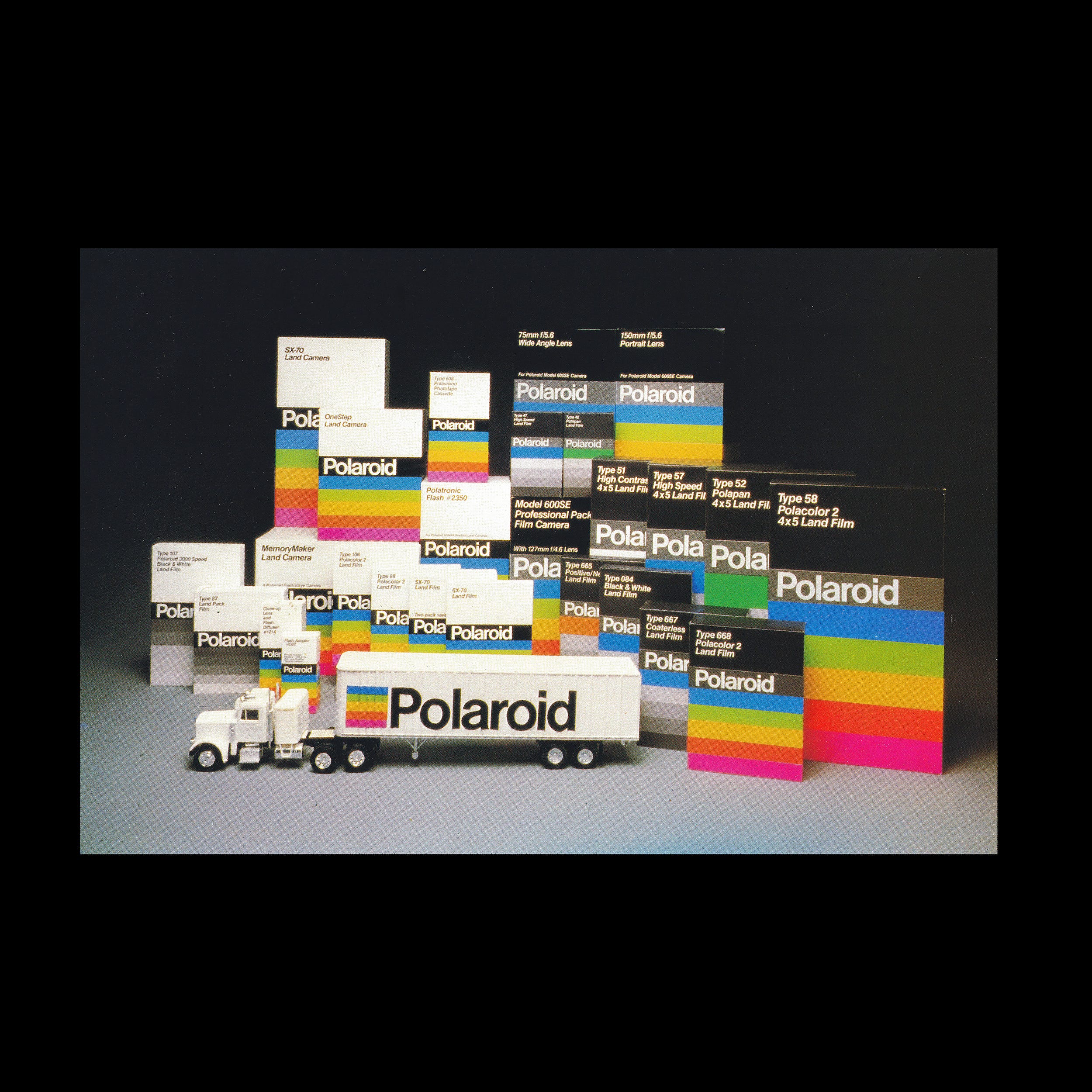
Parallel to Polaroid’s growth was the evolution of its visual identity, guided from 1958 to 1977 by freelance designer Paul Giambarba who was hired to revitalise the brand. His first effort included the introduction of a formalised logotype, set in News Gothic Regular, and the addition of black-sided panels to packaging. The effect of this was, not just a standardised visual language for the corporation, but would also add distinction to packaging when seen on black and white televisions.


With the introduction of consumer-focused packaging of Polaroid’s instant camera and refill packs at the beginning of the 1970s–which required an eye-catching visual presence on shelves–Giambarba devised colourful ‘artworks’ that emphasised the new era of instant colour. These were striking, highly graphic and original in their composition of form and colour, which was then maximised by their coverage of packaging. Giambarba explored compositions as new products were released.


The approach introduced a unified and colourful visual identity for products such as Polaroid Sunglasses, Polaroid Colorpack and black-and-white film packs. The stripes were used to help differentiate between the Type 108 Colorpack Film and Type 107 black and white film, with the former using a five colours and the latter, a greyscale effect. These stripes afforded the corporation flexibility for differently proportioned and sized packs, and for the creation of product families.

Throughout the years, each new product and technological development afforded Giambarba room to use packaging as creative canvas, which became a key part of the corporation’s visual identity. These bold graphic motifs were paired with News Gothic, derived from the logotype created in 1958, which was also used as Polaroid’s corporate typeface.
Set in a Regular weight, the sans-serif was used for the Polaroid logotype, product naming and descriptions. Despite hierarchy being limited by the consistency of the weight, the use of colour and pattern played a substantial role in aiding product differentiation and overall brand impact, until 1980.


In 1980, in response to new market challenges that included the growing interest in filming home movies, the logotype was changed to Neue Haas Grotesk. (This version of the logotype is often miss-labelled as being introduced in 1962).
Giambarba, whose roll had changed to Design Consultant and wasn’t involved in the update, described this evolution as a ‘one size-fits all approach’ and considered it the ‘product of a committee’. This moved the corporation away from diversity and towards stadardisation. The five colour gradient was became fixed across all products, and reduced down to a square and set alongside the new heavier logotype.
This change would vastly improve economies of scale, but ultimately reduce the creative expression of the company as it slowly succumb to quickly developing motion technology and increased competition.
Aspects of the 1960s and 1980s visual identity would be later brought back in 2017 under the Polaroid Originals as part of the launch of Polaroid OneStep 2, a revival of the analogue instant camera.
Thank you for subscribing to Logo Histories. If you enjoy reading this you may also enjoy these resources from the same team:
New! Wittl – Job posting and applicant tracking tool.
LogoArchive Website – Searchable modernist logo archive & research tool.
LogoArchive Shop – Vintage design books & LogoArchive Zines.
BP&O – Contemporary design editorial.
Brand Archive – Research tool for brand designers.