Striving for perfection
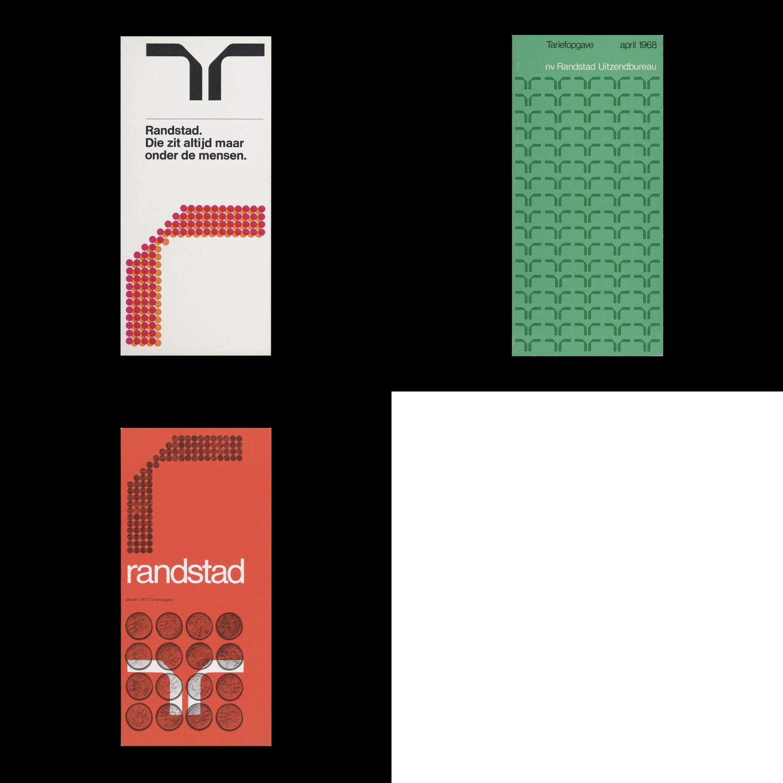
Ben Bos' 1967 logo for Dutch employment agency Randstad.
This post is supported by LogoArchive – The home of historical logos. Discover over 4000 of history’s greatest designs from the world’s finest designers. Always find the logo inspiration you need for your next project here.
On completion of his thesis, of which he wrote about temporary employment, Frits Goldschmeding turned his findings into a business. At the time, the literature on temporary employment in the Netherlands was sparse as this was a relatively new phenomenon post war. Capitalising on his insights, Goldschmeding formed the temporary employment agency ‘Uitzendbureau Amstelveen’ in 1960 with fellow economics graduate Ger Daleboudt.
Within the first few years, the agency opened branches in the cities of Leiden and Rotterdam alongside their original office in Amsterdam. This was accompanied by a change of name to Randstad Ultzendbureau, ‘Randstad’ referring to the urban area between Amsterdam, Utrecht, The Hague, and Rotterdam. This decade saw tremendous growth for not only Randstad, but also the temporary employment industry as a whole. Therefore, it was key for the agency’s logo and design policy to distinguish it and give it a competitive edge in the market. This design policy and logo would be created by Ben Bos of Total Design (Furness, PAM, De Bijenkorf).
Frits Goldschmeding stated that he wanted the logo for Randstad to stand out from other logos such as the star of Mercedes and the ‘stylised’ drop of gas giant PAM but have something of their power and simplicity. With this in mind, Ben Bos promised to do his best. Having seen colleague Wim Crouwel’s ‘computer alphabet’, which Bos described as having a strong austerity, he was convinced that his solution should be typographical, that he should create a nicely designed ‘R’. Further, it should be more graceful than the calibrated typeface created by Crouwel, and reflect the dualistic role of Randstad, speaking to both employment candidates and those companies looking to fill vacancies.
When designing the logo, it became apparent that a single ‘R’ had the appearance of being somewhat ‘unsteady’. A second ‘R’ that was mirrored, solved this, creating balance and expressing the two sides of the company.
There was a belief that, alongside the logo, the corporate identity not only communicate the essence of the Randstad culture (with notable characteristics of functionality, good faith, and striving for perfection) but also helped to also moulded. This can be understood in the strict programmatic and systematic nature of the agency’s communications. As such, from 1967 the performance of Randstad and its employees was characterised by a high degree of consistency. This would continue to reinforce the reputation of the company and ensuring its future success.
Randstad–continuously striving for perfection–were notoriously tricky clients for external service providers to work with, owing to their extremely critical feedback. Despite this, Randstad maintained a strong relationship with Ben Bos who coordinated much of its communications and then its restyling in the 1980s. Even after he left Total Design in 1991, he continued to work with Randstad as a consultant, remaining involved with the firm until 1997.
Bos’ design remains in use to this day, along with Randstad’s global reputation as a leader in the HR services industry – developed across five continents and 38 countries. Further, thanks to Bos’ extended involvement across decades, the Randstad logo is now known as one of the oldest active designs in Dutch history.
Key Takeaways
The business of Randstad was principally about the connection facilitated between temporary employee and employer. The needs of the two should be balanced. This was reflected in the mirroring of the ‘r’ to create a stable and dualistic logo.
Even as a pioneer of temporary employment, rapid market growth and increased competition forced Randstad to keep innovating. Expressing this through a unified design policy allowed it to continue to stand out and show that it was striving for perfection in all aspects of its business.
A logo that lasts. The Randstad logo has been in used for nearly sixty years. An ongoing relationship with its designer delivered a functional and systematic framework to guide design, whilst also providing a visual variety throughout an extended period of time.
Thank you for subscribing to Logo Histories. If you enjoy reading this you may also enjoy these resources from the same team:
Brand Archive – Research tool for brand designers.
LogoArchive Website – Searchable modernist logo archive & research tool.
LogoArchive Shop – Vintage design books & LogoArchive Zines.
BP&O – Contemporary design editorial.


