



By the mid-1960s, advances in computing and telecommunications technology were changing how quickly information could be shared and accessed. During this period, Reuters introduced The Reuter Monitor in 1964, which enabled banks and brokers to retrieve stock and commodity prices through a compact desktop unit. Alongside its international news reporting, the company was expanding its electronic financial information services, giving technological efficiency an increasingly important and visible role in its business. This necessitated a review and revision of its corporate identity.
This presented Crosby/Fletcher/Forbes with a unique challenge. Reuters had few tangible products on which to place a mark, no packaging and comparatively little advertising. The solution, a simple logotype, applied with creativity and impact in the few places it would appear.


Designed in 1965 by Alan Fletcher at Crosby/Fletcher/Forbes, the Reuters logotype consisted of letters constructed from 84 dots. These referenced the holes in the teleprinter tape used in Reuters’ transmission rooms to send and receive information. Fletcher translated an everyday component of the agency’s operations into a distinctive expression of its name. Despite referencing an old but foundational technology, the dots also called to mind dot matrix screens.
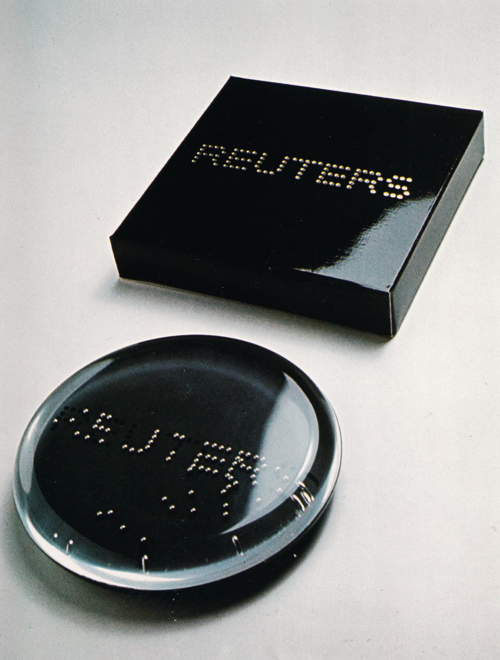
The regular arrangement of dots gave the logotype a lot of flexibility. Its structure could be reproduced using ink, perforations, individual objects or points of light. The letters remained recognisable across different materials and methods of manufacture, connecting the graphic idea with the practical requirements of an international organisation.
The logotype was punched into paper for company letterheads, assembled from nuts and bolts on the gate of Reuters’ radio receiving station, and illuminated using lightbulbs. It appeared on doorplates, matchboxes and vehicle liveries, and was even made into a corporate ball bearing toy. Each application explored the possibilities of the same simple construction.
If you enjoyed today’s What’s the Concept? LogoHistories has over 200 deeper dives available in the paid archive→
Blazing up Kawatetsu

This post is supported by LogoArchive – The home of historical logos. Discover over 4000 of history’s greatest designs from the world’s finest designers. Updated every single day. Always find the logo inspiration you need for your next logo or branding project.
A simple solution to a complex problem

When Swissair introduced its modernist corporate identity programme in 1953 it was seen as significant achievement. Through the pioneering work of Rudolf Bircher, the airline was able to clearly express itself as a modern, resolute and dynamic airline visually through a cohesive design system, consistently applied to aircraft, vehicles, ground equipment…
A Canadian gem

The Canadian Broadcasting Corporation (Société Radio-Canada) is the Canadian public broadcaster for both radio and television with its English-language and French-language service units known as CBC and Radio-Canada.
Thank you for subscribing to Logo Histories. If you enjoy reading this you may also enjoy these resources from the same team:
Brand Archive – Research tool for brand designers.
LogoArchive Website – Searchable modernist logo archive & research tool.
LogoArchive Shop – Vintage design books & LogoArchive Zines.
BP&O – Contemporary design editorial.