The ASICS logo story!
Herb Lubalin & and Alan Peckolick's logo for Japanese sporting goods brand ASICS
Japanese sporting goods brand ASICS was formed from the merger of Onitsuka, GTO and Jelenk, and was launched on to the market in 1977.
The development of its corporate identity began with a competition, with Japanese design studio PAOS securing the work after submitting six different proposals. However, with ASICS looking to reach new markets, an international perspective was required. With this in mind PAOS comissioned renowned American graphic designer Herb Lubalin to work on the ASICS logotype.
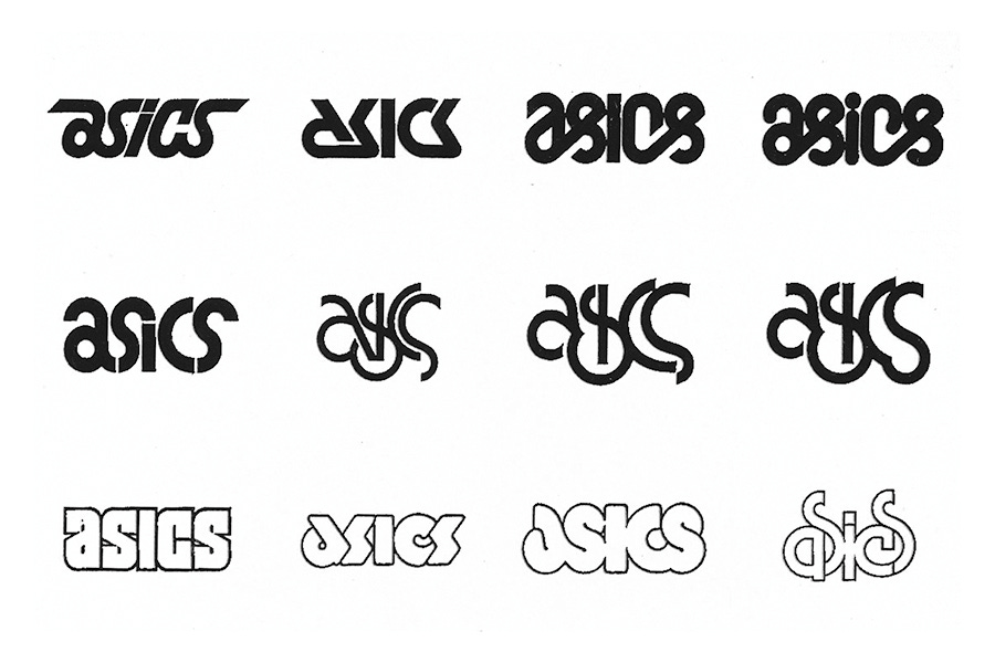
Above, Herb Lubalin's initial proposals to PAOS, designed with Alan Peckolic. These are twelve drawn from a collection of seventeen different options. The governing principles for selection were originality and the expression of ASICS corporate objectives; international appeal, product quality and function. Here, you can see the breadth of the options, ranging from the technical to the avant-garde, clearly exploring and testing the potential for synergising a dynamic and idiosyncratic character with the notion of technological advancement.
Two options from the initial seventeen met the criteria, top left and bottom right. These were studied for the suitability for ‘development potential’ and then refined. Both can be seen to present an intersectionality between Lubalin's study of and interest in formal modernist principles (geometry) and the strokes of an artist (the natural flow of an unbroken line).
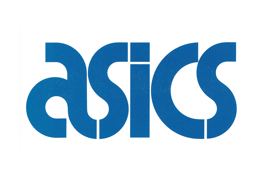
The final design is an elegant resolution of what could be perceived as opposing forces. There are some aspects of authorship here, a continuity of interest of the designer in elegant typographical gestures, and the practical consideration of use-cases such as screen printing and embroidery. This latter consideration can be seen in the difference between the images above and below. Terminals become square, and the relationships between letters are resolved through more formal geometric relationships, see the S to I, connected by a perfect right angle, and the transitions from A to S and C to S.
Once the final logotype was settled on, under the direction of PAOS, Herb Lubalin and Alan Peckolick were retained to developed further assets and create variations of the logotype for different applications. This included solid, knockout, outlined and lined versions.
Like this? Check out these projects, also by PAOS:
Bandai, 1983
Mazda, 1975
Bridgestone, 1984
INAX, 1984


Thank you for subscribing to Logo Histories. If you enjoy reading this you may also enjoy this resources from the same team:
Brand Archive – The research tool for brand building designers. Discover brands and brand assets from the 1960s to present day. Discover the colour palettes, typography and applications of many brands including Pepsi, 1969 and Adidas 1989. Collate individual images or bookmark whole brands. Start here.


