
The Daisy Wheel
Mark Woodham & Allied international Designers' 1968 logo for The Royal Bank of Scotland


In February 1968 it was announced that The Royal Bank of Scotland would merge with the National Commercial Bank to form The Royal Bank of Scotland Ltd. (RBS). As a result of this merger, the business would be much bigger, more diverse in its activities and complex in its corporate structure. Following a major reorganisation, members of the banking group became subsidiaries, and a new identity was required to unify the near-700 branches.
During this post-war era, identity had become an important way for banks to distinguish themselves from the competition. More high street banks emerged, giving customers the choice to ‘shop around’. RBS’ previous logo, a coat of arms, was respectable and a symbol of Scottishness. However, it was far from unique and failed to stand out from the coat of arms used by other banks and many other corporations.


RBS wanted to showcase themselves as a new organisation. Their new image had to appeal to loyal customers whilst also attracting new clients. In June 1968, The London-based firm Allied Industrial Designers (now Allied International Designers) were appointed to develop a striking and recognisable new house style. Furthermore, the project had to reach completion in time for the formal opening of the new banking organisation in April 1969. This gave the team - led by design director Mark Woodham and assisted by designers John Jamieson and John Lloyd - a 10 month window to complete all stages of development.
To aid their research, the team visited Edinburgh, Glasgow, and nearby areas to better understand the mindset of a customer who would bank with RBS. A survey was also completed over several weeks, culminating with a written report to the General Managers of several branches.

During the ideation process, the team had a pile of coins arranged into formations of 3 by 3 squares. These coins would become the grid for the new logo. This logo came to be known as the ‘Daisy Wheel’ and consists of 4 arrows pointing inwards and converging around a central rounded shape, suggestive of a coin. This, according to the designers, “represents the accumulation and concentration of resources by the Group in the interests of its customers.” 1


The rounded shapes not only contribute to the logo’s reliable and personable character but also make the logo easier to print on a range of surfaces and sizes, reducing bleed.
The NatWest Group’s archives also recall that, “the squareness of the symbol was intended to emphasise reliability, and the blue colour was said to be associated with calm, dependability, and the bank's Scottish origins.”


Within the brand identity the daisy wheel logo was the only constant, allowing for flexibility in brand expansion. Whilst Royal blue was the house colour, various colours have been used to represent other subsidiaries of the banking group. Helvetica medium was used for the bank name, with other weights used for printed matter.
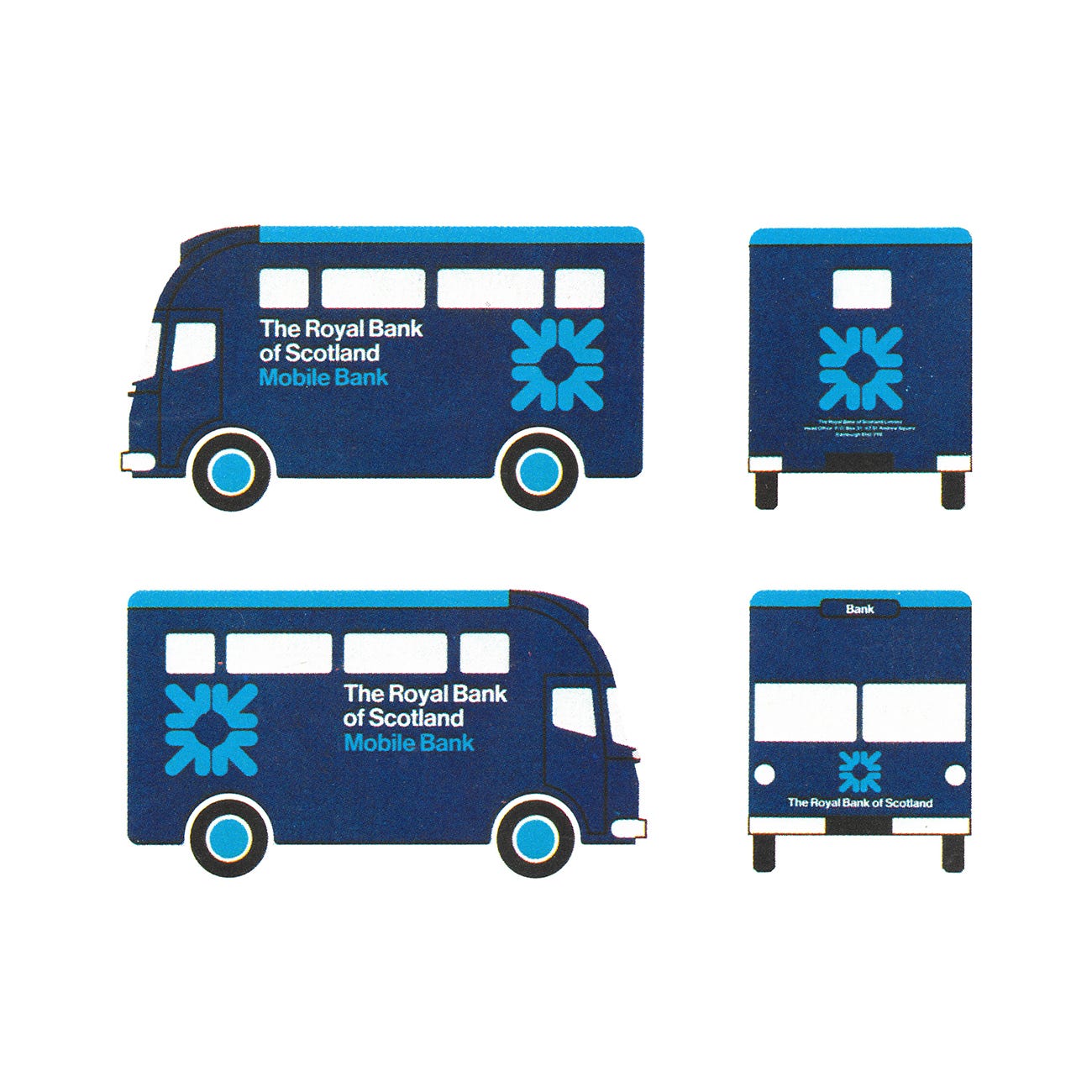
Following the launch of the new corporate identity, the daisy wheel logo appeared on delivery trucks, bronze plaques, and on buildings in stainless steel. The design team worked closely with the architectural departments in the application of the new logo to building exteriors. The work went on to receive the "Presidential Award of the Royal Society of Arts for Design Management'" and the Daisy Wheel remains central to RBS’ identity to this day.
“The functional nature of the banking profession lends itself to the economy of form which is reflected in the new corporate image. The symbol expresses efficiency, security, stability and concentration of wealth.” 2
Thank you for subscribing to Logo Histories. If you enjoy reading this you may also enjoy these resources from the same team:
Brand Archive – Research tool for brand designers.
LogoArchive Website – Searchable modernist logo archive & research tool.
LogoArchive Shop – Vintage design books & LogoArchive Zines.
BP&O – Contemporary design editorial.