
The Sea We Would Like To See
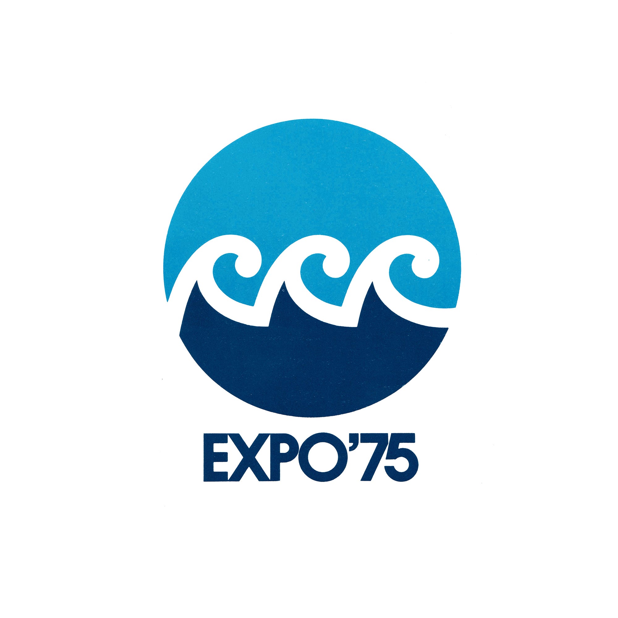
Kazumasa Nagai's symbol and Yusaku Kamekura's mascot for Expo '75.

This post is supported by LogoArchive – The home of historical logos. Discover over 4700 of history’s greatest designs from the world’s finest designers. Always find the logo inspiration you need for your next project. Start here.
Expo ‘75 was a World’s Fair held on the Japanese island of Okinawa, opening on July 20th, 1975 and running until January 1976. Like other Expos, the attractions and international pavilions revolved around a central theme, this time, it was the ocean, presenting to the public various oceanographic technologies and marine life. Expo ‘75 was also conceived of as a commemorative event, celebrating the handing over of Okinawa from the US to Japan in 1972, which was finally completed in 1975.
A closed competition was held between 11 designers to find a symbol for the Expo, and a selection committee was assembled to narrow down the many entries. The chairman of the comittee was Masaru Katzumie. Katzumie was a strong choice, having had extensive experience working with selection committees overseeing the design of symbols for Expo '70, the Meiji Centenary, the BIE and Sapporo Winter Olympic Games. The rest of the committee was made up of designers Kenji Ito, Koya Ooshiro, Iwataro Koike, Ikko Tanaka (Expo ‘85), Hideo Mukai, Ryuichi Yamashiro, Seiji Kaya and Yasaburo Ikeda. Norio Ochi, the secretary-general of the Ocean Exposition Association, also joined the committee.

