Treated as a whole
FHK Henrion and HDA International's 1967 logo for Blue Circle Group
Blue Circle Industries was formed in 1900 as the Associated Portland Cement Manufacturers Ltd from the amalgamation of 24 cement works. By the mid-1960s, following a period of international expansion, The Blue Circle Group had grown into the largest cement manufacturer in the world.
Located in Great Britain, the group was made up of parent company The Associated Portland Cement Manufacturers Ltd. (APCM) and its sales arm the Cement Marketing Company (CMC). The group also had a number of subsidiaries and allied companies that had created a complex tapestry of entities while post-war diversification had also created a broad range of products. The use of inconsistent trademarks and names, and the growing number of products had created a confusing and divisive situation for the group.
The Cement Marketing Company, prior to 1967, had been using a blue circle as its trademark, and from this, various configurations had been introduced to hold together the subsidiaries and products.
In 1965 chairman John Reiss commissioned McKinsey & Company to analyse APCM's management structure and methods, and present a report detailing its findings, conclusions and recommendations.
The outcome of the report indicated that the management structure was inadequate for the future development of the company, concluding that there was no visible cohesion between the finance department, the works department and the sales department. And further, that this was having an adverse effect on the profitability of the company. The recommendations made by McKinsey & Company were not acted upon, however, in 1966 the company commissioned Henrion Design Associates International (HDA International), led by partner FHK Henrion, on the development of a new corporate image.
HDA International worked to unify the organisations that made up the group under the name Blue Circle Group, and develop a cohesive brand identity system. Blue Circle Cement was one of the primary expressions of this new work.
As noted by FHK Henrion in IDEA Issue 114, “in many corporations the appearance overall gives a rather bad impression, usually because it has never been treated as a whole. A few good aspects are lost in a mass of poor neglected ones”.
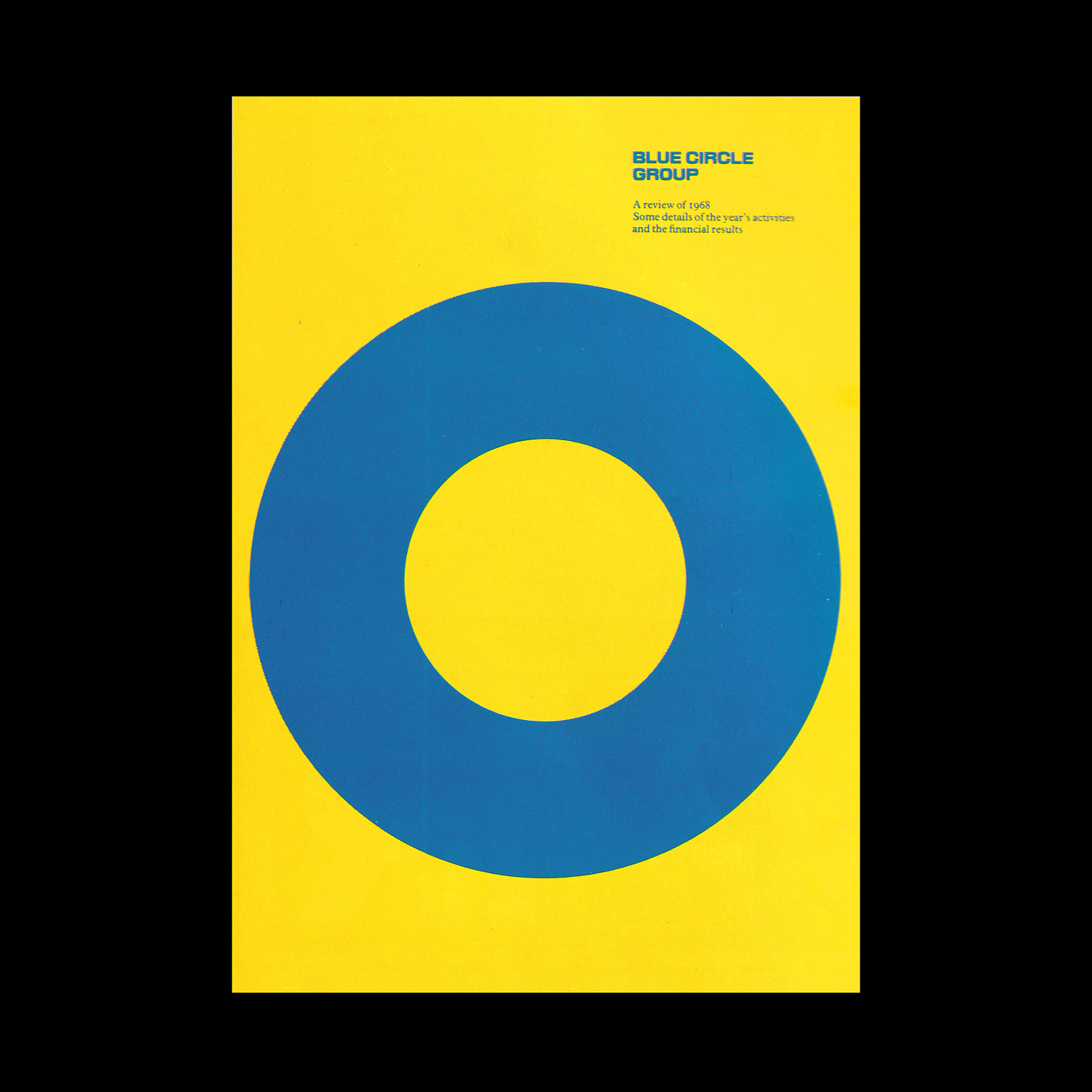
The principle design element of this system was simply a blue circle, drawing on the past but pioneering and progressive in its application. The dimensions of the circle, from its centre point to its outside diameter, was twice the distance as from the centre point to the inside diameter.
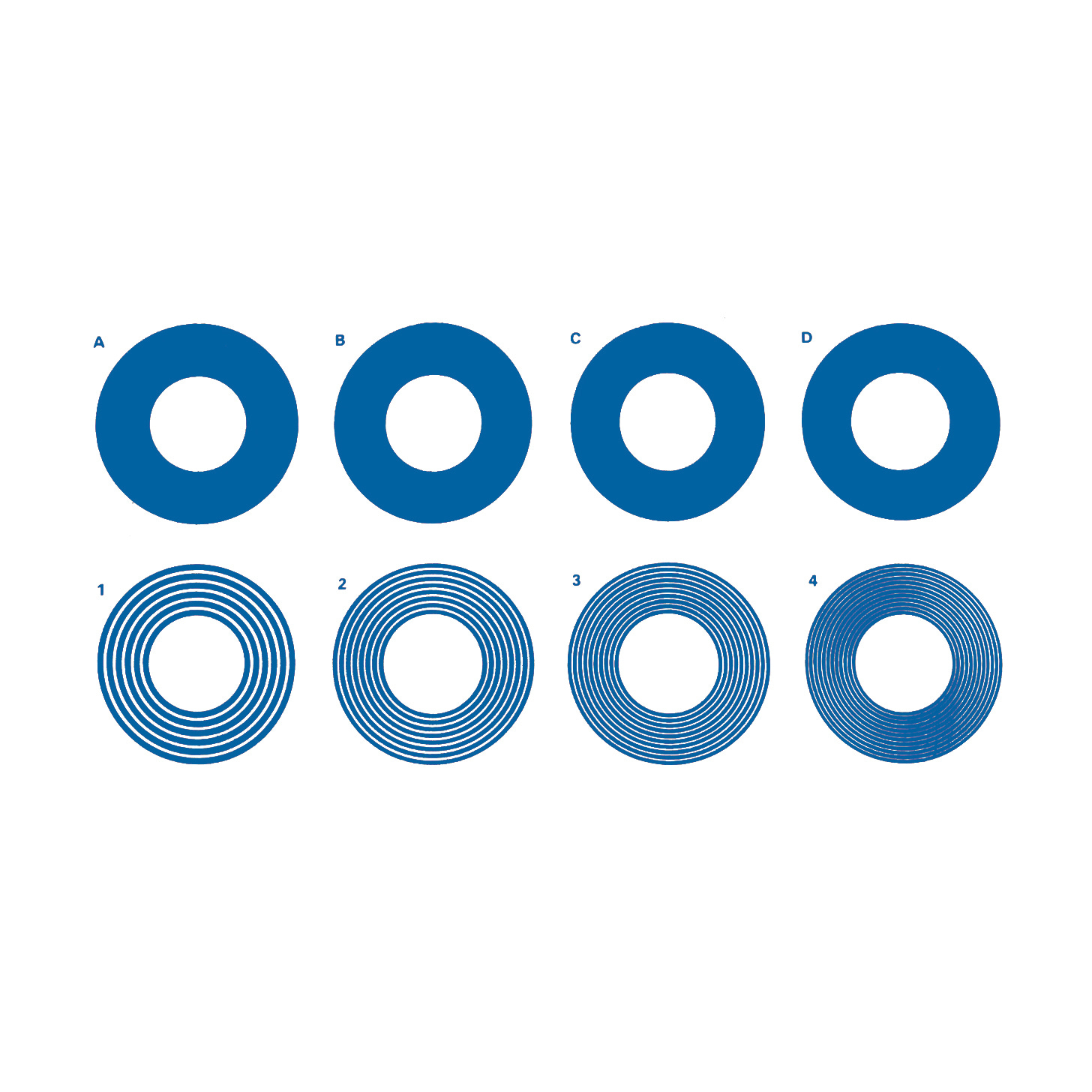
HDA International created four different variations of the logo to account for optical inconsistencies when the logo was scaled up and down. These variations counteracted an optical effect; the appearance of the circle’s negative space seeming bigger as the logo was made smaller.
As noted in the Blue Circle Group Design Manual, the logo was not to be implemented in a solid black. Instead, four tonal versions of the logo were created for single colour printing. These were made up of a varying number of concentric rings which were rendered in different weights.
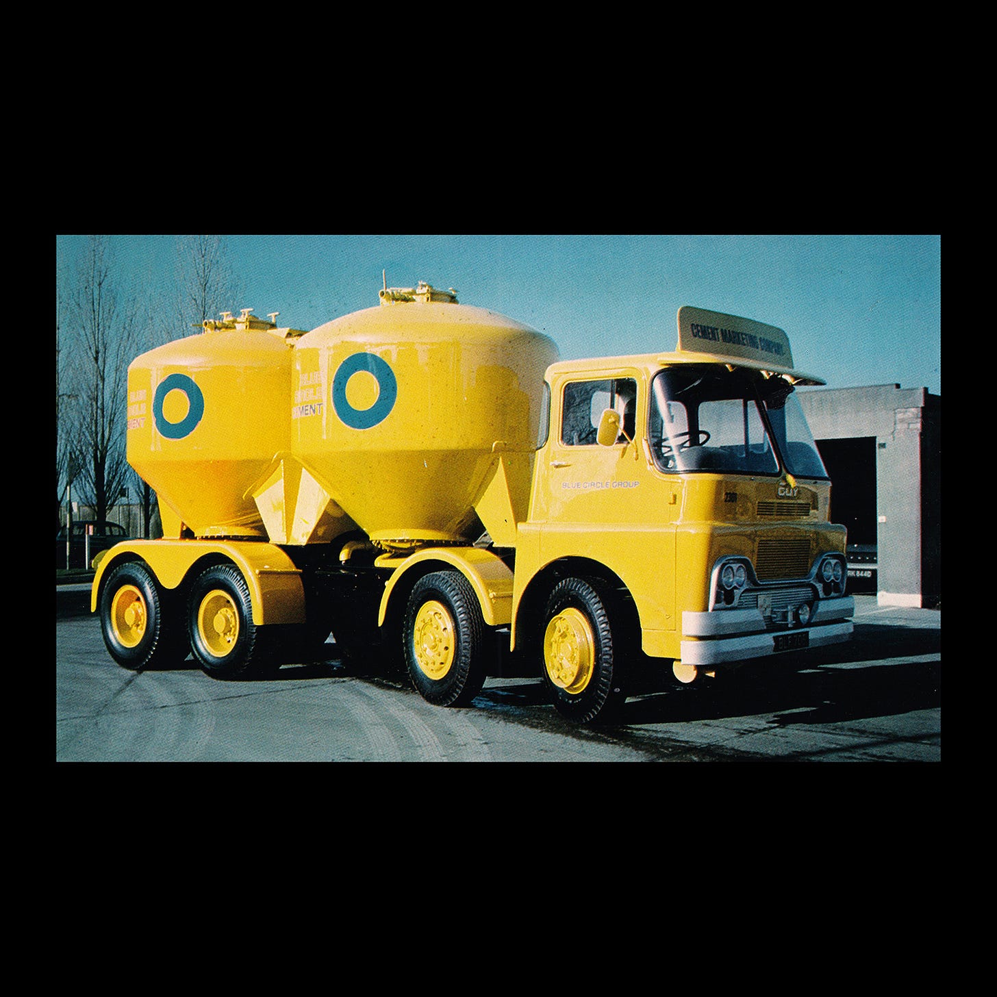
The blue circle was printed using ‘Blue Circle Blue’ and placed on ‘Blue Circle Yellow’. This yellow would flood the context it was used in, whether that was signage or directional board or a whole cement truck or packaging. A further palette of secondary colours was created and used to help delineate between a vast number of products
The logo was used alongside a bespoke typeface in four different styles. Blue Circle Number 1 was used for copy titles and product names. Blue Circle Number 2 was a condensed version used on cement bags and general signage. Blue Circle Number 3 was a lightly outlined version of Number 1 and used for The Blue Circle Group and its subsidiaries. And finally, Blue Circle Number 4, a slightly more heavier outlined version of Number 1. This was used for The Blue Circle Group and its subsidiaries when applied to transport and special display materials and print.
Although the logo was based on a previous trademarks, the project was, at the time, pioneering in its consistent and systematic approach, and where the logo derives its effectiveness. This was acknowledged in 1973, with the Design Department of the Blue Circle Group receiving a Duke of Edinburgh Award for Design Management and Design Achievement. Even though the company would eventually be bought out in 2001 by Lafarge, the logo continues to be used today.
Thank you for subscribing to Logo Histories. If you enjoy reading this you may also enjoy these resources from the same team:
Brand Archive – Research tool for brand designers.
LogoArchive Website – Searchable modernist logo archive & research tool.
LogoArchive Shop – Vintage design books & LogoArchive Zines.
BP&O – Contemporary design editorial.


