
Tu Felix Austria – Fly!
Josef Oberauer’s 1969 logo for Austrian Airlines.


In 1963, Austrian Airlines, Osterreichische Luft-verkehre-AG, settled on the abbreviation “AUA”. Unfortunately, this alphabetic combination was one of many that was not well-received internationally, and contributed to negative associations in German-speaking countries. Aiming to improve their overall corporate image, Austrian Airlines staged a competition in 1969 to find a new logo. Unusually, the participants were Viennese design students.
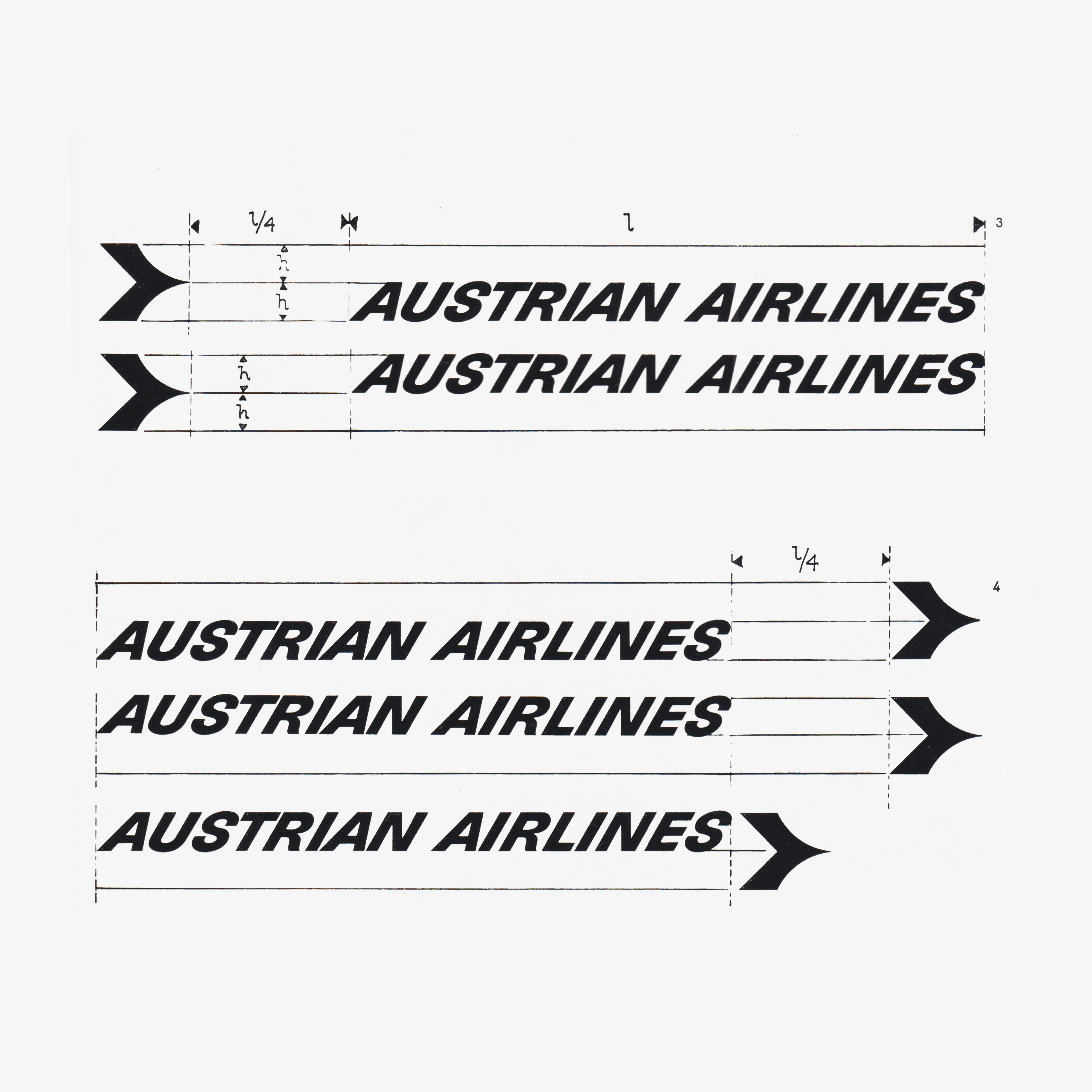
As outlined in the contest brief, it was said that the new logo must be appropriate for the international scope of the airline, and whilst the contest encouraged creative freedom, it was also emphasised that the logo would appear alongside the existing ‘Austrian Airlines’ logotype and therefore it should be created with this harmony in mind.


Of the applicants, students from two Viennese design schools took part; the 1969/70 cohort from the Academy of Applied Art and Graphische Lehr und Versuchsanstalt.
The jury was composed of professors from the two schools, alongside three representatives of the airline, and two members of the advertising agency Gould, Cargill & Cie. These notably included Mario Rehulka, the advertising director of the Austrian Airlines and Ewald Maly, the Art director of Gould, Cargill & Cie.
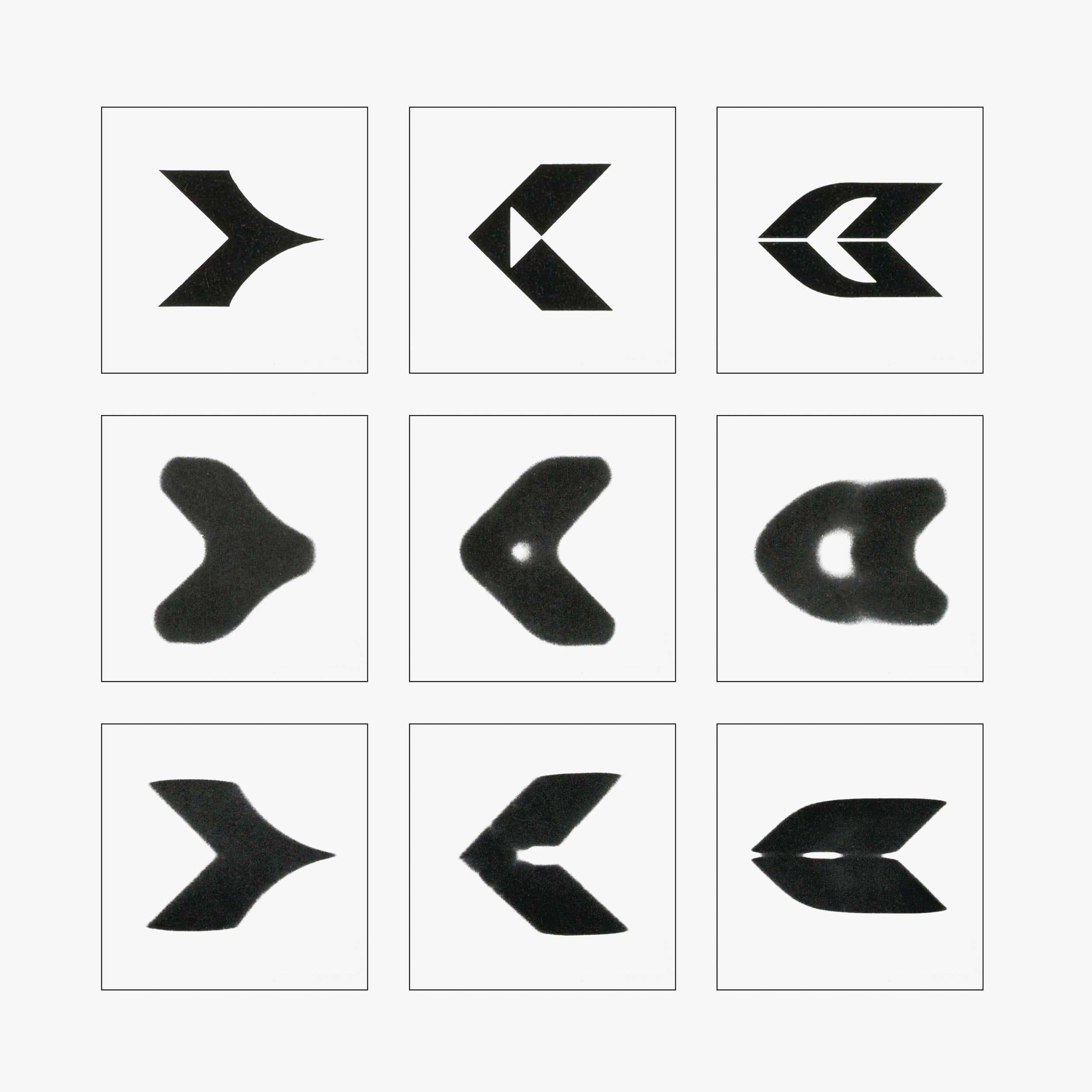
On December 2, 1969 the entrants were narrowed down to 14 finalists, who were ranked using a points system. The top three received 31, 22, and 10 points, respectively. The remaining designs were subjected to a series of tests, utilising photography to determine how recognisable the logo was under ‘realistic’ conditions. Emulating the logo’s viewpoint from a plane in motion, and conditions that included viewing the logo from a distance, in low visibility and rapid horizontal motion.
From an initial pool of over 200 entries, the winning design, by Josef Oberaurer, was selected. The design depicted a stylised aircraft in the form of a chevron arrow facing right; the reverse of the arrow is sharp and rectilinear, with a curved and tapered point at the front. The result is an arrow that communicates direction whilst simultaneously suggesting a streamlined and dynamic shape, ready for flight.
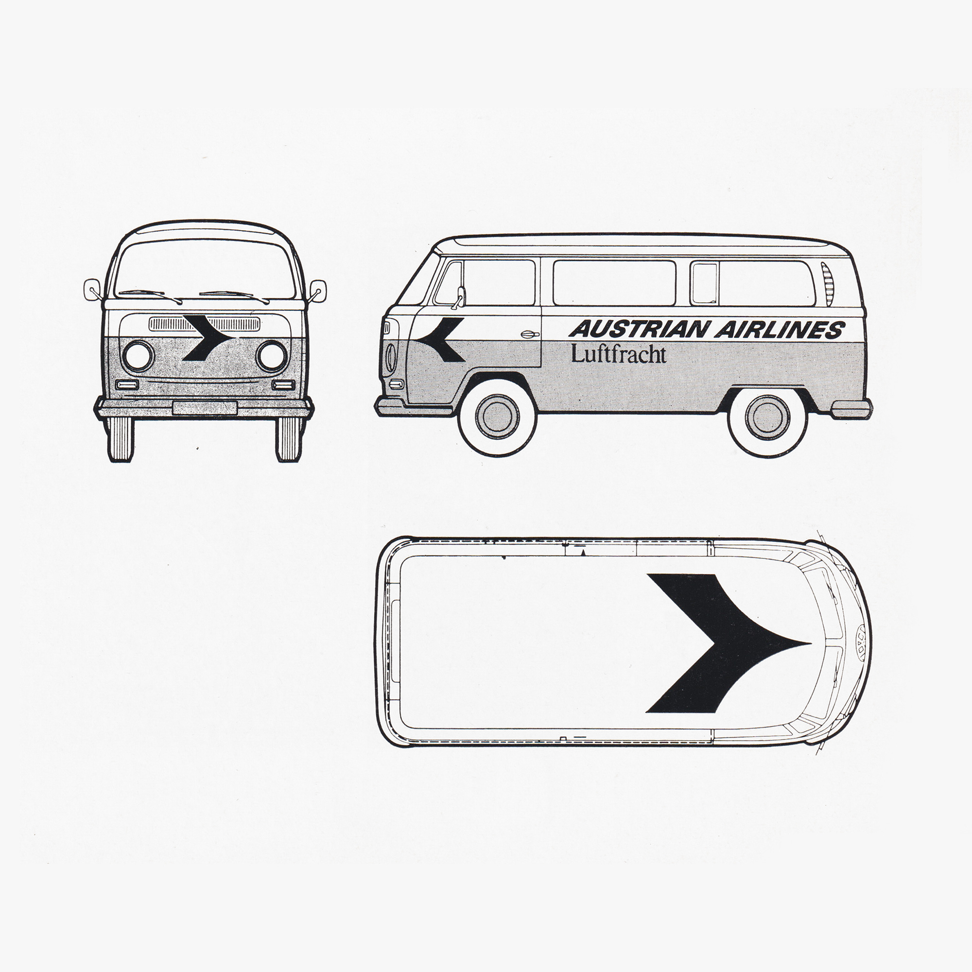
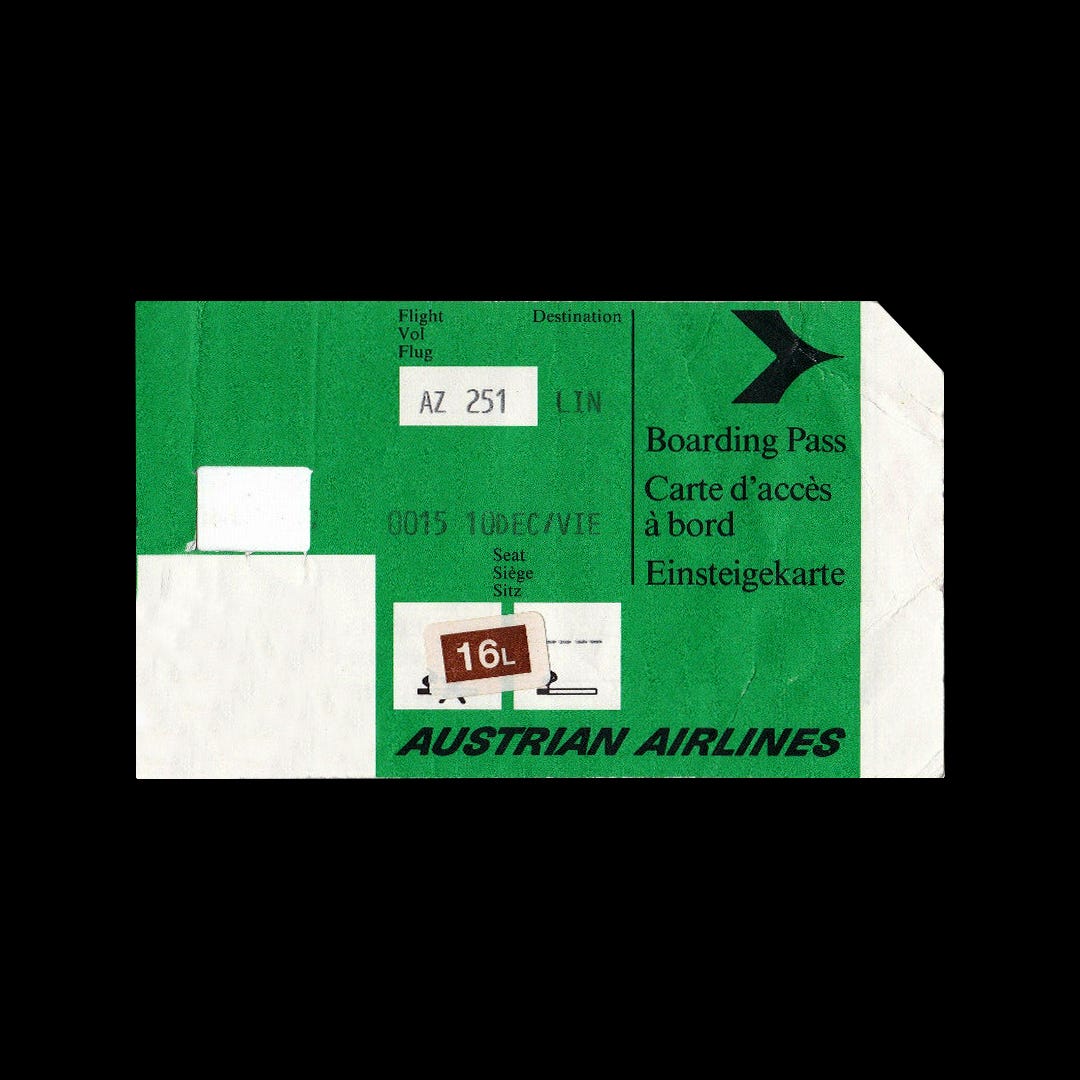
Oberaurer’s logo became the striking focal of the airline’s new corporate image, applied in the vibrant red of the Austrian flag. This could be seen across baggage stubs, hangars, tickets, stationery, flight plans, and the flight staff’s uniforms. The new corporate image was its most successful in application across brochures, ads and posters, not only owing to the bold design and art direction, but also in part due to the well-written, engaging, and persuasive copy.

Featured in Novum February 1972, it was noted at the new design “is truly classic and faithfully reflects the forward-bound dynamic motion of the signet.” Austrian Airline’s new corporate image, elevated by the logo’s new design, successfully contributed to an improved international image of the airline and fulfilled the original of giving it a strong international presence.
Thank you for subscribing to Logo Histories. If you enjoy reading this you may also enjoy these resources:
Brand Basics – Automated Brand Guidelines maker.
Brand Archive – Research tool for brand designers.
LogoArchive Website – Searchable modernist logo archive & research tool.
LogoArchive Shop – Vintage design books & LogoArchive Zines.
BP&O – Contemporary design editorial.