Growth from a central foundation
Brownjohn, Chermayeff & Geismar's 1960 logo for Chase Manhattan.
This post is supported by LogoArchive – The home of historical logos. Discover over 5000 of history’s greatest designs from the world’s finest designers. Updated every single day. Always find the logo inspiration you need for your next logo or branding project. Start here.
In 1955 the merger of Chase National Bank and the Bank of the Manhattan Company would form Chase Manhattan, the largest commercial bank in New York and the second largest in the United States.
Shortly after the merger Vice Chairman David Rockefeller sought a new corporate image for the company, one that would would reflect Chase Manhattan's increasing global reach and complement the modern design of its new 60 story headquarters located in Lower Manhattan.
It was felt that the logos that had been previously used would fail to capture the ‘unique feel of the brand’. Further, the five different elements from the company's two ‘heritage banks’, would have created unnecessary complexity. Rockefeller knew the logo needed to be simple and strong graphic and would be recognisable around the world, and worked with Brownjohn, Chermayeff & Geismar (BC&G), now Chermayeff & Geismar & Haviv, to design this. The design studio were supported by the Chase Manhattan Corporate Image Committee which included production advisor Ralph Watson and designer Peter Gee.
BC&G were convinced that the bank would benefit from a simple symbol that would not only unite the two newly merged corporate cultures but also come to stand in for the company’s ‘unwieldy name’, creating a visual shorthand. Chase Manhattan had ‘tremendous’ advertising resources that if used effectively would be able to quickly establish an abstract symbol in the minds of the public, something quite unique at the time.
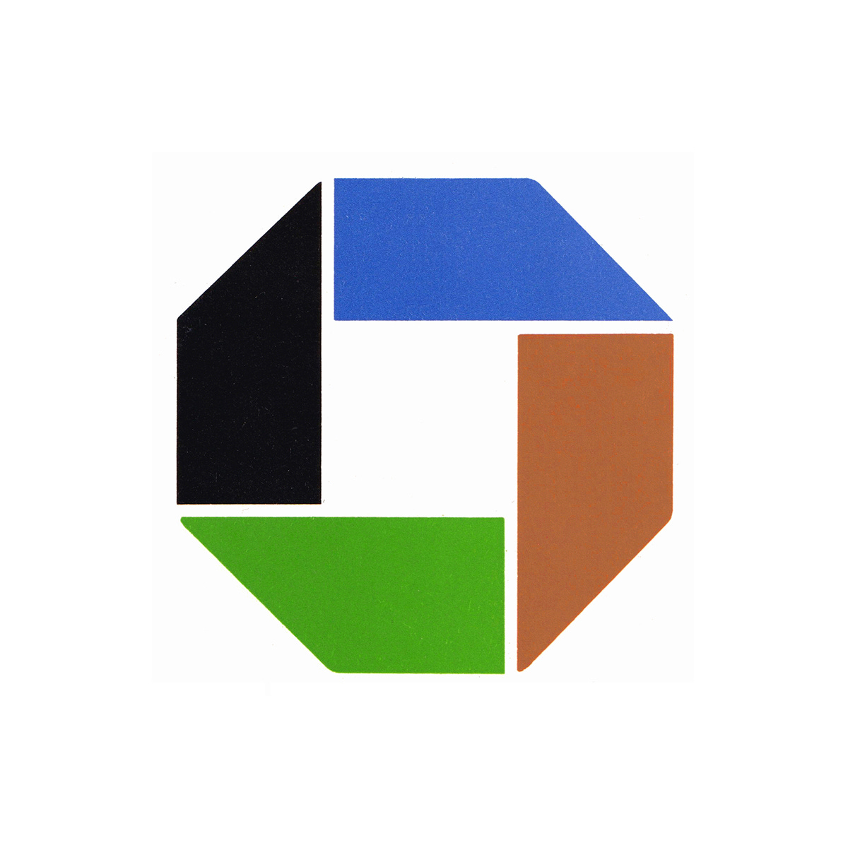
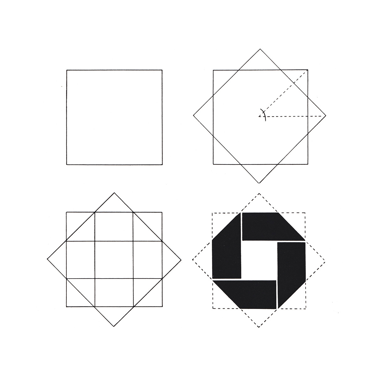
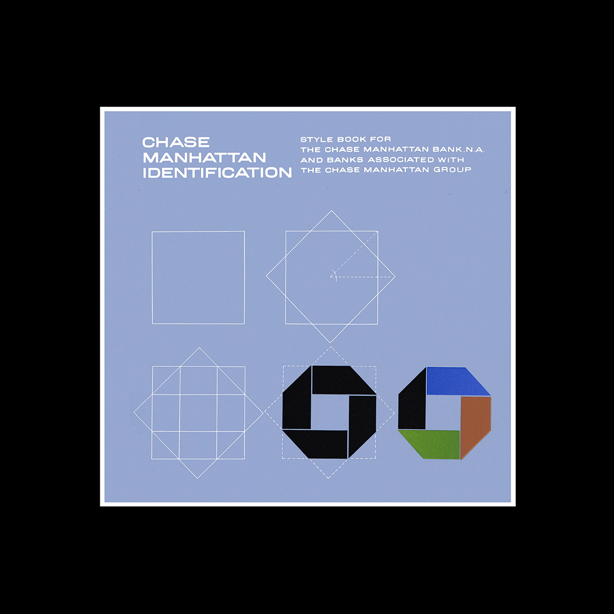
The logo was inspired by a traditional Chinese coin, a circle with a square cut out of the centre. This was developed into the square enclosed in an octagon, suggesting a bank vault and, by extension, the notion of security and trust. As the designers would put it, the logo suggested how all activity (national or international) is centred around a square, implying growth from a central foundation. The addition of the 45-degree angles around the exterior edge was said to give the logo a sense of motion, dynamism and a hint of three-dimensionality, whilst remaining simple. The visual was said to be sleek, attractive and timeless, and the three-dimensionality would later play out in the form of signage.
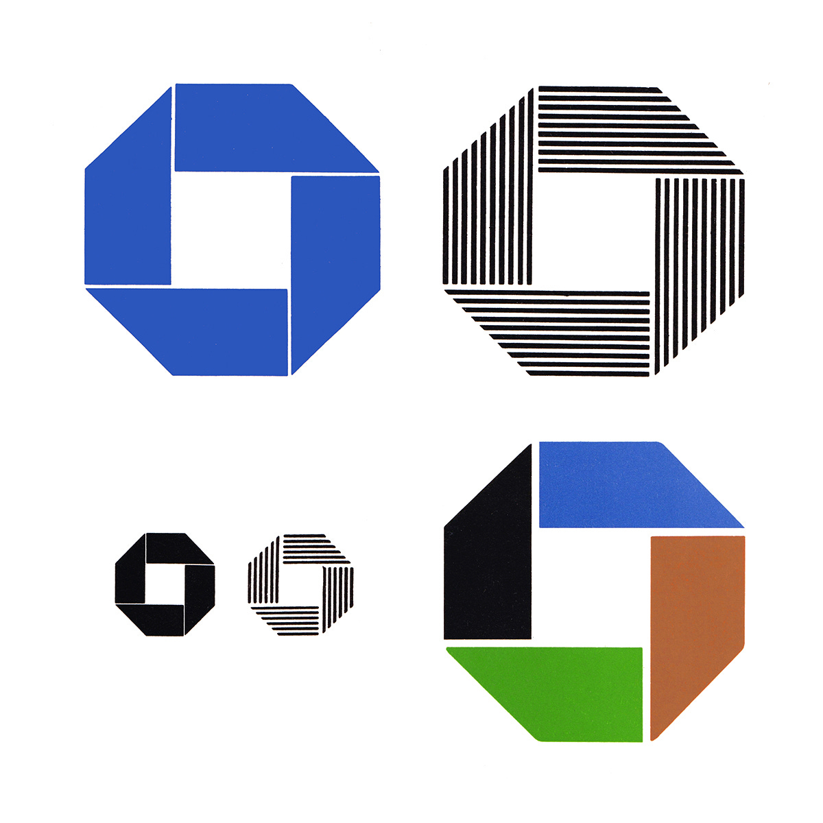
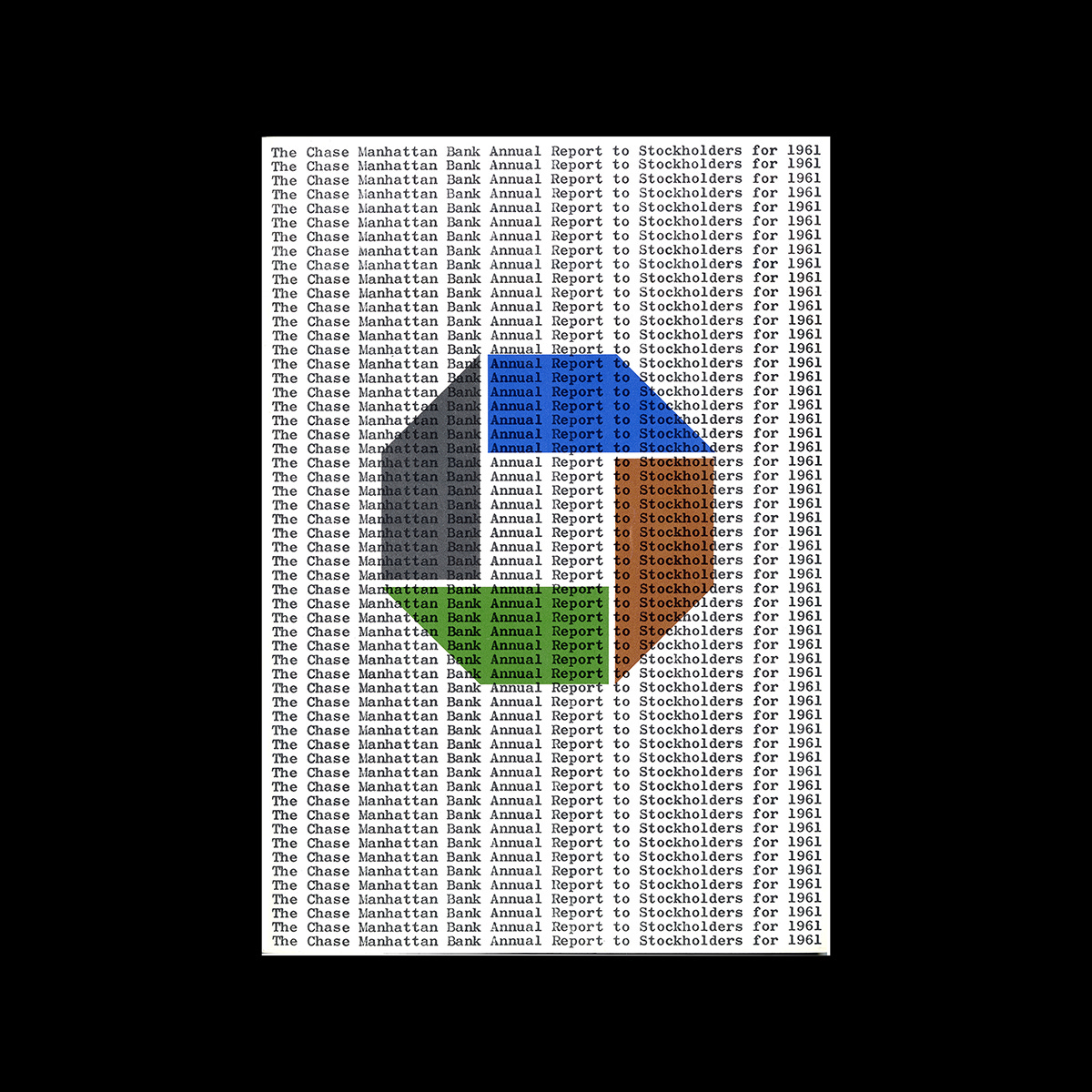
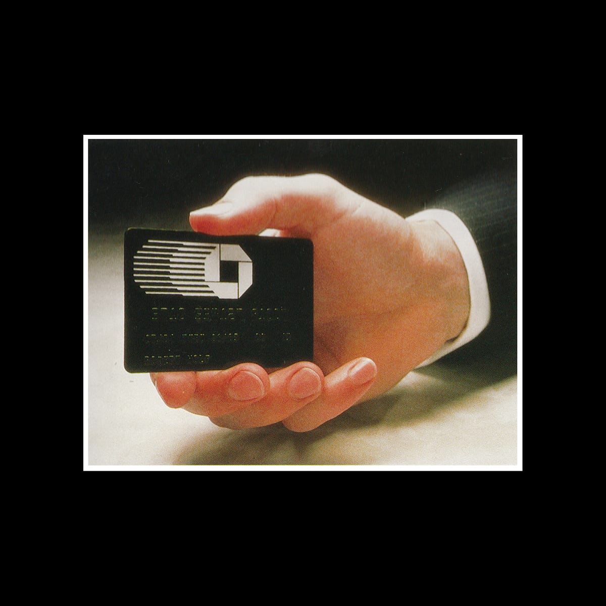
A number or versions of the logo were developed to increase its usability across the vast number surfaces, from signage to stationery, from credit cards to car liveries. The versions included solid variations (full colour for ‘special circumstances’, single colour blue as the official mark and black), line versions for newspaper use (with a different number of lines for different sizes), and a design with finer negative space for larger contexts such as signage, and one with more open negative space for scaling it down.

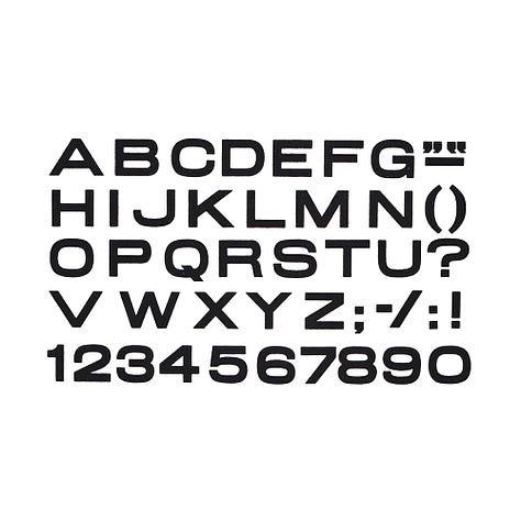

Chase Manhattan also extended itself to partnerships and controlling stakes in foreign banks such Peru’s Banco Continental, Banco Mercantil y Agrícola in Venezuela and Belgium’s Banque de Commerce, amongst others. In order to unify these, bringing them closer to the image of Chase, but maintain their names, a custom corporate typeface was devised. This was characterised by uppercase extended sans-serif letterforms. This was produced as condensed and extended styles and in regular and bold weights. This increased the flexibility of the system. This was particularly important when dealing with a long name in restrictive circumstances where space was limited.
Headlines, titles, and similar items did not use the Chase Alphabet. In these cases, the permitted typefaces were Times Roman, Baskerville, Century Torino (Italic), Helvetica and News Gothic. A special preference was given to the last two. Body copy and small things such as addresses, subheads, department names, etc., used Times Roman, Baskerville Century, De Vinne, Lightline Gothic, Helvetica and News Gothic. The guiding principle for typeface selection was to give the overall impression of modernity.
When presented to the Chase Manhattan top executive board, two of the three top executives resisted the idea of an abstract symbol. However, within months of the adoption of the identity, the same executives who had opposed the mark were said to be proudly wearing it on cufflinks and tie tacks.
On November 21st, 1960, the new logo was unveiled to the public. This was, at the time, a pioneering example of abstract logo design in banking. Around the same time it unveiled its new logo, Chase also released an advertising campaign “You Have a Friend at Chase” which ran from 1960 to 1975. This was one of the first to feature the bank’s new logo. The advertisements reinforced the notion of friendly service no matter which Chase Manhattan branch was visited, domestic or international. This campaign helped solidify the new logo in the minds of customers and, despite its abstract nature, would take on the associations of the campaign, and its welcoming message.
The Chase logo survived a number of subsequent mergers, and is currently the property of JPMorgan Chase & Co., and becoming one of the world’s most recognisable trademarks through its persistence. The logo has, however, undergone subtle changes over the years. Although the original design featured multiple colours and variations to support scaling up and down in single colour, in 2004 the solid blue octagon was adopted and the typeface changed to better-suit the digital era. This was undertaken by Chermayeff & Geismar & Haviv.
Discover more Chase Manhattan brand assets and assets from hundreds other historical and contemporary brands at Brand Archive.
Thank you for subscribing to Logo Histories. If you enjoy reading this short you may also enjoy these resources from the same team:
New! Portal – Design-driven jobs board (ATS Coming soon)
Brand Archive – Research tool for brand designers.
LogoArchive Website – Searchable modernist logo archive & research tool.
LogoArchive Shop – Vintage design books & LogoArchive Zines.
BP&O – Contemporary design editorial.






It's a very fine logo as an abstract logo and brilliantly distilled from a chinese coin, the first coin. A shape that encompasses so well the values that it implies.
Timeless it is!
Did not know the colour version. It is nice but it got dated. It works very well in monochrome. The original blue shade is nicer than the currently used color.
Chermayeff & Geismar's (then BC&G now CG&H) work is always inspiring.
Every time I read these short logo case studies I always learn something new. So well researched and well written. Amazing work Richard!