


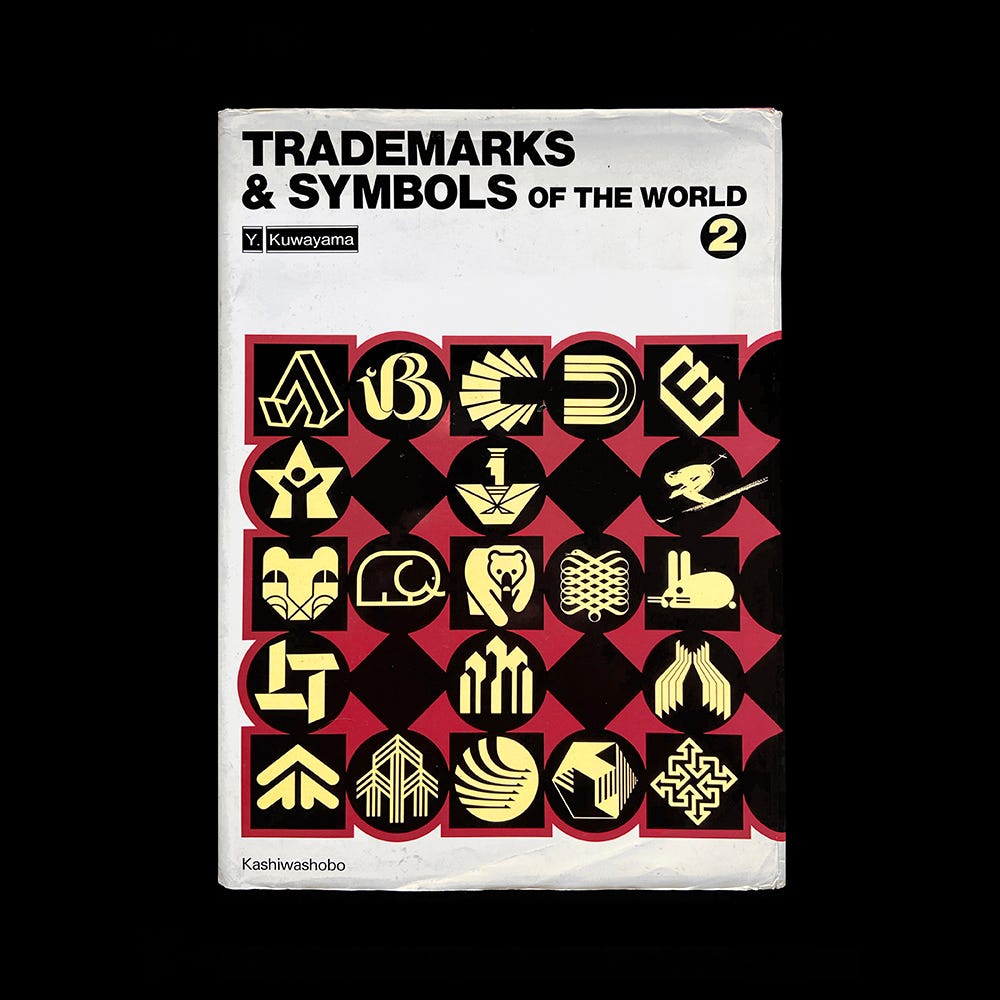
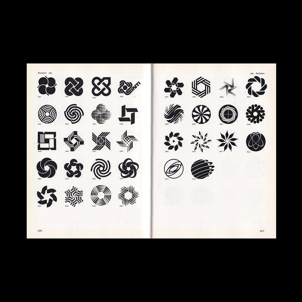
The following is Yasaburo Kuwayama’s thoughts on the state of trademark design in the 1980s after composing the second volume of Trademarks & Symbols of the World. It’s illustrated with spreads from the book, plus examples of the types of logos written about in the text.

In the postscript of the reprint of the previous book (Trademarks & Symbols of the World Volume 1) I wrote that the perfection of marks and symbols had reached its peak in the 1960s, but in editing this book, I became convinced that I had been mistaken. What then is the new trend in marks and symbols? To this question, the following answer can be given : The number of those marks with the following features has increased: (1) the tone is subtle and the shape is complex; (2) the mark can be used at the length of one's choosing; (3) the mark can expand without limit; (4) the mark has many variations; (5) the mark is multicolored; and (6) the spirit of play has been incorporated into the mark.
(1) Marks and Symbols with Subtle Tones and Complex Shapes
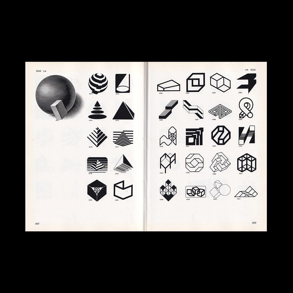
Up to now I have transmitted the contents as the factors in creating marks and have considered simplicity, strength and beautiful shape as the three major factors. But the phenomenon which can be seen here in that of marks and symbols going beyond this framework, using difficult and subtle tones, complex shapes and collections of delicate lines. This is because the same shape is not used for big and small sizes as has been the case of marks up to now, but when the size is small, a simple shape is used, and a complex shape is used when the size is large. Also, since the scope of use is limited, the shape does not necessarily have to be simple. This is due to the improvement in printing technology and the use of appropriate, high-quality paper.
Explore more like this in Logo Design Theory: Classic Essays on Trademarks →
Go behind the logos. Explore 200+ in-depth and meticulously researched logo histories revealing the designers, design decisions and ideas behind the world’s most iconic logos and important brand identities.
(2) Marks Which Can Be Used at Desired Length
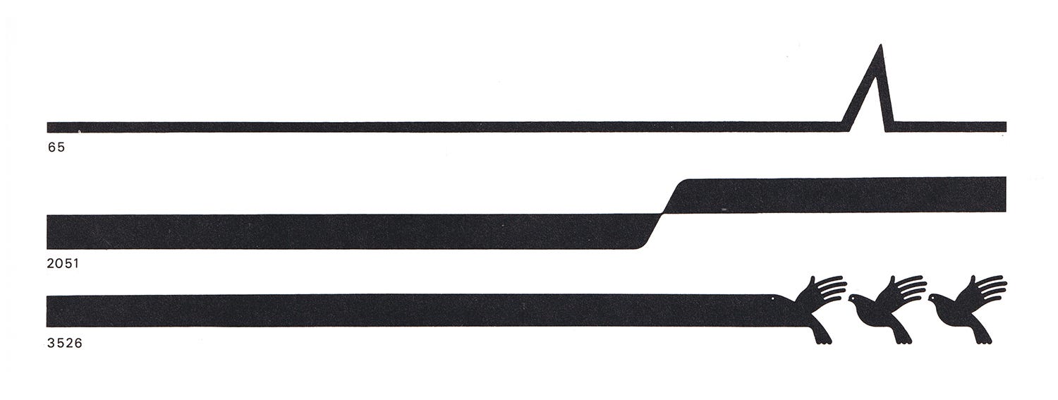
Various devices have been used to differentiate and give individuality to the image of the company or organization using the mark. Combining marks with surfaces and lines is a method which is used often, but here the length of the mark can be freely extended depending on how it is used. (Examples: 65, 2051 and 3526) For instance, the length can be cut appropriately depending on the width of a business card or a letter/head.
(3) Marks and Symbols Which Can Expand Without Limit
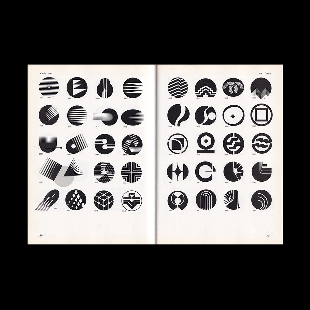
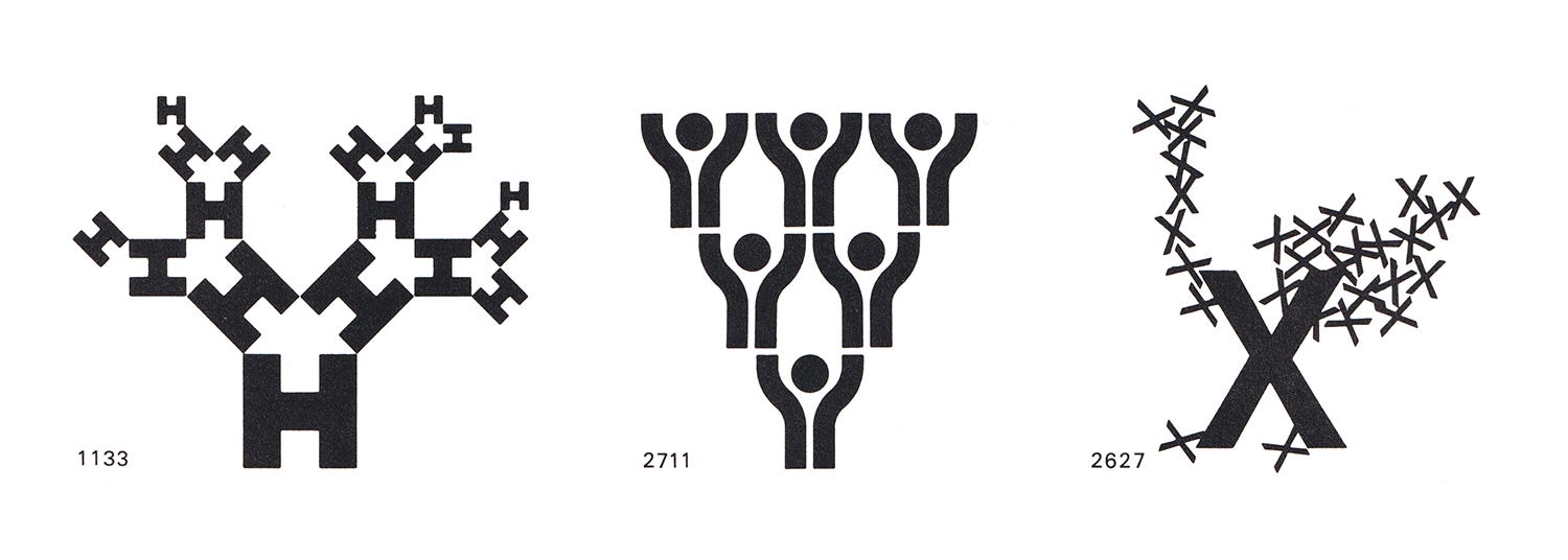
The size of the mark or symbol is changed according to how it is used. Previously, there was the method of repeating the original shape to form a pattern to be used on wrapping papers and packages. There has been a further development of this method, and a shape which can be continuously repeated is prepared in advance and assembled like a jigsaw puzzle or building blocks. In the case of the jigsaw puzzle type (Example: 1133 and 2711), the combination method is planned from the very beginning. In the building block Type (Example: 2627), the combination method changes and is different according to use.
(4) Marks With Many Variations
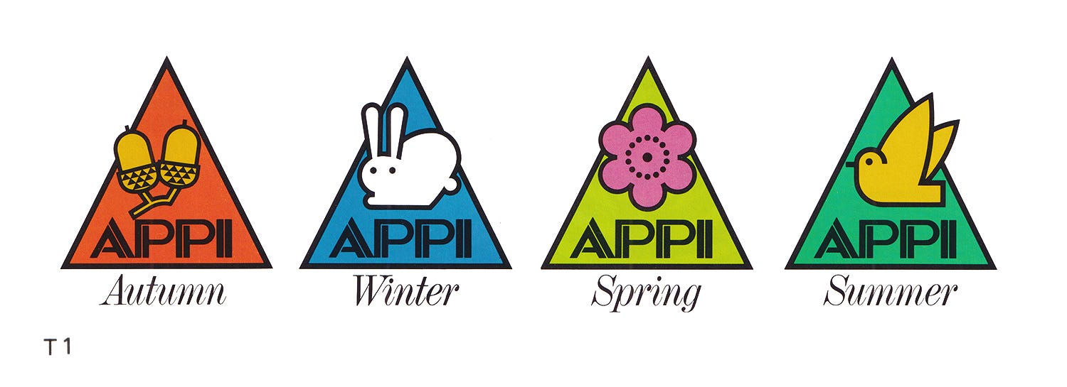
It is said that "a mark is the face of the company”, but this face can be very flexible. Just as a person changes clothes depending on the time and place, so a mark changes its shape according to necessity. Once the shape of the mark or symbol is remembered, it plays the role of an accessory, and is often used in amusement parks and resorts, changing according to the facility or season (Example: T1). There are cases where symbols are needed by departments within the company. There are also cases where symbols are needed by affiliate companies and sister companies because of the company's development. These must have original form and variation but in such a way that the image remains unified and the general public recognizes it as representing the same company or group.
(5) Multi-colored Marks and Symbols
Along with the improvement in printing technology and in answer to the demands of the times, this edition offers an increased number of color pages. It is the age of color television, and just as there are colors in nature, the human eye is made to enjoy color. Because marks and symbols can freely use colors, their range of expression has been considerably expanded. The number of multicolored marks and symbols has increased, and it has become difficult to transmit the shape using just the color black.
(6) Marks Incorporating the Spirit of Play
From now on, more marks incorporating the spirit of play a novel and enjoyable development, will probably appear.
Logo Histories: Mazda, 1975

The fascinating story behind Rei Yoshimura and PAOS' 1975 logo and corporate identity for Mazda. Read/subscribe here.
Want more in-depth articles? Check out LogoHistories’ other articles on logos by Yasaburo Kuwayama →


Thank you for subscribing to Logo Histories. If you enjoy reading this short you may also enjoy these resources from the same team:
Brand Archive – Research tool for brand designers.
LogoArchive Website – Searchable modernist logo archive & research tool.
LogoArchive Shop – Vintage design books & LogoArchive Zines.
BP&O – Contemporary design editorial.