This post is supported by LogoArchive – The home of historical logos. Discover over 4000 of history’s greatest designs from the world’s finest designers. Always find the logo inspiration you need for your next project. Start here.
‘The Housewife’s Store Daiei’ (株式会社ダイエー) opened its doors in 1957, and was located near Sembayashi Station in the Japanese city of Osaka. In its early years the retailer, founded by Mr. Nakauchi, was known for selling medication and groceries, with a strict discount strategy that gave it a competitive advantage. Thanks to their discount prices, innovative distribution methods, and no-nonsense approach to wholesalers, Daiei grew quickly; out-pricing its rivals until it became a leading national chain and one of the largest supermarkets in Japan.
In 1972 Daiei would surpass the Mitsukoshi Department store to become the top retailer in the country. This achievement was marked by a period of reflection for the chain; a time to review its pre-existing design and visual communications.
The following year, in 1973, Daiei formed a corporate identity team and approached PAOS – a design consultancy founded by “father of Asian Corporate Identity,” Motoo Nakanishi – to assist with the research and development of a new design system. PAOS (ASICS, Noritiz, Kenwood) coordinated a competition for the development of Daiei’s identity system, which began in April 1974.
The key criteria for the design was to express “reliability, security, a simple and unaffected strength, an international and forward-looking attitude, and the leadership and energy characteristic of the nation's number-one retailer.” The design would also have to be developed into a broad and cohesive system across a number of applications, therefore it needed to have a versatility and variety.
Six designers were invited to develop ideas. Kakutaro Iimori, Kan Sano, Mamoru Shimokouchi, Shin Matsunaga, Horishi Morishima, and Rei Yoshimura. Together, they submitted 26 drafts, with each being judged against a 58 point system. Two final designs (both by Rei Yoshimura) remained, and were referred to as Plan A and Plan B.
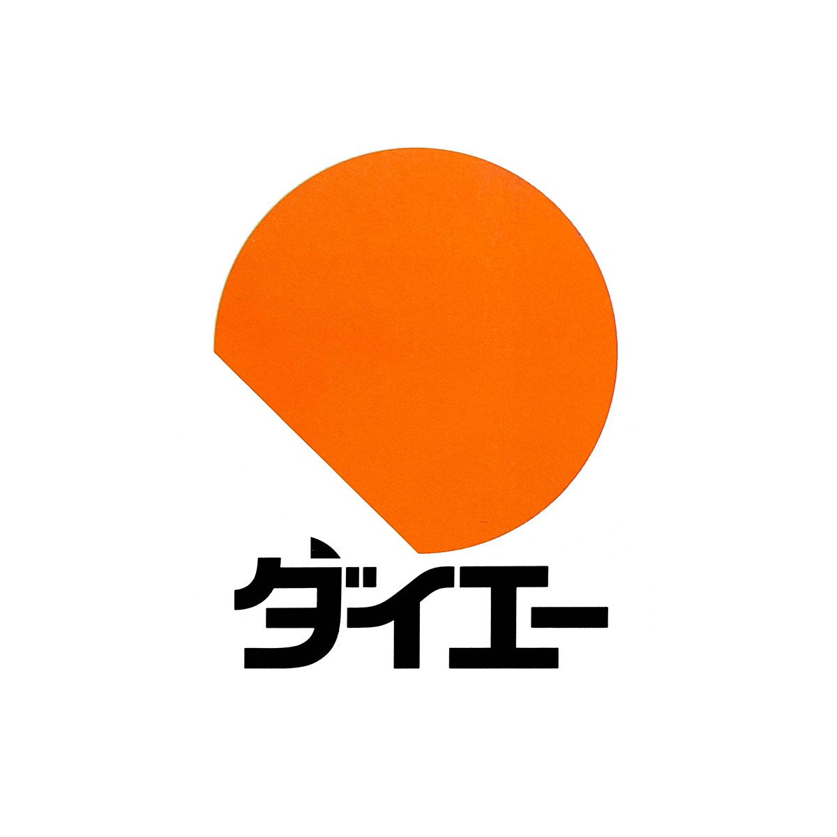
After a week of careful consideration, President Nakauchi announced that Yoshimura’s Plan B, at the time described as the “chopped-off circle”, as the winning design, and the one to be developed into a complete visual system.
Conceptually, as an incomplete circle or ‘waxing moon’, the logo would communicate that which is eternally “unfinished”, constantly growing and continuing. However, at the time, there was also concern that, if the orange circle was displayed high on the tower, it would give the impression of the Japanese flag. To remedy this, a green version of the logo was often placed alongside the orange.
Thanks to the simple geometric nature of Yoshimura’s logo, it was flexible and lent itself well to a range of expressions, arrangements and practical applications throughout a vast range of surfaces. Four versions of the logo were produced to expand its usability and variety: solid, stripe, fine stripe, and outline. Furthermore, it would be paired with the Daiei logomark – produced in both English and Japanese Katakana versions – and introduced in October 1975.
The logo was tailored to the hundreds of thousands of products, sign systems and in-store displays. Subsystems were also developed for items according to use and image. With the large number of applications, the logo would vary in colour, scale, and layout – even repeated in a variety of patterns – all whilst remaining undeniably and recognisably Daiei.
Colour was used extensively throughout the design program, with thirty four standard colours (including the corporate colour of Daiei orange) used for the logo, plus 36 additional recommended background colours.
The entire comprehensive design system was presented in a corporate identity manual to define guidelines for the company’s brand and implement standardised design across the company. Detailed and systematic, it would ensure that the new design system would be applied consistently to the wide and extensive selection of items.
The logo was in use at the Daiei Group supermarkets for 30 years until November 30, 2005. The logo was officially discontinued in December 2005.
Key Takeaways
POAS was an early practitioner of hiring outside specialists, what today would be called freelancers. The belief in this approach to develop effective and creative solutions was reflected in the studio’s name, with the ‘OS’ of the name standing for ‘Open System’.
Beginning with a logo – today this would seem limiting, however, with such a vast and complex system of products and touch points, the simplicity of a geometric logo, and its ability to be used consistently across a variety of contexts would help establish the brand, maximising the logo’s attribution through repetition.
Simple forms come with a multiplicity of meanings that change across borders. From a distance, it was thought that the logo could appear similar to ‘The Rising Sun’ flag of the Japanese army of WWII, and would evoke negative connotations. The addition of the second colour green sought to minimise this.
Thank you for subscribing to Logo Histories. If you enjoy reading this you may also enjoy these resources from the same team:
Brand Archive – Research tool for brand designers.
LogoArchive Website – Searchable modernist logo archive & research tool.
LogoArchive Shop – Vintage design books & LogoArchive Zines.
BP&O – Contemporary design editorial.