See the light!
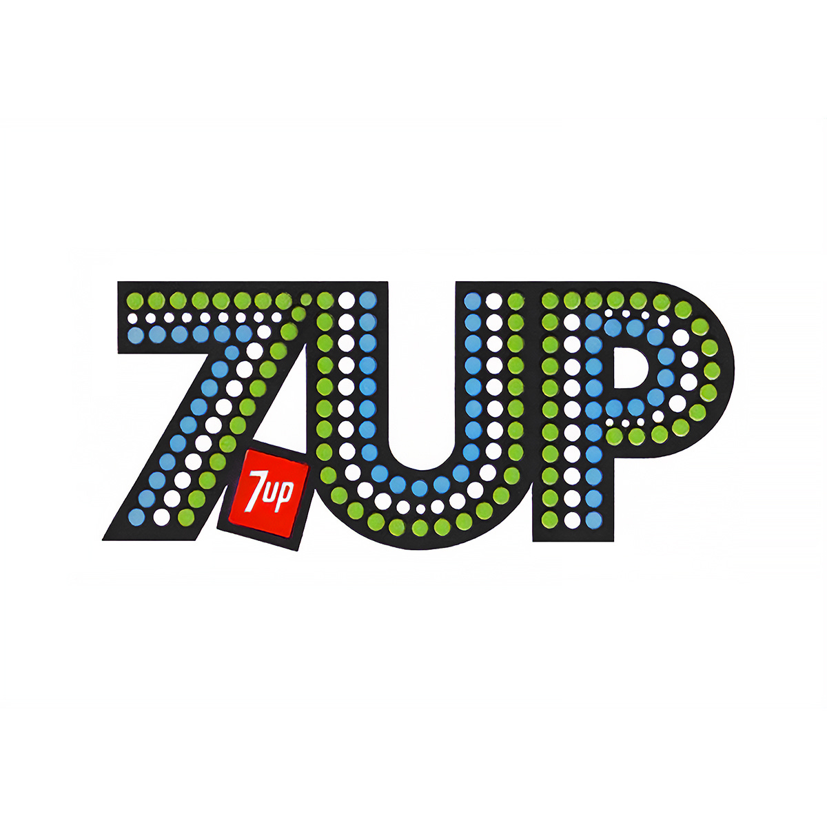
Thomas Miller and Morton Goldsholl's 1975 logo for 7UP.
This post is supported by LogoArchive – The home of historical logos. Discover over 4000 of history’s greatest designs from the world’s finest designers. Always find the logo inspiration you need for your next project. Start here.
7UP was an American soda first formulated in 1929, and one of the original ‘medicine’ drinks of the early 20th century. It was originally called "Bib-Label Lithiated Lemon-Lime Soda", was later shortened to "7 UP Lithiated Lemon Soda", and then to "7UP" by 1936.
The name, it has been suggested, is a hold-over from the medicinal days, with the UP being a reference to the ‘mood-stabilising’ nature of lithium and the ‘7’ a nod to its atomic mass. Current owner Britvic puts forward a more palatable suggestion, that the name simply references the original seven ounce bottle the soda came in. It remains unclear today what the true origins of name is, however, by the 1950s 7UP was the third most popular drink in the US.
In the early 1970s much of 7UP’s campaign materials carried with them the spirit of the era, brought to life through psychedelic illustrations by the likes of renowned artists Pat Dypold, Nancy Martell and Bob Taylor, amongst others. While these captured the pop-culture zeitgeist, this was waning and the campaigns did not halt flagging sales. From between 1974 and prior to 7UP’s acquisition by Philip Morris in 1978, the lemon-lime soda had been losing market share. It was in need of a new image, one more in line with a period increasingly defined by bright animated graphics for TV, computer technology and electronic home entertainment.
Morton Goldsholl Associates (Motorola) was commissioned to develop a new image and campaign for 7UP. Working alongside Morton Goldsholl and head designer Thomas Miller was Orville Roesch, 7UP Marketing Director and Bob Taylor, Art Director at advertising company J. Walter Thompson.
Taylor and Thompson were responsible for the “Uncola" and "See the light!" campaigns which had given 7UP its “exotic and special image” in the early 1970s. Morton Goldsholl described Roesch at the time as being “brim-filled with imagination and exciting ideas”.
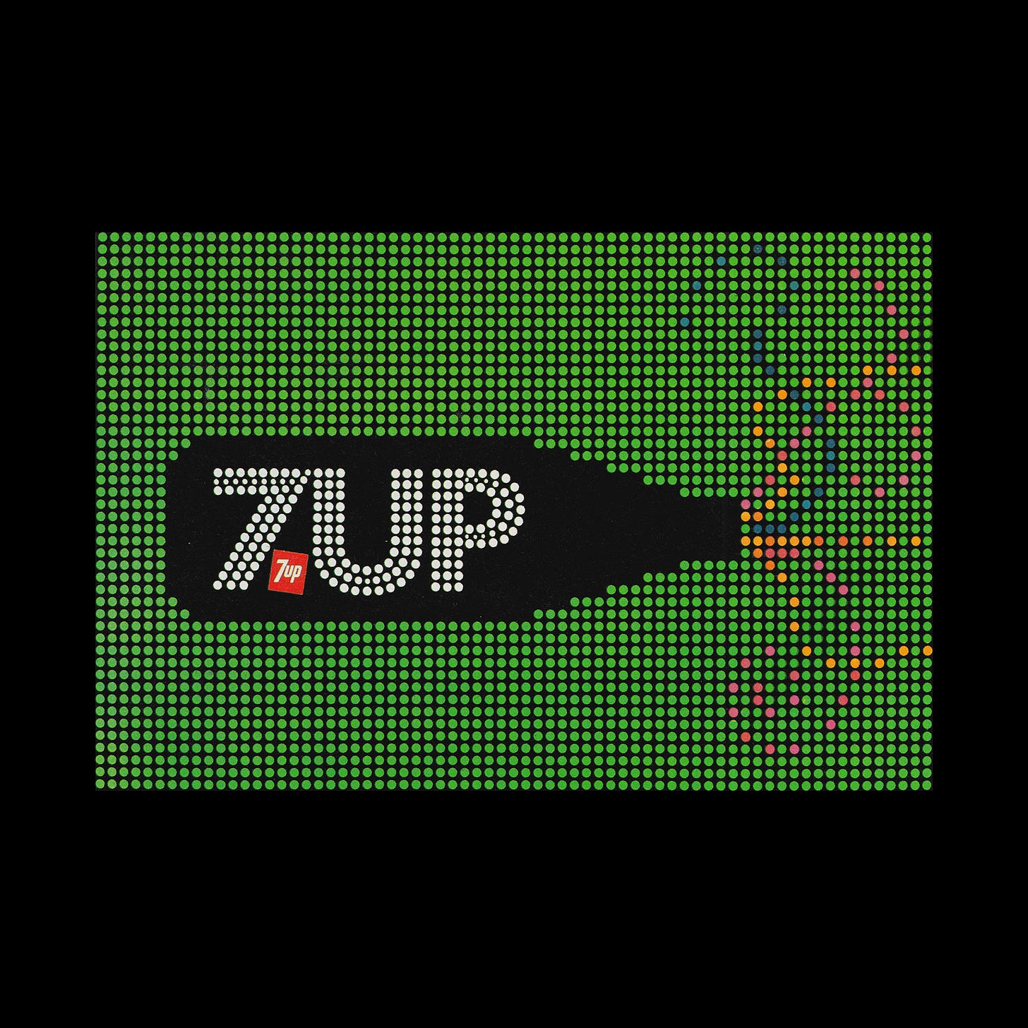
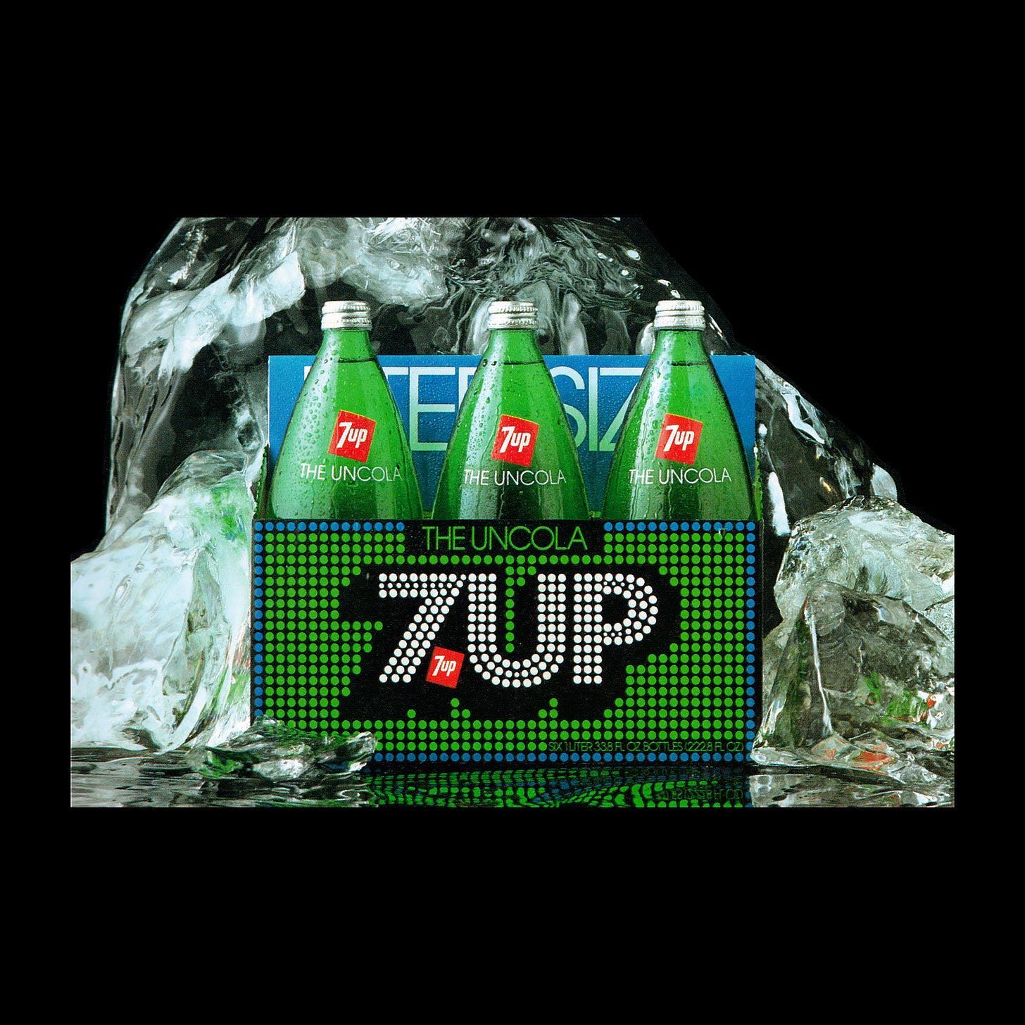
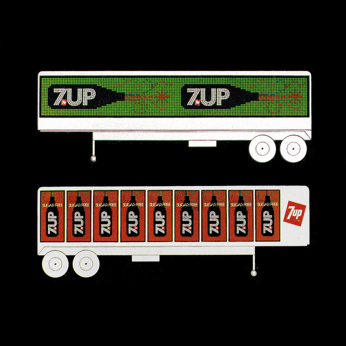
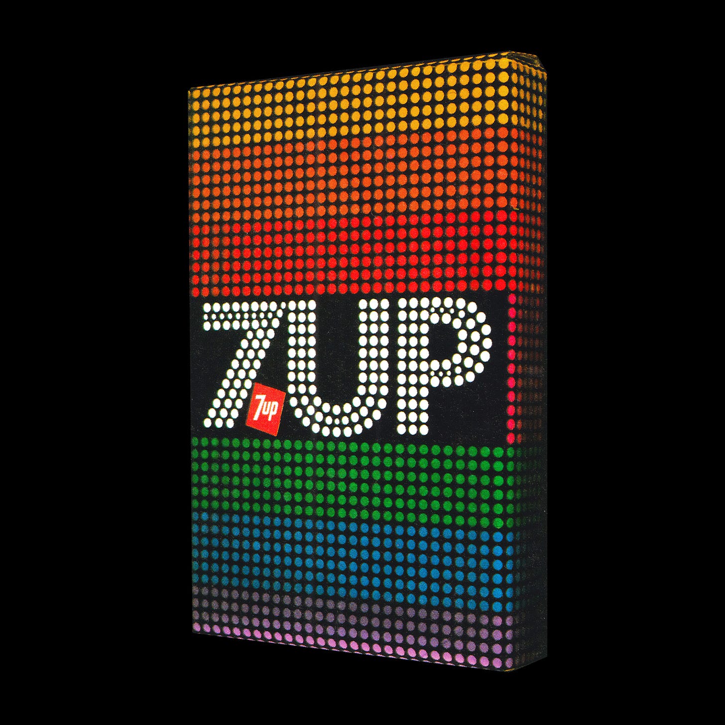
It was the "See the light!" campaign slogan that was the beginning of Goldsholl and Miller’s search for a new image for 7UP. This would encompass all forms of packaging, graphic communication and corporate identity, consolidated around a concept of a grid of bright lights, like a sign board.
The logotype, set in Futura Dot, broke slightly from this formalised grid, to improve legibility whilst also carrying the same stylistic spirit of the new visual identity, in the words of Miller, the lights had a bubbly feel.
Packaging, signs, graphics and collateral were based around a formalised grid of consistent dots and spacing, often set around the logotype. This would also then form the structure for a commercial film Morton Goldsholl directed for television. The fluidity of perception, moving from ‘light’ to ‘fizz’ became the cornerstone of the identity, evolving the brand into a structured design policy and away from the illustrative images that had characterised its previous campaigns.
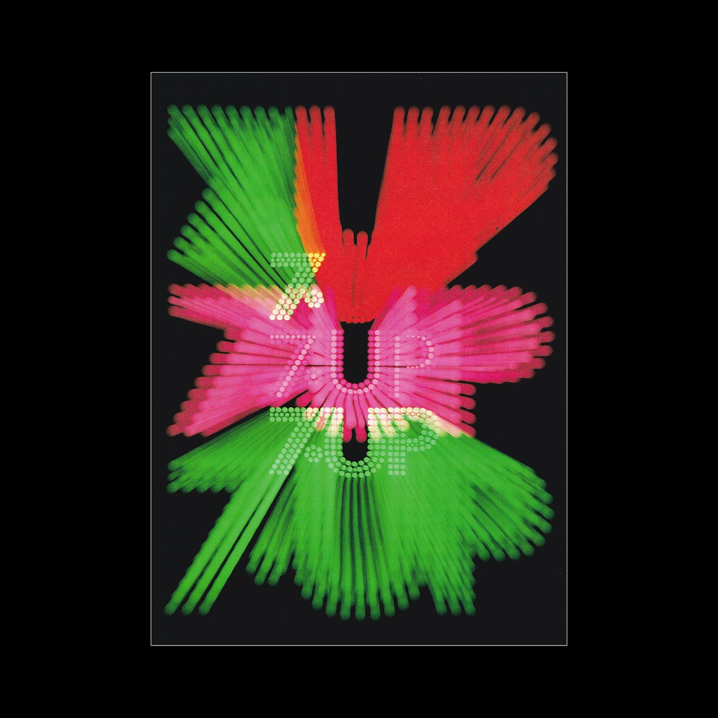
To sell in the idea to the 7UP management, Goldsholl invited Lef Steinwohl, a local photographer, to help experiment with light. The name was “streaked, strobed and moved in a dark space with an open camera lens”. This became a study in light and this experiment can be seen in the striking red and green launch poster. Seeing this study, the 7UP management team, in the words of Goldsholl, “responded favourably”, and the work was signed off.
A 30-second TV spot was created that maximised the system and medium of light and colour by animating the grid of dots to a percussive music track to deliver the message of Sugar-free 7UP. The transforming images created the illusion of a sign made of electric lights and brought the idea to life.
Reflecting on the project later, in a book co-authored with Japanese designer Yoshinobu Sekiguchi, Goldsholl explains that there were many superb graphic artists and designers who were involved in developing the spirit of the 7UP product, and specifically Thomas Miller, but it was really Roesch and Taylor “who were the leaders into this fantasy project.”
Unfortunately, as part of the Philip Morris acquisition of the soda in 1978, and with a desire to develop the international market of 7UP, the work of Morton and Miller was phased out by 1979 and replaced with a new globalised vision and brand identity.
Key Takeaways
People had responded well to the campaign “See the light!”. And while the illustrative imagery used by the brand to express this idea was connecting less with a changing youth, it was a powerful notion that could have a new modern interpretation.
Experimentation was the key to winning over the management of 7UP. Playing with light, colour and photography, the agency was able to draw the client into a world of exciting potential for the brand.
It was not until the early 1970s that colour televisions in North America outsold black-and-white. The TV campaign made the most of this widespread adoption with focused dots of colour in motion on screen.
Thank you for subscribing to Logo Histories. If you enjoy reading this you may also enjoy these resources from the same team:
Brand Archive – Research tool for brand designers.
LogoArchive Website – Searchable modernist logo archive & research tool.
LogoArchive Shop – Vintage design books & LogoArchive Zines.
BP&O – Contemporary design editorial.





Little extra information:) My mom was 10 years old when she help create that new logo by drawing the 7up with dots/bubbles for a contest. she won a camera for winning the competition and then they patented her idea as their new logo. My grandpa worked at the San Bernardino location till 53 years old when he passed away . Her name is Lori Duggan 😊 she shared photos on her Facebook
Was this story a surprise? What should we tackle in the next few months? Share your thoughts.