A gift
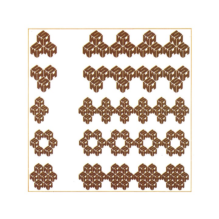
Professor Richard Guyatt, Nick Jenkins, Ian Middleton and Jane-Ann Withers' 1973 logo for WHSmith.
This post is supported by LogoArchive – The home of historical logos. Discover over 4000 of history’s best designs from the world’s finest designers. Always find the logo inspiration you need for your next project here.
Formed in 1792, the British retailer known today as WHSmith began as a news vendor in Little Grosvenor Street, London. Following the death of founders Henry and Anna Walton Smith, the business remained under Smith family ownership for 180 years until 1972. During this time, customers grew familiar with the beautifully designed oak-fronted shops, newsboy mascot and egg-shaped ‘WHS’ symbol.
The 1970s saw many changes for WHSmith. Like other businesses in the post-war years, it was suffering financially and had to change with the times. Chairman David Smith ended direct family involvement with the business when he retired in May 1972, marking another significant era for the workforce. For the business to survive, a large-scale expansion was planned– diversifying into other markets beyond their reputation as a leading retailer of stationery, newspapers and books.


With the expansion came the need for a revitalised corporate image–something uniform and contemporary to signify and support the change and growth of WHSmith. The new Chairman at the time, Mr Charles Troughton, launched the development of the Design Programme in 1973. Starting with RCA Professor Richard Guyatt, a small team was developed, not just to devise a new symbol, but an entirely new house style. This team included senior RCA tutor Nick Jenkins, designer Ian Middleton, and design assistant Jane-Ann Withers.
Although many ideas were considered throughout the design phases, the team had found themselves returning to the concept of a ‘gift’. A suggestion from Withers, that the ‘S’ should be dominant while the W and H sat as secondary but equally sized elements, led to the formation of the famous and fondly remembered ‘cube’ shaped logo.


A logotype was developed to support the ‘cube’ and establish a bolder and more modern outlook for the retailer, whilst maintaining a continuity with the lettering that came before. This was achieved through the use of Times Bold–selected for its legibility and formal character–and updates that included running the W and H together with ‘Smith’ and removing the dots. This was considered a controversial idea by the WHSmith board at the time, however, it was eventually accepted and implemented as the final logotype alongside the logo. To accompany these elements, a warm and ‘very 70’s’ colour-way of orange and brown was chosen.
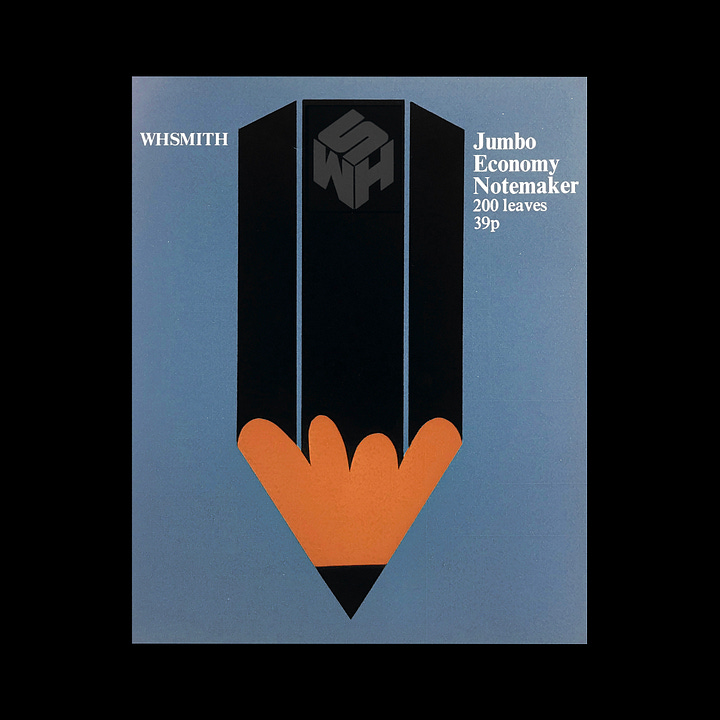
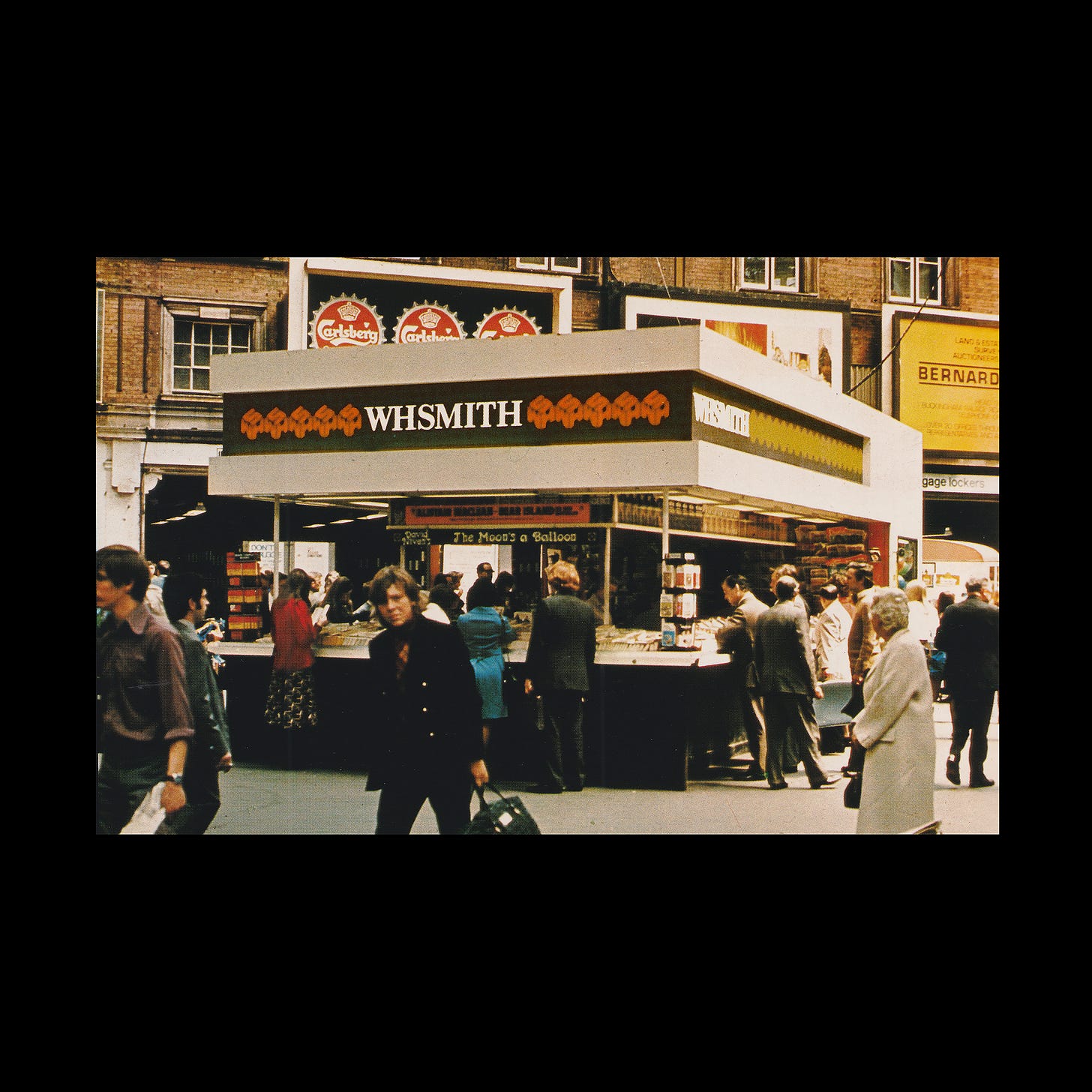
Thanks to the uniformity and geometric nature of the cube design, it was perfect for creating a variety of repeating patterns which were developed and applied to many brand touch-points; from shop fascias and vehicle liveries, to bags. packaging, wrapping paper and posters.


While the design was discontinued in the early 1990s, its legacy lived on and was widely considered a symbol of nostalgia for Britons who grew up during, and after, the ‘70s. To celebrate their 225th Anniversary in 2017, WHSmith featured the beloved design recognisable repeat pattern on their canvas and plastic bags.
Key takeaways
Post-war downturn for the retailer forced it to consider a new and diversified future, away from just stationery, newspapers and books to include other items such as gifts. This helped pave the way for the cube-shaped ‘gift’ logo.
In order to maintain a continuity with what came before, some of the qualities of the previous lettering can be seen in Times Bold, however, typesetting which removed spaces and dots helped move this forward and convey the retailer as modern and relevant.
The geometric composition of the logo afforded the designers opportunities to create patterns. This use of repetition helped establish the logo in the minds of customers. Different patterns helped avoid a monotony. The cube was also used in a range of creative manners, such as replacing the keys of a typewriter.
Thank you for subscribing to Logo Histories. If you enjoy reading this you may also enjoy these resources from the same team:
Brand Archive – Research tool for brand designers.
LogoArchive Website – Searchable modernist logo archive & research tool.
LogoArchive Shop – Vintage design books & LogoArchive Zines.
BP&O – Contemporary design editorial.


