This post is supported by LogoArchive – The home of historical logos. Discover over 4000 of history’s best designs from the world’s finest designers. Bookmark and collate logo inspiration for your next project here.
Noritz launched its first product on to the Japanese market in 1958. This was a bathwater heater that sought to broaden Japan's bathing culture and improve people's living standards. Between 1961 and 1970 it was at the forefront of switching over to gas-powered bathwater heaters and became a market leader.
Founded on the belief that quality baths bring joy to people, the company positioned itself, not as an engineering innovator, although it was at the forefront, but as a company that seeks to use this knowledge to improve the lives of both individuals and wider society. In 1984, working with Takenobu Igarashi and PAOS, Noritz introduced a new and more personable corporate image to better reflect this belief.
Prior to the development of Nortiz’s new corporate image, the Japanese water heater specialist had had little experience in putting forward a cohesive image of itself. This absence of experience proved problematic as the company began to expand its product line and develop a marketing strategy that was more customer-focused.
Noritz looked to PAOS to develop a simple, integrated and manageable design system to address the practical issues of reproducibility across a diversified product offering and associated marketing, and develop a logo that would be original and highly symbolic. Leading the design was Takenobu Igarashi.
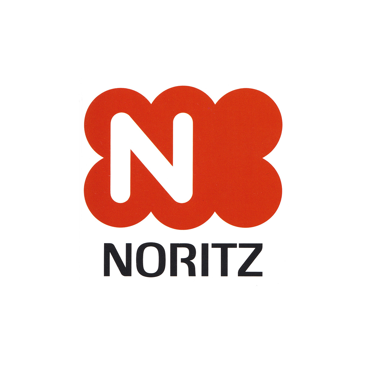
Igarashi developed a number of different options with three showing the most promise; a distinctive cloud-like form around an ‘N’, a sharper abstract N created from a square, oblique form and circle. And finally, a v-shaped combination of over-lapping circles in which the overlaps created a flower-like negative space. These concepts were presented to Noritz with examples of their application across shopping bags, van livery and product packaging.
The stylised ‘cartouche’ cloud-form logo in red, out of three options, was felt to have best symbolised the activities of Noritz as it grew. It expressed a sense of ‘abundance’, ‘warmth’ and ‘gentleness’.
The logo was then created as four different variations that would address the increasing product lines and, by extension, the logo's use-cases. Alongside the solid and outlined versions, Igarashi also produced two tonal striped variations with different line thicknesses.
The logo proved a success and, since its creation in 1984, continues to be used today as it was originally designed, appearing across large format signage, window decals, packaging and car liveries.
Key takeaways
Due to a diversified product line and increased marketing effort the company required a logo that was capable of working on many different surfaces and contexts.
The new logo was made from geometric forms and produced in four variations. This allowed it to be applied to many different surfaces using different print techniques. The effect would be to establish the logo over time through continuity and consistency.
Although Noritz was known for its engineering innovation, and pioneering the move to gas, it sought to position itself as a company that improved lives and society.
The cloud-like soft rounded forms and a warm red avoided technological and engineering motifs, instead, it suggested and invitational warm and coziness, distinguishing itself through belief rather than product.
Thank you for subscribing to Logo Histories. If you enjoy reading this you may also enjoy these resources from the same team:
Brand Archive – Research tool for brand designers.
LogoArchive Website – Searchable modernist logo archive & research tool.
LogoArchive Shop – Vintage design books & LogoArchive Zines.
BP&O – Contemporary design editorial.