


In 1972, under the auspicious guidance of Nancy Hanks, the Federal Design Improvement Program (FDIP) was born. This was a concerted effort by the Administration and the National Endowments for Arts to improve the communications and presentation of many of the American federal agencies of the time. This began with the Department of Labor and went on to produce iconic identity programs and logos for the National Aeronautics and Space Administration (NASA), the United States National Park Services and the Environmental Protection Agency (EPA), among over 30 others.
The Federal Energy Administration (FEA) was one of the benefactors of this program. This was set up in 1974 to address the 1973 oil crisis. In June 1974 Fred Troller was invited to join management consultant Otto Spaeth to develop an overall identity design programme for the FEA that would ‘tastefully’ reflect the organisation, its purpose and aspirations.
Unusually, the logo found its form through thinking about movement, as the brief prioritised an animation for broadcast over a static printed logo. Only movement, it was said, could convey convincingly the principle ideas inherent to the agency.
Energy problems are serious not frivolous, Troller noted at the time, and so the logo needed to have strength, impact and gravity, as well as being simple and unique. An additional requirement was agreed in a meeting with the FEA that the logo also be ‘relevant’. This posed the toughest challenge. Troller explored many sources and forms of energy seeking ideas, looking at at the language of physics and electronics and graphic ways to depict or suggest motion.

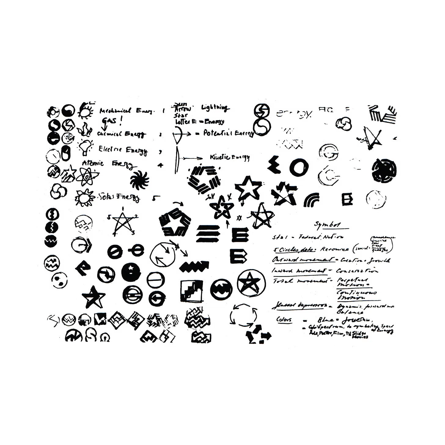
Early on, a sun/star concept took hold as a symbol of the root source of all energy, and was a strong American symbol well-suited to a Federal agency. However, even at the time, the star was a well-worn American motif. To mitigate this, the logo for the FEA would need to be both distinctive and immediately tied to energy in some way.
The FEA was founded to manage energy in the national interest, the complimentary notions of ‘creation’ and ‘conservation’ and the balance and coordination of these by an independent agency became the conceptual key. Troller writes that ‘it would be great if we could design a mark that not only contained the idea of simultaneous creation and conservation, but which could help communicate this perception of the FEA’s mission’.
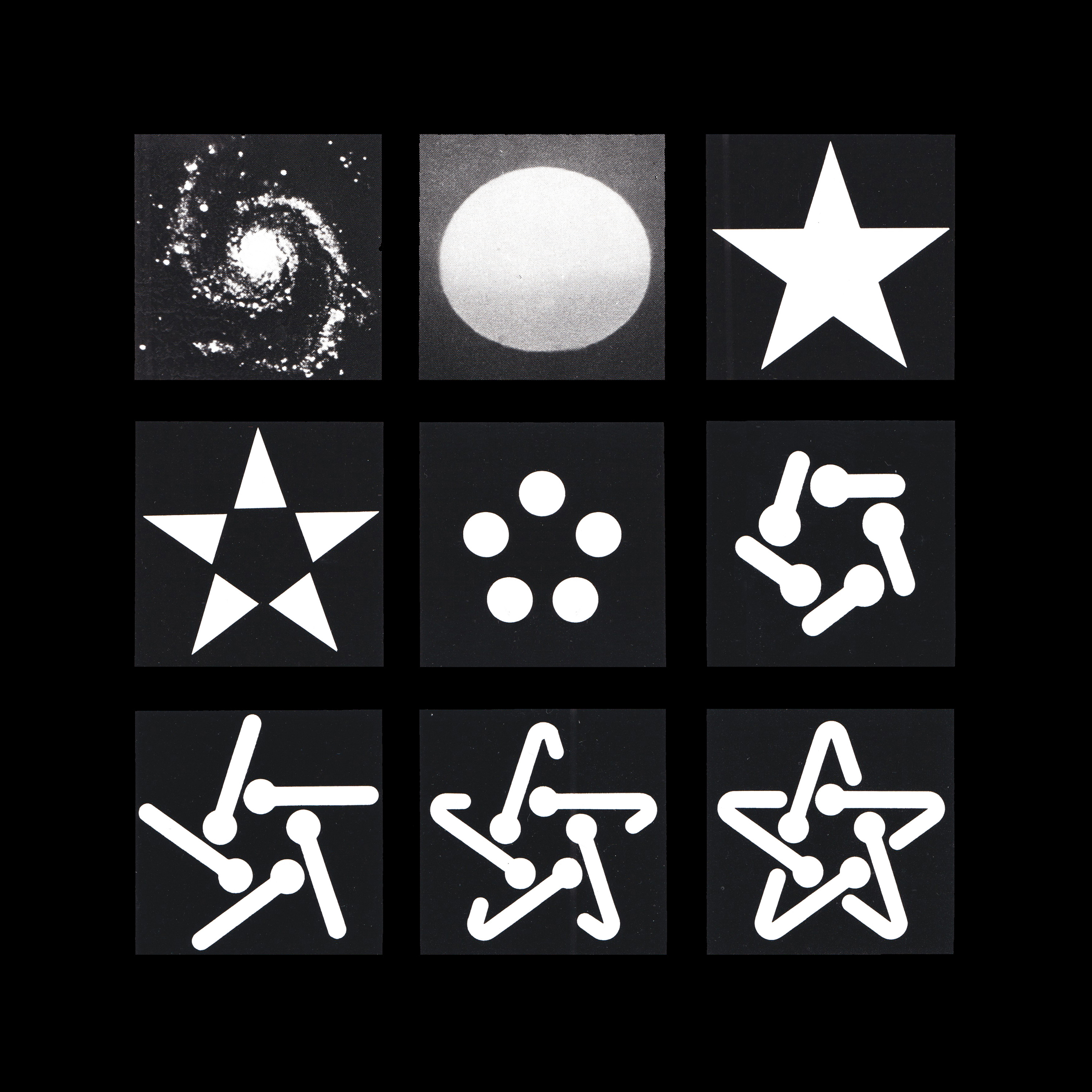
Alongside a number of other ideas was a logo composed of five folded lines emerging from five central dots that formed a five pointed ‘Energy Star’. The value of the idea only came to light when testing it within the mandated requirement of an animation. ‘The outward motion of the lines, from five sources, represented growth or creation. The bending inwards of these forces represented control, shaping, discipline–in other words, conservation.’


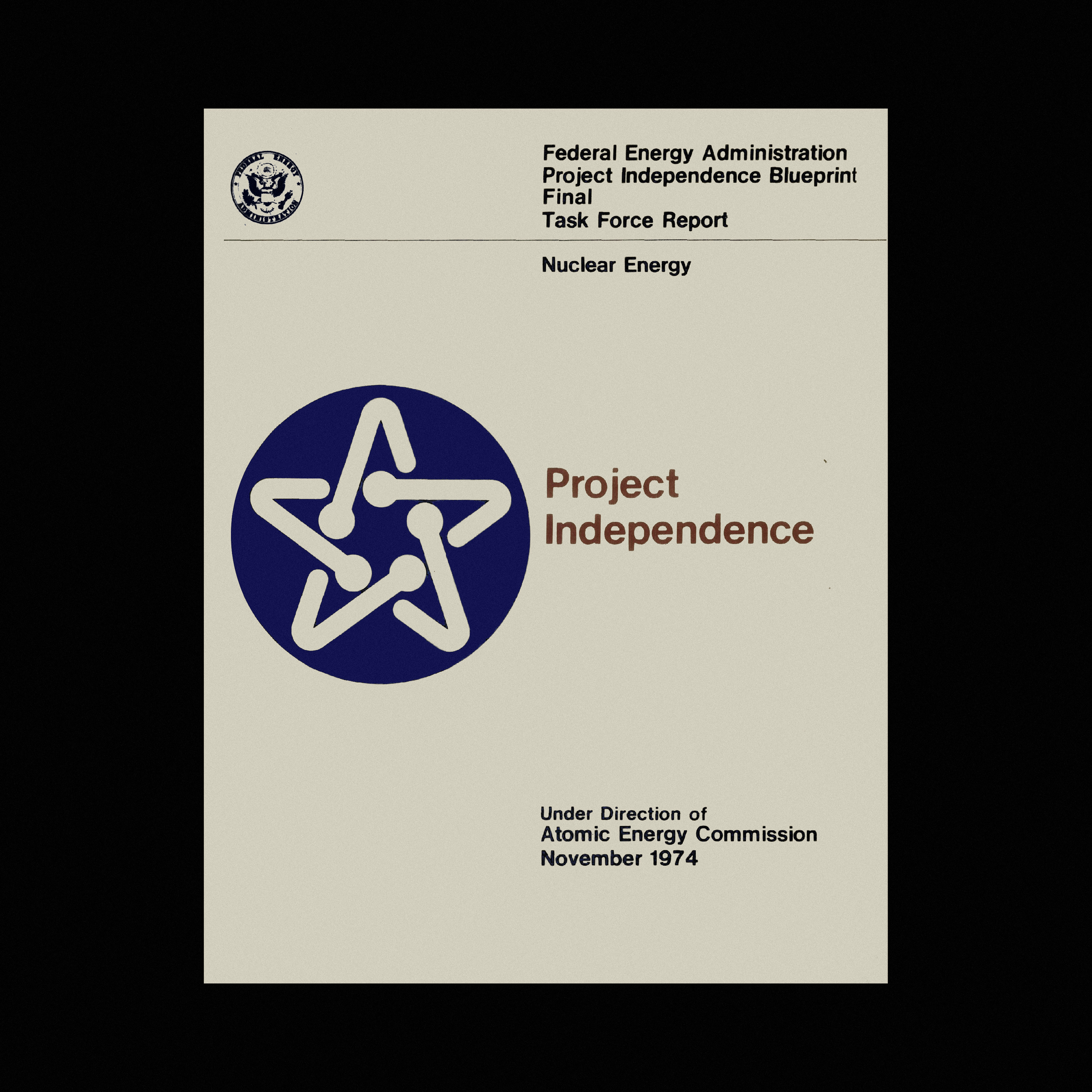
The ‘Energy Star’ was approved and adopted by the FEA in July 1974. It was used in large and small sizes, in a negative version and applied to report covers, certificates and multi-coloured banners. It was also ‘loaned’ to ‘Project Independence’. This was an initiative of Nixon’s designed help the United States of America achieve energy self-sufficiency by 1980 following the oil crisis of 1973. In this instance, the logo was placed inside a blue circle.
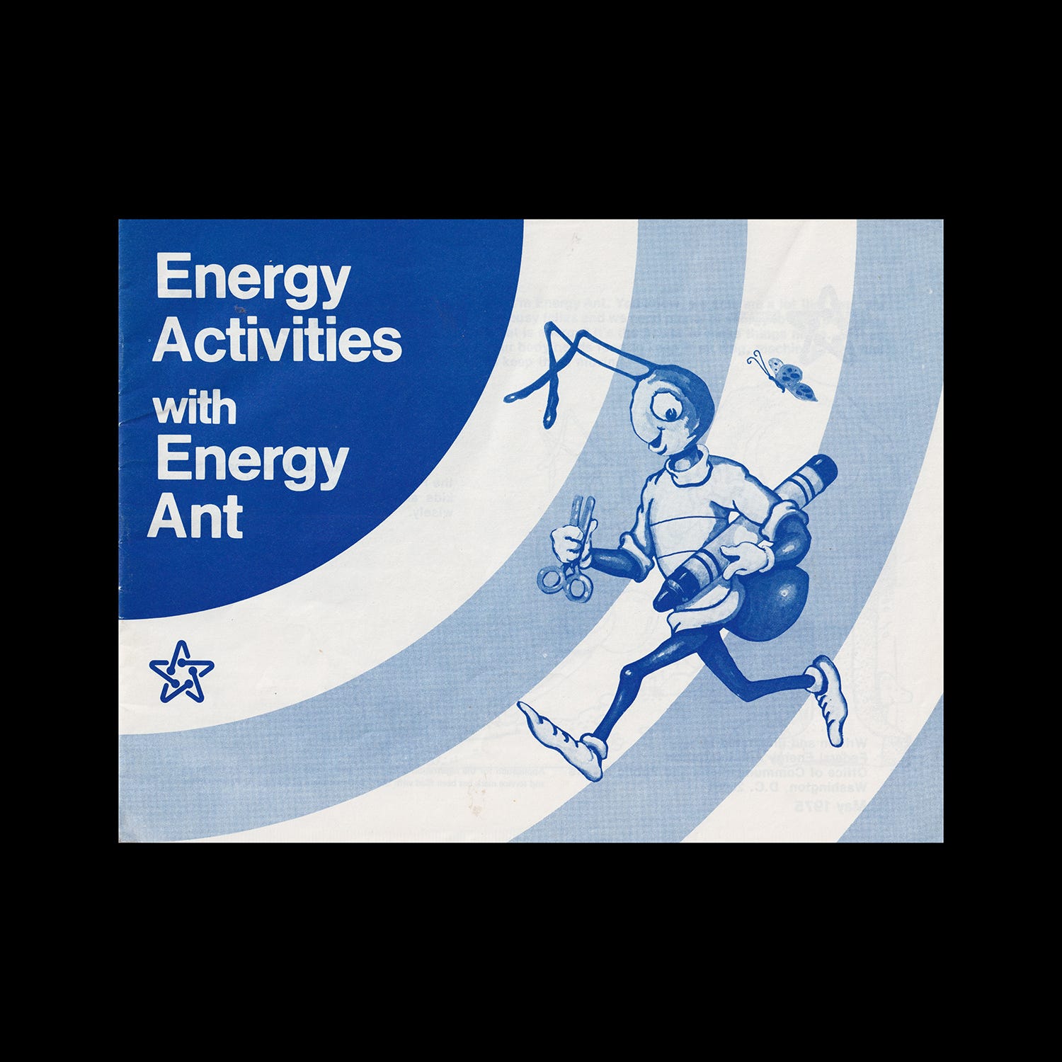
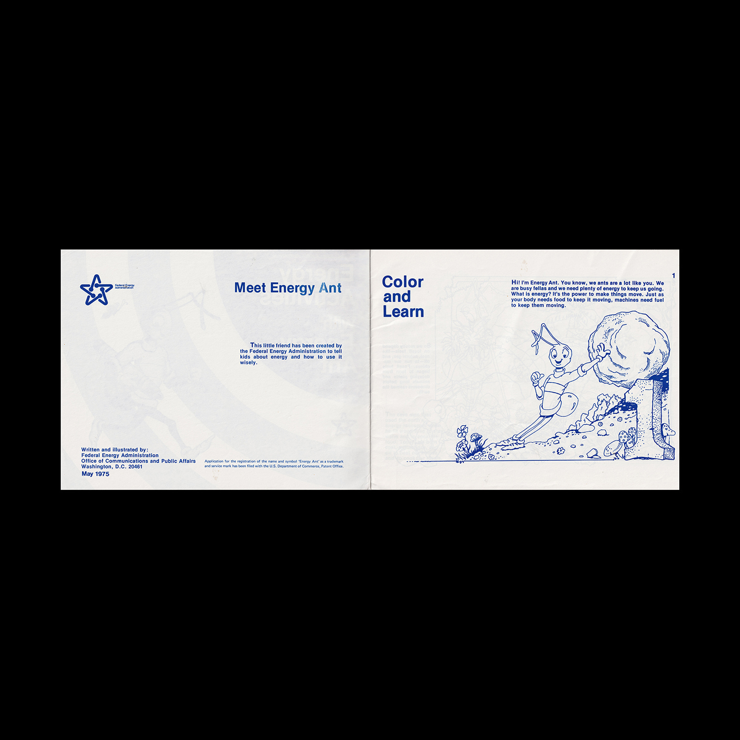
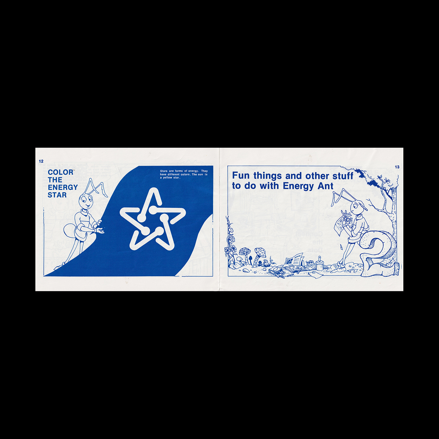
The logo was also used in more convivial and civic initiatives such as educational documents. Below, the ‘Energy Star’ is used in conjunction with ‘Energy Ant’ to teach children about energy conservation.

In 1977 the FEA was merged with the Energy Research and Development Administration (ERDA) to form the United States Department of Energy. As the FEA ceased to exist, so did the logo.
Thank you for subscribing to Logo Histories. If you enjoy reading this short you may also enjoy these resources from the same team:
Brand Archive – Research tool for brand designers.
LogoArchive Website – Searchable modernist logo archive & research tool.
LogoArchive Shop – Vintage design books & LogoArchive Zines.
BP&O – Contemporary design editorial.