A flower in bloom
Steff Geissbühler and Chermayeff & Geismar's 1977 logo for the Environmental Protection Agency.
This post is supported by LogoArchive – The home of historical logos. Discover over 4000 of history’s greatest designs from the world’s finest designers. Always find the logo inspiration you need for your next project here.
For the modern environmental movement in the US, the 1960s was a period of significant growth. There was widespread momentum in the last years of the decade, evidenced in the run-up to the 1968 Presidential Election. Candidates saw potential for electoral advantage, demonstrating advocacy through speeches and legislation proposals. Of these candidates, election winner President Nixon had also opted to benefit from interest in the movement. Going beyond the lip service that critics accused him of, Nixon fulfilled his promise by creating the Environmental Protection Agency (EPA), in an effort to coordinate the government’s response to environmental concerns.
The first official agency logo had been produced by the advertising agency McQuade, Wilkins, Bloomhorst, Newman and Colbert, of which Ken Bloomhorst was the illustrator. The logo featured a flower, a ‘carry over’ from the 1960’s ‘Flower Power’ era.
The component parts of the flower’s bloom represented the sky, the earth, and water in their relevant colours of green and blue, with the circle being either a sun or moon. By utilising three colours, the printing was more time-consuming and expensive. The logo was circled by the full title UNITED STATES ENVIRONMENTAL PROTECTION AGENCY, in blue letters, which created further difficulties in the printing process when reduced down. The logo also received criticism that the complex flower design was too ‘feminine’ for that of a law-enforcement agency.
An updated version of the logo was designed in 1977. This was created by Swiss designer Steff Geissbühler, also an enthusiastic environmentalist, who had joined the design studio Chermayeff & Geismar in 1975. The studio had been selected following Nancy Hanks and Jerome Perlmutter’s suggestion to the EPA to work with professional graphic designers on the project. This was part of a wider effort known as the Federal Design Improvement Program (FDIP). The FDIP was guided by Nancy Hanks and introduced a more design conscious thinking to many of the Federal departments. This was, up until that point, unheard of.
Upgrade to paid and help support the research and writing of Logo Histories. If you can’t, no hard feelings ;)
Whilst the team had developed several design proposals, they opted not to stray too far from the logo’s initial iteration. However, there were some notable and effective changes applied that made the logo simpler, more authoritative and adaptable - further providing a unifying element for all of the agency’s initiatives.
Within the new corporate identity, the team opted to replace the agency’s long name with a colloquial acronym, EPA, which was already familiar to the public. This was capitalised and set in Helvetica. This was supported by the typeface Univers, a popular typeface of the era, and selected for its versatility.
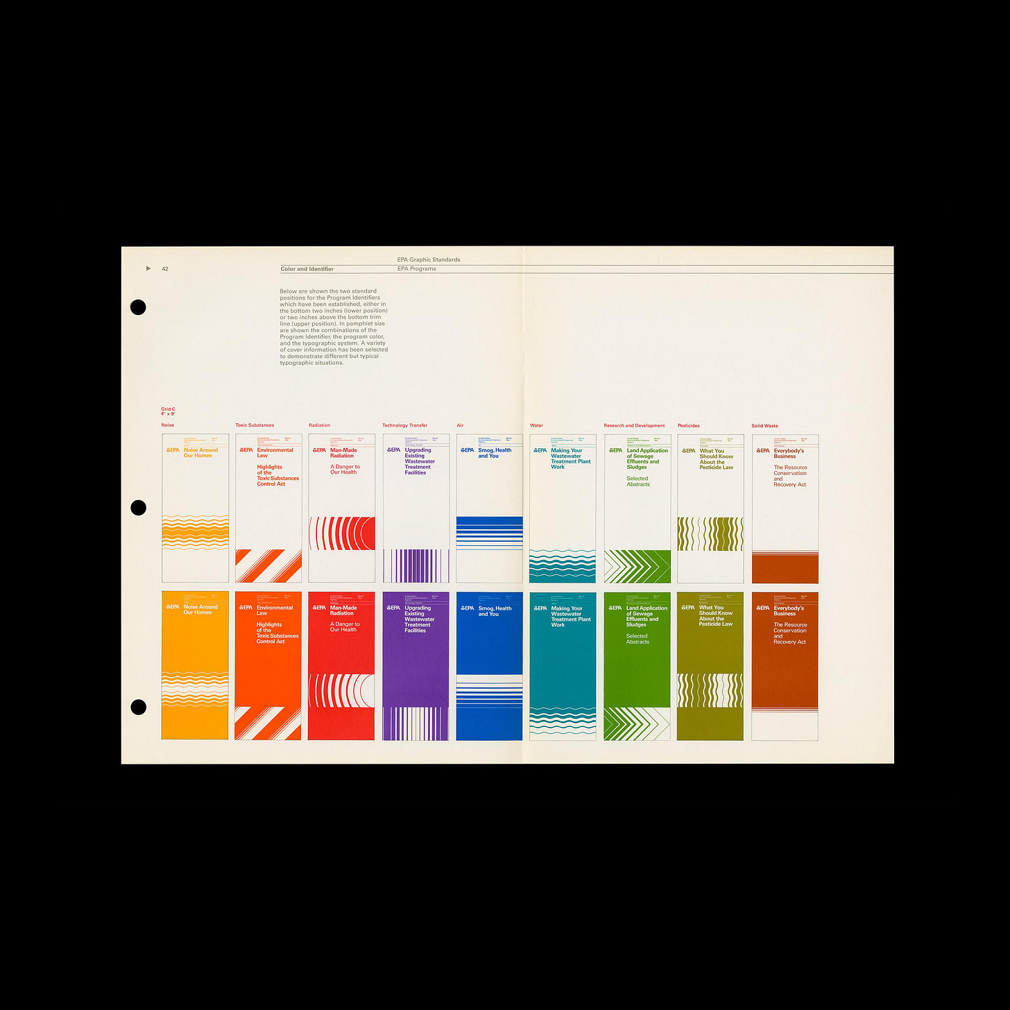
The simplified, monochromatic version of the logo meant that it was easier to print in black, white, or a single colour. This proved to be effective when used in conjunction with a new system of photography, patterns and nine colours which had been developed to align with and differentiate the agency’s various divisions (Noise, Toxic Substances, Radiation, Technology Transfer, Air, Water, Research & Development, Pesticides, and Solid Waste).
The nine colours corresponded to the nine programs at the time and these were named after visual associations with the subject matter. These included Air Blue, Solid Waste Brown and Radiation Red.
While the changes to the logo made it far more economical, the combined effect of imagery, patterns, colour, grid systems and the new logo made it easier and quicker for the EPA to generate consistent, more impactful and communicative visuals.
The visual identity created by Steff Geissbühler at Chermayeff & Geismar was designed to be simple, not only for aesthetic purposes, but also for the ease of use, for designers and non-designers alike. However, despite the design’s success, the EPA reinstated the previous logo in the 1980s and the work of Steff Geissbühler was abandoned.
Thank you for subscribing to Logo Histories. If you enjoy reading this you may also enjoy these resources from the same team:
Brand Archive – Research tool for brand designers.
LogoArchive Website – Searchable modernist logo archive & research tool.
LogoArchive Shop – Vintage design books & LogoArchive Zines.
BP&O – Contemporary design editorial.


