A mountain in the gaming industry
George Oppermann and Evelyn Seto's 1972 logo for Atari
This post is supported by LogoArchive – The home of historical logos. Discover over 4000 of history’s greatest designs from the world’s finest designers. Always find the logo inspiration you need for your next project here.
In 1972 the American electronic games maker Atari entered the arcade market with Pong. It would be an era and culture defining moment that would kickstart a global multi-billion dollar electronic entertainment industry and develop further into competitive esports that would later become professionalised.
Timing was everything. At the time, computer technology was lowering in cost and was making its way into the consumer productivity space. Bringing the arcade into the home was the next big leap and made Atari legendary.
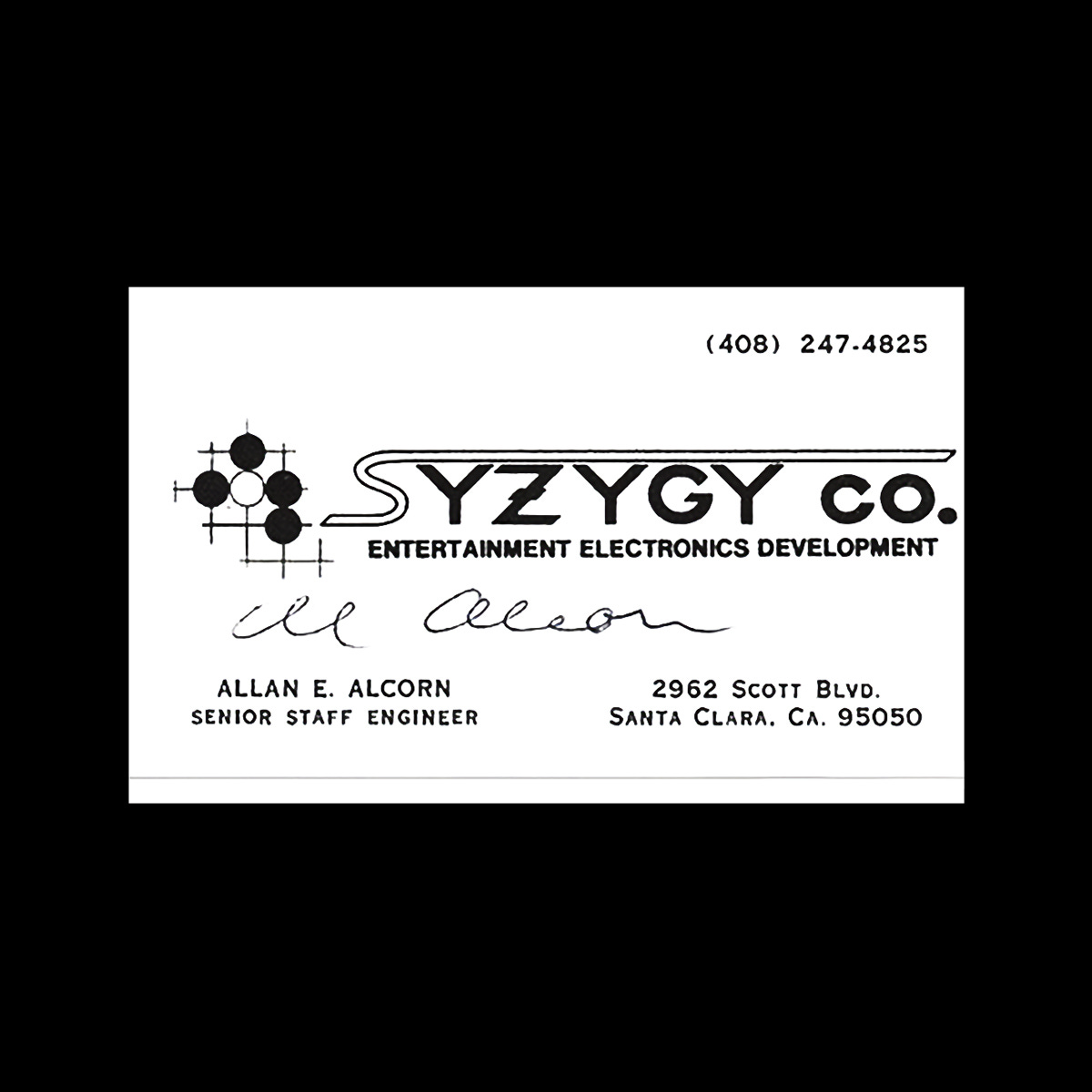
Atari was founded by Nolan Bushnell and Ted Dabney to develop Pong, and was originally called Syzygy. It was, for some time, the largest company producing arcade games in the world. Although Pong would be their most profitable creation, they had a string of international hits with the likes of Asteroids in 1979, Space Invaders in 1980 and Pac-man in 1982.
George Oppermann and assistant Evelyn Seto of Oppermann Harrington Inc., under the direction of George Faraco, Atari Creative Director, and Bushnell, were tasked with the redesign of the company’s logo, moving it beyond the “SA” monogram towards a more professional image.
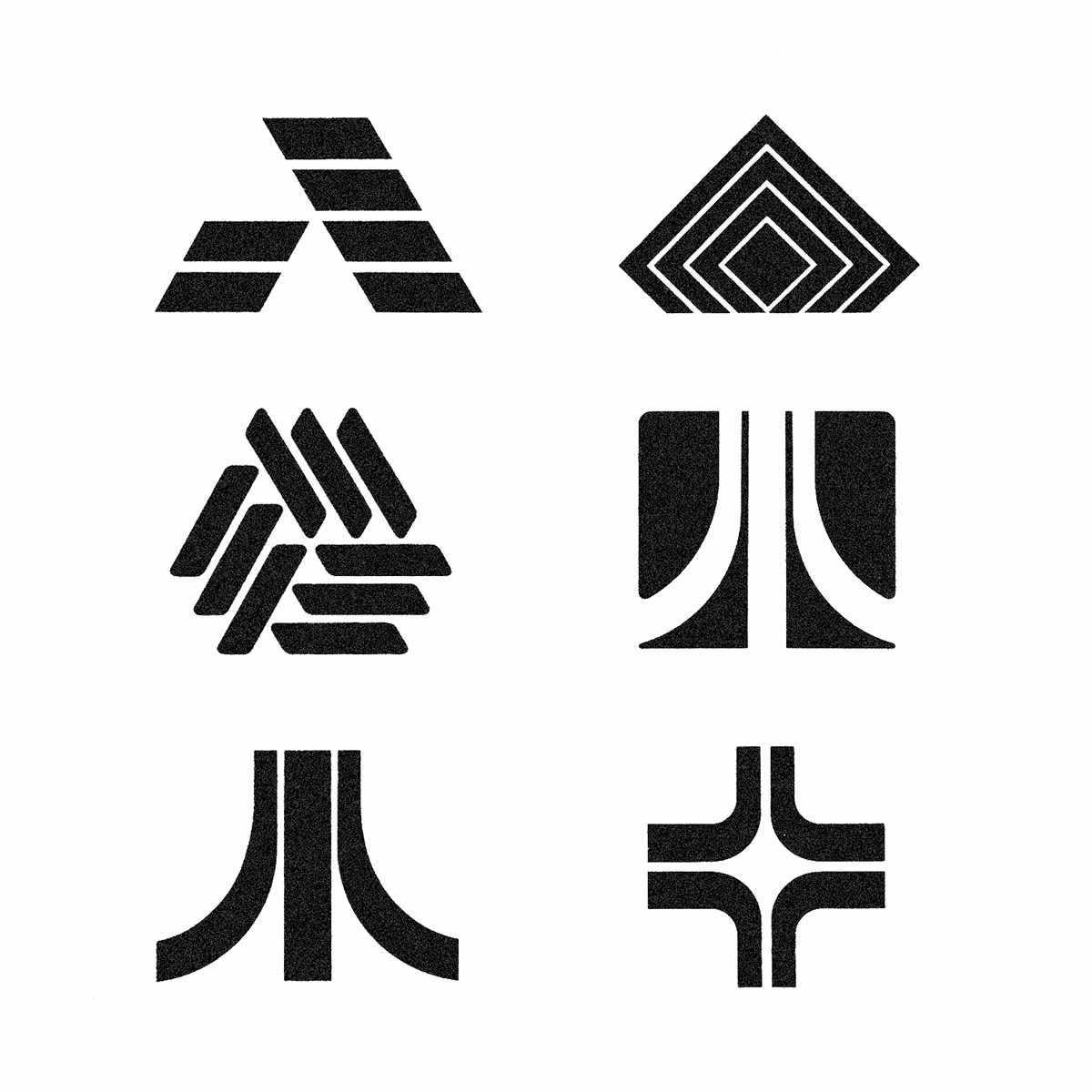
Oppermann generated a range of options, and were documented in the book, The Art of Atari by Tim Lapetino. These were variations on the letter ‘A’, some abstract, others more literal. There were also dynamic compositions of lines and then what came to be known as ‘The Fuji’. As later explained by Oppermann, despite the form, the design had very little to do with the Japanese mountain.
The Atari logo–just as the early days of arcade gaming and the pioneering period of personal computer development–is subject to mythologisation, contradictory stories, selective memory and a bit of showmanship. But let’s take it from founder Nolan Bushnell, who described the qualities of the final design in an interview in 2022 as being symbolic of a “collective”, and being “aspirational” through the gesture of an “upward swoosh”.
Designer George Opperman described the logo as capturing something of the duelling energy of the game Pong, which he had seen prior to its release, with two forces being applied to a third at the centre, and then converging to form an apex and an ‘A’. In a 1983 interview with Video Games, Opperman downplayed the figurative nature of the logo, instead simply describing symbols as “just visual nicknames” that typically “combine first letters and interpretive design elements.”
Further resources:
Podcast interview with Evelyn Seto.
Video interview with Nolan Bushnell
The Art of Atari by Tim Lapetino
Designer Evelyn Seto was involved in the production of the logo. At the time, that meant doing the line work with a ruling pen, french curves and templates, refining the proportions and details, making the logo ready for production.
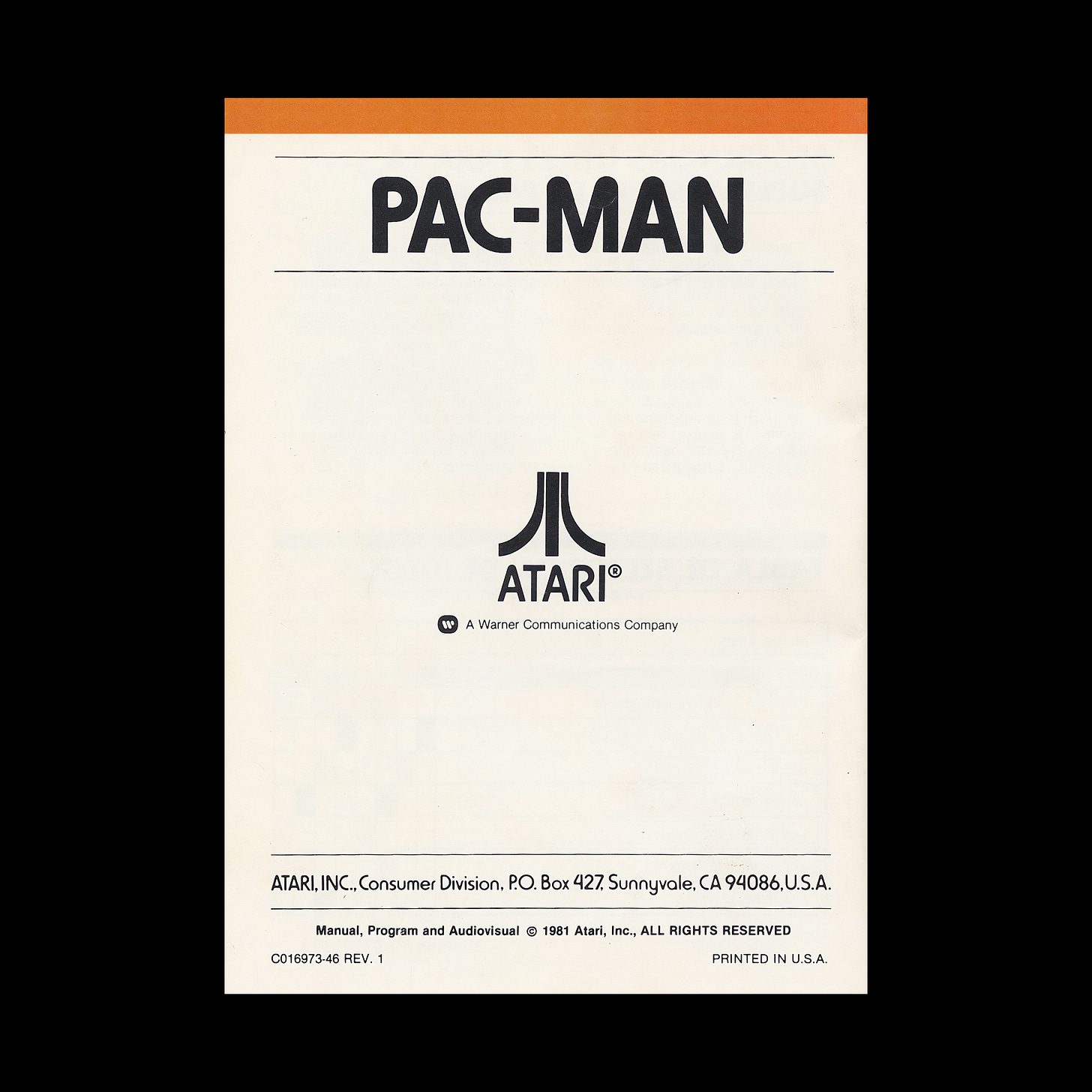
Whatever the truth of the logo’s conceptual origins maybe, the association gamers have with the logo is profound, and it lives on, not just in popular culture, but as a business. Although Atari has changed hands on multiple occasions through the 1980s and 1990s, the logo continues to be used today.
Key Takeaways
Meaning changes over time. Founders and designers can get caught up in adding to the story / concept after the fact. What matters is what it means to others. For a whole generation, the Atari logo represents a cultural shift and their participation in this.
The logo was hand drawn by Evelyn Seto using using ruling pens and templates. It wasn’t uncommon for the ink to bleed under the ruler. This would mean restarting. While digital tools have removed this issue, ink bleed remains an important consideration when printing logos.
For Atari Japan it was customary to have a Japanese version of the business card. The logo’s abstract dynamic form, open to different interpretations, allowed it to sit comfortably in this quite different context and market.
Thank you for subscribing to Logo Histories. If you enjoy reading this you may also enjoy these resources from the same team:
Brand Archive – Research tool for brand designers.
LogoArchive Website – Searchable modernist logo archive & research tool.
LogoArchive Shop – Vintage design books & LogoArchive Zines.
BP&O – Contemporary design editorial.


I honestly thought the logo was a reference to Mt. Fuji. Whatever the actually origins, the result is strong. What do you think?
Such an iconic mark that still holds up. There is something nice about the original word mark as well.