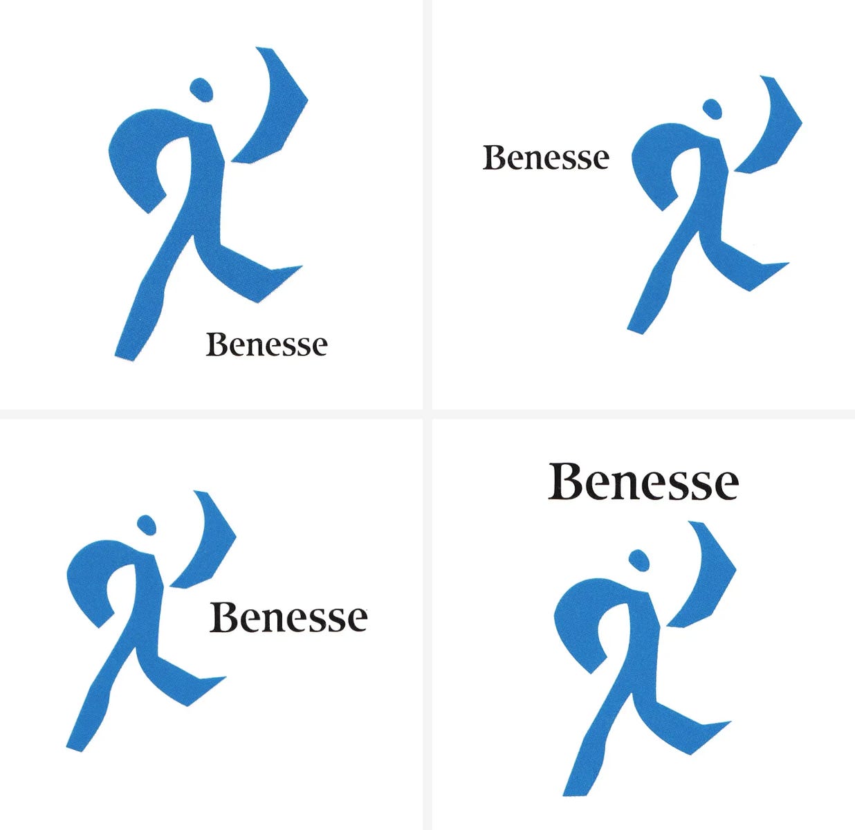
Benesse Logo, 1988
Shin Matsunaga & PAOS' 1988 logo and corporate identity for Japanese educational materials publisher Benesse.
This post is supported by LogoArchive – The home of historical logos. Discover over 5000 of history’s greatest designs from the world’s finest designers. Updated every single day. Always find the logo inspiration you need for your next logo or branding project. Start here.
Benesse was founded by Tetsuhiko Fukutake in 1955 as Fukutake Publishing Co., Ltd. It produced educational materials, student handbooks, text books and mock exams for middle school and high school students in Japan.
Tetsuhiko Fukutake, the president at the time (he would later pass in 1984 and be succeeded by his son Soichiro Fukutake), came to renowned design studio PAOS (Bridgestone, Mazda, Daiei) with a concern. He wanted to avoid having the company ‘run its course’ as a regional supplier. His vision was to expand, from literary books to more comprehensive publishing and engage in cultural activities and develop overseas business. Further, Fukutake wanted to improve the performance of ‘information processing’ and use information more intensively. Simply put, his goal was to pave the way for the company to become a global organisation with culture and information at its core.
This change would require a new way of thinking, and position the company for a 21st century global outlook. The first corporate identity (CI) project, initiated in 1979 and undertaken by PAOS was strategic. PAOS put forward a maxim that would serve to guide the company into the future. This was comprised of key words: ‘informatization’, ‘internationalization’ and ‘enculturatization’. This strategic exercise would be followed up in 1988, with the development of a new trading name and visual identity.
For the second CI project, implemented a decade later in 1988, PAOS put forward the idea that the company develop a unique visual identity that would make manifest the new corporate maxim as it continued to expand internationally.
PAOS proposed a new name to spearhead this. ‘Benesse’, derived from the Latin words "bene" (well) and "esse" (live) captured the spirit of an evolving company. Latin, rather than Japanese, was chosen as it formed the basis of the ‘cultural common ground of Western intellectuals’ as the company expanded internationally.
The Benesse spirit was “to always consider the best way to live, to work hard to make work a part of life, to become a component of lifelong learning for self-development, and to make even the most painful moments part of the path to joy.” The Benesse corporate identity design was developed with the goal of bring this notion to life and creating a new ‘foundation’ (and formalised identity system beyond a logo) for Fukutake Shoten, “a global company in the human age”.
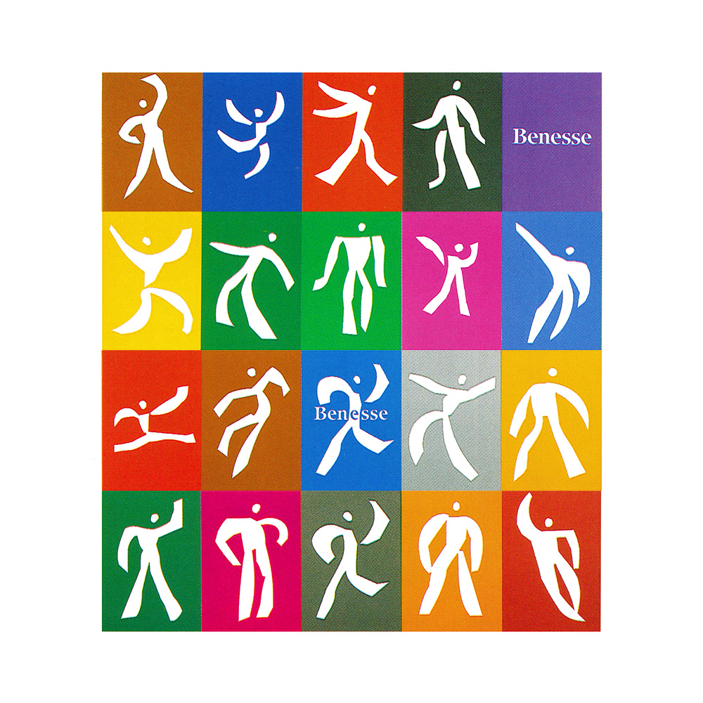
An expressive visual language was developed and defined in order to better symbolise these ideas, transmit them in symbolic form, and construct a new ‘Benesse world’. The core aspect of this new visual language and world would be a set of dynamic figures.
The new Benesse corporate identity design was developed in collaboration with Shin Matsunaga, one of Japan's leading designers and under the direction of PAOS. The expression of humanity was central to much of his work, and the project, to convey the activities and vision of a corporation interested in helping people ‘live well’, was a perfect fit.
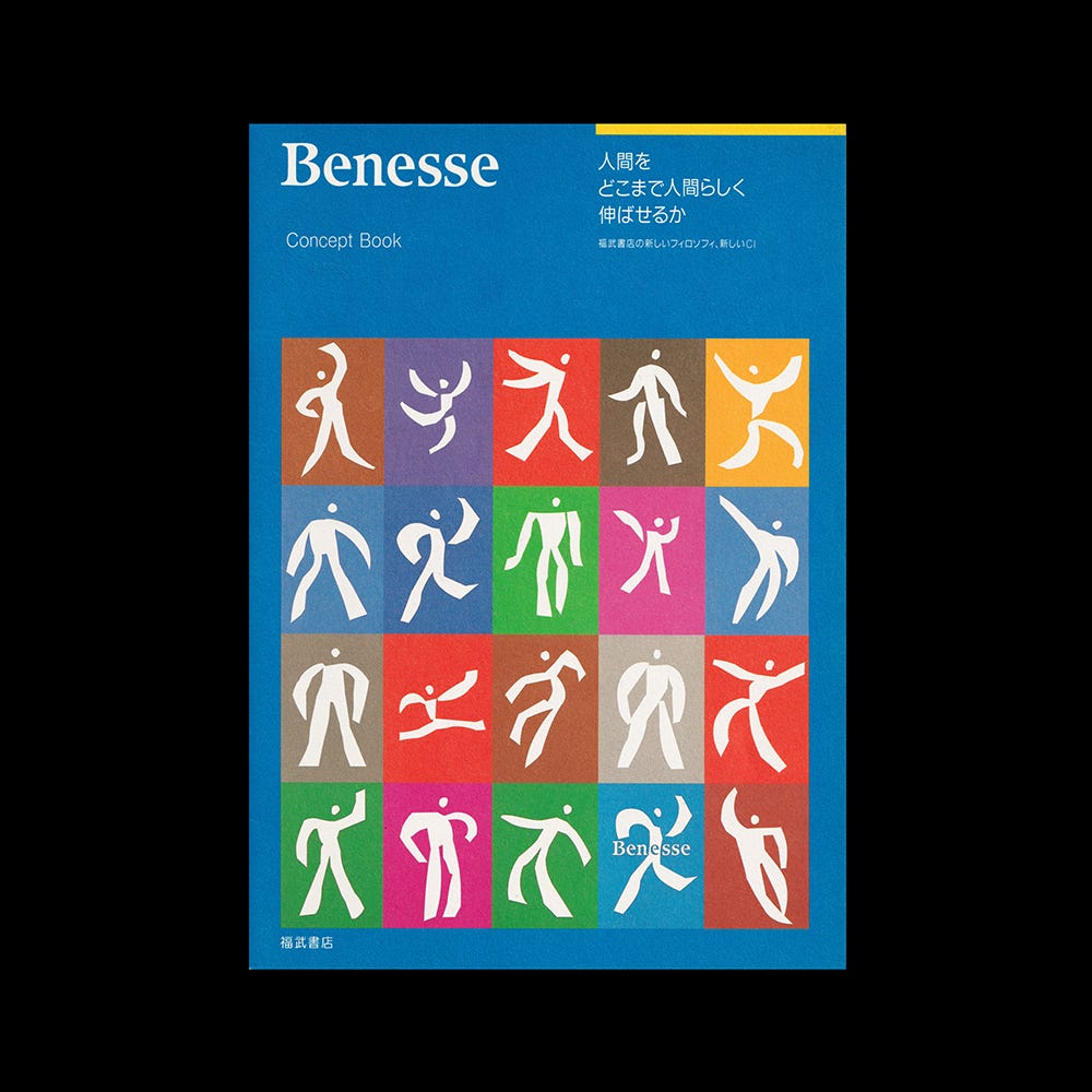
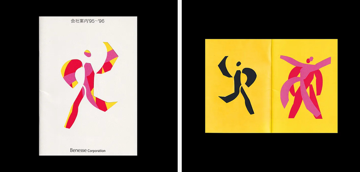
At the core of Matsunaga’s proposal was a set of 19 paper cut-out-like character symbols which, through their expressive postures, expressed the philosophy of Benesse in a ‘richly humane manner’. In conjunction with an equally diverse colour palette, the overall effect of the corporate identity was one of liveliness and diversity.
Colour, figures and logotype could be combined, or used individually to create an almost infinite number of variations and compositions to suit different applications and use-cases. In its variety, the CI was pioneering.
Although the corporate identity had variety and variation as a central aspect of its expressiveness, there was a basic colour, ‘Benesse Blue’ and a consistent logotype that often anchored the dynamic composition of figures. The logotype was typeset set in ITC Isbell, designed by Richard Isbell and Jerry Campbell in 1980.
In 1988, Benesse broke records when its stock was listed on the Tokyo stock exchange. And, as the brand took hold, Fukutake Publishing Co., Ltd. changed its name to "Benesse Corporation", marking its fortieth anniversary in 1995.
PAOS’ strategic approach, Tetsuhiko Fukutake’s forward looking and people-centric vision and the design work of Matsunaga set Benesse on a profitable and culturally important course. These efforts transformed Benesse into a much-admired corporate entity, powered by a favourable image with consistently held expectations and aspirations. Today, it continues to stand out as a representative example of a culturally-oriented Japanese company and continues to show incredible growth on the Tokyo Stock Exchange.
Thank you for subscribing to Logo Histories. If you enjoy reading this short you may also enjoy these resources from the same team:
New! Portal – Design-driven jobs board and applicant management.
Brand Archive – Research tool for brand designers.
LogoArchive Website – Searchable modernist logo archive & research tool.
LogoArchive Shop – Vintage design books & LogoArchive Zines.
BP&O – Contemporary design editorial.


