
A double arrow
Design Research Unit and Gerald Barney's 1965 logo for British Rail.


This post is supported by LogoArchive – The home of historical logos. Discover over 4000 of history’s best designs from the world’s finest designers. Bookmark and collate logo inspiration for your next project here.
During the 19th and early 20th century national transport service British Railways had been pioneering and hugely successful. However, following amalgamation in the 1920s, WWII pooling and nationalisation in 1947 the image of the railways was in decline. The British Rail logo was a small part of bigger program to modernise Britain’s railway infrastructure, address organisational problems and an absence of any “design consciousness”.

From 1947 the visual identity of British Railways, as it was known at the time, would be made up of the ‘hot dog’ which was used for signage print, and on the caps of porters, and the ‘Starving Lion’ used on locomotives. The former had the suggestion of a modernist potential in its rationalised forms, however the latter was very much rooted in the steam-powered Industrial age aesthetic.

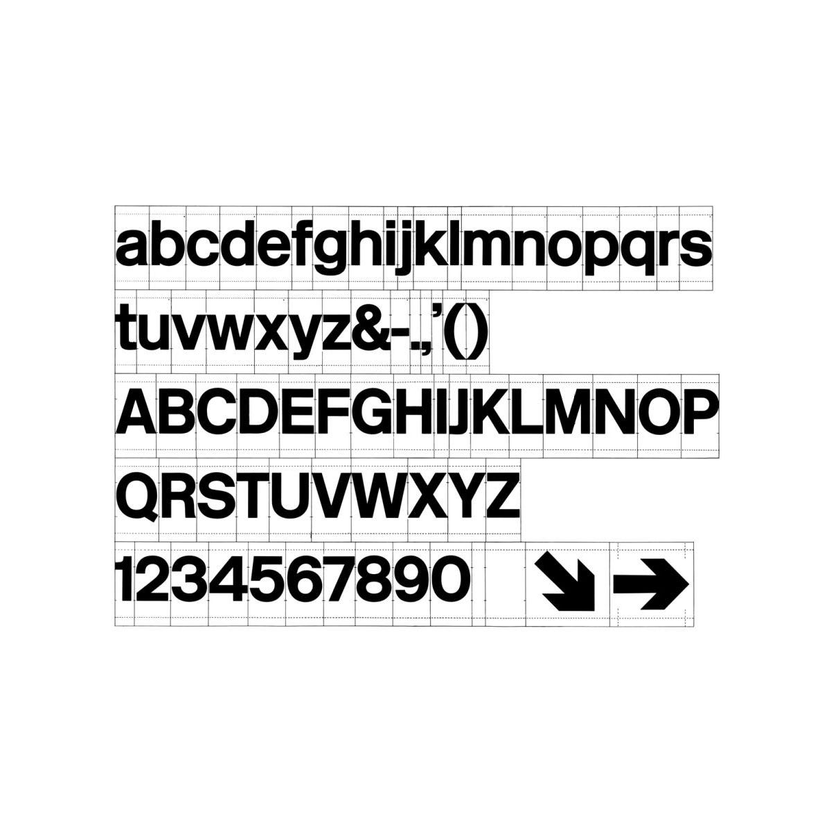
Under the recommendations of the Railway Board Design Panel in 1956 a new programme of design for British Railways was initiated. Taking nine years to produce, the new house style was launched in 1965. This was developed by Design Research Unit (DRU) with a comprehensive signage system developed by Kinneir Associates which applied the newly designed custom corporate typeface Rail Alphabet by Margaret Calvert and Jock Kinneir.
For the new logo, DRU’s dedicated British Rail design team developed a range of options, however, DRU co-founder and project lead Milner Gray was unhappy with the results. In order to generate more options, Gray opened up the opportunity to the rest of the studio, from which 50 new logo designs were submitted.


Some of the proposals were shown as part of an exhibition announcing the new design policy at London's Design Centre in January 1965, four of which are presented above. The logos display a range of interesting synectics, bringing together arrows with tracks, rail intersections, the Union Jack and a lion motif.
Gerald Barney, a young letterer, submitted a proposal created from two interlocked arrows across parallel lines pointing in different. He drew this, as it appears today, on the Underground on his way to work, only formalising small aspects of this later.


The logo submitted by Collis Clements was favoured by the panel responsible for overseeing the British Rail design. This was made up of two overlapping circles and an arrow pointing right. However, a press leak revealing this logo to the public provoked a last minute change which led to the now iconic double arrow design by Barney being selected and applied.


The double arrows feature a small and imperceptible tapering towards the centre. This counters an optical illusion that, if the arrows were drawn parallel, would make them appear to taper outwards. It is a small detail and practical consideration that perhaps reveals some of Gerald Barney's early understanding of, and work with lettering.


The logo was sidelined due to the privatisation of the rail network in the 1990s. It still appeared as an identifying mark for stations and as a small detail printed on tickets. In 2022, a modified version began appearing as part of a series of campaigns and mark the launch of the ‘Great British Railways’ brand. This will be a new public body (overseeing private entities) that intends to integrate the railways and deliver passenger-focused travel with simpler fares and a more reliable service.
Discover more British Rail brand assets and assets from hundreds other historical and contemporary brands at Brand Archive.
Thank you for subscribing to Logo Histories. If you enjoy reading this you may also enjoy these resources from the same team:
Brand Archive – Research tool for brand designers.
LogoArchive Website – Searchable modernist logo archive & research tool.
LogoArchive Shop – Vintage design books & LogoArchive Zines.
BP&O – Contemporary design editorial.
amazing