
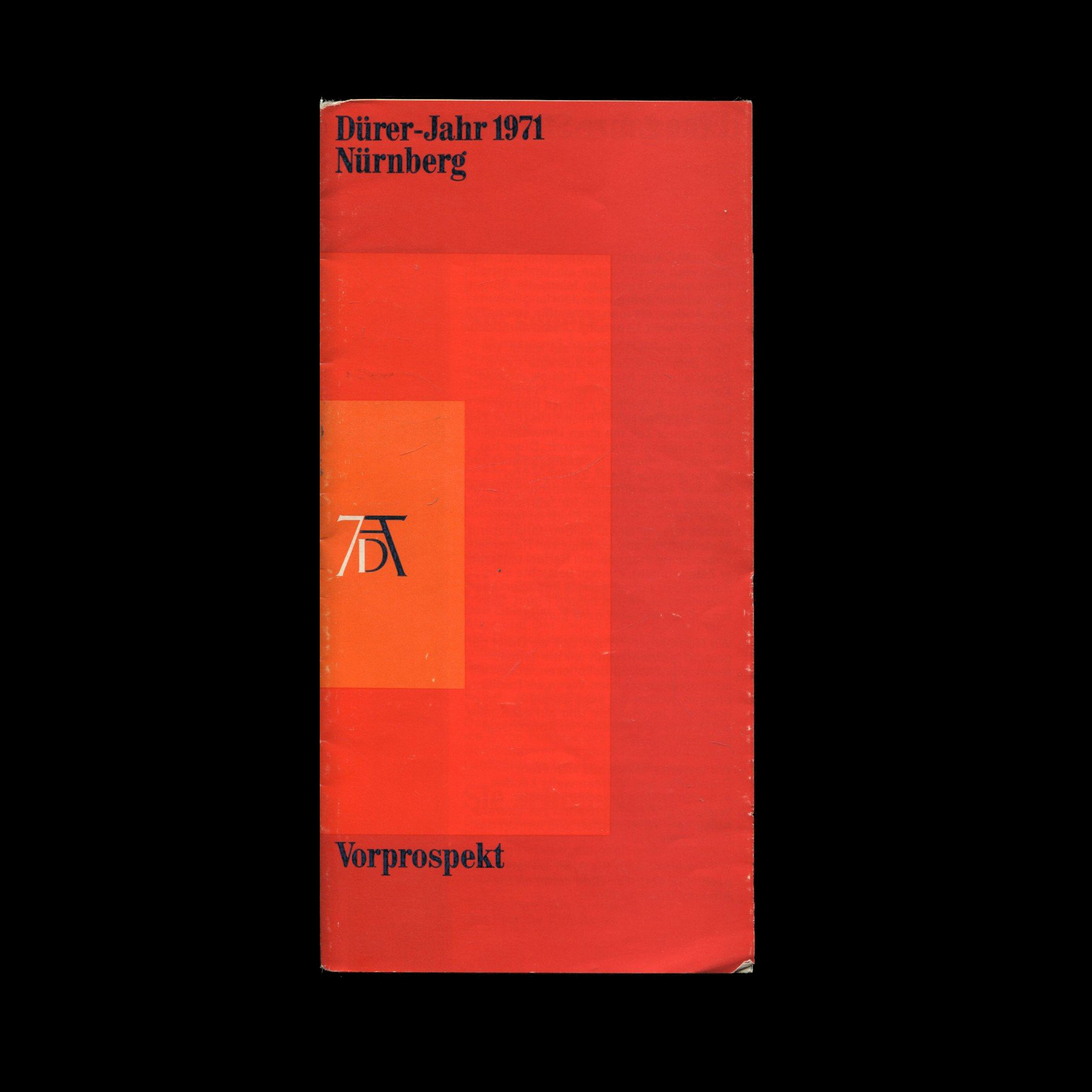
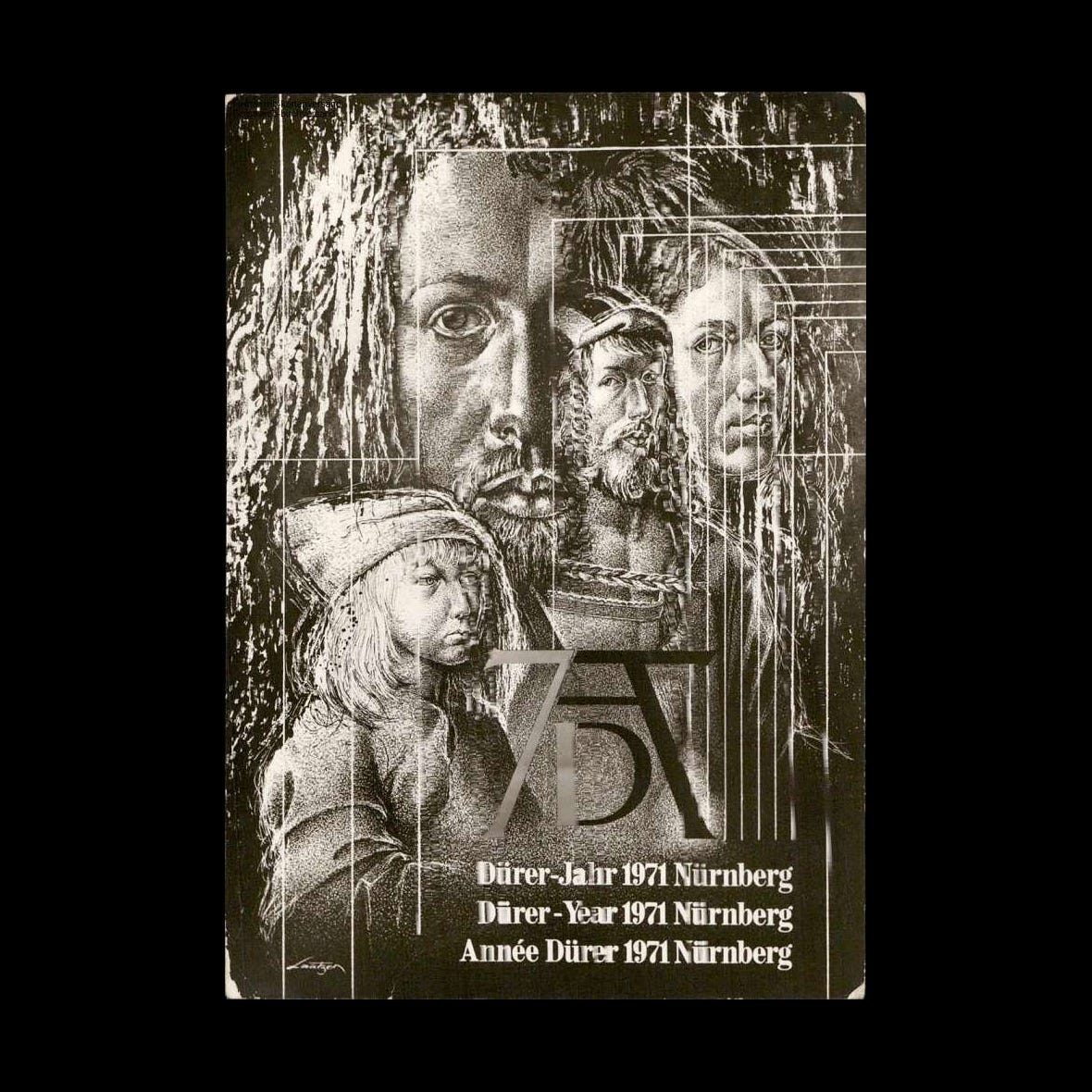
Dürer's 500th
Joachim Romann's 1969 winning logo for Dürer-Jahr 1971 Nürnberg.


Albrecht Dürer was a German painter, printmaker and theorist of the German Renaissance. He was born in Nuremberg in 1471. To celebrate what would have been his 500th birthday, the city planned a year-long programme of cultural activities and initiatives throughout 1971. These initiatives would fall under a unified visual identity. To find a logo for the celebration, the Department of Cultural Affairs of the City of Nuremberg launched a competition. Over a thousand logos were submitted with the winning entry being submitted by Joachim Romann, who recieved a first prize of 6.000DM.

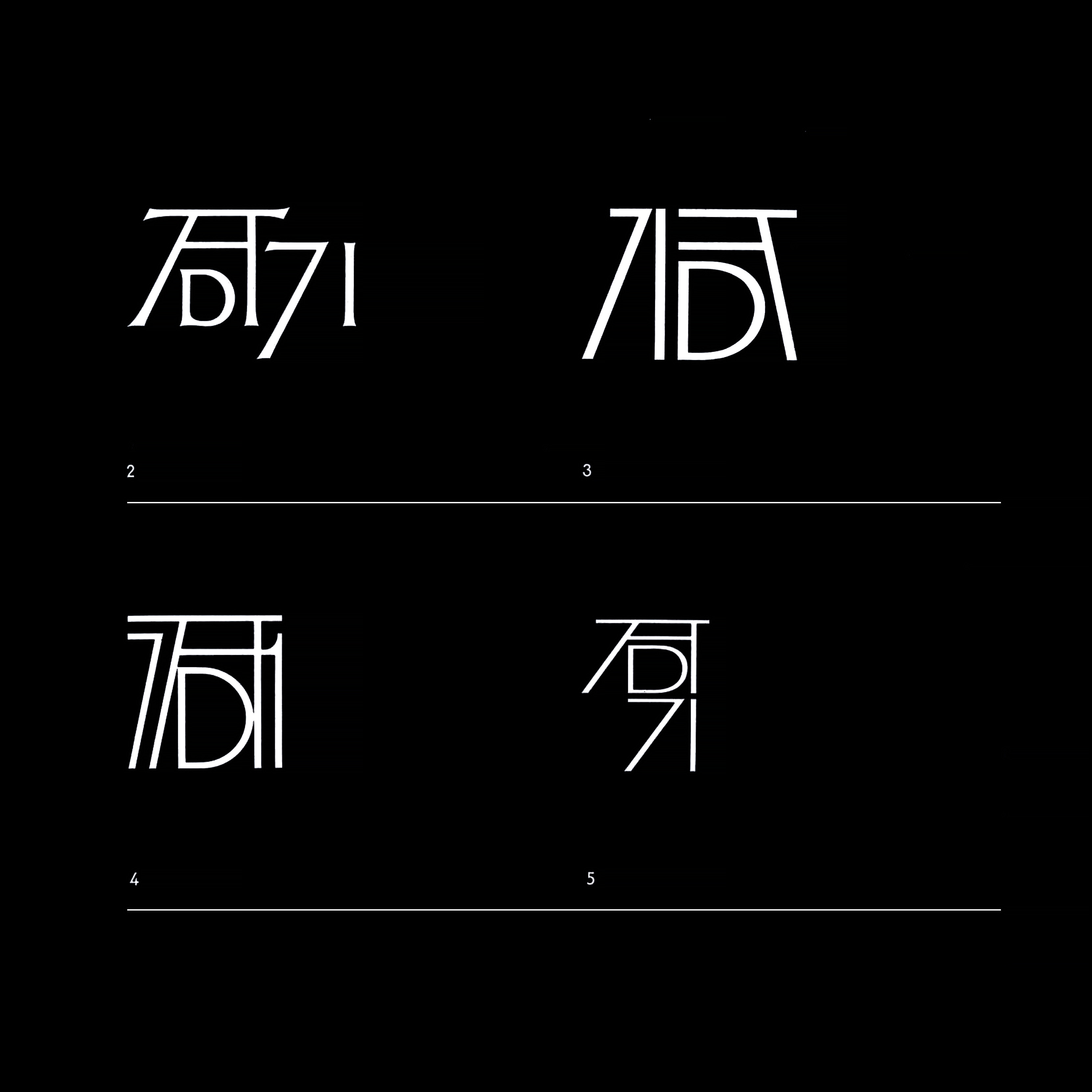
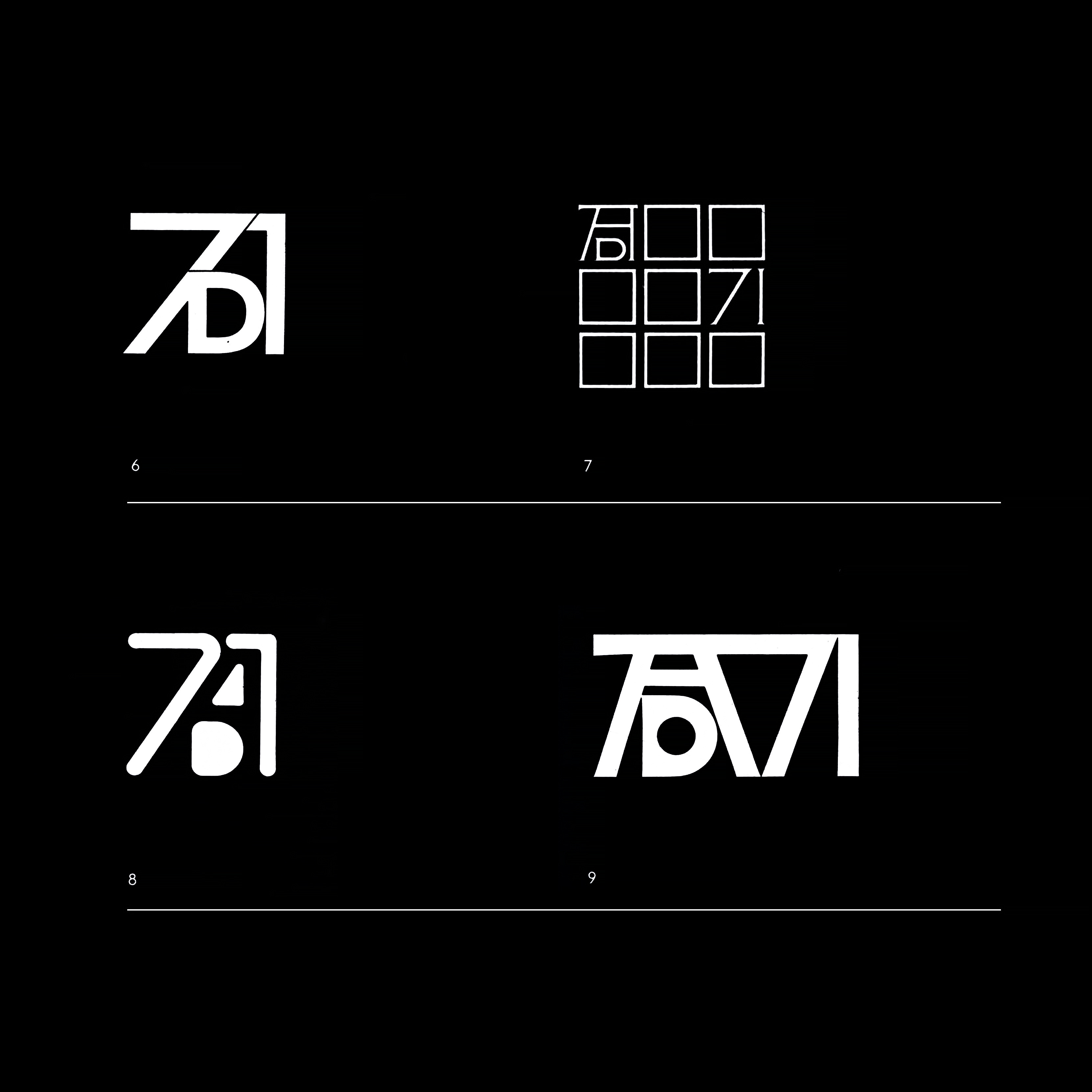
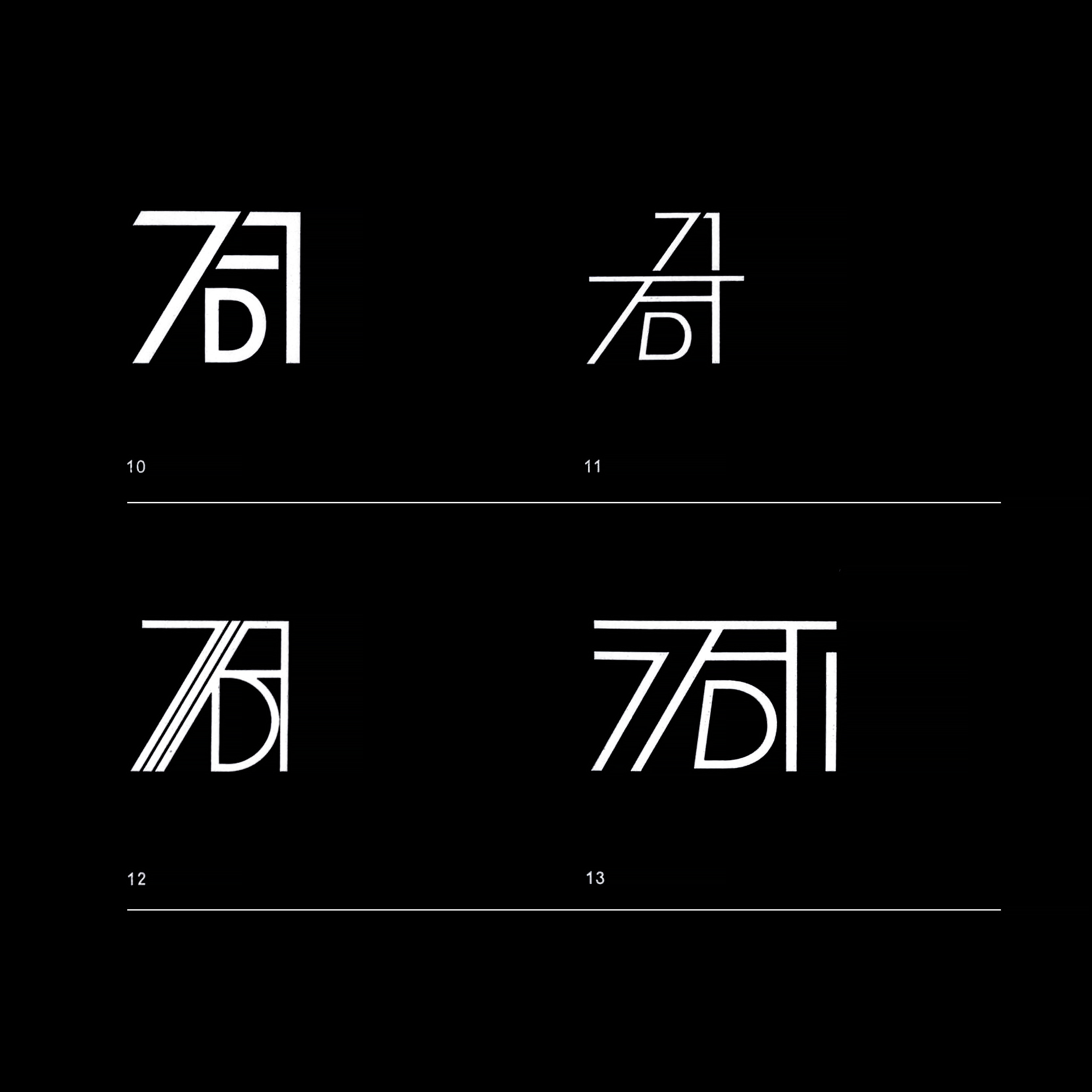
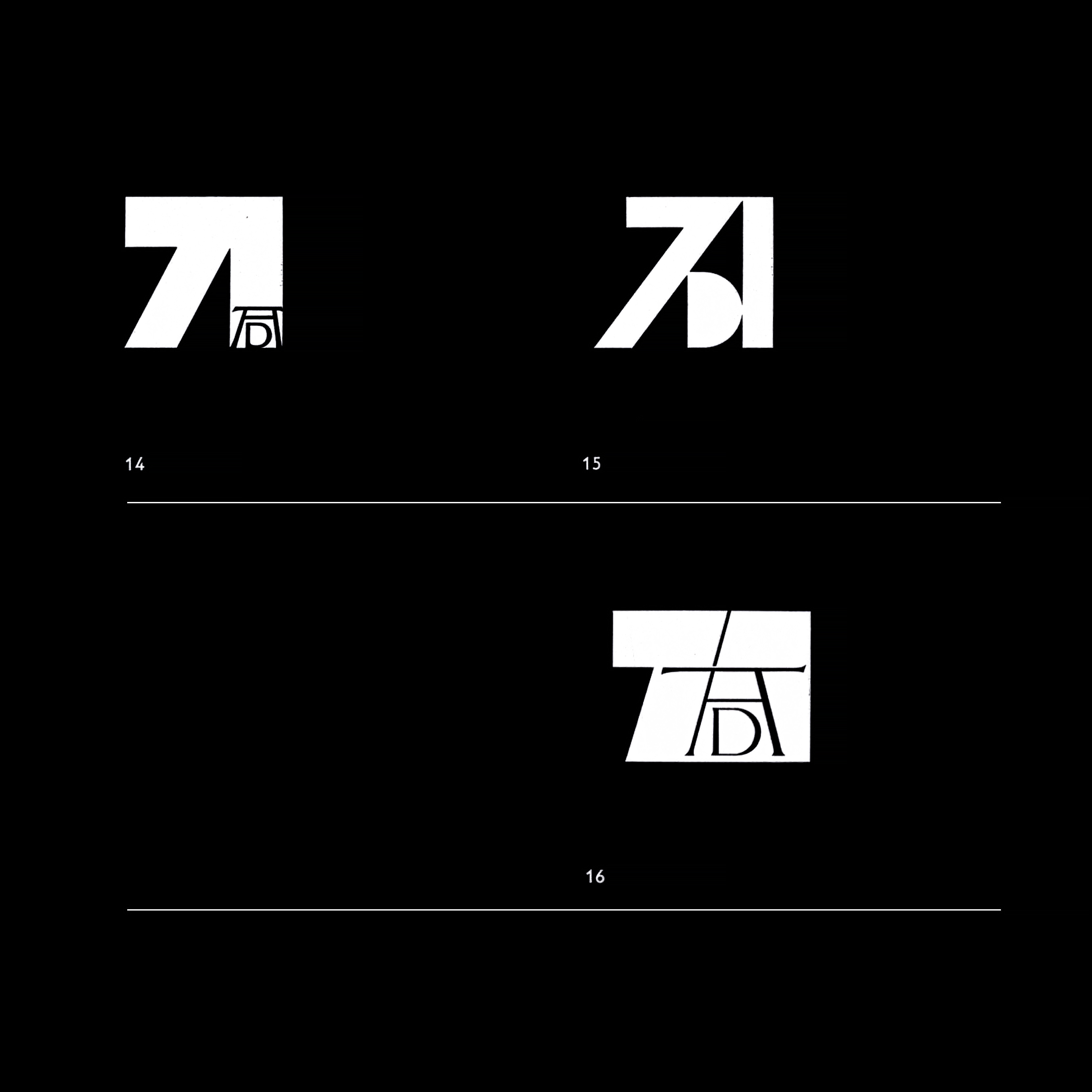
The key challenge was finding a suitable interpretation of Dürer’s famous AD monogram, and integrated the figure of 71. This was a key requirement of the brief. At the time, it was noted, that this felt like it offered little room for creativity, however, 1,131 submissions were recieved and collectively displayed a remarkable range of interpretations, some of which are presented in this post.

In front of the attendant representatives of the Press, Radio and TV, Professor Dr. Carlo Schmid, Vice-Chairman of the Kuratorium Dürer-jahr 1971 opened the envelopes containing the names of the winners, with first prize going to Joachim Romann. The result of the contest was met with universal approval.

In the jury's opinion, Romann’s design fulfilled the conditions of the contest, and succeeded in drawing the year ‘71 out of Dürer's initials without any significant changes to its characteristics. The figures and monogram were fused into a harmonious whole, as noted by Professor Dr. Carlo Schmid. The specific accomplishment of the winner was in having recognised and made visible the figures 71, which were latently contained within in Dürer's monogram. This was done without being detrimental to its familiar and recognisable shapes.
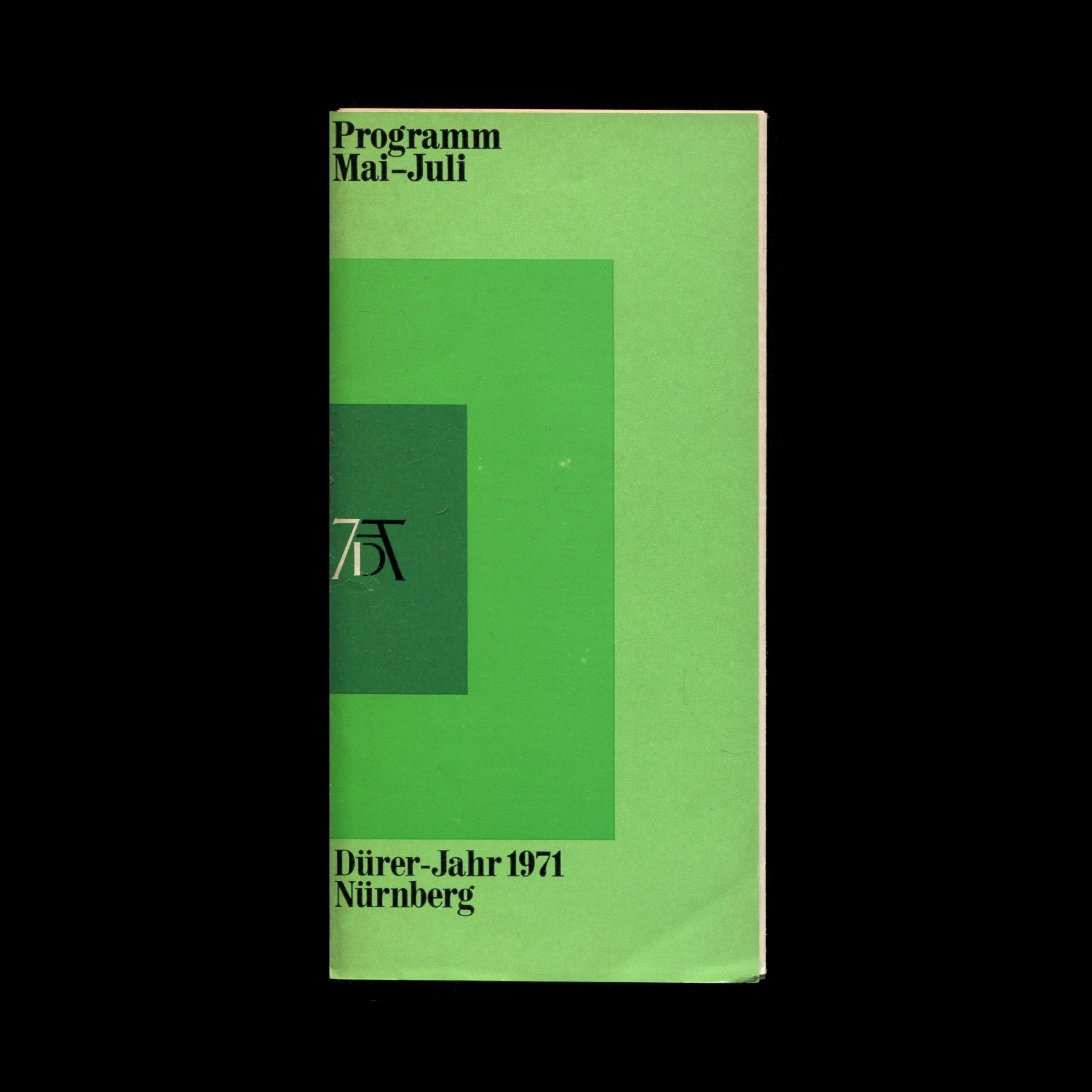
As expressed in the October 1969 Issue of Gebrauchsgraphik, even though the logo’s full effect was dependant on a two tone execution, this was of a minor significance. The logo was used to great effect across the programmes of the festival, and in conjunction with a palette of bright colour blocking and within the context of busier imagery.
“This Dürer Year contest once more showed that a great number of young and as yet unknown graphic designers manage to reach the top group. And this is another good argument illustrating the necessity of staging far more contests for younger designers than has been done lately.” –Gebrauchsgraphik, October, 1969
Thank you for subscribing to Logo Histories. If you enjoy reading this short you may also enjoy these resources from the same team:
Brand Basics – Automated Brand Guidelines maker.
Brand Archive – Research tool for brand designers.
LogoArchive Website – Searchable modernist logo archive & research tool.
LogoArchive Shop – Vintage design books & LogoArchive Zines.
BP&O – Contemporary design editorial.