



By the late 1960s, Eucatex had a name but no real identity. The Brazilian manufacturer of acoustic and insulating boards had used its name in a succession of styles, from heavy slab capitals to condensed and decorative lettering.
When Alexandre Wollner was invited by Eucatex to work on its next logo and corporate identity, he identified two problems: the company communicated poorly, and its visual identity had no meaningful connection to its business.
Before drawing anything, Wollner studied the identities of other national companies in the same sector and how they had changed over time. What he arrived at in 1968 was a single spiral, derived from the anatomy of the human ear, and a lowercase alphabet built on exactly the same geometry.
Eucatex and the problem of sound
Eucatex was founded in 1951 to manufacture ceiling linings and insulating board from eucalyptus fibre, a heritage the name still carries. Its products existed to absorb and dampen sound, and Wollner took that as his starting point. Rather than looking for a symbol of wood, boards or buildings, he looked at how sound is perceived in the first place.
From the ear to the spiral
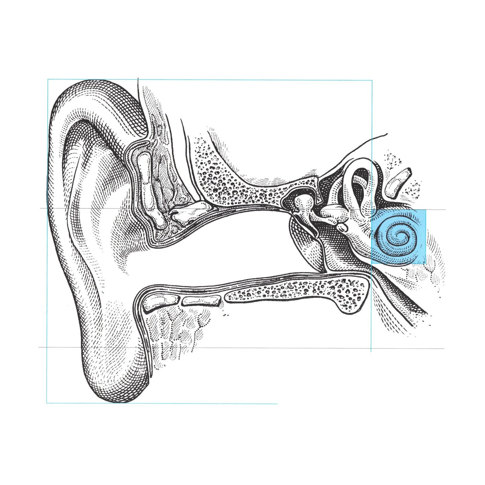
That led Wollner to the ear, and to a discovery that would shape the whole identity: hearing depends on two spirals.
The outer ear, Wollner noted, is itself a spiral form, one he related to Fibonacci’s proportions. It gathers sound and funnels it inwards. In the inner ear, sound reaches a second spiral, the cochlea, which he related to the spiral of Archimedes. From there, the signal travels on to what Wollner called the labyrinthine brain.
For a company in the business of controlling sound, the cochlea offered a symbol that was both precise and appropriate: a form that already belonged to the act of hearing.
Labyrinths, Dürer and Fibonacci
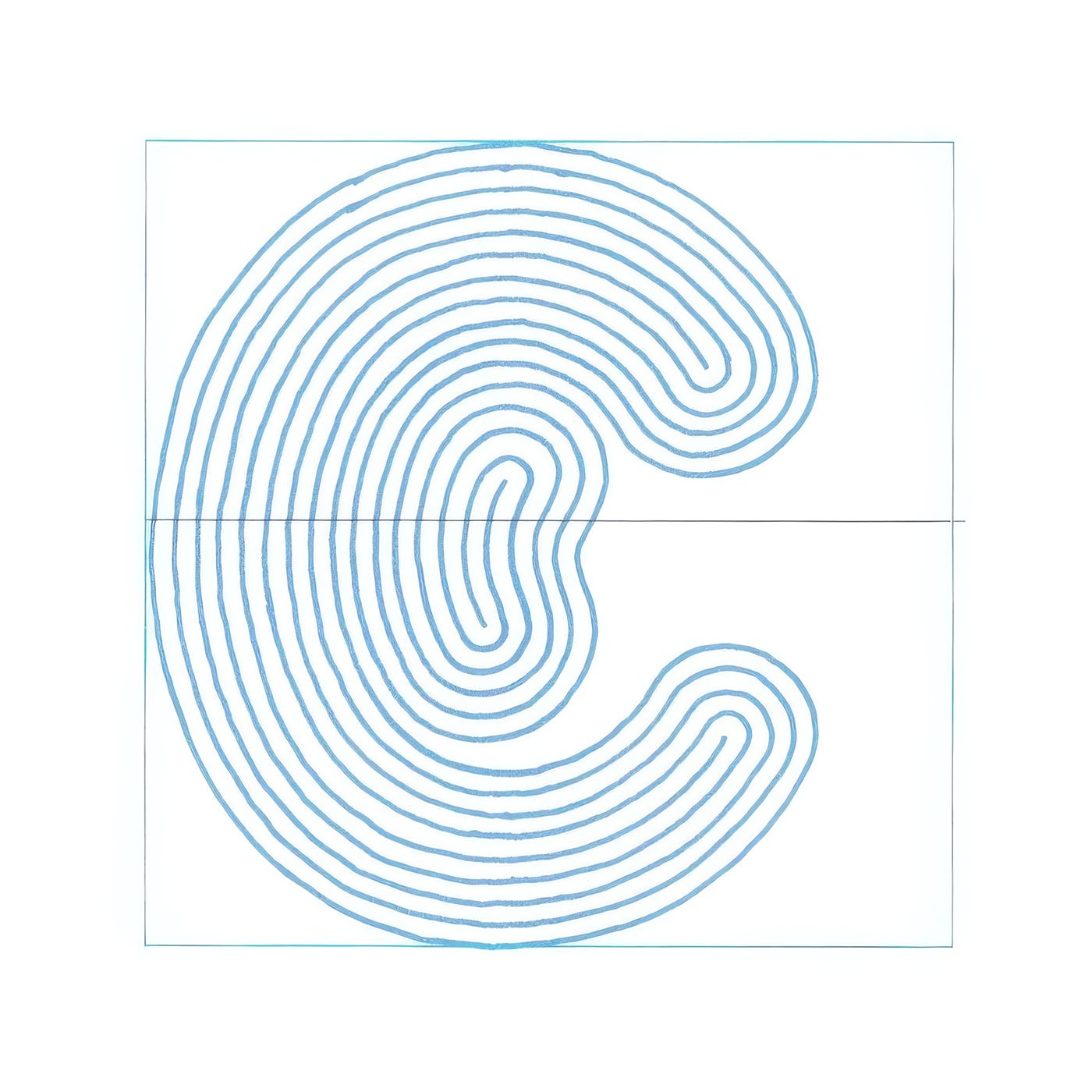
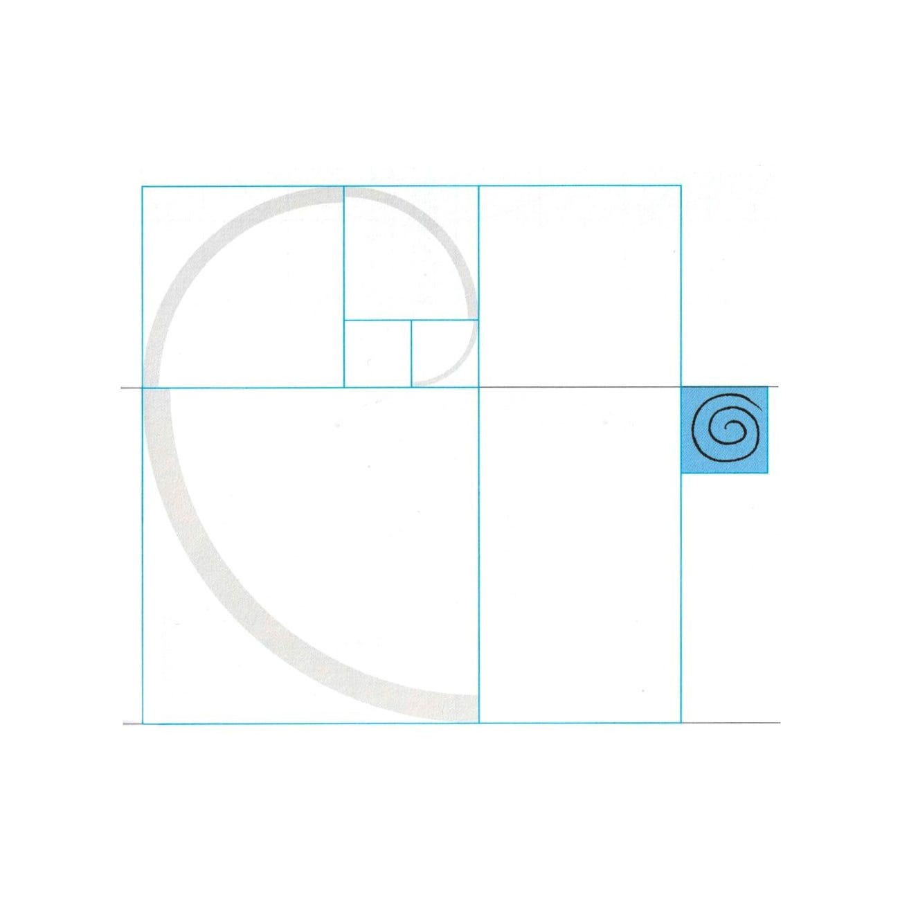
Wollner assembled a set of historical references around the spiral. He looked at a 1607 illustration of a labyrinth, the Wunderkreis at Hausberg in Germany, and at Albrecht Dürer’s studies of human proportion from 1532–1534, laying the labyrinth over one of Dürer’s proportion drawings. He set these against the two mathematical spirals that described the ear: Leonardo di Pisa’s (Fibonacci’s) spiral constructed from the golden section, and the spiral of Archimedes.
The distinction mattered. A Fibonacci spiral widens with every turn, growing outwards by the golden ratio. An Archimedean spiral keeps an even distance between its turns, like the groove of a record. That consistency made it the more practical model for a logo, giving Wollner a form with a steady rhythm that could be drawn with a single, even stroke.
Wollner describes the creative process that followed as a period of preparation, in which references, information and ideas sit unresolved in the unconscious, combining and excluding one another. Then, he writes, “Quite suddenly and unexpectedly, the right solution then flashes out.”
Testing the spiral
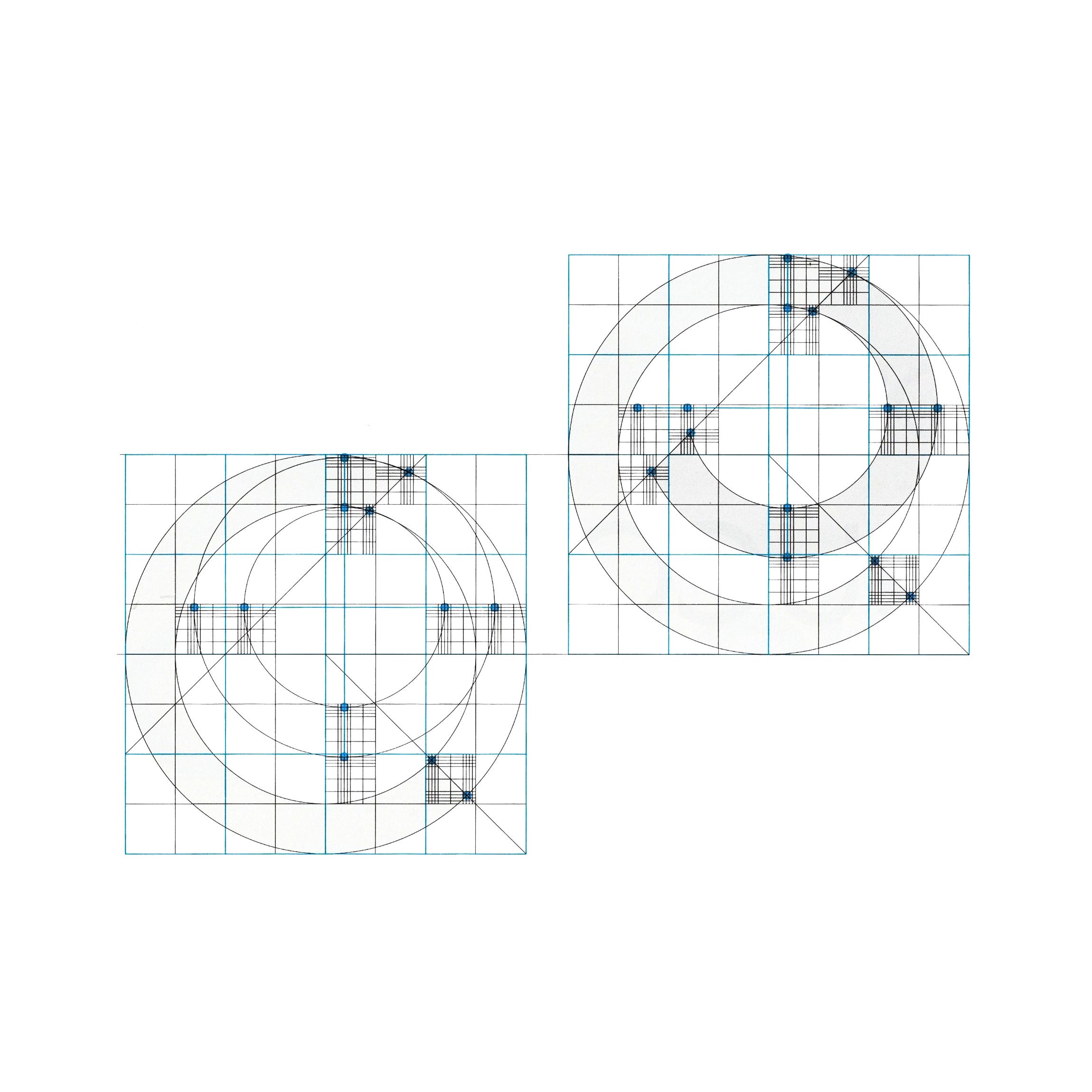
Before settling on a final form, Wollner tested the spiral against modular grids divided into eight, nine and ten units. He drew symmetrical versions and non-symmetrical ones, oriented vertically and horizontally, and compared them side by side until one variation stood out.
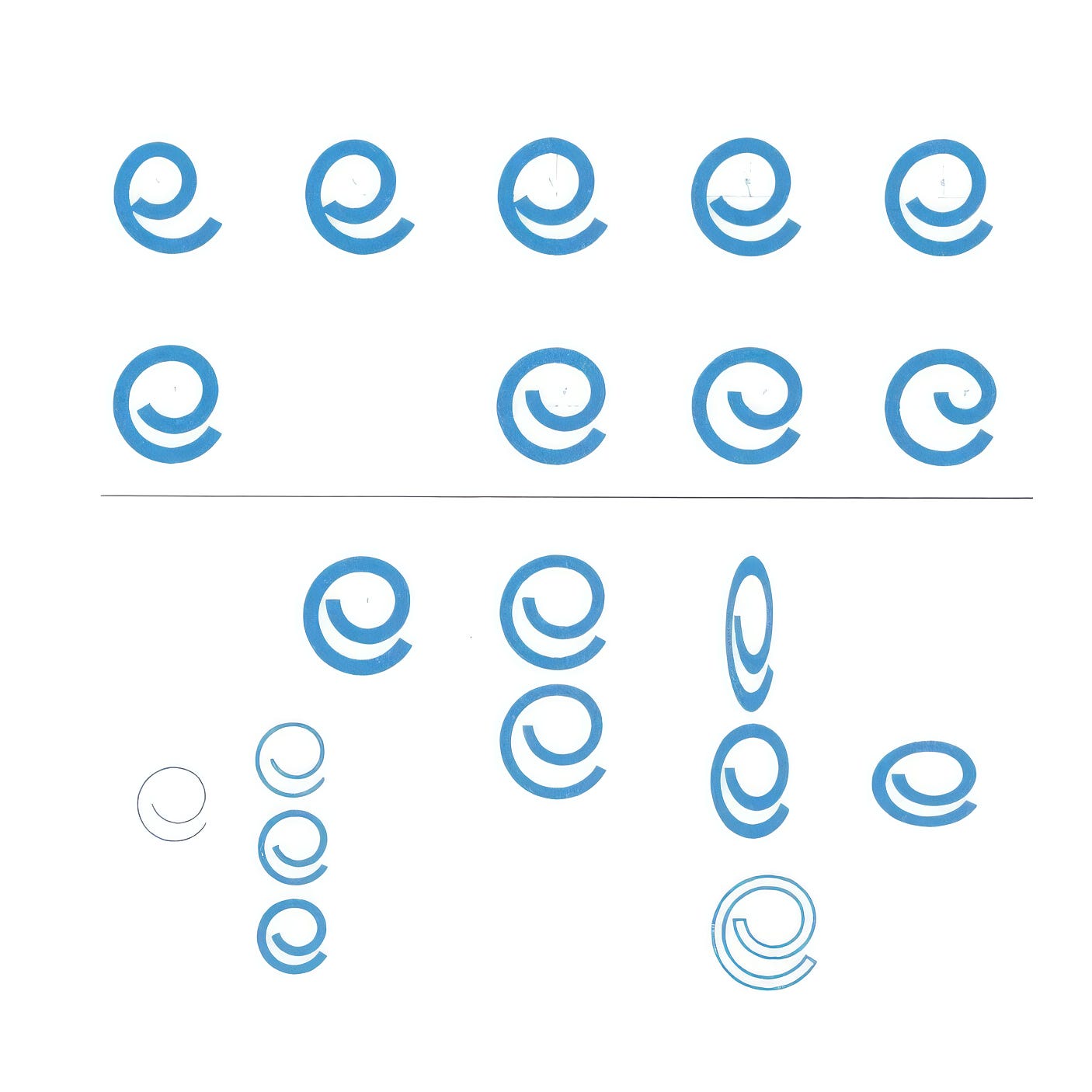
The chosen sign is a broad blue stroke that runs almost a full circle before turning inwards and ending in a cut at 45 degrees. Wollner fixed every part of it on a square grid: the centres of its arcs, the width of the stroke and the angle of its terminals. Like the construction drawings of the period, this meant the sign could be redrawn and reproduced exactly, whether on a factory, a board or a sheet of letterhead.
The spiral also reads as a lowercase e, the company’s initial, so the symbol of hearing doubles as a letter.
Key Takeaways
A symbol taken from the act of hearing
For a manufacturer of acoustic insulation, Wollner based the Eucatex logo on the cochlea, the spiral of the inner ear that turns sound into hearing.
Two spirals, one chosen for consistency
Wollner studied both Fibonacci’s golden-section spiral and the spiral of Archimedes, choosing the even rhythm of the Archimedean form for a sign drawn with a single, steady stroke.
One grid for symbol and alphabet
The spiral was fixed on a modular grid with 45-degree terminals, then used as the basis of a corporate alphabet so that symbol and name read as one.
Go behind the logos. Explore 200+ in-depth and meticulously researched logo histories revealing the designers, design decisions and ideas behind the world’s most iconic logos and important brand identities.
→ free previews
→ join here
Continue reading to discover how Wollner turned the spiral into a complete lowercase alphabet and product naming system →
