A sign of the times
The relevance of grids and guides in 1960s and 1970s logo design.
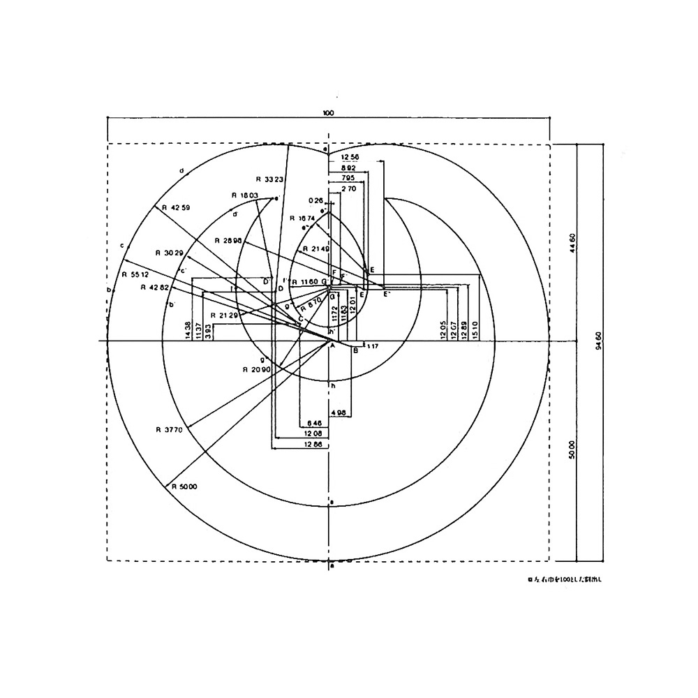
In the last decade, logo construction has found itself as a tool for marketing, for showing the rationalised approach to logo design, for impressing upon clients the thought and care that has gone into the work. The golden ratio crept in, somewhere in the mid-2000s, adding a further layer of ‘inherited’ beauty. That this happened during the rise of social media is. perhaps. not a coincidence. For many young designers, this appears a necessary part of the design process, a show-your-working-approach. However, the visibility of a logo’s construction (as well as its placement on a grid) is rooted in historical necessity that may come as a surprise to some.
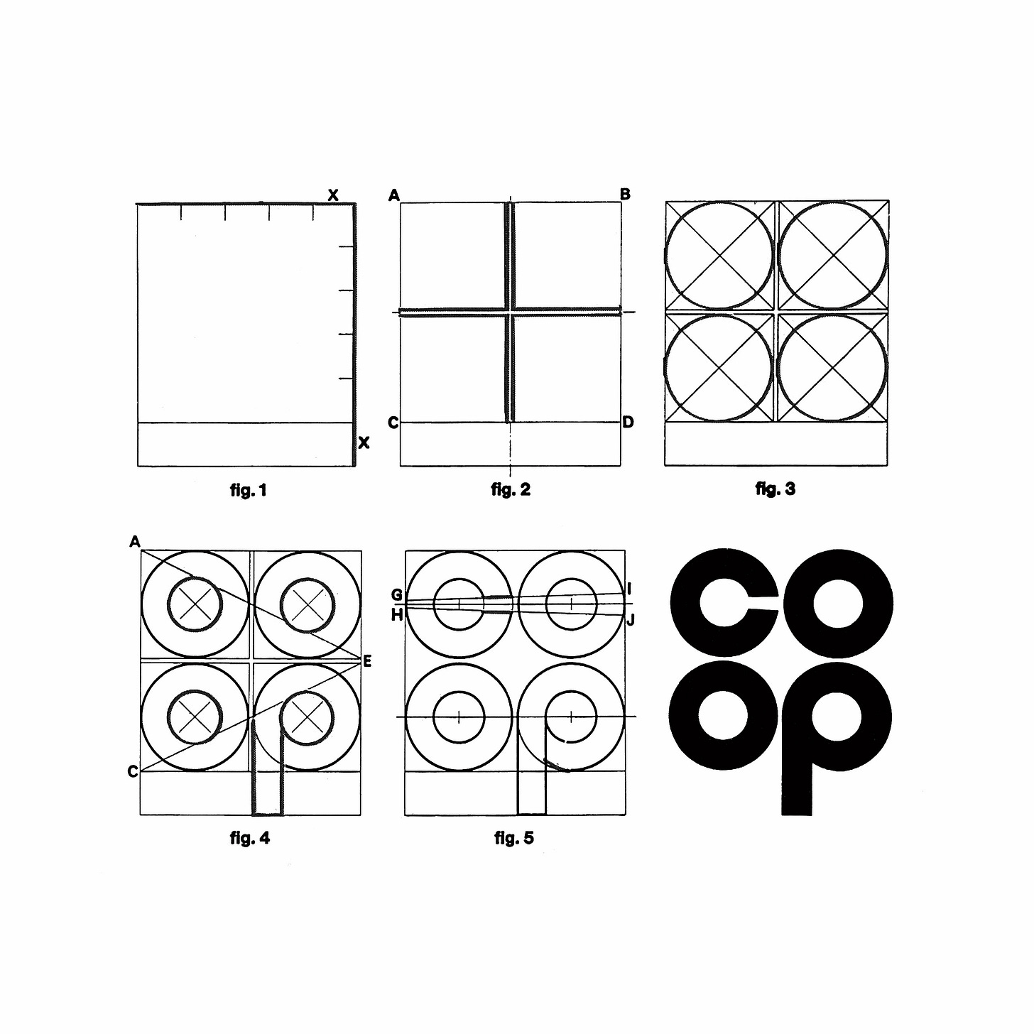
Grids, guides and logo construction date back to the 1950s. There’s plenty of examples peppered throughout the Logo Histories archive. The common thread that ties these together is communication and consistency, the ability for designers to share the basic proportions and geometry of a logo with fabricators, printers and other designers.
Sequential drawings, such as the one produced by Raymond Loewy for COOP France, would be used to help sign makers understand that basic elements that made up a logo in order to help them produce this as physical signage.
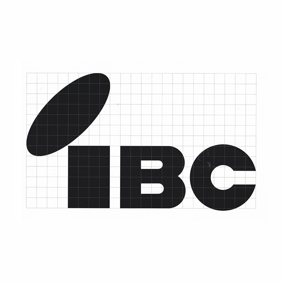
Supporting the goal of accurate fabrication was the grid. This would allow sign makers to easily scale a logo, at a time when there wasn’t vector artwork or computers. The importance of the grid to Japanese designer Ikko Tanaka is evident in his work for IBC. Within the guidelines, he chose to use a metallic silver to print informative elements, which included the grid.
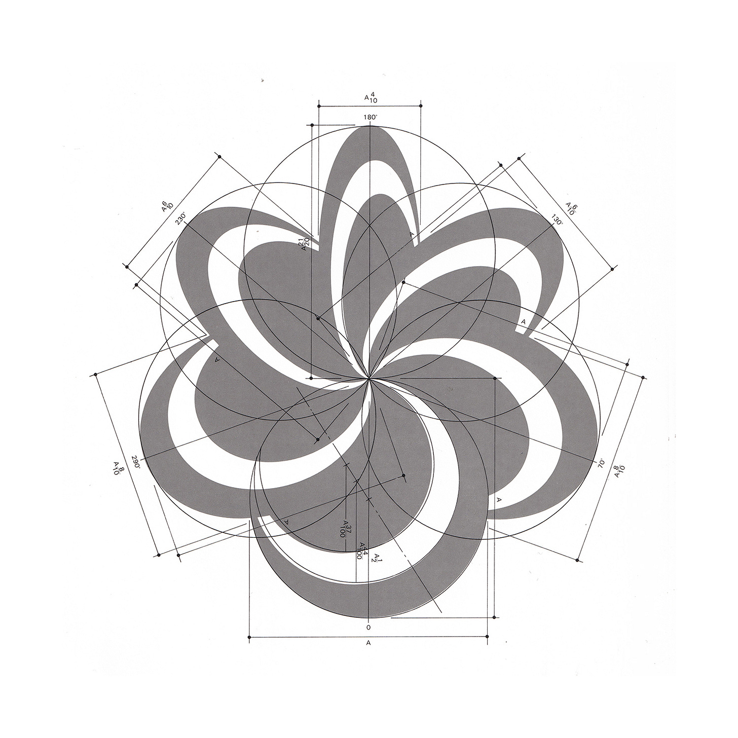
For multinational corporations, where consistency could provide not just a visual continuity but made economical sense, making sure that their logo could be replicated efficiently internationally was essential. Thus, the instructions for constructing a logo had to often be understood by non-English speaking print production and fabrication firms. This would not just be limited to signage but also extend to the application of vehicle liveries or the printing of regional language stationery.
Drawings had to rely on numbers not descriptions, and were augmented with details that would help with scaling (grids) and fabrication (technical drawings).
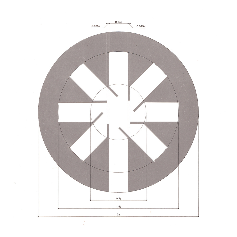
While rationalised design was partly a product of a new era of advertising and modernised industrial practices, the use of formal geometry also supported cross-border continuities. Fixed radius and proportions made it clear and easy to build signage, compared to irregular organic shapes.
Rather than the designer showing their working out to clients, or impressing other designers, the use of grids, guides and construction diagrams were solely in service of basic conditions and requirements. Framing logo design from this practical vantage, particularly in terms of scaling, printing and fabrication, can today drive client conversations towards logical conclusions.
If you enjoyed reading Logo Histories also check out these projects:
Brand Archive (Beta) – Research tool for brand designers.
LogoArchive Website – Searchable modernist logo archive & research tool.
LogoArchive Shop – Vintage design books & LogoArchive Zines.
BP&O – Contemporary design editorial.


