
Fed-Excellent
Lindon Leader & Landor Associates' 1994 logo for FedEx.


When Frederick W. Smith founded Federal Express Corp. in 1971, in the American state of Arkansas, it was unlikely that he knew this would be the start of the modern air/ground express industry. His idea arose several years beforehand, as Smith outlined a system for shipping urgent and time-sensitive cargo such as medicine, computer parts, and electronics. This idea, conjured up during his university studies, would be revolutionary.
With continuous success in its first decade, Federal Express grew from strength to strength, reaching US$1 billion in revenue by 1983. From there, the company began expanding globally and introduced operations in Asia Pacific and Europe.
Despite this growth, the corporation faced growing competition as other companies in the shipping business began to offer similar overnight services. The industry Federal Express pioneered had become a fiercely competitive market. It was increasingly viewed as a commodity service driven by price.
With this in mind, it was felt that Federal Express would need to better communicate its broad service offerings and position it as an industry leader amongst this growing competition. Further, by devising a broader and more formalised design policy, it would, through consistency of application across catalogs, trucks and airplanes, leverage its unparalleled network size to improve the impact and visibility of the brand.
Landor Associates, led by Senior Design Director Lindon Leader, were extended a level of trust and flexibility in developing the new design policy. Alongside the above considerations, the key objectives were to ensure that the new corporate identity communicated the attributes of the Federal Express brand; precision, service, speed, and reliability.


Landor conducted extensive consumer research to understand the public’s relationship with the ‘Federal Express’ brand. By the 1990s, the phrase to ‘FedEx a package’ had become synonymous with shipping packages, regardless of the courier. This truncation was identified as a valuable brand asset. Used strategically, it was felt that this would signal a move away from the negative (and national) associations of the word ‘federal’ and move it towards a more global position. This would be important as it continued its international expansion.


During the logo’s development, it wasn’t until hundreds of designs had already been mocked-up (using the pre-established colour palette of purple and orange) before Leader reached his ‘lightbulb moment’. He noticed a hidden arrow was formed from the negative space of ‘E’ and ‘x.’ As he began to develop this concept further, he found early iterations to be ‘clunky’ and ‘inharmonious’. This was resolved through the intersection of two typefaces.
The final design, a bespoke logotype, draws inspiration and the preferable characterises from the sans-serifs of Univers 67 (Bold Condensed) and Futura Bold. He incorporated elements from both typefaces. By applying tight letter spacing, increasing size of the lower-case letters relative to the capital letters and using the corporate colours of orange and purple, Leader was able to find a distinctive and proprietary whole.

Through the seamless union of two typefaces the second image of an arrow was formed in the negative space of the ‘E’ and ‘x’ negative space, alluding to the notions of speed and precision.
Despite the truncation, and perhaps functioning as a transitional element, the full name Federal Express, and in some instance just ‘Express’ set in ITC Century Condensed, was used below the logo and was employed, alongside the Univers font family, as a secondary typeface.

The new wordmark was supported by the new tag line, ‘The World On Time’, also developed by Landor Associates. This would reinforce the company's positioning as a global time-sensitive delivery service.
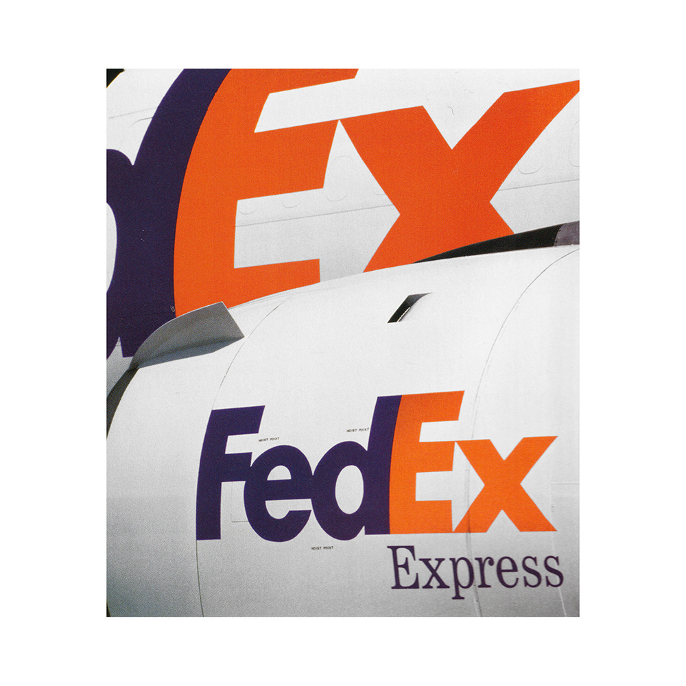
The logo’s synergy of compact globalised name and symbolism, as well as the innocuous yet proprietary character of type, placed the logo in good stead. It was immediate and recognisable from a distance and easier to consistently apply across as large and mixed network of assets. So much so, that remains in use today, almost 30 years later.
Thank you for subscribing to Logo Histories. If you enjoy reading this you may also enjoy these resources from the same team:
Brand Archive – Research tool for brand designers.
LogoArchive Website – Searchable modernist logo archive & research tool.
LogoArchive Shop – Vintage design books & LogoArchive Zines.
BP&O – Contemporary design editorial.
Extra Issue – Unlocking opinion and insights from the past.