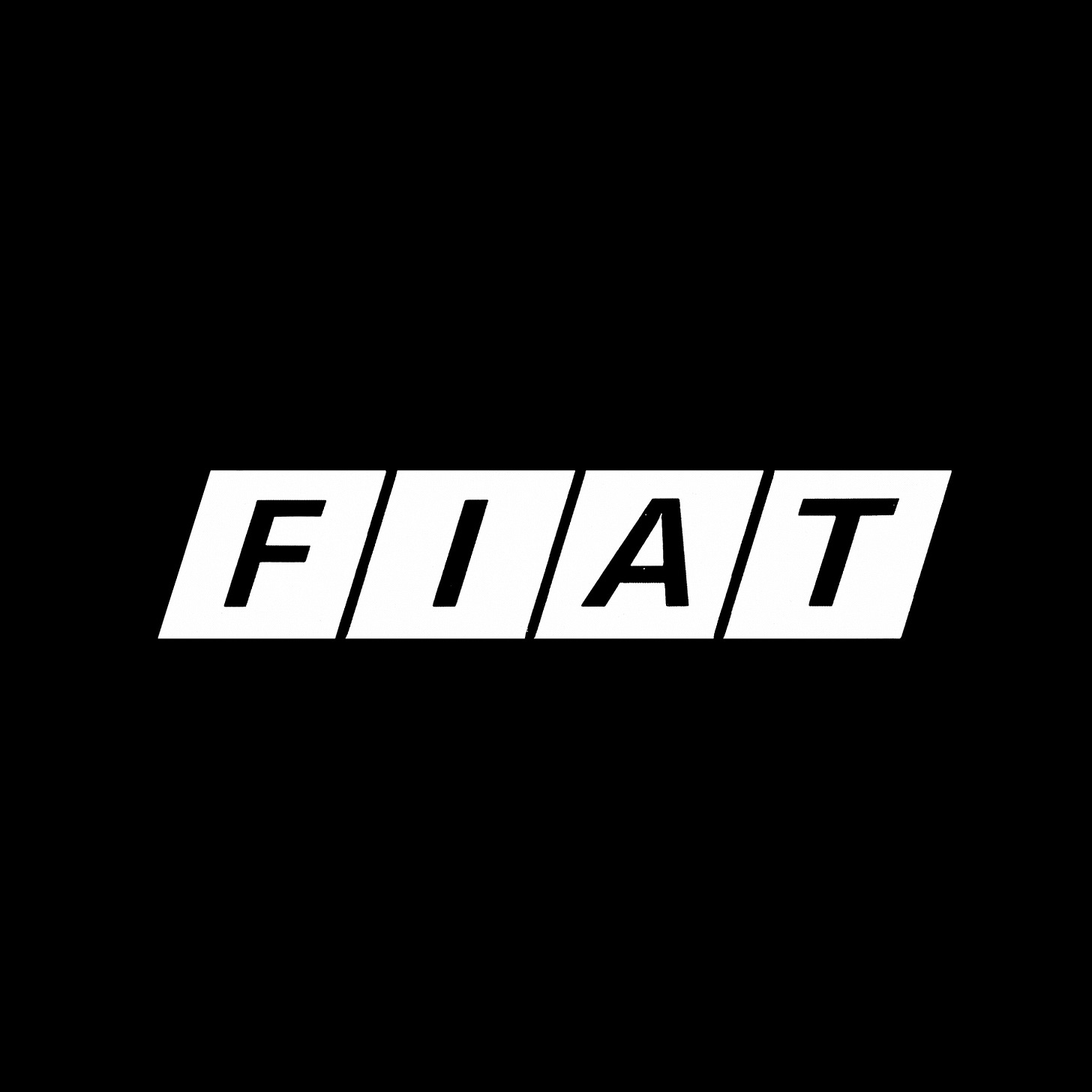
Designed for life
Armin Vogt and Jean Reiwald's 1968 logo for Fiat
In 1899 a group of businessmen and professionals from Turin joined forces to realise a shared dream: to develop an Italian automobile factory that could offer ‘democratic mobility’ and cars ‘designed for life’. This ambitious automaker was Fiat.
By the mid-1960s, Fiat had grown to become the world's seventh largest car maker and had also expanded its manufacturing to include tractors for agriculture, civil and land engineering machinery, automobile components, diesel rail-cars and aero engines. Alongside this, Fiat was also involved in the raw materials trade. This expansion of products and materials catapulted the Italian manufacturer into the international market, distributing many of its products throughout Europe and the U.S.S.R, having taken a large share of the Italian auto market and seeking continued growth.
As the automaker expanded it was felt that its trademark (a logotype of condensed uppercase letterforms) didn’t reflect the increasingly modernised operation, nor its expanding international reach. The decision was made to embark upon the design of a new corporate identity, which would be launched to coincide with Fiat’s 70th anniversary. The project was initiated in 1968 and placed in the capable hands of Swiss designers Armin Vogt and Jean Reiwald.
Continue reading to learn the concept behind the logo. Understand the system that was developed from this. And see how this played out across model numbers, advertising and signage.


