The Saltire takes flight
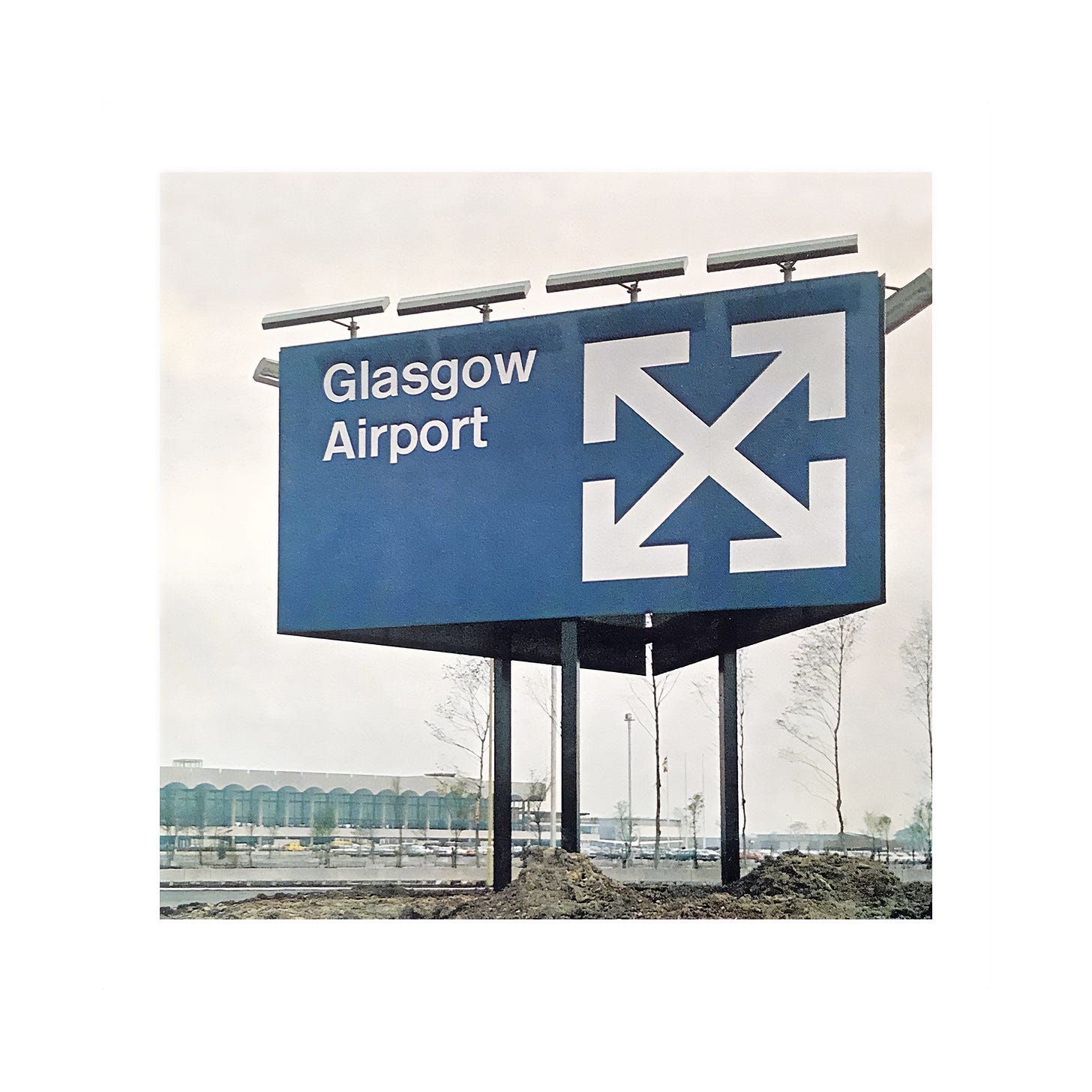
Margaret Calvert's 1964 logo for Glasgow Airport.
This post is supported by LogoArchive – The home of historical logos. Discover over 5000 of history’s best designs from the world’s finest designers. Always find the logo inspiration you need for your next project here.
Due to increasing demand for domestic air travel in Great Britain during the early 1960s, the Scottish city of Glasgow required a new airport. Moving away from the original site at Renwick, the new airport was built at a former Naval/RAF base at Abbotsinch in Paisley. This was designed by architects Sir Basil Spence and Peter Ferguson of Spence Glover & Ferguson and was then opened by Queen Elizabeth II in 1966.
The airport reflects within its architecture and design aspects of the technological innovation and modernisation that was well-underway in Europe. Just as the building created a striking modernist presence and needed to accommodate future expansion, so did its visual identity and sign system.
Following their revolutionary work on British road signs, Margaret Calvert and Jock Kinneir, Kinneir Calvert Associates, were commissioned to create Glasgow Airport’s sign system and were briefed by the architects in 1964.
Continue reading to understand the concept behind the logo and see it applied to ground equipment and signage.
Calvert and Kinneir were also asked to create a house style for the airport, which would make it the first of its kind in Great Britain. It would be Calvert that would design the now-iconic logo, and also develop the system for vehicle livery for the airport’s various ground equipment and vehicles. This included forklift trucks, vans and flight ladders.
For the airport’s house colours, a striking pairing of blue and bright yellow was chosen, ensuring high visibility for the vehicles on the runway. Lettering was applied in white using Rail Alphabet, which was developed by Calvert and Kinneir on their earlier and pioneering project for British Railways.
Communication was a key part of Calvert’s work: the design need to be simple, legible, and adaptable. When designing for an airport there is the extra consideration of language barriers. This led to the design of Glasgow Airport’s logo.
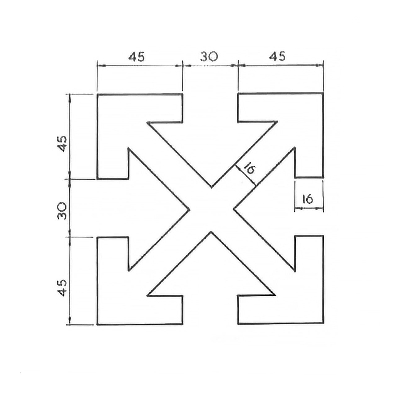
The initial impression of the logo is a white cross made of 4 diagonal arrows pointing outwards. However, the sign can be understood to have several further perceptual components.
On a blue backdrop, the Scottish flag is created from the cross of the intersecting white arrows. The flag (also known as the Saltire) is subtly framed by the arrows’ inside corners. Then, within the negative space of the logo, four arrows can also be seen pointing inwards.
Arrows are recognised internationally as a symbol of direction and movement. Glasgow Airport’s flights were mostly domestic and to nearby European countries. Therefore, the directional arrows, combined with the Saltire encapsulates the sign’s meaning: travel into and out of Scotland.
Around £6000 (estimated as £102,748.62 in 2022) was spent on the roof sign and the large sign which sits at the roundabout on the approach to the airport.
“.. its boldness and clarity are impressive, and faithfully reflect the character of the building which follows.” – Design Journal
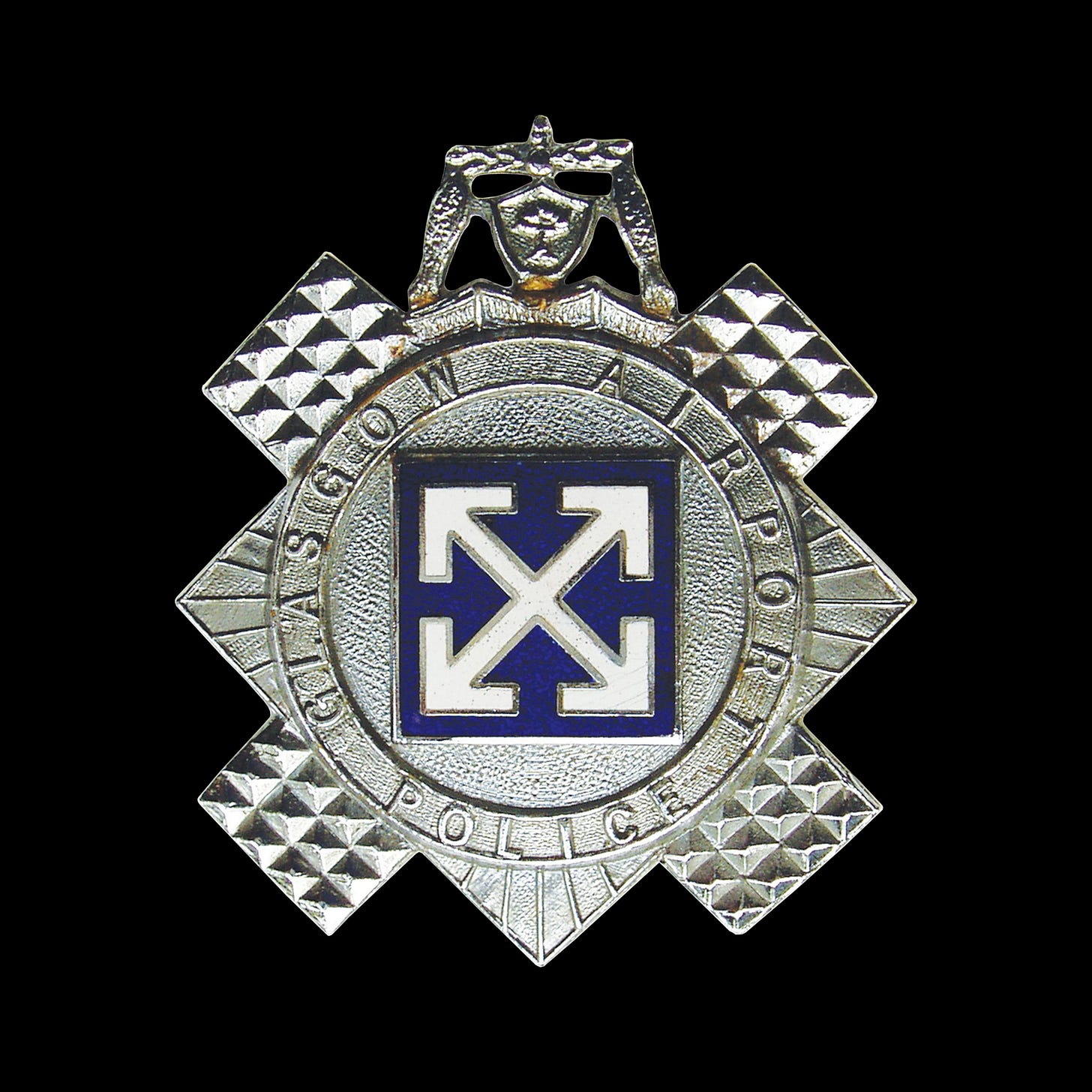
The logo also appeared in a more unusual place. As part of the new airport a dedicated Glasgow Airport Police unit was set up and given its own badge. The bold modernist logo stands out as the central motif of a traditional police cast metal insignia.
Following their work for Glasgow Airport, Kinneir Calvert Associates were invited to work on more airport projects such as Belfast, and would later work as design consultants for the British Airports Authority.
Thank you for subscribing to Logo Histories. If you enjoy reading this short you may also enjoy these resources from the same team:
New! Portal – Design-driven jobs board and applicant management.
Brand Archive – Research tool for brand designers.
LogoArchive Website – Searchable modernist logo archive & research tool.
LogoArchive Shop – Vintage design books & LogoArchive Zines.
BP&O – Contemporary design editorial.


Love the work keep it up.
This ID is inspiring, and not to shame the legacy of Virgil Abloh... but can't help but think this is where he got the ID for Off White.
Virgil Abloh's practice, often asked the question, do we need another, whatever? He documents it in his 3% theory and the use of readymade throughout his work.