
The natural flow of an unbroken line
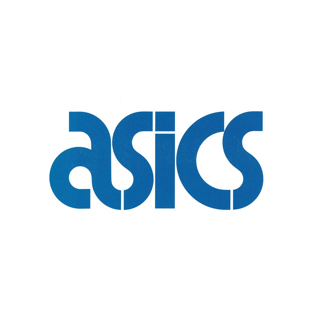
Herb Lubalin & and Alan Peckolick's logo for ASICS.

This post is supported by LogoArchive – The home of historical logos. Discover over 4000 of history’s best designs from the world’s finest designers. Bookmark and collate logo inspiration for your next project here.
Japanese sporting goods brand ASICS was formed from the merger of Onitsuka, GTO and Jelenk, and was launched on to the market in 1977.
The development of its corporate identity began with a competition, with Japanese design studio PAOS securing the work after submitting six different proposals. However, with ASICS looking to reach new markets, an international perspective was required. With this in mind PAOS comissioned renowned American graphic designer Herb Lubalin to work on the ASICS wordmark.


Above, Herb Lubalin's initial proposals to PAOS, designed with Alan Peckolic. These are twelve drawn from a collection of seventeen different options. The governing principles for selection were originality and the expression of ASICS corporate objectives; international appeal, product quality and function. Here, you can see the breadth of the options, ranging from the technical to the avant-garde, clearly exploring and testing the potential for synergising a dynamic and idiosyncratic character with the notion of technological advancement.
