HSBC Logo, 1983
Henry Steiner's 1983 logo for the HongKongBank.
This post is supported by LogoArchive – The home of historical logos. Discover over 5000 of history’s greatest designs from the world’s finest designers. Updated every single day. Always find the logo inspiration you need for your next logo or branding project. Start here.
The Hong Kong and Shanghai Banking Corporation (later ‘HongkongBank’ and then HSBC) was founded in 1865 by Thomas Sutherland to finance the growing trade between China, Europe and the United States.
By the 1980s HongkongBank was considered a pioneer of modern banking in a number of countries, however, it’s corporate identity didn’t reflect this. Expansion (increasing branch numbers to over 1,000) and the acquisition of a controlling stake in New York’s Marine Midland Bank started to create consistency issues. The bank appeared less unified the more it grew.
At this time, the bank was represented by a version of the flag of Scotland, the homeland of Sutherland and a heraldic crest similar to Hong Kong’s former colonial coat of arms. In its composition of lions, a unicorn, merchants and a Chinese junk it symbolised a city emerging as an important exchange between East and West.
In order to give the bank a consistent and modern visual presence, unify its diversified and expanding international operations and improve the clarity of customer and investor communications it worked with Henry Steiner to devise a new corporate identity (CI). This kicked off a two year consultation period in which Steiner invited stakeholders to share their perceptions of the bank, which then saw him having to manage the competing voices of bank managers across 52 countries. Reflecting back on this time, Steiner noted that, while the intention was to use this feedback as the basis of possible directions for the CI, many of the respondents latched on to historical imagery, and the exercise didn’t provide a sufficiently forward-looking direction to explore.
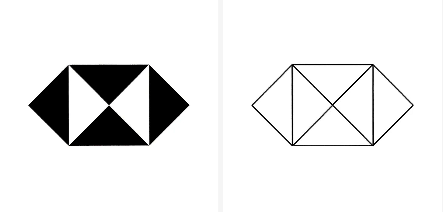
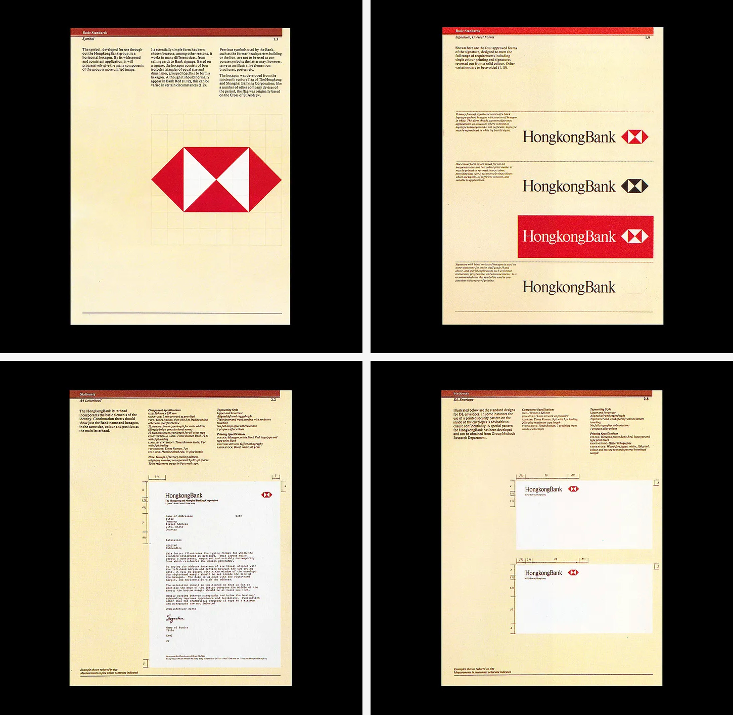
Despite the extensive and lengthy consultation period, Steiner would later note that he arrived at the solution relatively quickly. The HongkongBank was a British institution founded on ‘sound Scottish banking principles’ but it had always adopted local beliefs and traditions. Steiner drew from this cross-cultural foundation and developed a logo made up of four isosceles triangles of equal size and dimension. These were grouped together to form a hexagon which could be perceived as inward and outward facing arrows pointing east and west. In this way, the shape reflected the notion of coming together, and suggested interaction and communication between several parts of the world. Further, the ‘X’ at the centre also evoked aspects of the Saltire, the flag of Scotland (also read: The Saltire Takes Flight).
As a further element, the bank had an ‘affinity’ with feng shui. The head office had been intentionally positioned specifically to create a relationship with water. The four arrows of the logo, in the spirit of feng shui, would be presented to bank management as the four poles, and business coming from all directions.
Rather than using the blue of the Scottish flag, the logo would be a vibrant red. This colour was important to Chinese culture and it was already associated with the bank, as it was used on its money boxes and passbooks.
Unlike the previous brand elements and in particular the crest, the hexagon logo’s balance of positive and negative space afforded the company far more flexibility. The new logo would work better at many different sizes, scaling down to business cards and up to large format building signage. Despite the improved function and memorability of the new logo, the heraldic lion would be retained and serve as an illustrative element on brochures and posters.
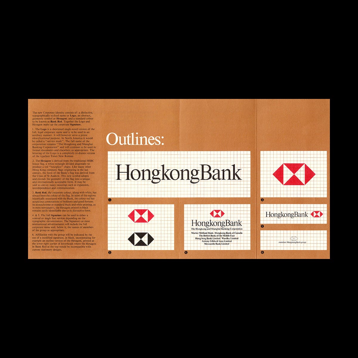
As part of the formalisation process, and with the introduction of a new logo, a simplified name was suggested and designed as a one-word logotype, without spacing. This was set in a specially drawn version of Times New Roman. Just like the logo, this truncation made the logotype more flexible and easier to use.
In 1984 the CI was phased in over an extended period of time to avoid unnecessary replacement expenditure, improve economies of scale and to allow for local factors. This was guided by a new corporate manual and a pamphlet that introduced the basic principles to employees.
The logo remained in place for over four decades until 2018. That year, the bank underwent a further rebranding effort designed to, once again, modernise the institution. The proportions, arrangements and colour of Steiner’s work were altered. And Times Roman was replaced with Univers, as it was felt this was more fitting for the period. Steiner described this update as “wasteful and confusing”.
Discover these brand assets and more at Brand Archive.
Thank you for subscribing to Logo Histories. If you enjoy reading this short you may also enjoy these resources from the same team:
New! Portal – Design-driven jobs board (ATS Coming soon)
Brand Archive – Research tool for brand designers.
LogoArchive Website – Searchable modernist logo archive & research tool.
LogoArchive Shop – Vintage design books & LogoArchive Zines.
BP&O – Contemporary design editorial.


You have such a strong sense of honor when it comes to documenting logos of multiple shapes and sizes.