Japan Railways Logo, 1987
Yoji Yamamoto's 1987 logo for Japan Railways.
This post is supported by LogoArchive – The home of historical logos. Discover over 5000 of history’s greatest designs from the world’s finest designers. Always find the logo inspiration you need for your next project here.
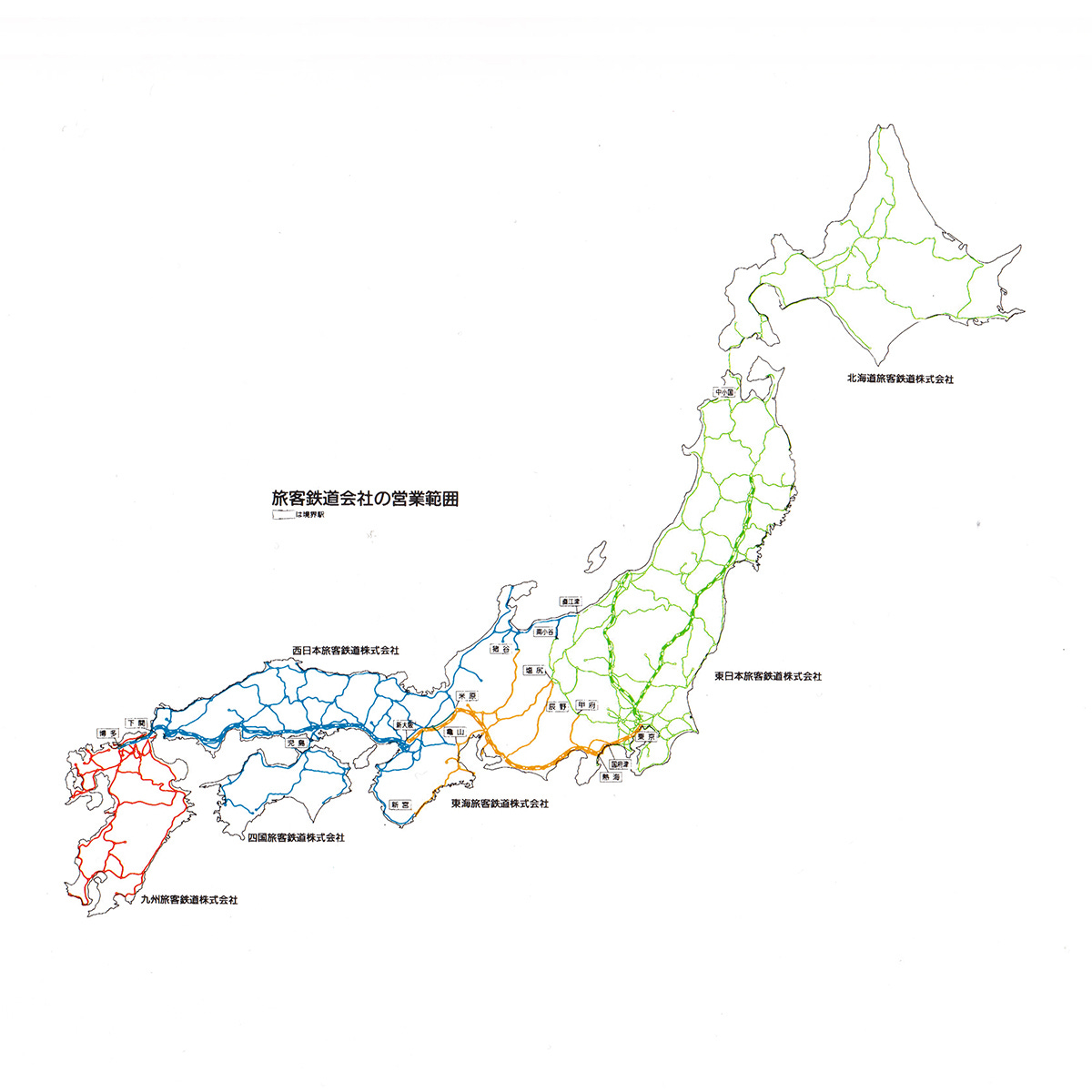
Having accumulated a growing amount of debt the national railway of Japan was privatised in 1987 and split into seven for-profit railway companies; six regional passenger services and one freight service. These were collectively called the Japan Railways Group or the JR Group.
Normally, each new company would have had a new logo decided on by the management of these new entities. However, just like the post-war split of Mitsubishi, a single logo was felt to have been, in some ways, more useful and reassuring. Further, based on the feedback of JNR employees, it was decided that a single new visual identity for the network should be designed and applied all at once.
On November 28, 1986, the same day that the JNR privatisation bill was passed, Nippon Design Center (NDC) (also read: TEPCO) was commissioned to begin development on the new image. The NDC team included Creative Director Yusuke Kaji, Art Director and designer Yoji Yamamoto, Supervising editor Kazumasa Nagai and Producer Ikuo Kenmori. The communications agency DENTSU were also involved.
While the post-privatisation name would be ‘JR Group’, there were two potential directions for the design of the logo, JR (Japan Railway) and NR (Nippon Railway). This was a time when using ‘J’ wasn’t as common as it is today (see: NTT). The decision to use either JR or NR would be dependant on whether one or the other worked better as a logo. Designer Yoji Yamamoto later recalled that he was really excited about this opportunity.
The rail network would relaunch under the new image on April 1st, 1987, giving Yamamoto less than 124 days to deliver the final design and prepare assets for a press release.
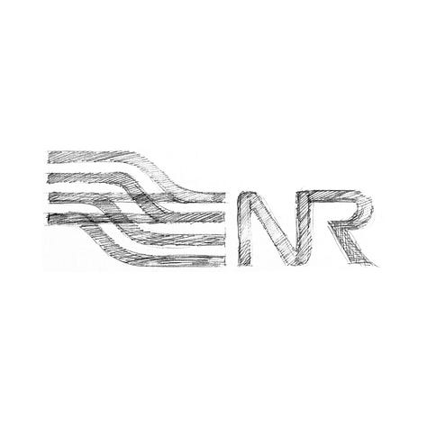
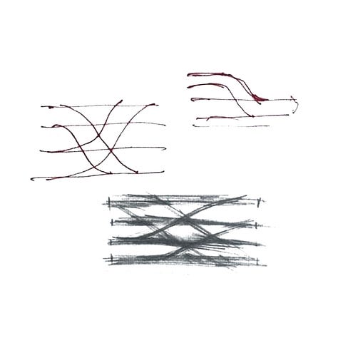

More than 100 concepts were submitted for consideration. In addition to various ‘JR’ and ‘NR’ monograms, there was also a proposal to represent the rails of six of the passenger companies in symbolic form like British Rail, an iconic initial "R" for ‘Railway’, and an idea that focused on a numerical device, numbering each line.
On January 16th 1987, the final design was selected from two options. This was a simple design that combined the letters J and R to form a single continuous line in the same spirit as Canada National Railways. A ‘basic design that wasn’t gimmick’, something that Yamamoto stayed true to throughout his career. On the design of the JR logo Yamamoto suggested that trains move in both directions, rather than in one direction. Therefore, he designed the letters so that it would not feel strange seeing these move to the right or left.
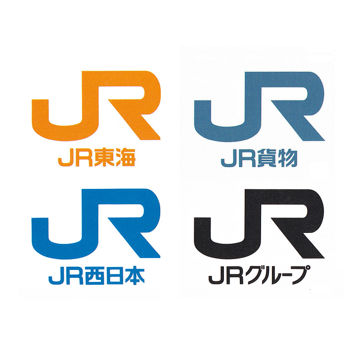
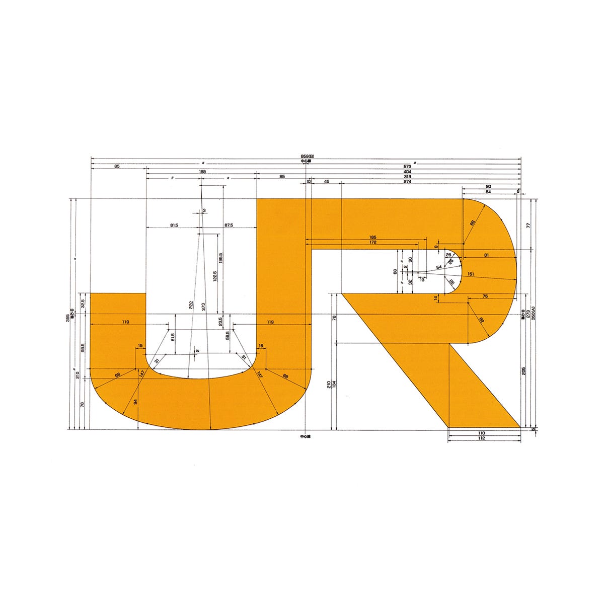
To improve legibility and recognition at high speed–Japan had and continues to have one of the fastest rail services on the planet–the letters were made intentionally wider. The extended JP letterforms and their connection were also designed to give the viewer the impression of speed, even when static.
It is said that the JR logo designed by Yamamoto popularised the use of ‘J’ over ’N’, and led the way for many others such as JT – Japan Tabacco and The J League.
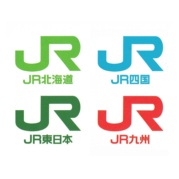
After the logo was settled on, each company's symbol colour was selected. President candidates from each company chose from among 15 options, giving each a sense of ownership and distinction within the network.
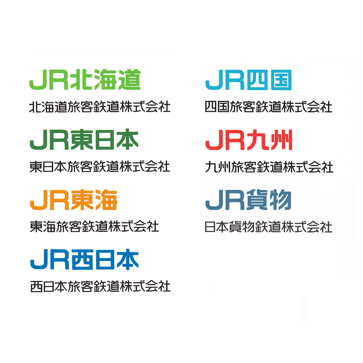
The next step was to create logotypes for each JR company to sit alongside the monogram. This was at a time when computers were not as advanced as today, so photoengraving, hand lettering and tracing was the approach, and done for every character and for every logotype across the JR Group.
Typography and other design elements were approved at 5pm the day before the printing of the press release that would announce the new logo. Despite this, Yamamoto was concerned about the details. "Once it's decided, it's used all the time. Those parts that bothered me would remain." With this in mind, he redid all the lettering for all the companies overnight and had it ready to print at 10 a.m. the next morning.
The work didn’t end there, once the logo and logotypes were settled on and the new image launched, the vast quantity of other design elements would need to be created, from flags to business cards, to badges, envelopes and ticket machines as well as the guidelines necessary for consistent fabrication of signage and the printing of corporate stationery.
The only trains scheduled to run with the new JR mark on April 1 were some limited express trains and commuter trains. However, it was decided that all trains should be equipped with the new design as quickly as possible.
There were only five hours between the last train that ran on the March 31st and the first train on April 1st, and a total of 10,000 vehicles in service. Just like NTT, the immediacy of its overnight application would provide a strong signal to passengers that JR was beginning a new era. To oversee this, Yamamoto developed instructions for all vehicles nationwide to complete the work in this short time. JR Group employees, without experience of livery application, took on the challenge, and personally placed the logo on the passenger trains just in time.
Discover more Japan Railway brand assets and assets from hundreds of other historical and contemporary brands at Brand Archive.
Thank you for subscribing to Logo Histories. If you enjoy reading this short you may also enjoy these resources from the same team:
New! Portal – Post design-driven jobs for free.
Brand Archive – Research tool for brand designers.
LogoArchive Website – Searchable modernist logo archive & research tool.
LogoArchive Shop – Vintage design books & LogoArchive Zines.
BP&O – Contemporary design editorial.




A logo like the 1967 one for Japan Railways is absolutely invigorating and exciting!