The dynamic loop
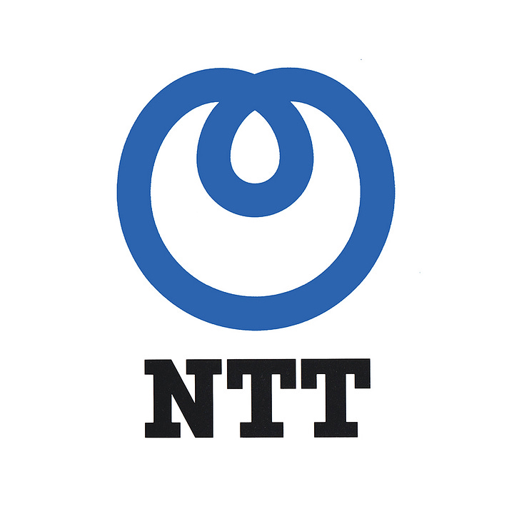
Yūsaku Kamekura's 1984 logo for Nippon Telegraph & Telephone Corporation.
This post is supported by LogoArchive – The home of historical logos. Discover over 4000 of history’s best designs from the world’s finest designers. Always find the logo inspiration you need for your next project here.
Following WWII, during the occupation of Japan as the country rebuilt, its telecommunications system was operated by American company AT&T. This responsibility was handed back in 1952, and Nippon Telegraph & Telephone Corporation (NTT) (Nippon Denshin Denwa Kōsha) was reestablished as a state monopoly. From 1952 to 1984 NTT used a logo created from two inter-connected ‘T’s caught in a loop. This can still be spotted on old manhole covers throughout the country today.
In 1985 a governmental programme of industry privatisation was initiated. This was intended to develop competition within the country's telecoms market, improving services and reducing cost. This would see NTT spun off into a private corporate entity on April 1, 1985, ending its 115 years run as Japan's only telecommunications service.
The NTT corporate identity program (CI) was initiated in 1982. This would position the company ready for a new competitive landscape and help employees gain a better awareness of their roles within this.
Rather than institute internal educational drives, NTT concentrated on replacing the ‘timeworn’ symbols of its monopolistic past with something ‘fresh’. This would broadcast to the general public that NTT had undergone major change and its employees now assumed attitudes more responsive to public expectations. Further, the new corporate identity sought to give the impression that NTT was constantly innovating and putting clients, people and society at the heart of its business.
The sheer scale of such a project, Japan’s largest at the time, required a team of experts. Design and development would be handled PAOS who, using their open source approach, would bring in specialists such as Yūsaku Kamekura. Responsible for producing the vast number of applications would be Dentsu Inc. This would eventually included over 13,000 designed items.
Under the direction of Motoo Nakanishi (PAOS), Yūsaku Kamekura would be responsible for devising the NTT logo. This new logo was required, as outlined by NTT president at the time, to have a ‘simple and impressive form’ with a ‘space-age quality’ suggesting ‘optical fibres’.
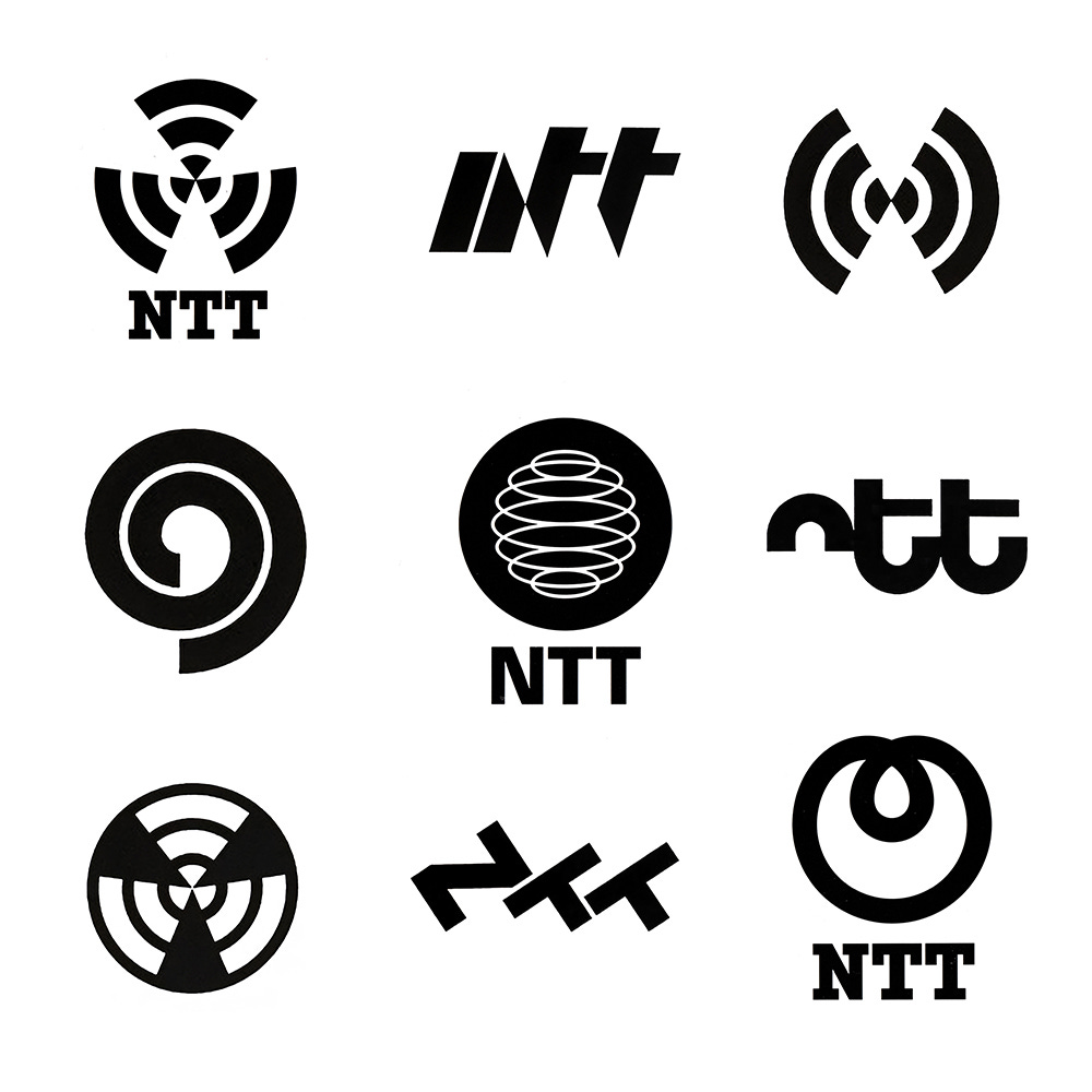
Kamkeura began by concentrating on sketching, producing over 150 initial ideas using paper and pencil. Of these, about 40 of them were full-resolved concepts. These were narrowed down and developed further. These included variations on the letters NTT, radiant shapes, spirals and globes.
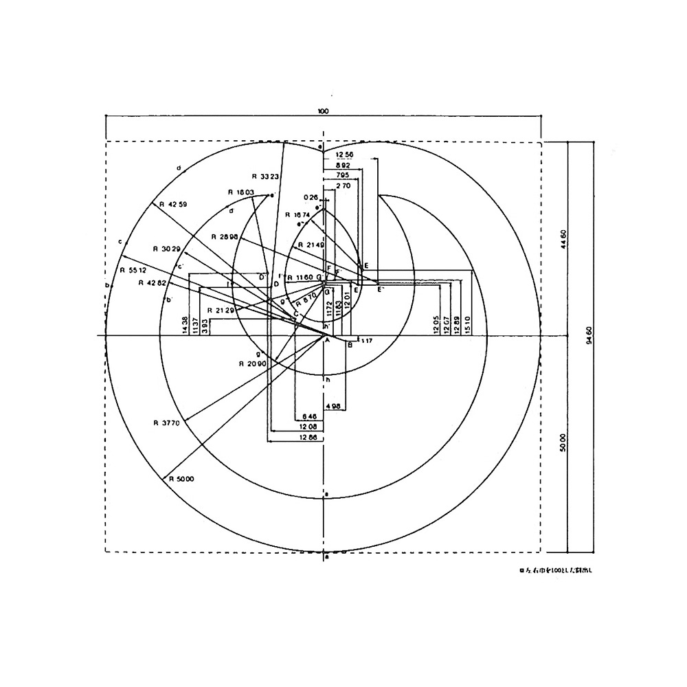
A concept seen as having promise was a simple circle and loop. Kamekura created many variations of this using a process of trial and error. This included changing the thickness of the lines and making the loops larger and smaller.
Kamekura submitted 10 concepts, however, Nakanishi saw what would be later be called the ‘dynamic loop’ as the standout. He pressed NTT to adopt it.



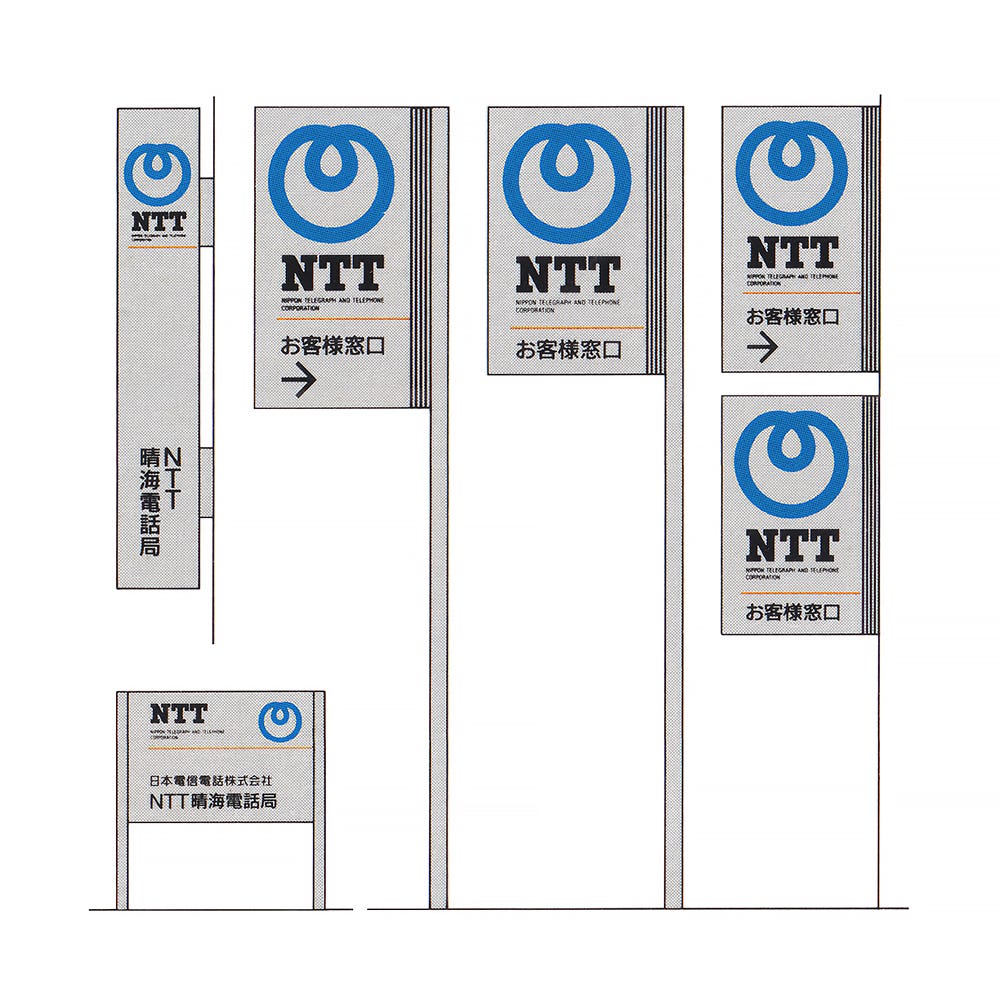
A crucial focus of the CI development process was conveying NTT's public service role. It had become a familiar landmark at the heart of every regional community with hundreds of facilities and 2,000 phone offices nationwide. A swift and coordinated change, employing thousands of fabricators, would impress upon the general public at large, the new face of NTT and cast an aura of technological leadership. The new look would pop-up almost overnight. Furthering this sense of social responsibility, signs would be designed to blend well with the buildings they adorned and would scenically contribute to their surroundings.
NTT's sign system, through three basic elements: the loop, the NTT logotype, and the corporation’s full official name, would ‘transcend’ utilitarian function and symbolise its bold move into the arena of private competition. This was supported by a colour palette of ‘vivid blue’ and ‘appealing’ orange on a silver background. This intended to give the impression of NTT's distinction for technical excellence and precision. This would also extend to its fleet of over 40,000 service vehicles; a mobile medium to project NTT's new image in coordination with the mass signage switch.
Tadamoto Tadashi, who had designed a similar logo in 1976 (applying for but being rejected a trademark registration in 1980), raised doubts about the copyright of NTT’s logo, and the matter was reported in the newspapers. There was a suggestion that the case may be brought to court, however, a peaceful settlement was reached and the NTT logo continued to be used right up until today.
Surveys after the swift implementation of the CI programme showed that the majority of people in their 20s and over half of those 60 and up could identify NTT's new logo and, moreover, satisfaction with its ‘service posture’ and ‘corporate future’ had improved substantially, providing a foundation from which to build on within the new competitive landscape.
If you enjoy reading this you may also enjoy these resources from the same team:
Brand Archive – Research tool for brand designers.
LogoArchive Website – Searchable modernist logo archive & research tool.
LogoArchive Shop – Vintage design books & LogoArchive Zines.
BP&O – Contemporary design editorial.


