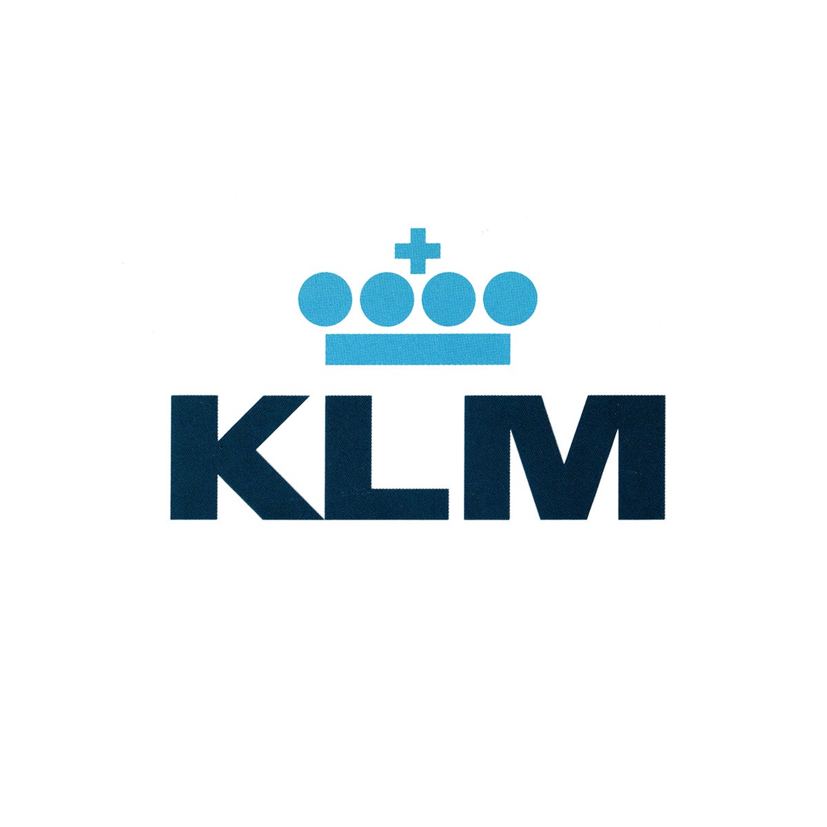
🔥 KLM by Henrion Design Associates, 1961
The story of Henrion Design Associates 1961 logo for Dutch airline KLM.
This post is supported by LogoArchive – The home of historical logos. Discover over 4000 of history’s greatest designs from the world’s finest designers. Always find the logo inspiration you need for your next project. Start here.
Koninklijke Luchtvaart Maatschappij (Royal Dutch Airlines) abbreviated to KLM, was founded in 1919 and is the flag carrying airline of The Netherlands. Even in the 1960s it was among the oldest and best known international airlines, and was a widespread organisation with operations all over the world.
In 1960, KLM entered the jet age, introducing the Douglas DC-8 into its fleet. As noted in Idea 114, “a large corporation can rarely afford to make a sudden and complete break with its past, even if its management wishes to do so”. The introduction of new aircraft presented an opportune moment for KLM management to address issues it was having with its visual identity. It was felt that, at the time, the airlines’ corporate identity was perceived as being ‘out of date’. And further, the company was struggling to standardise this visual identity throughout a widespread and growing global operation. And zooming in, the graphic elements didn’t function well, specifically, the diagonal stripes changed direction relative to the side of the vehicle it was being used on.
Although KLM management were said to have been open to an entirely new logo, market research had suggested that the initials KLM, the crown and the stripes were well-established. They were widely recognised and carried with them the association of goodwill on the part of passengers. However, these elements were lacking a sense of modernity and a coherently governed design policy as it continued to grow.
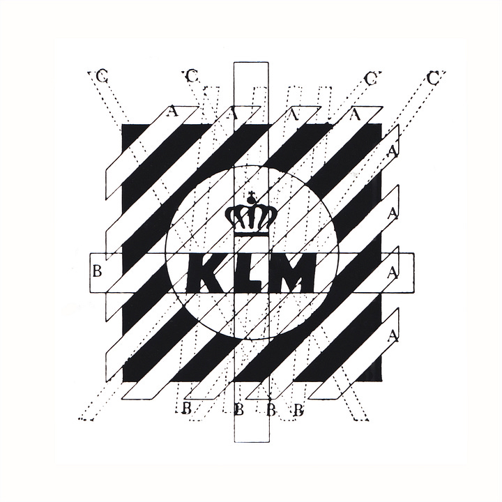
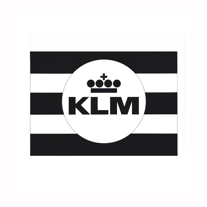
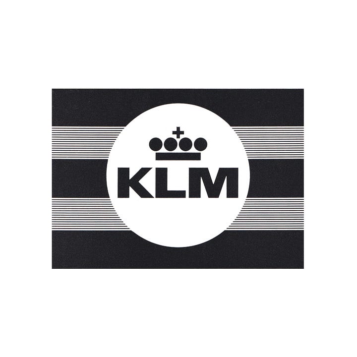
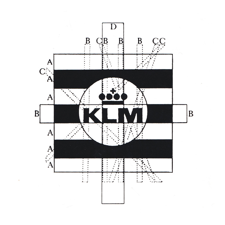
To minimise upfront cost, lower the wastage of materials carrying the old visual identity, and with consideration given to the effect of lost revenue from withdrawing aircraft to be repainted, the changeover period from old to new would be a long one. With this in mind, the proposal put forward by Henrion Design Associates and FHK Henrion (National Giro, LEB, Blue Circle) working in collaboration with W. Brinkereve of KLM, was to modernise the existing assets of the initials, crown and stripes. This would improve their overall impression, flexibility and continuity of the visual image across the entire international operations of the airline but would not be disruptive and fragmented as it was rolled out incrementally, as planes came in for service.
Improvements came in a change from diagonal to horizontal stripes, reducing the number and increasing the thickness. This new configuration, maintained the same direction on either side of vehicles and the overall impression was simpler, bolder and more immediate, especially from a distance.
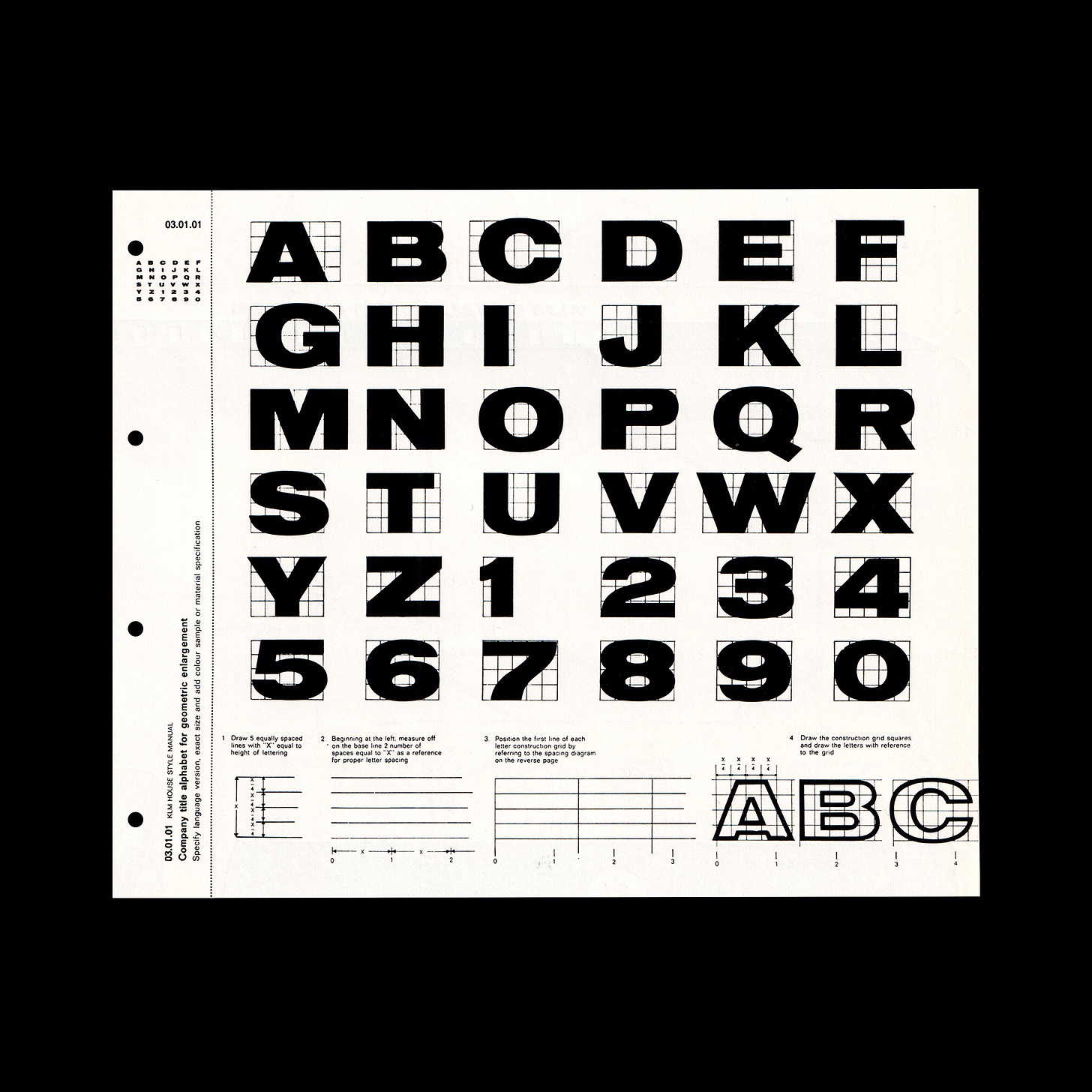
The lettering of the initials was also reviewed. These were extended, more in line with the length of the aircraft; an important contextual consideration. Together with an increase in weight and stroke contrast these letters were also made bolder and clearer.
The crown, a key component of the KLM visual identity, and tied to the name ‘Koninklijke Luchtvaart Maatschappij’ (Royal Dutch Airlines) was the subject to a number of studies and tests. Many variations were created. These iterations were measured under different conditions such as from a distance, in motion, at a sharp angle and ‘low attention’. Under these conditions, the most abstract crown, reduced to just a few geometric elements and disparagingly described in one meeting as an "IBM Crown", was discovered to be more ‘crown-like’ by gestalt psychologists. This also scored well in terms of modernity.
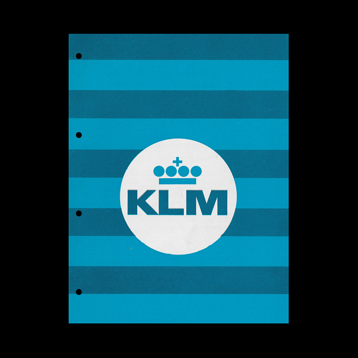
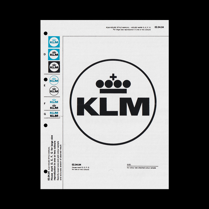
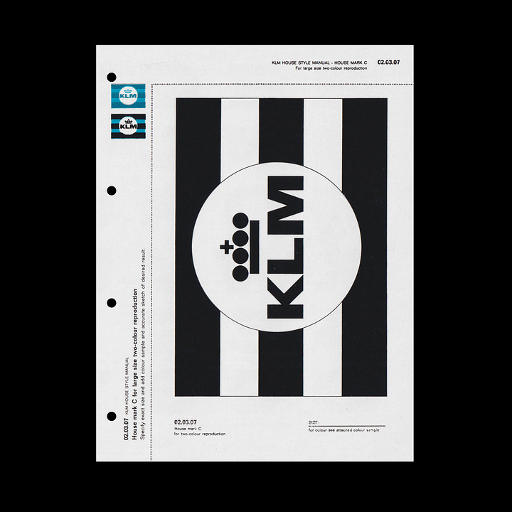
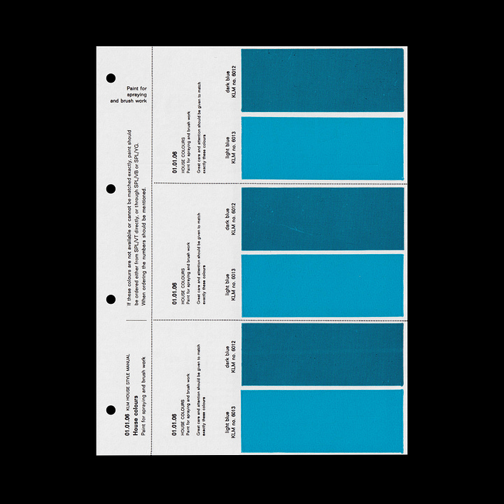
Once the elements were settled on, a system was devised in which maximum flexibility would be afforded to the airline, adapting the identity to a vast series of conditions and contexts. From the full set of elements (crown, stripes and initials) a series of ‘abbreviations’ where created. The stripes could flood an aircraft tail or the initials could be used alone, reduced down to just outlines and etched on to cutlery. This was the first time these elements had been used independently of each other.
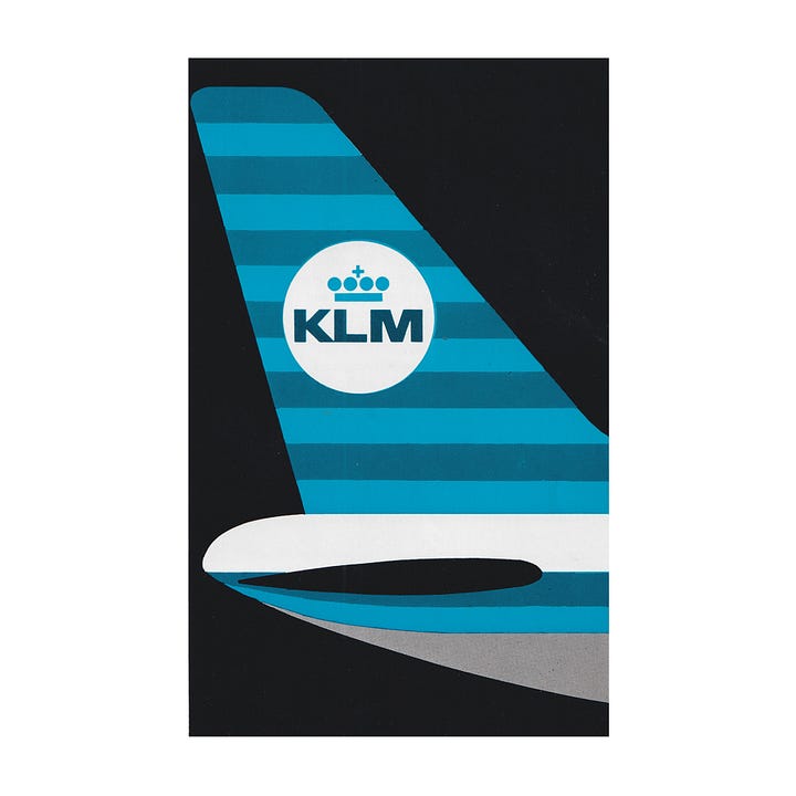

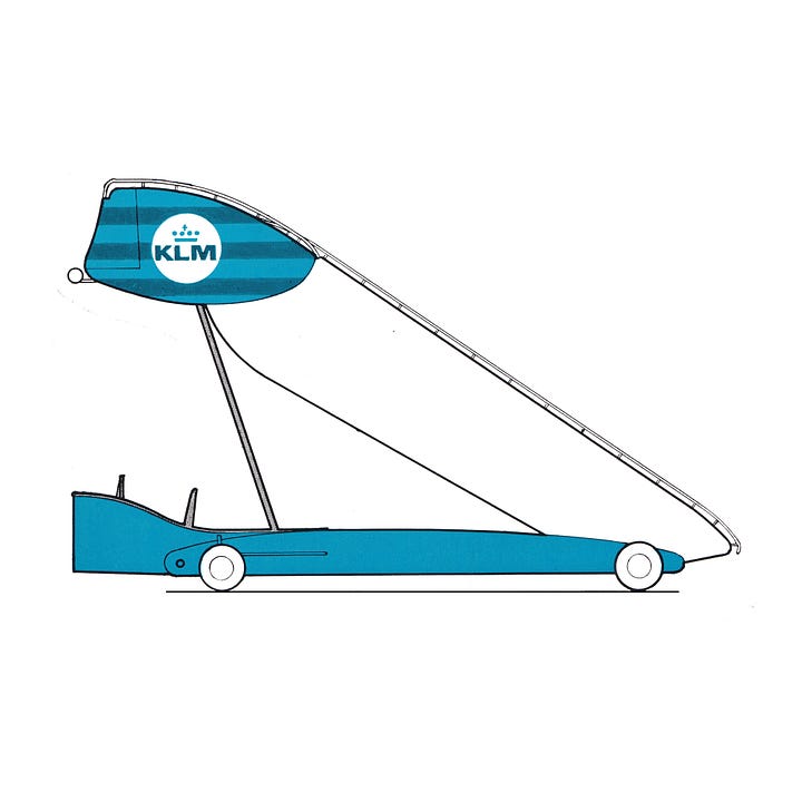
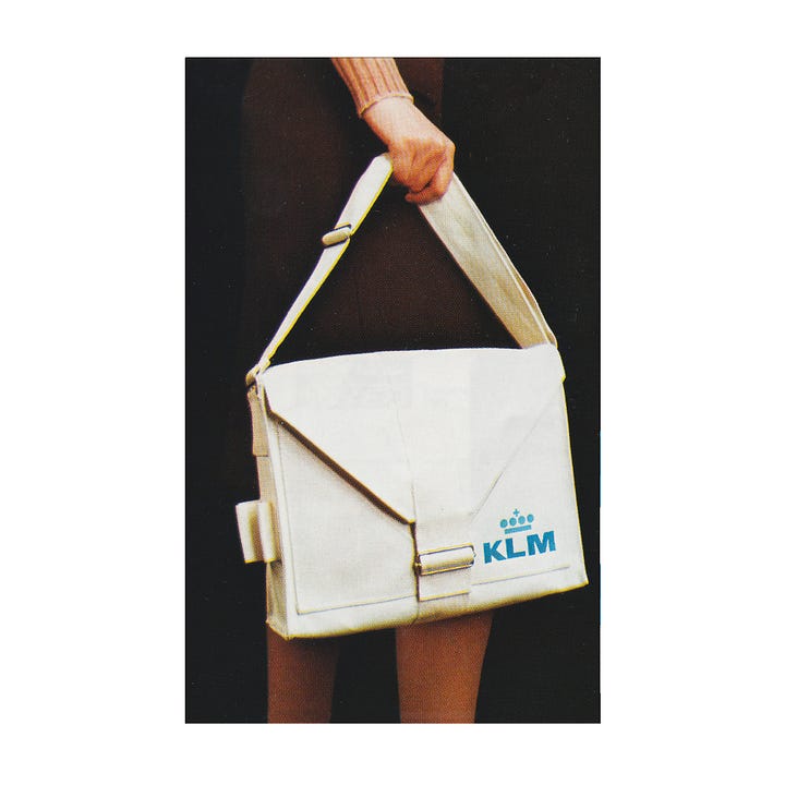
Other examples of these ‘abbreviations’ included a rectangle of stripes on buses; a roundel only version used on ground equipment; initials and crown on areas with limited height; and letters only, where space severely was restricted. This characterised the extreme scales and flexibility of Henrion Design Associates’ design for KLM, acknowledging the varied and diverse use-cases demanded of such an identity system. This allowed the airline to go further than what had been possible before in terms of continuity, recognition and usability. This set KLM up for the jet age, and the future as the continues to be used today. While the stripes are gone, the initials and crown remain unchanged.
Thank you for subscribing to Logo Histories. If you enjoy reading this you may also enjoy these resources from the same team:
Brand Archive – Research tool for brand designers.
LogoArchive Website – Searchable modernist logo archive & research tool.
LogoArchive Shop – Vintage design books & LogoArchive Zines.
BP&O – Contemporary design editorial.


