This post is supported by LogoArchive – The home of historical logos. Discover over 4000 of history’s greatest designs from the world’s finest designers. Always find the logo inspiration you need for your next project here.
The Electricity Act of 1947, passed 1st April 1948, marked the beginnings of the London Electricity Board. This, formed alongside 13 other regional boards, was part of Great Britain’s electricity supply nationalisation. Under the British Electricity Authority, these 14 area boards would fairly and economically distribute and sell bulk supplies of electricity to both industry and domestic consumers
For decades, London’s Electricity Board held a good reputation, with the acronym LEB proving recognisable and familiar. However, market research carried out by HDA International under the direction of FHK Henrion (National Giro, Blue Circle) in 1969 concluded that, despite this, the energy supplier’s visual identity system was perceived as old-fashioned and unattractive. This was particularly evident when compared to the modernised design policies of the Co-op and British Rail, created by Lippincott & Margulies and Design Research Unit, respectively.
According to surveys conducted by HDA International, the ‘weak’ existing corporate identity lacked consistency – in all areas regarding colour, logo and typography. This lack of a uniform and dynamic look undermined attribution and made it clear that there was a need for a new corporate identification system. This would need to be, not only modern and dynamic, but also extremely flexible, allowing for a wide range of applications.
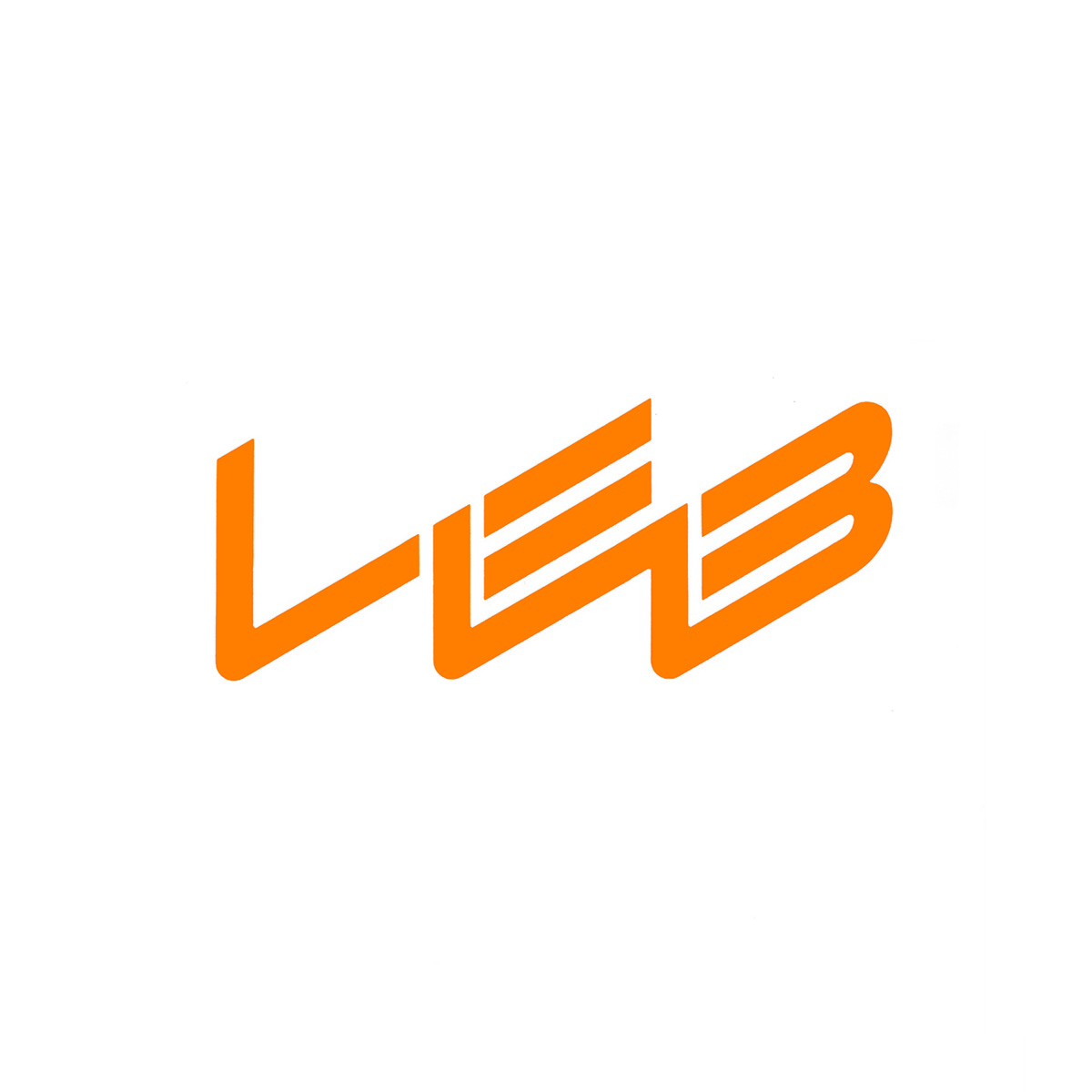
In deciding the final logotype, two directions were created; “LEB” and “LEctric”. Logotype one, “LEB”, was a dynamic development of the pre-existing ‘static’ logotype. Three consistent letterforms were composed in an angled formation; striking and evocative of an electric lightning bolt. Logotype two, “LEctric” was a ‘crisp’ short and pronounceable word, set in Helvetica, considered at the time as the bold, modern and legible at the time.
In order to gauge the effectiveness and popularity of these two logo designs, customer research was conducted outside of London, where respondents were unfamiliar with LEB. Surprisingly, the final tally was very close: of 889 (valid) respondents, 446 preferred “LEB” whilst 443 chose the “LEctric” identity. A three person difference!
Analysing the feedback, it was reported that “LEB” was perceived as eye-catching, modern, unusual but relatively complex and illegible. Meanwhile “LEctric” appeared relatively simple and very legible to respondents but also felt old-fashioned and passive. From these opinions, a decision was made to use the “LEB” design.
HDA International opted for a distinctive shade of orange as the main display colour, contrasting against the ‘blue’ of British Gas and providing the perfect connotation for warmth, friendliness, and modernity. This also gave many LEB offices throughout ‘grey’ London an eye-catching colour scheme that would be essential to helping the company stand out on buildings and on the street printed on the sides of vans, trucks and service equipment.
The logo, designed by HDA International founder Frederick Henri Kay Henrion, was introduced in 1971 and became renowned throughout London. Whether it was cast in metal, printed plastic fascias, or delivered on customer communications, it was widely recognised throughout the English capital until it’s retirement in 1990, following the 1989 Electricity Act, and subsequent privatisation of the retailer as London Electricity plc.
Key Takeaways
Market research was a critical part of corporate identity design. Studios like HDA International would often conduct focus groups to get feedback on design directions and measure outside perceptions.
Colour gives the identity much of its unique character and maximised with full coverage liveries. Understanding the grey urban environment that the identity would operate in led to a choice that was warm, inviting and differentiating.
While not competition directly with the likes of the Coop and British Rail, the new design policies of these companies had began a paradigm shift in corporate communications and visual identity. LEB needed to develop its image to maintain a sense of modernity and efficiency.
Thank you for subscribing to Logo Histories. If you enjoy reading this you may also enjoy these resources from the same team:
Brand Archive – Research tool for brand designers.
LogoArchive Website – Searchable modernist logo archive & research tool.
LogoArchive Shop – Vintage design books & LogoArchive Zines.
BP&O – Contemporary design editorial.