The continuity of the species
Lance Wyman's 1975 logo for the National Zoo.
This post is supported by LogoArchive – The home of historical logos. Discover over 4000 of history’s greatest designs from the world’s finest designers. Always find the logo inspiration you need for your next project. Start here.
The Smithsonian's National Zoological Park was founded in 1889 and, in the 1970s, was home to nearly 1,800 animals and more than 360 species spread across 163 acres of land in Rock Creek Park, Washington D.C. Prior to 1975, the zoo’s signage system, which employed hundreds of different design styles had become ‘disorganised’ and ‘inconsistent’. The results of an extensive visitor survey further confirmed this issue and precipitated the need for a cohesive system.
The National Endowment for the Arts–and as part of the Federal Design Improvement Programme (FDIP), an initiative to improve all forms of Federal communications through design–hired Robert E. Mulcahy as art director for the Zoo. Working with the New York-based design firm of Wyman and Cannan, Mulcahy set in motion the creation of a new graphics system and visual identity for the Zoo.
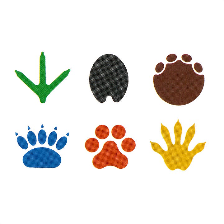


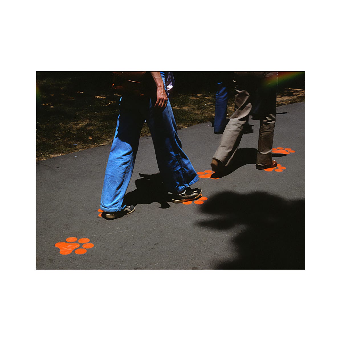
Wyman and Cannan’s proposal sought to establish a walkway through the Zoo and a series of individual trails that would take visitor’s past major animal exhibits throughout the park. The basic concept revolved around a totem structure of animal pictograms set within ‘soft squares’ and a series of animal footprints and colour system known as “trailblazers”. These would identify and guide visitors along six key trails; Crane, Zebra, Elephant, Polar Bear, Lion and Raccoon.
The graphics program was a diverse one, yet unified by the use of an "O' from a specially-designed soft square typeface. The "O" forms the frame for animal pictographs, the stacked structure of the totems and informed the design of map stands and visitor kiosks.
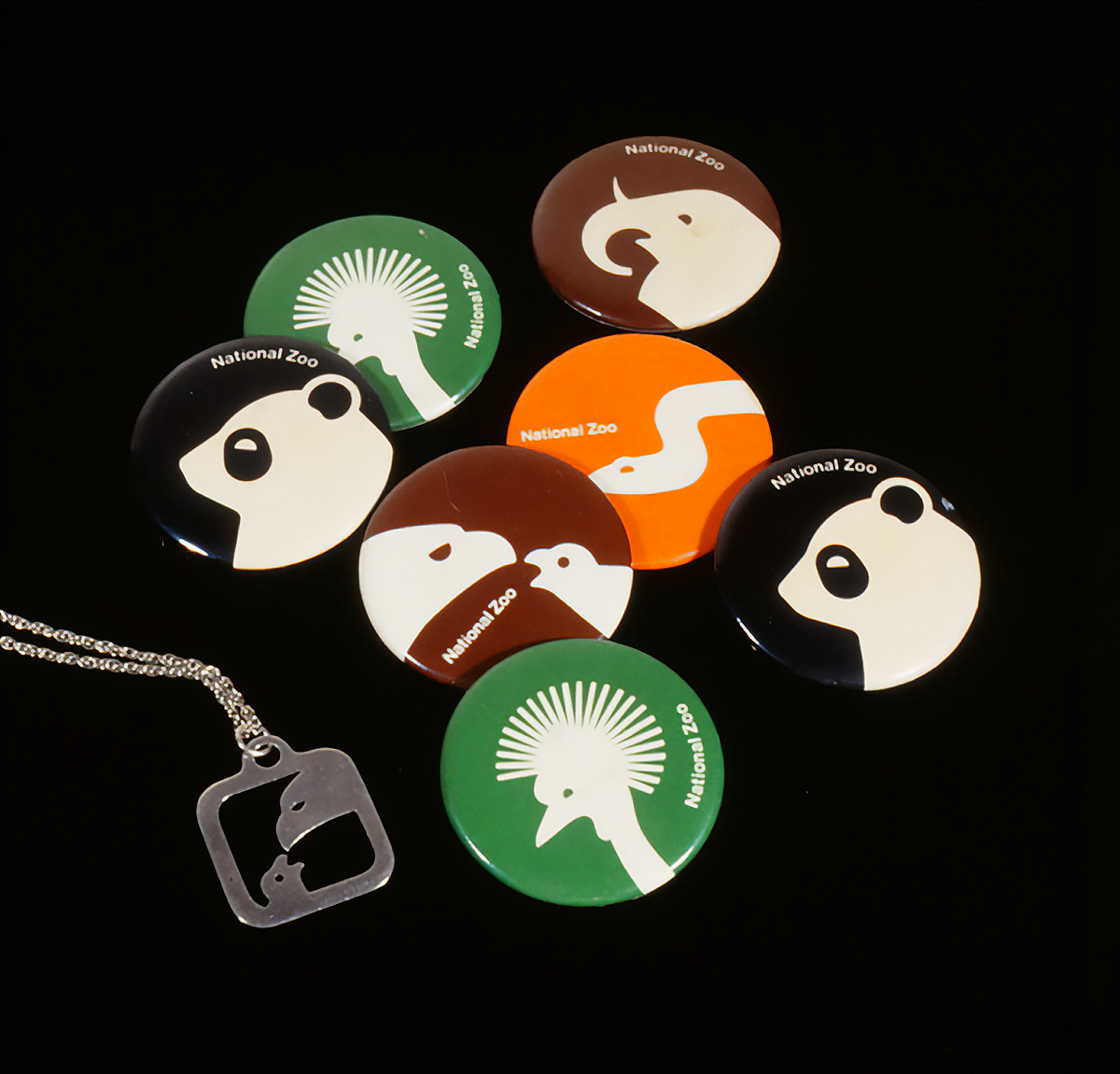
As well as the wayfinding system, Wyman and Cannan also devised a new logo for the National Zoo. Designed by Lance Wyman (USIA, American Bicentennial, Mexico ‘68), the logo depicted an eagle feeding a chick. This was set within the same ‘soft square’ of the pictograms, and that made up the ‘O’s of the Zoo’s new logotype. This was created in three different variations to accommodate different use-cases such as simple scaled-down icons, vinyl cut graphics, badges and metal stamped merchandise that included key chains.
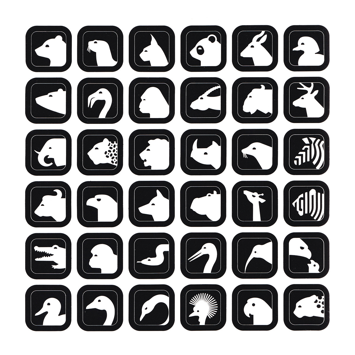
Conceptually, the eagle–chosen from an abundance of animals that were present in the zoo–was selected for its symbolic quality; a national icon for international visitors. The eagle and chick motif then reflected the broader mission of the zoo to raise awareness and, by extension, secure the ‘continuation of the species”. Lance Wyman notes in a special issue of the LogoArchive Zine that it took a lot of studies to combine the eagle and the chick in a way that suggested ‘care and continuation’, and was one of his favourite logos to work on. Alongside the logo, Wyman also devised an extensive set of animal pictograms.
The system provided a robust system and adaptability for an ever-changing attraction. Mulcahy and his design team at the zoo were able to continually evolve the system to suit the varying animal populations, introducing changes in keeping with the overall concept and design system created by Wyman & Cannan.
While the programme as a whole, including the totems, no longer exist, some elements are still present. The concrete ‘zoo’ sign remains at the front, albeit without the perspex inlay, and the pictograms continue to be used on maps and banners.
Thank you for subscribing to Logo Histories. If you enjoy reading this you may also enjoy these resources from the same team:
Brand Archive – Research tool for brand designers.
LogoArchive Website – Searchable modernist logo archive & research tool.
LogoArchive Shop – Vintage design books & LogoArchive Zines.
BP&O – Contemporary design editorial.


