Heritage, Horizon and Festival
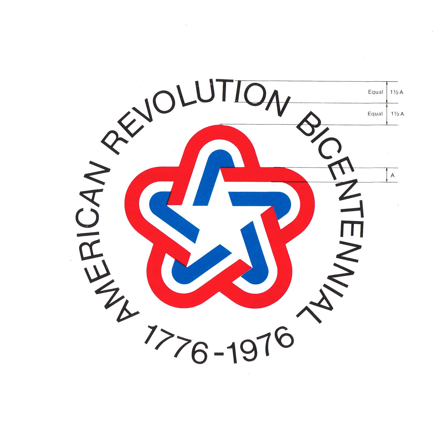
Bruce Blackburn's 1975 logo for the American Revolution Bicentennial
By issuing the Declaration of Independence, adopted by the Continental Congress on July 4, 1776, the 13 American colonies severed their political connections to Great Britain. By the 1900s, there were 48 and then 50 by 1976 as Alaska and Hawaii became states in 1958 and 1959, respectively.
1976 was to be a big year, the 200th anniversary. After the Watergate scandal and the Vietnam War, it was hoped that the next decade would lay the foundations for something better. The spirit of the American Bicentennial celebration of 1976 was supported by three key pillars: ‘Heritage’, ‘Horizon’ and ‘Festival’, and would celebrate the cultural heritage and traditions of the country through a diverse programme of events and parades. This was initially to be in the form of a single exhibition Expo ‘76 in either Philadelphia or Boston, however after six and a half years of debate, the Commission recommended that there should not be a single event. Congress dissolved it on December 11, 1973, and created the American Revolution Bicentennial Administration (ARBA).
To unify this extensive country-wide programme, ARBA sought out a symbol. This would be used to identify and merchandise the celebration. A competition was devised to solicit ideas from studios and designers from across the United States. This initiative would form an early part of the Federal Design Improvement Program (FDIP), a pioneering effort by the National Endowment of the Arts to improve the design and communications of the Federal government. The Bicentennial logo would be one of the first of many ‘improvement’ initiatives, and would go on to include The National Zoo, the Federal Energy Agency and the Environmental Protection Agency.
The symbol designed by Bruce Blackburn while working at Chermayeff & Geismar Associates is well-known and celebrated as a fine achievement in marque-making. The symbol would go on to be used on the side of the NASA Vehicle Assembly Building, on the Viking Mars lander and used across stamps, patches and all kinds of promotional materials, which accounts for its widespread recognition in the US. However, few know that Blackburn’s design was not the winning entry, that honour went to Lance Wyman (USIA, National Zoo, Mexico ‘68, Channel 5).

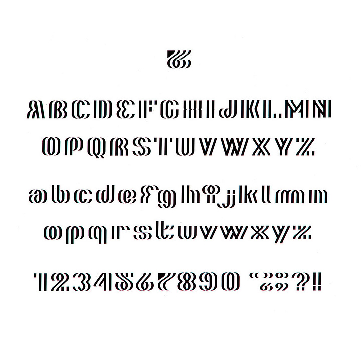
Lance Wyman’s entry was produced in the same spirit as the pioneering work done with the Mexico 1968 Olympic design team in that it was highly creative and went beyond just a logo. Wyman produced a compelling design programme with architect Michael Cohalan. Their proposed symbol, which was composed of a 7 and 6, reimagined the American flag in motion. They went on to develop a custom typeface based on this symbol and various architectural expressions derived from its form.


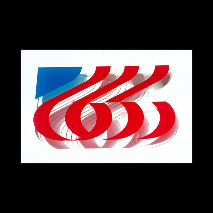
Wyman revealed that, although he won the competition, his programme wasn’t used as questions had been raised around him not having a US office with a significant staff. At the time, he was still working in Mexico. ARBA would go on to engage Chermayeff & Geismar Associates, where Bruce Blackburn created the logo widely-known today.
Further Reading: Lance Wyman: Process. A proposal for the 1976 USA Bicentennial identity.

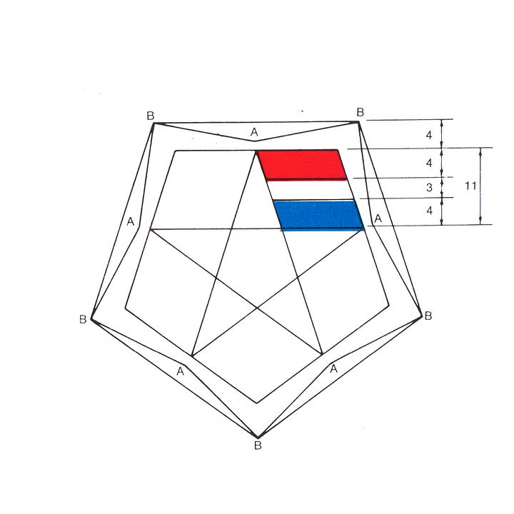


Blackburn’s design consisted of a white five-point star created within the negative space of red, white and blue ribbons. The rounded points moved a militaristic suggestion towards a ‘soft star’, something far more ‘accessible’ and ‘friendlier’ in keeping with a celebration, and calling to mind patriotic bunting. The double star (positive and negative) had further meaning, as this was the second century that was being marked.
Nixon, President at the time, felt it was not “governmental” enough and asked Blackburn to add a line of text around the star and, in opposition to the ‘soft star’ appearance, send it back towards an insignia with military feel.
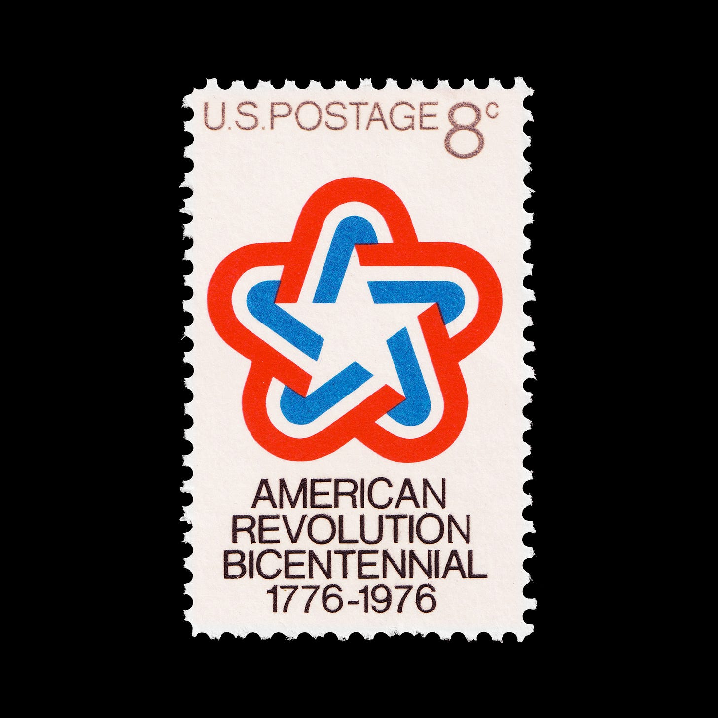
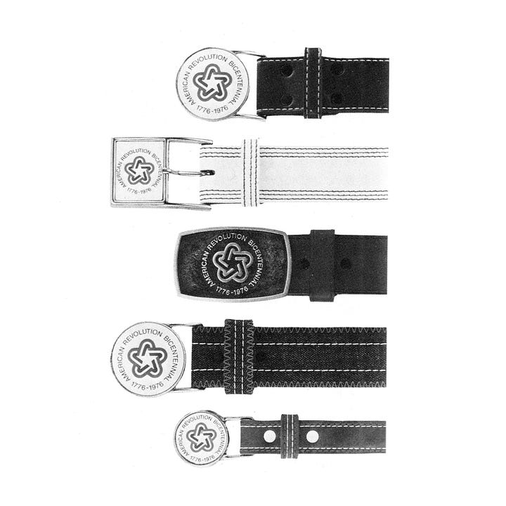
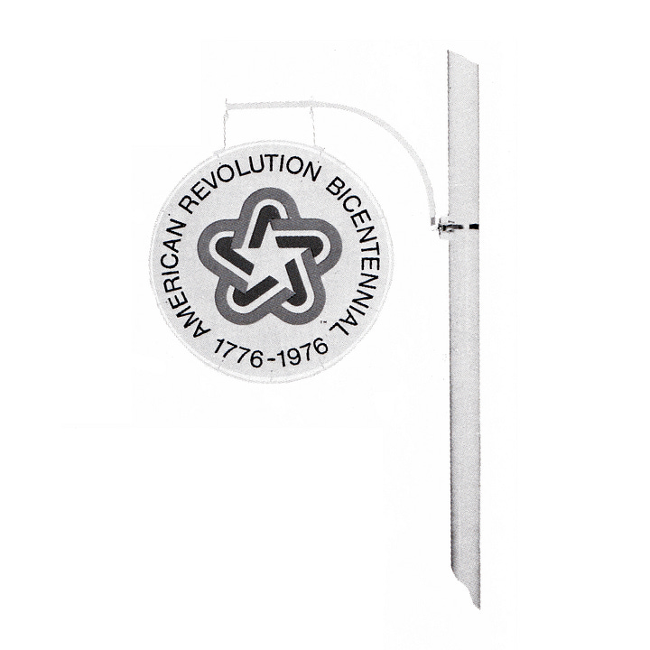
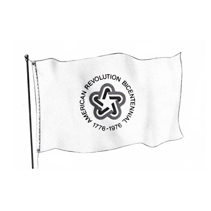
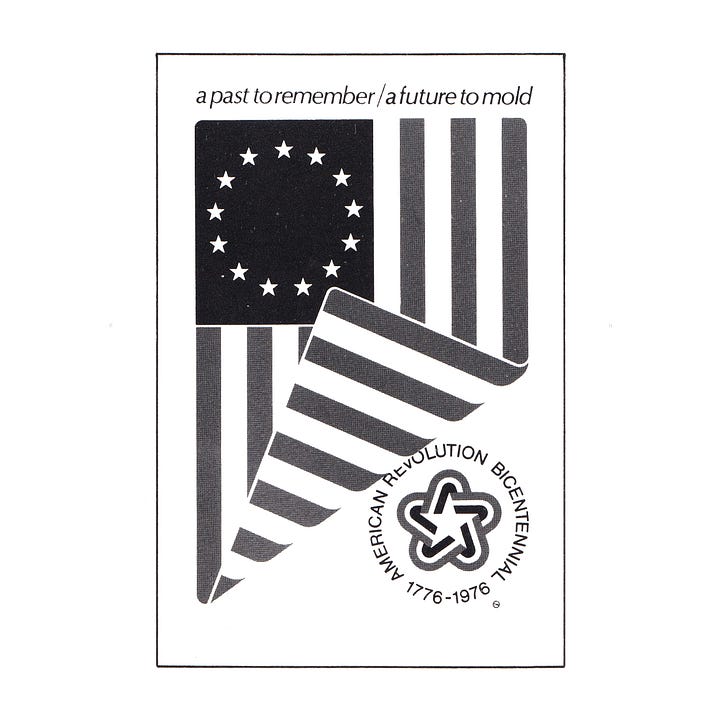
The final design displayed an exceptional capacity across sever scaling, from large format signage such as flags and signage to small pieces of merchandise such as belt buckles and stamps. It became a widely-recognised symbol during a period that needed to look forward.
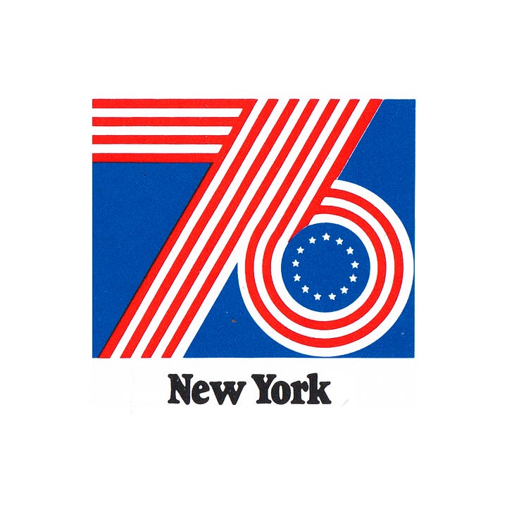
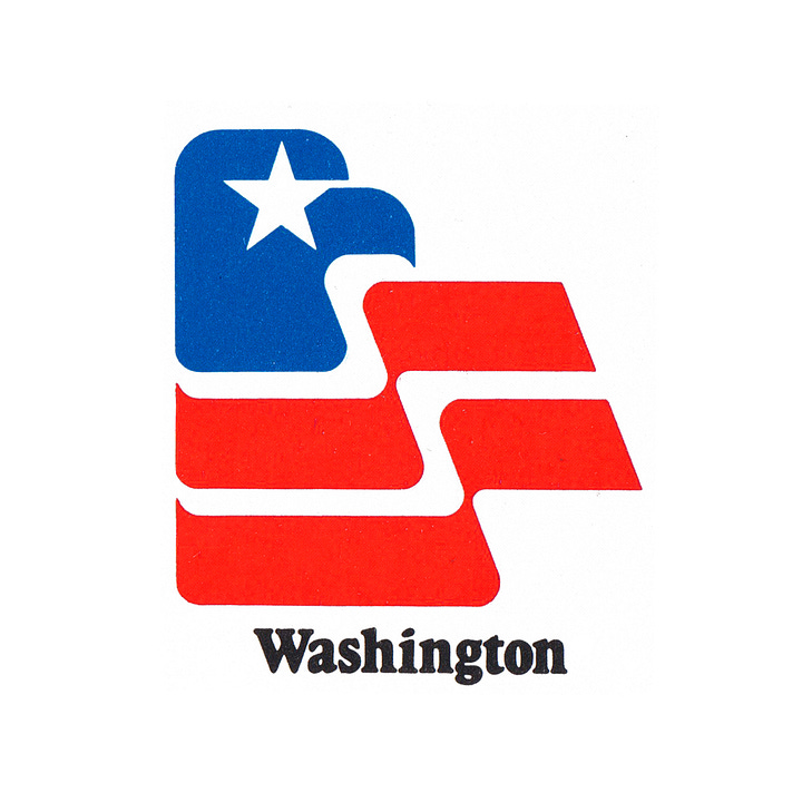

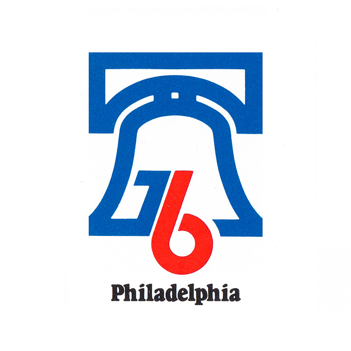
Alongside the American Bicentennial symbol, a number of city symbols were also created. The symbol for Philadelphia was selected by vote, with local residents using a mail in ballot printed in the daily newspapers. Five designs were put forward, with the winning design (shown) used for promotion, advertising and memorabilia connected with the city's Bicentennial Celebration. The winning design, created by Ruut Van Den Hoed, used the figure '76 to represent the famous crack and clapper of the Liberty Bell.
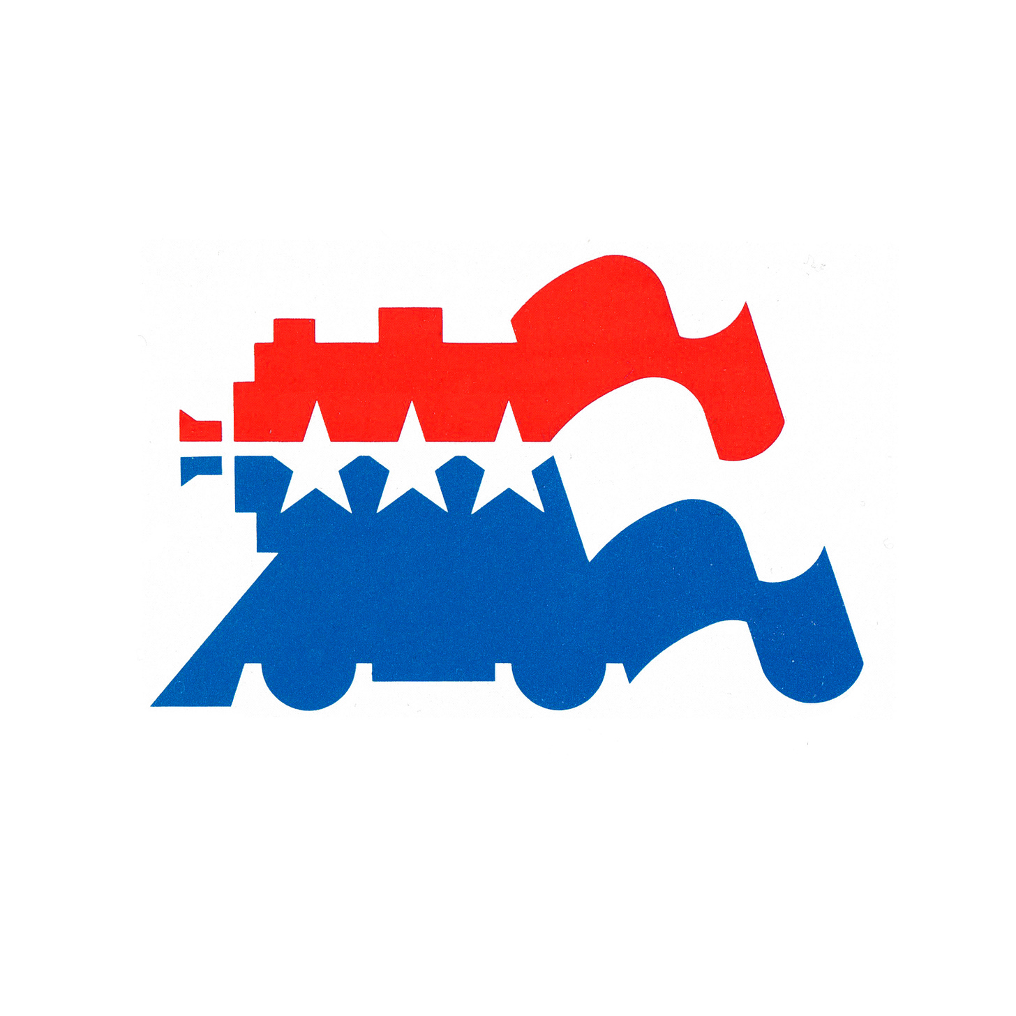
Connecting the events was the Freedom train, which travelled around the United States over the course of two years, taking ‘passengers’ around 76 cities via a travelling exhibition that was onboard. 22 carriages were packed with all kinds of American exhibits, and described as a museum of 200 years of America in motion. This symbol of a united states had its own logo, a train rendered as a flying flag.
If you enjoyed reading Logo Histories also check out these projects:
LogoArchive Website – Searchable modernist logo archive & research tool.
LogoArchive Shop – Vintage design books & LogoArchive Zines.
BP&O – Contemporary design editorial.
Perspectives – Unlocking opinion and insights from the past.


