


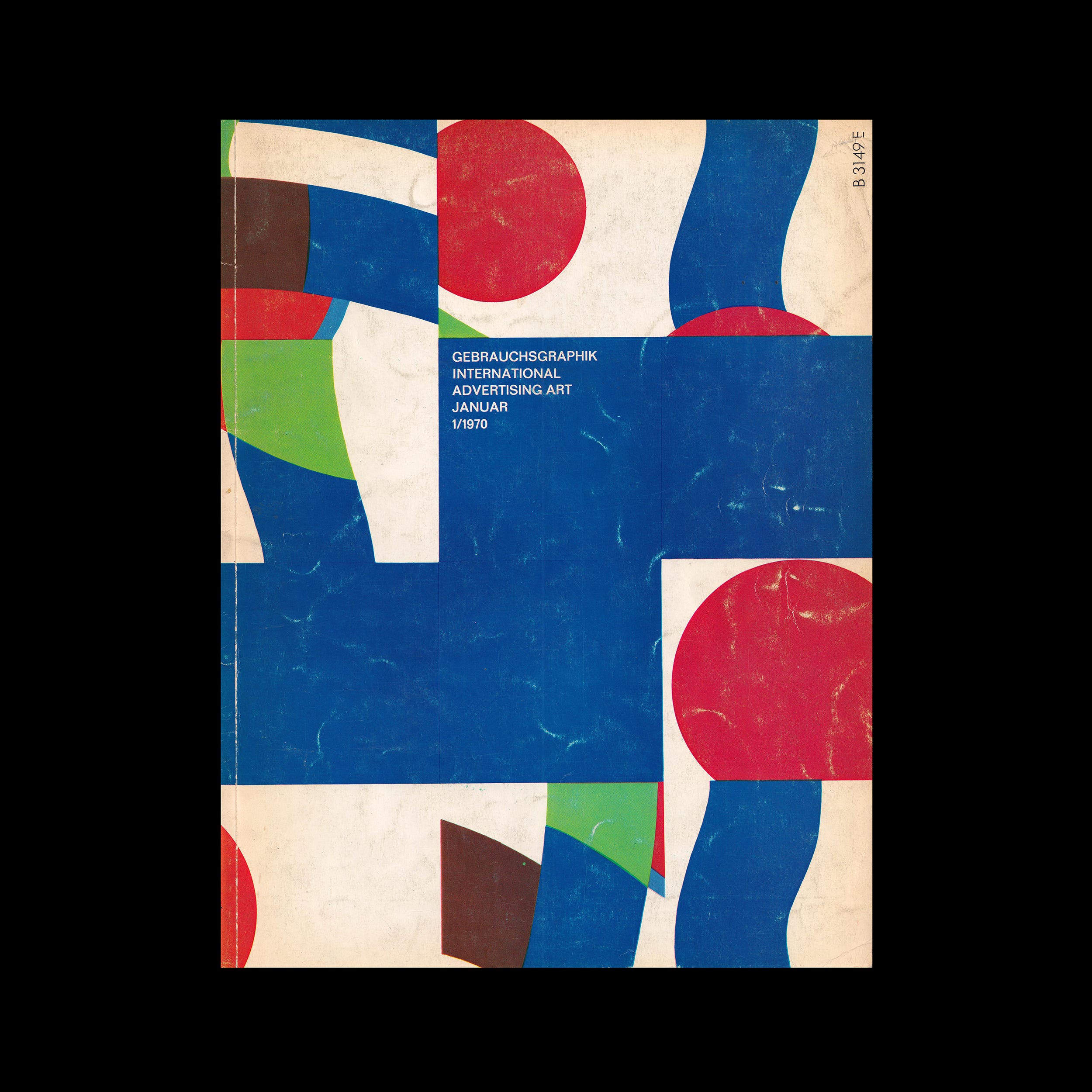
The following is an article published in 1970. In it, Franz Hermann Wills writes about the trade marks and signets of Poland.

The reduction of a mostly geometrical basic shape to that minimum size which still barely permits the distinction of the respective sign leads to an increasing number of frequently unintended cases of similarity and mistaken identity, which often provoke trouble and even law suits especially when the trade-marks or signets had been designed for highly competitive branches of industry.
Figures composed of letters, cogwheels in the machine building industry and retorts in the chemical industry are typical cases in point. What makes most of the Polish signs so engrossing is their simplification of realistic basic shapes, an approach which never entirely eliminates the personal note of the designer. Therefore, they are also more lively and less sober than the new signets of our own industrial enterprises.
Explore more like this in Logo Design History by Country →
Go behind the logos. Explore 200+ in-depth and meticulously researched logo histories revealing the designers, design decisions and ideas behind the world’s most iconic logos and important brand identities.
After two disastrous wars and all their dire consequences, after the rebuilding of the country and the new structuring of social, communal and commercial life, the revival of commerce and export provided Polish graphic designers with the welcome opportunity of creating signs, symbols, trade-marks and signets for industrial enterprises as well as for national and social institutions of all sorts. All of these designs which were either commissioned or created for contests betray that pleasure in playing with shapes and colours which we know from Polish poster art and which is inspired by folk-art. The duct of the lines is full of life sometimes even playful and only rarely ‘international’ i.e. without a recognisable trait of its national origin.
Much has been written about the advantages and disadvantages of trade-mark contests. The fact that many such contests have failed to produce gratifying results in Germany may be less the fault of the participating artists than that of the restrictive conditions and the attitude of the jurors, most of whom are far too sober to accept an unusual solution. It is quite true, of course, that virgin soil yields better results than long-tilled ground. Our contests for industrial enterprises would seem to have had their day. But the many newly established official and semi-official institutions should not simply content themselves with arranging meaningless letter such as EWG, ERP, EPF, FDP, NATO, SEATO, EFTA, ARD, BMW, INTERZUM, etc. but ought to try and find memorable visual images.
Want more in-depth articles? Check out LogoHistories’ other articles on European logos →


Thank you for subscribing to Logo Histories. If you enjoy reading this short you may also enjoy these resources from the same team:
Brand Archive – Research tool for brand designers.
LogoArchive Website – Searchable modernist logo archive & research tool.
LogoArchive Shop – Vintage design books & LogoArchive Zines.
BP&O – Contemporary design editorial.