The 'Big W'
Saul Bass/Herb Yager & Associates' 1972 logo for Warner Communications.
This post is supported by LogoArchive – The home of historical logos. Discover over 4000 of history’s best designs from the world’s finest designers. Always find the logo inspiration you need for your next project here.
Due to a financial scandal involving price fixing and car parks, the various entertainment assets owned by the Kinney National Company were spun off and reincorporated as Warner Communications on February 10, 1972. This reincorporation formed an entity with broad and diversified interests. These included music, motion picture and television production and distribution, book and magazine publishing and cable television.
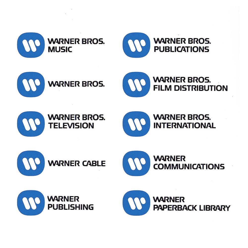
The Warner Bros. shield was extended to and shared by many of these companies. The addition of newly created and acquired companies, each with its own identification, had served to compound growing confusion around the corporation and its activities. Further, due to the widespread recognition of the shield throughout the USA and the World, Warner Communications was perceived primarily as a film company despite its many subsidiaries. This situation was considered at the time as not being an ‘optimum’ image for a corporation heavily involved in areas that were ‘more stable and predictable than movies’. With this in mind, it was agreed that the corporation needed to establish a new and coherent visual identity, one that could be used by all divisions, unifying varied operations without being impeded any pre-established associations with film. This would also leverage the corporation’s scale and reach to improve the overall visibility of the brand. Warner worked with legendary designer Saul Bass/Herb Yager & Associates to develop a logo and corporate identity that would fulfil these requirements.
The key element in the development of the new corporate and divisional identification system for Warner Communications would be a logo. Taking the initial ‘W’ as a starting point, various iterations were created and degrees of abstraction explored. Each made the most of the inherently dynamic character of the letterform, either standalone or placed inside a container. In their simplicity these would be able to accommodate the broad and diversified applications, on screen and in print.
The final design was described as being ‘somewhat electronic in character’ with a twisting cable-like form that conveyed the shared effort of the corporation’s sub-divisions to serve as communications-related entities, whether that be in music or print publishing, film production and distribution or as a cable provider.
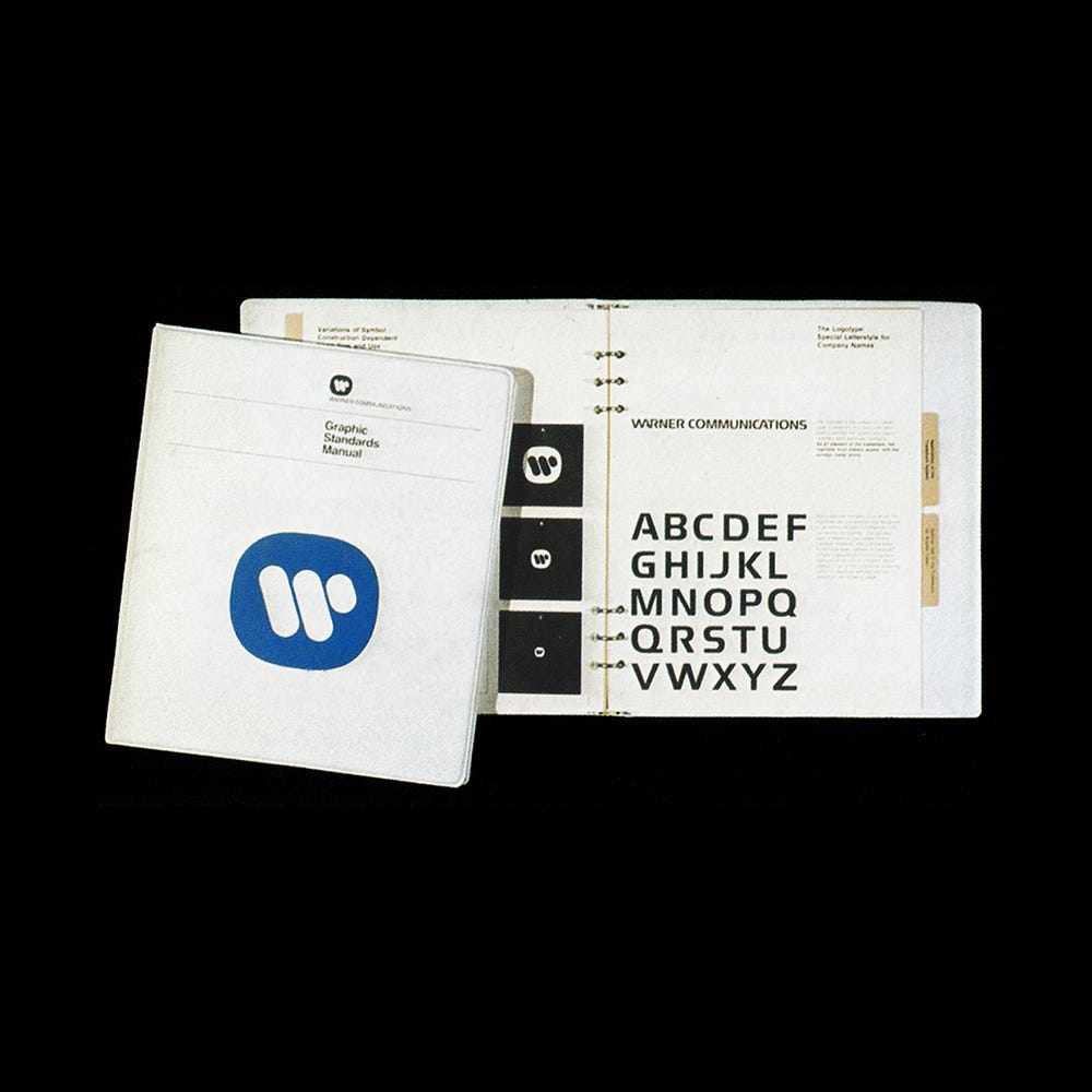
Alongside a formalised nomenclature, placing Warner at the front, each sub-division employed a consistent custom corproate typeface. This was an adaption of Handel Gothic, designed by Donald J. Handel in 1965 and who worked for Saul Bass. Adaptions included ‘WA’ and CA’ ligatures, cuts to the bar of the ‘A’, a square ‘E’ and an open ‘R’.
The logo, arranged either to the left or above centre-aligned, in conjunction with a blue and the consistent type style brought into coherence of the Warner organisation, and provide a future-proof continuity to a corporation that was expanding and evolving.
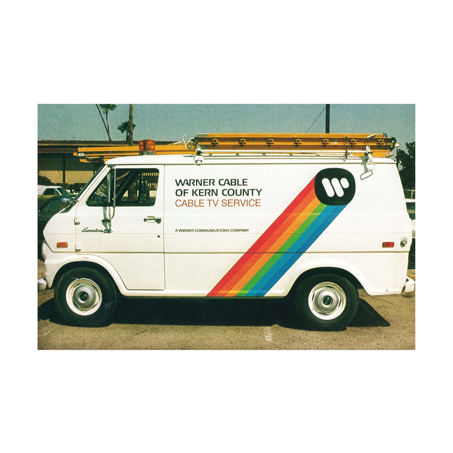
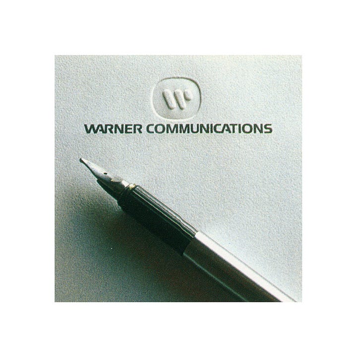
Due to the vast size and scope of Warner Communications the logo appeared on countless applications. It was used blind embossed on stationery and in motion for film and television. The bold and simplified design accommodated the vast array of use cases and, due to its simplicity and distinctiveness could withstand extreme scaling. By the mid-1970s, it was ‘almost impossible for a consumer not to see it each day–driving by on a van, in a magazine, or book, on television, or on records or film’.

What would be referred to as the ‘Big W’ would last until January 10, 1990. At this time, the logo was retired as Warner Communications merged with Time Inc. to form Time Warner. This new organisation was represented by the ‘ear-eye’ logo designed by designed by Steff Geissbuhler in 1989, while working at New York-based design studio Chermayeff & Geismar.
Thank you to Ryan Brotherston who found the iterations created by Saul Bass in an issue of the Hartford Courant dated Sunday, October 4th, 1981, and kindly shared these with Logo Histories.
If you enjoy reading this you may also enjoy these resources from the same team:
Brand Archive – Research tool for brand designers.
LogoArchive Website – Searchable modernist logo archive & research tool.
LogoArchive Shop – Vintage design books & LogoArchive Zines.
BP&O – Contemporary design editorial.


