


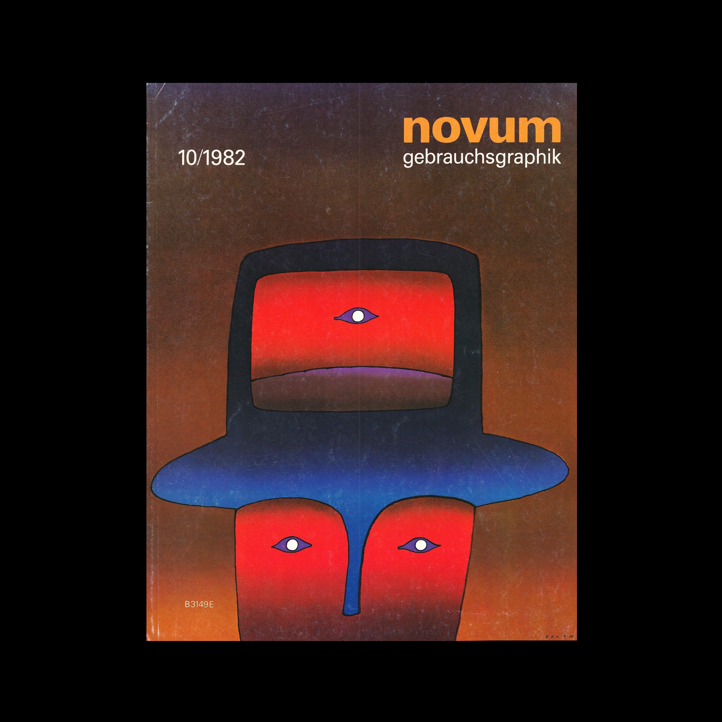
The following is an article published in Novum Gebrauchsgraphik, October 1982. In it, Tobias Christoph writes about the qualities of a good logo.

In a study investigating the comprehensibility and effectiveness of a sign, the so-called AIDA formula has been developed by promotional psychologists. The abbreviation stands for Attention, Interest, Decision and Action. This means that an effective sign will cause the following chain reaction:
It draws the observer's attention, thus raising his interest, which in turn is so great that a decision is made to buy something or to avail oneself of a service. The action of buying or being served follows.
Explore more like this in Logo Design Theory: Classic Essays on Trademarks →
Go behind the logos. Explore 200+ in-depth and meticulously researched logo histories revealing the designers, design decisions and ideas behind the world’s most iconic logos and important brand identities.
The following values are essential if a sign is to fulfill its function while being understood by the target group:
Eye catcher (attention) The sign must clearly set itself out from its surroundings; Statement (information) The sign should be unequivocal and convey a message; Originality (novelty) The sign must not be reminiscent of other existing signs. Quality of form (aesthetic point of view) The sign should combine its function with an aesthetic value and be so precise that it is easily remembered.
It is the designer's task to follow these four aspects in this order when processing his data collection. The sign should also have a pragmatic reference, i.e. it should fit in the right ‘climate’ and specifically refer to the product or service it represents. If a sign does not combine the four values mentioned it cannot serve the client in the way he wants to make use of it. Consequently, a sign may be regarded as thematically representative, graphically well translated and even concise, and yet it cannot be called an eye catcher. It simply does not attract attention. Or else, a sign may be insignificant because it can hardly be differentiated from other signs. Finally, the form may not be in harmony or unsuccessful. Whenever a sign does not ‘ring a bell’ in spite of its aesthetically perfect design the reason may be that it has missed the subject or makes the beholder think of another brand. A trade mark issued for a machine factory will certainly evoke other images than a mark for a cosmetics firm. What are the prerequisites for an aesthetically pleasing sign? The classic rules will help to give an answer: symmetry, the golden section, optical contrasts, a well-balanced relation between tension and tranquility and a harmoniously arranged layout. These are the principles every responsible designer will orient himself by when selecting a visual subject and its outward appearance from his wealth of sketches.

In summarizing, it can be said that styling is the decisive factor in proving whether the sign is impressed on the consumer's memory as a contraction of the company philosophy. Since the sign and product are interrelated, an association with quality will only be evoked when looking at a brand name if the product itself possesses quality. If a positive association is called up in connection with the object the sign represents, and this aspect is repeated each time the sign appears, the positive association will finally become a retained memory. For example, any one of us could draw the Mercedes star from memory. The sign was developed from an illustration of a steering wheel; it is visually trenchant. Yet taken by itself it awakens no associations. It is only through identification with the product that quality comes to mind in connection with the sign.
Want more in-depth articles? Check out LogoHistories’ other articles on classic logos and corporate identities →


Thank you for subscribing to Logo Histories. If you enjoy reading this short you may also enjoy these resources from the same team:
Brand Archive – Research tool for brand designers.
LogoArchive Website – Searchable modernist logo archive & research tool.
LogoArchive Shop – Vintage design books & LogoArchive Zines.
BP&O – Contemporary design editorial.