



Swissair’s modernist identity
When Swissair introduced its modernist corporate identity programme in 1953 it was seen as a significant achievement. Through the pioneering work of Rudolf Bircher, the airline was able to clearly express itself as a modern, resolute and dynamic airline visually through a cohesive design system, consistently applied to aircraft, vehicles, ground equipment, offices and advertising.
However, by 1978, air travel had significantly changed. Airlines had upgraded their fleets for the jet age and falling fares saw commercial air travel take off. The airline management felt that, to meet these cultural and technological shifts, it was necessary to update the airline’s values and image.
In the process of modernising their fleet and ahead of their upcoming 50th anniversary in 1981, Swissair commissioned Swiss designer Karl Gerstner to develop a fresh new livery for its aircraft. Gerstner went all in, presenting Swissair with a completely new visual identity and logo design.
This is one of twelve stories in our collection of the best airline logos, from Lufthansa in 1918 to Japan Airlines in 1989.
Key Takeaways
An update for a new era
By 1978 jet travel and falling fares had changed flying, so Swissair asked Karl Gerstner for a new livery ahead of its 50th anniversary.
Gerstner went all in
Rather than just a livery, Gerstner presented a complete new visual identity and logo after exploring warped type, winged arrows and an outward pointing cross.
The Swiss cross, emphasised
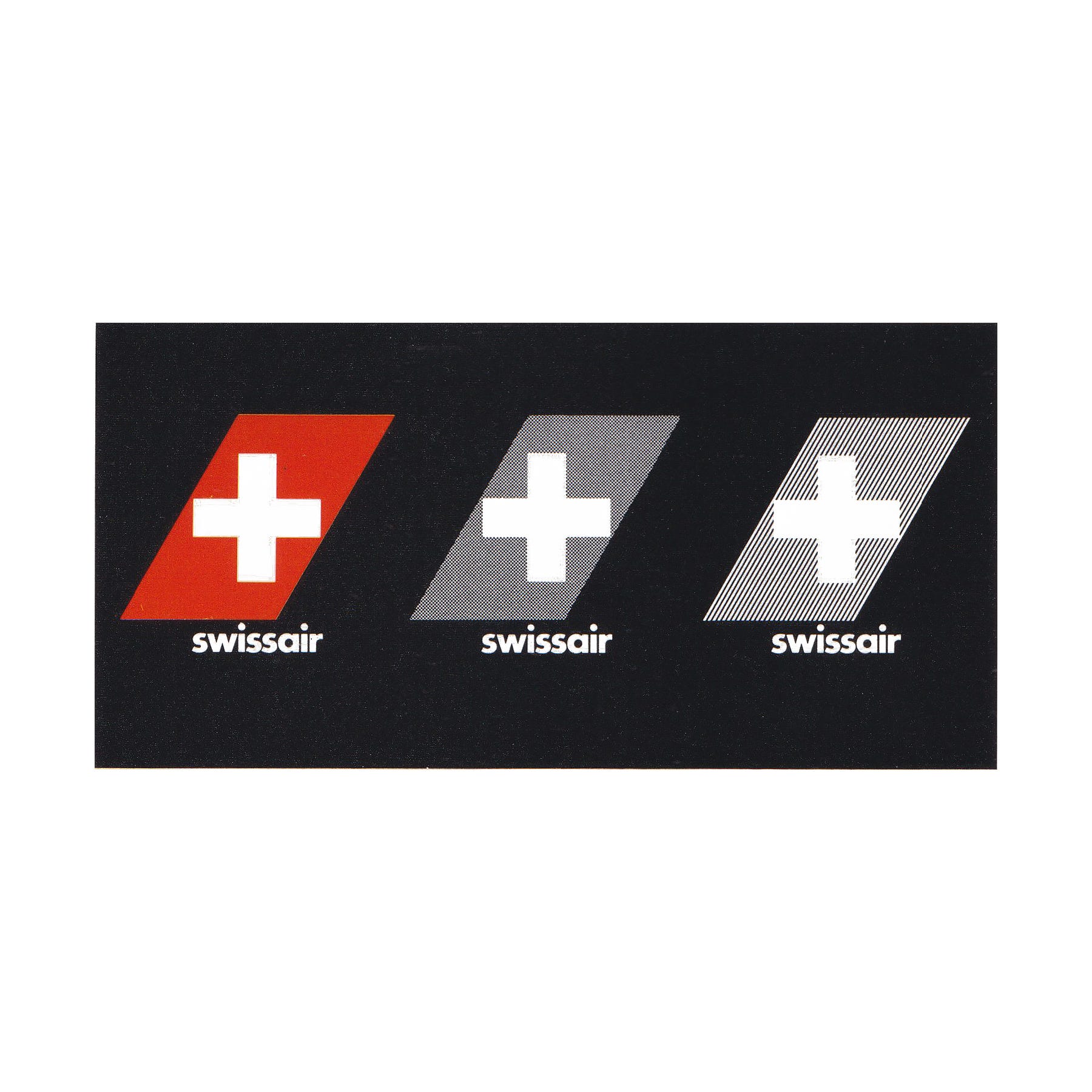
Gerstner placed the Swiss cross in a parallelogram, giving it a dynamic character and connecting everything Swissair produced to the image of flight.
Go behind the logos. Explore 200+ in-depth and meticulously researched logo histories revealing the designers, design decisions and ideas behind the world’s most iconic logos and important brand identities.
Karl Gerstner’s concepts


Gerstner explored a number of ideas. These included warping the name to give the impression of flight; a reinterpretation of Bircher’s winged arrow; and an outward pointing cross.
The Swiss cross in a parallelogram
Known for his simple solutions to complex problems, the final design proposed by Gerstner took something Swissair had always had, the Swiss cross, and emphasised it. Prior, the Swiss cross had featured on the tail-fins of all of Swissair’s fleet, rather than Bircher’s logo, which was positioned at the front.

By placing the Swiss Cross within a parallelogram Gerstner emphasised the national character of Swissair, its position as the nation’s flag carrier, and represented Switzerland more plainly than any other logo could do. Further, within a parallelogram the cross gained distinction, a dynamic character and, outside the context of the aircraft tail, connected all materials produced by the airline to the image of flight.
Continue reading to discover why Swissair chose Futura, how Gerstner pushed its red towards cinnabar, and how the identity launched in 1979 →
