The stillness of Tsukuba
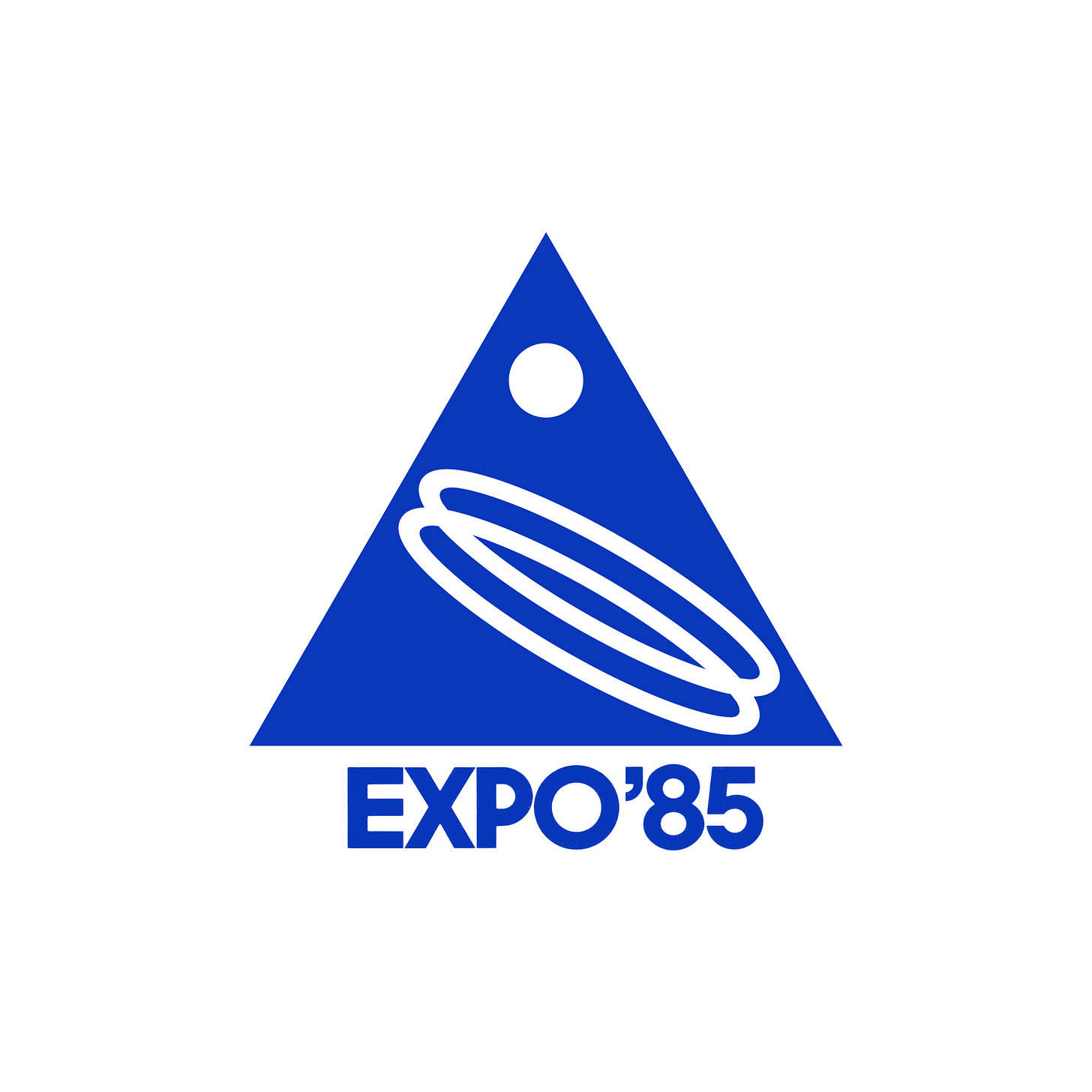
Ikko Tanaka's 1981 logo for the International Exhibition, Tsukuba Japan 1985.
This post is supported by LogoArchive – The home of historical logos. Discover over 4000 of history’s greatest designs from the world’s finest designers. Always find the logo inspiration you need for your next project. Start here.
The International Exhibition, Tsukuba Japan 1985 (国際科学技術博覧会, Kokusai Kagaku Gijutsu Hakurankai) shortened to Expo ‘85, was a world's fair held in Tsukuba Science City, north of Tokyo. The event ran from March 17 to September 16, 1985 with international exhibitors exploring the theme of “Dwellings and Surroundings - Science and Technology for Man at Home". Just like Expo '70, the process of procuring ideas and a final symbol came down to a competition and selection committee.
Kotani Shoichi, chairman of the publicity committee for the Expo, asked renowned Japanese designer Yusaku Kamekura (Shell, Fuji Bank) to serve as the chairman of the committee. Seven designers were selected to submit proposals, these included Ikko Tanaka, Takenobu Igarashi (Noritz) and Shigeo Fukuda. Although Kamekura was away at the time and wasn’t able to participate in this selection process, he was pleased by the variety. This variety also extended to the committee, which was made up of only three designers with the rest being a mix of songwriters, editors, actresses, cartoonists, sculptors and ‘people of learning’.
Kamekura later reflected on the diversity of the committee, expressing an initial trepidation, saying that variety can be a problem as there is a tendency for things to go off in absurd directions. There is a need for a chairman in order to keep discussions on the right track. However, in this instance, there was nothing to worry about. The composition of the committee fortunately resulted in everyone's opinions going naturally in one direction. The conclusion reached was that the proposals were ‘somewhat inadequate’, ‘lacking strength’ and did not display the ‘high-level depth of a completed form’ that they were looking for.
The committee wondered whether the designs could be revised, developed into stronger ones. Kamekura asked the designers of the symbols considered the strongest to revise them. These designers were Ikko Tanaka, Takenobu Igarashi and Mitsuo Katsui, their names only revealed after their proposals had been selected for revisions.
A second round of judging was held a week later, and a vote was taken on the final designs. It was the opinion of the judges that it was difficult to tell which was the best. Secret ballots were then cast, and the most votes went to a triangular design by Ikko Tanaka and an oval mark in which lines crossed designed by Takenobu Igarashi (top left). A final vote was held on these two designs. Since Tanaka's mark won more than 80 percent of the votes, this design was unanimously recommended to the board of directors. Several days later, the board of directors unanimously approved the design.
Designer Ikko Tanaka, drawing on the theme of “Dwellings and Surroundings - Science and Technology for Man at Home” sought to evoke feelings of the future, as well as alluding to the universe, earth, humans, science and art.
Tanaka’s symbol was a bright blue triangle. This represented the mountains that surrounded Tsukuba, with the three points signifying ‘humans’ ‘living’ and the ‘environment’ and three parts of the exhibition: ‘mankind’, ‘housing’, ‘environment’. The apex of the triangle and the circle symbolise the stillness of Tsukuba, Mt. Tsukuba and the welcoming of the dawn of science and technology into the 21st century. The addition of two parallel rings set at an angle, expressed an ideal future; a harmony between humans and science.
Kamukura later shared his thoughts with ‘Graphic Design’ saying that it was understandably difficult for the designers to create strong symbols for this expo. Describing the content as too abstract to grasp and express symbolically. Tanaka's triangular mark, Kamekura said, was good in that it is superior in style and form, and displayed a freshness.
Thank you for subscribing to Logo Histories. If you enjoy reading this you may also enjoy these resources from the same team:
Brand Archive – Research tool for brand designers.
LogoArchive Website – Searchable modernist logo archive & research tool.
LogoArchive Shop – Vintage design books & LogoArchive Zines.
BP&O – Contemporary design editorial.
I appreciated this retrospective.
It has inspired me to work on logos this afternoon.