Tokio Marine Logo, 1986
Ivan Chermayeff and PAOS' 1986 logo and corporate identity for Tokio Marine.
This post is supported by LogoArchive – The home of historical logos. Discover over 4000 of history’s greatest designs from the world’s finest designers. Always find the logo inspiration you need for your next project here.
Tokio Marine and Fire was founded in 1879 and, by the mid 1960s, had become the leader in Japan's non-life insurance industry. Although its early emphasis had been marine insurance the corporation had diversified its products and services, and moved into household insurance. This also included automobile, fire and casualty policies.
Tokio Marine and Fire was well-regarded. It was a household name in cities, listed on the stock exchange, and one of the top employment choices for many college graduates. Despite this, a careful investigation of the corporation’s image revealed that the ‘marine’ aspect was what people were most familiar with. This was emphasised further by the wave-like quality of the previous logo, very much in the style and spirit of Japanese ‘mon’.
With an expanding share of the corporation’s business going to household insurance and related products, and in view of the introduction of new information technologies and rivalries in the financial market a rethink was needed to help the corporation better align its visual identity and its primary product.
Japanese design studio PAOS was hired to undertake the strategy and design of a new corporate image and, true to its name (Progressive Artists Open System – which focused on outsourcing specialists) set up a logo competition from which a design system would be built from. Three design studios were selected from Japan, Europe and the United States, with each being invited to submit proposals.
In the competition brief, PAOS requested that the logo should express the notions of ‘intimacy’, ‘activity’ and ‘foresight’. Six concepts were put forward by the three studios. These included a ‘T’ knocked out of and forming the negative space within a diamond shape. A ‘T’ and a figure motif, a dolphin, and overlapping rings to form a ‘T’ which was then knocked out of the lower half of a blue circle.
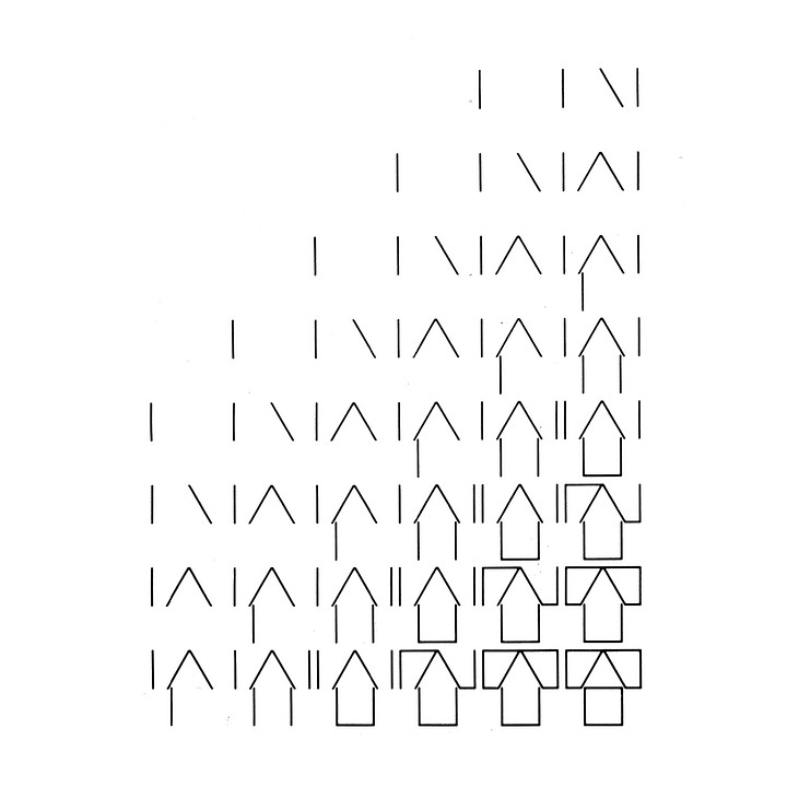
It was the logo of American designer Ivan Chermayeff of studio Chermayeff & Geismar Associates that won. The logo created by Chermayeff developed the letter ‘T’ as its key motif. Through the use of negative space he introduced an arrow and the suggestion of a house with a pitched roof. Chermayeff described the logo as a ‘memorable and simple reminder of Tokio Marine’s continuing upward movement, its solidity and the protection of goods and people’. Further, the overall symmetry and proportions of the design added the suggestion of strength.
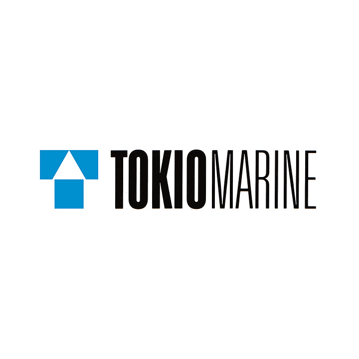
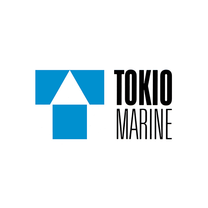
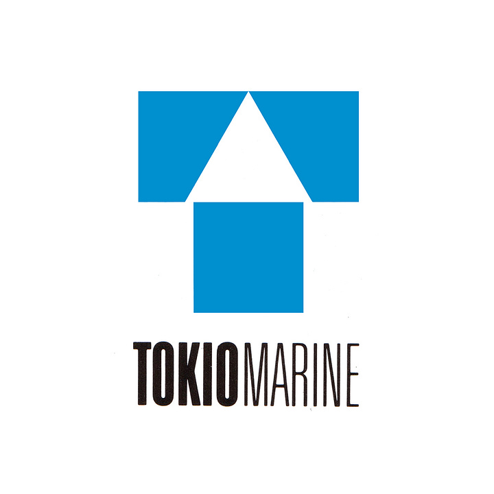
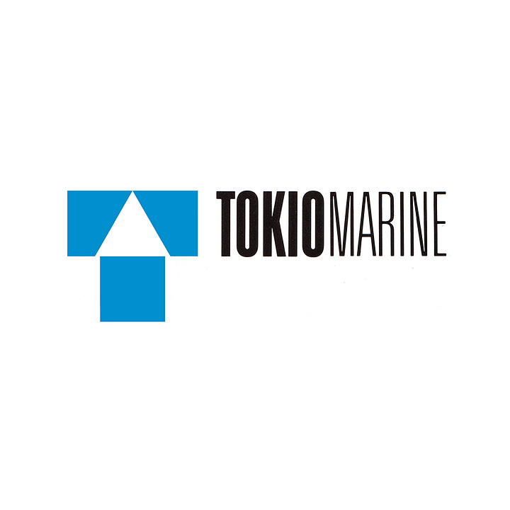
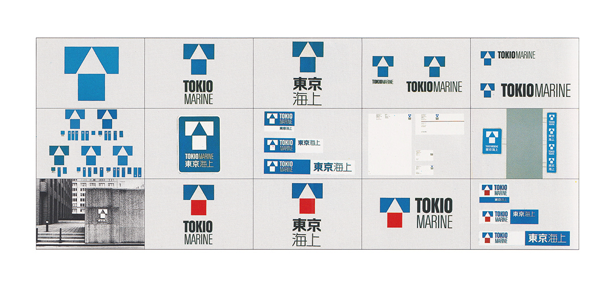
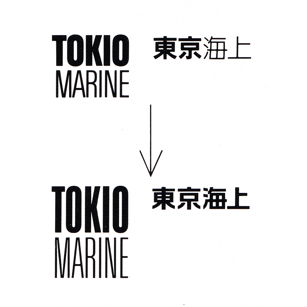
PAOS refined the logo and the colours of the original draft and worked this into a design system, introducing a logotype in Japanese and English. This preserved the unusual spelling ‘Tokio’ used since Tokio Marine and Fire's founding. The logotype was changed to a more condensed version of Univers which was proposed by Chermayeff, improving usability in a variety of space-limited contexts that included tall building signage common to the country. The Japanese version was evolved to be set in one typeface, used horizontally and vertically stacked.
The extent of Tokio Marine’s visual presence extended to all types of signs, as well as printed items including business cards, letterheads, pamphlets, catalogues, business forms, and insurance policy certificates. The new corporate logo played a leading role across these items, while the brand name Tokio Marine had a supporting role.
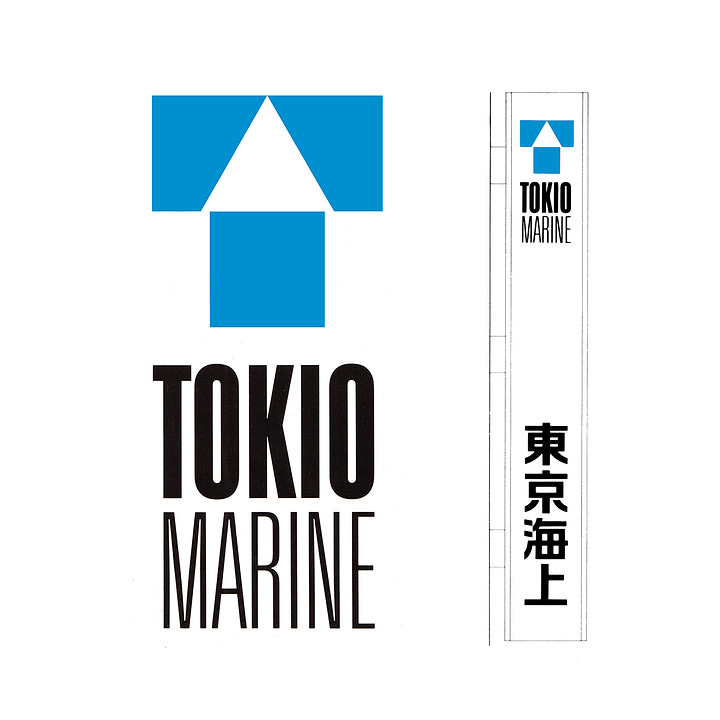
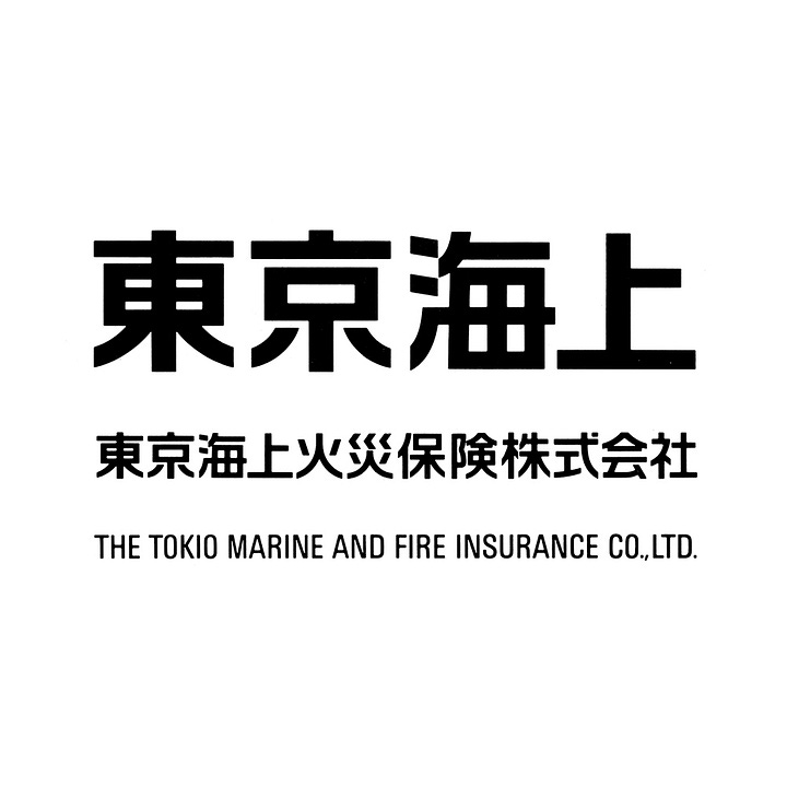
The condensed uppercase sans-serif and almost square composition of the logo, afforded the corporation flexibility throughout the diversity of its signage and printed materials, and was further supported by four different lock-ups.
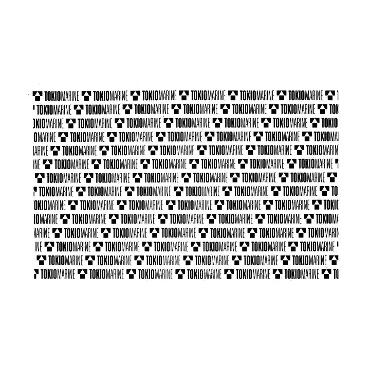
Further elements were added such as decorative patterns made from the logo used across the brand guidelines, shopping bags and branded merchandise. Blue became the primary corporate colour and the red, originally included in Chermayeff’s original proposal, was removed from the logo.
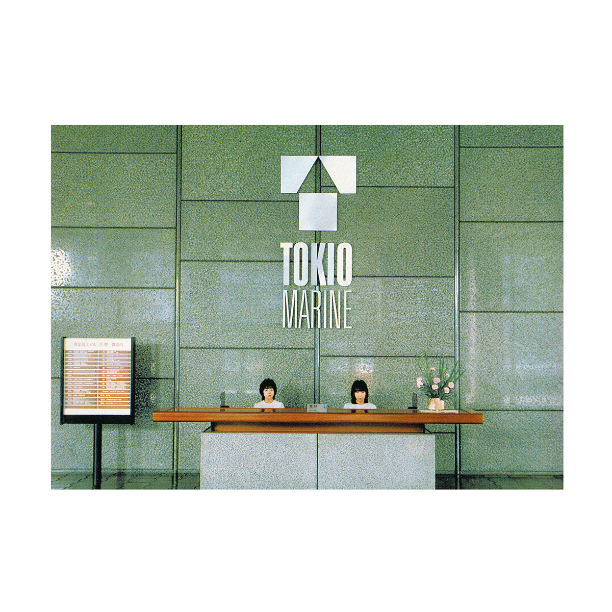
The first step in applying the new design was the installation of a two-meter stainless steel logo in the lobby of Tokio Marine’s head office. This delivered an impressive first impression and was used to symbolise to employees and the public that a new era had begun for the corporation.
As the program rolled out, the ‘heroic’ proportions of new signage was used as a marketing tool as they were quickly erected. These were developed for the more than 500 Tokio Marine branches, and casualty service centres and around 40,000 agencies around the country.
With the introduction of the new Insurance Business Act in 1996, which saw comprehensive deregulation rolled out for insurance products across Japan, competition increased. This saw significant changes within Tokio Marine, including new subsidiaries and mergers, alongside a more global outlook. This would later demand a new image and saw Chermayeff & Geismar’s logo retired, replaced by a globe forming ribbon.
Discover Tokio Marine brand assets and assets from hundreds of other historical and contemporary brands at Brand Archive.
Thank you for subscribing to Logo Histories. If you enjoy reading this you may also enjoy these resources from the same team:
New! Wittl – Job posting and applicant tracking tool.
LogoArchive Website – Searchable modernist logo archive & research tool.
LogoArchive Shop – Vintage design books & LogoArchive Zines.
BP&O – Contemporary design editorial.
Brand Archive – Research tool for brand designers.


