



Plaza Court, Los Angeles
America’s ‘Plaza Court’, as it eventually came to be known, was located on Los Angeles’ Figueroa, between 7th and 8th Street. The complex would be made of three towers and a plaza with a mix of offices, retail spaces and an open courtyard that featured a geodesic canopy and focal point. This canopy was designed and developed by renowned architect Jon Jerde who became an innovator in the design of malls and related spaces. The challenge of creating the logo and visual identity for Plaza Court was given by Canadian developer Oxford Properties to designers Bill Cannan and Lance Wyman, Bill Cannan & Associates, who completed the work in 1989.

Three Pacific Plaza logo proposals

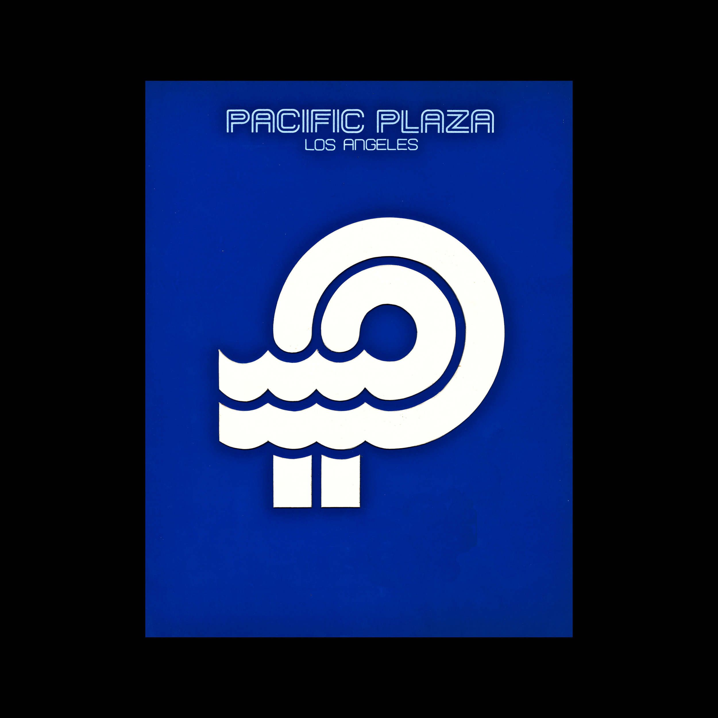
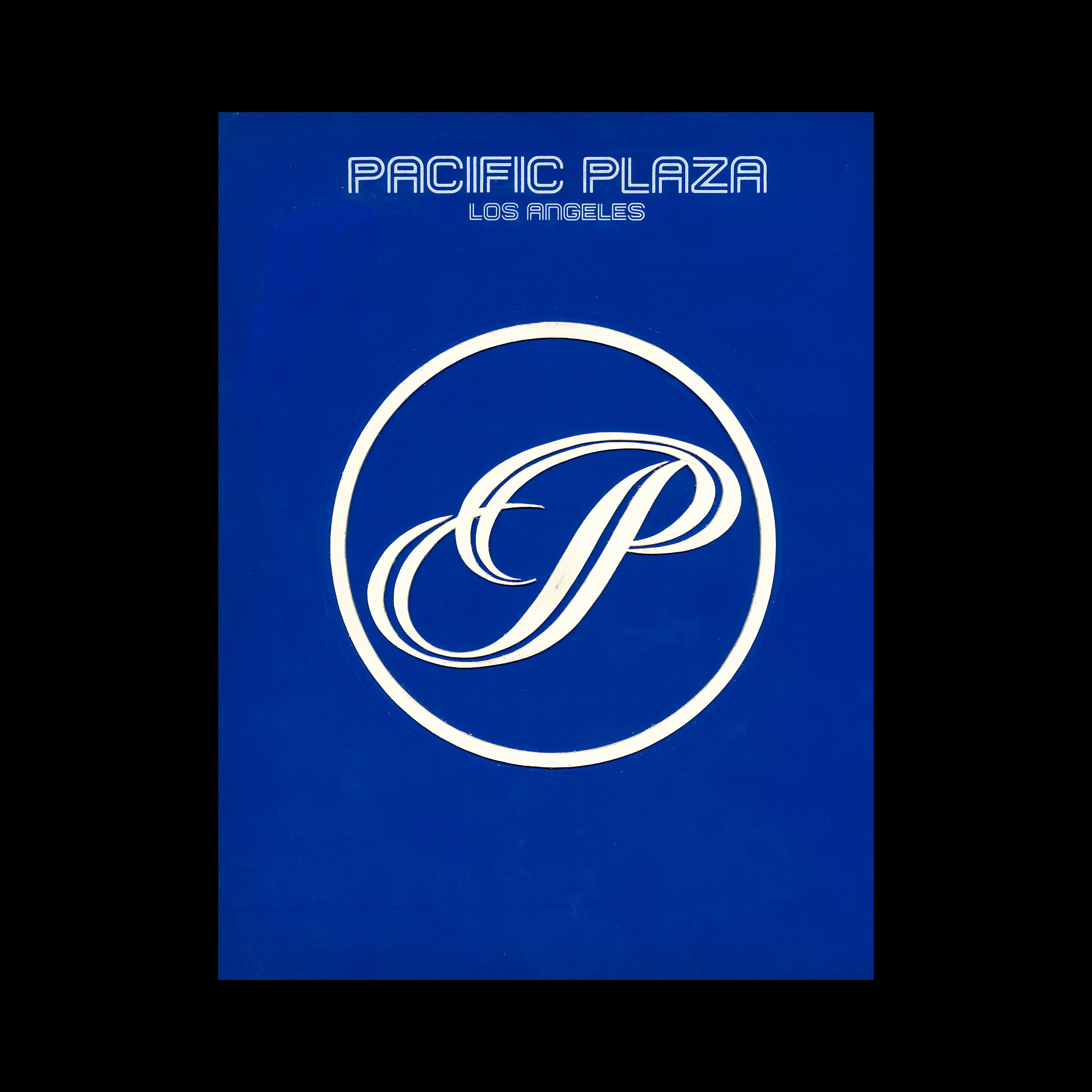
The team at Bill Cannan & Associates delivered three initial logo proposals for the project which, at the time, was known as Pacific Plaza. These initial concepts explored different aspects of the space; the offices, the “Pacific” name and the retail component. These were expressed through depictions of three trimetric towers drawn with lines to create a sense of light and shadow, an inline P with an ocean wave and a calligraphic P set within a circle.
Key Takeaways
A mixed-use complex in Los Angeles
Oxford Properties commissioned Bill Cannan and Lance Wyman to create the identity for Plaza Court, three towers and a plaza on Figueroa Street.
A name change, a new direction
When Pacific Plaza became Citicorp Plaza, the designers moved away from the Pacific P towards the architecture.
A logo from a canopy
The final logo renders Jon Jerde’s geodesic trellis canopy as a faceted, jewel-like mark of intersecting lines.
Go behind the logos. Explore 200+ in-depth and meticulously researched logo histories revealing the designers, design decisions and ideas behind the world’s most iconic logos and important brand identities.
Continue reading to discover how Jon Jerde’s trellis canopy became the Plaza Court logo →
From Pacific Plaza to Citicorp Plaza
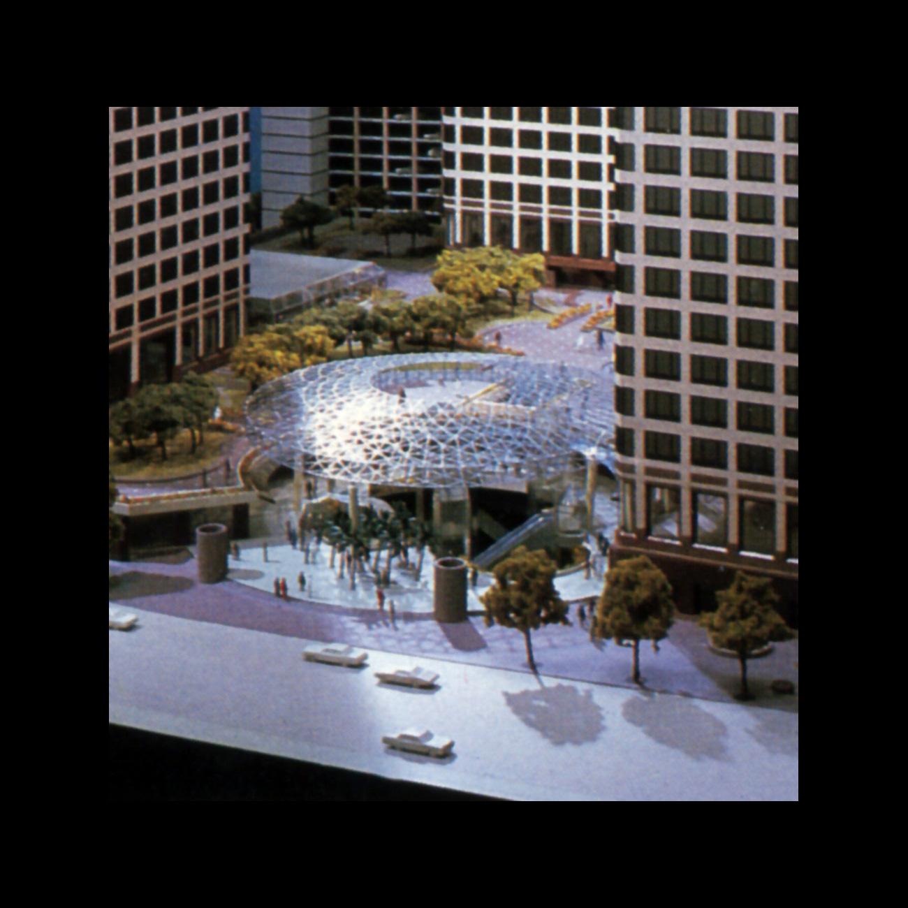
These proposals were eventually rejected after the name of the development was changed from Pacific Plaza to Citicorp Plaza. This pushed the design directions away from a focus on the Pacific “P” towards the architectural. The inspiration eventually came from the central feature of the plaza that linked the individual parts of the complex, the retail space and office buildings.

The trellis as a logo
The final logo evolved from the striking linear “trellis” structure / geodesic canopy created by architect Jon Jerde, which marked the Plaza Court retail entrance at street level. The designers interpreted and then rendered the complex geodesic three dimensional structure as an elegant jewel-like faceted logo of intersecting lines.



An arc version for banners, flags and vent towers
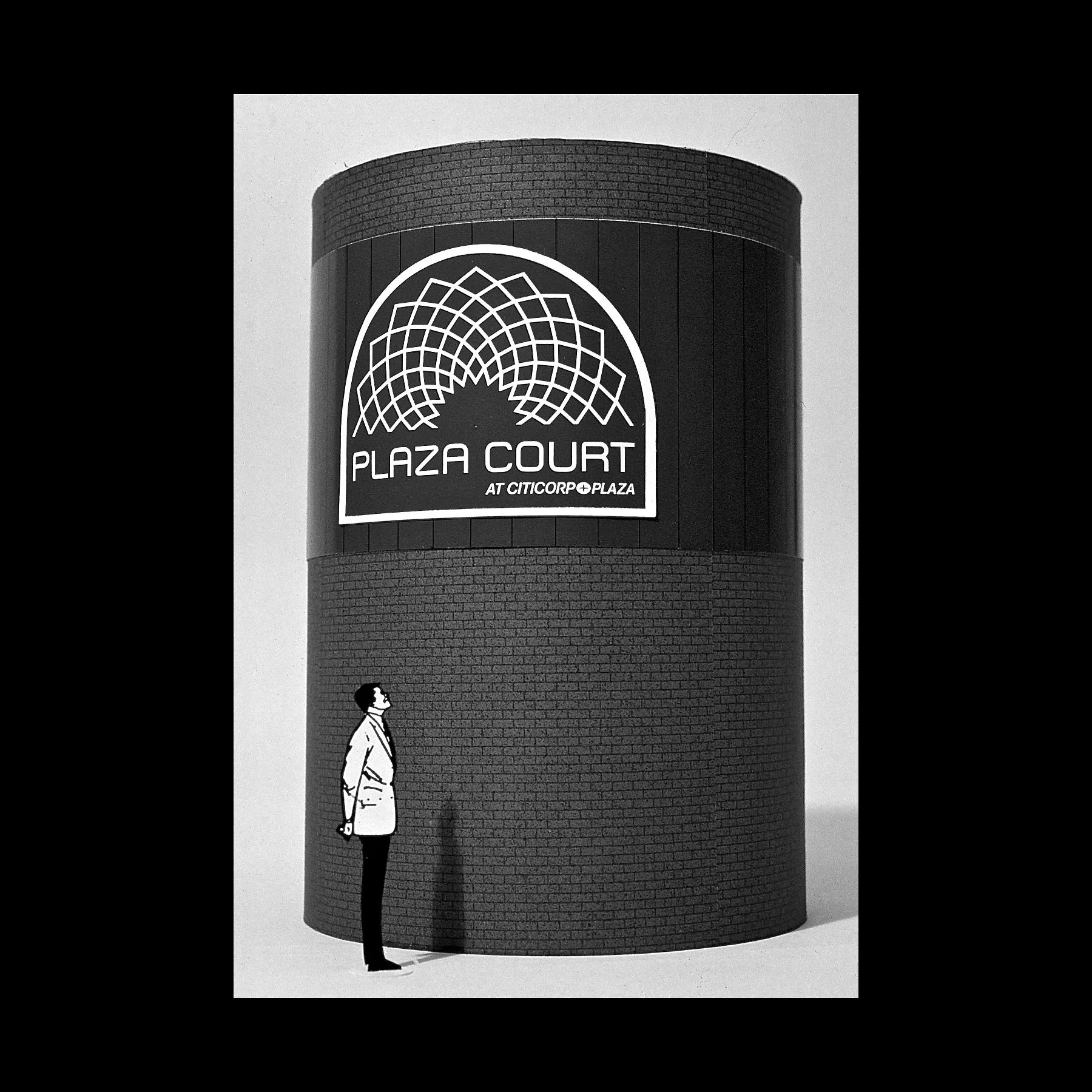
For various use-cases, and to improve the logo’s functionality across items such as promotional banners, flags and the covering of vent towers the logo was sliced through the horizontal centreline to create an arc version. This was used on its own and placed within a container with the full (and lengthy) name “Plaza Court at Citicorp Plaza”.
Bill Cannan & Company and Oxford Properties
Plaza Court at Citicorp Plaza (also read: Citibank) was one of many projects undertaken by Bill Cannan & Company for Oxford Properties. This relationship spanned over twenty years, only ending when Oxford Properties’ U.S. business was sold to Bell Canada Enterprise Development in the 90s.
Want more in-depth articles? Check out LogoHistories’ other articles on Lance Wyman logos →


