Come the Jet Age
The effect of commercial jet travel on corporate identity

Insights is a series that pulls together learnings from our Logo Histories; the fascinating stories behind individual logos. We now have over 100 individual stories, the largest and only online archive of its kind. Sign-up here to instantly access all of these.
Post-war aviation history was defined by the advent of jet turbine-powered engines. These jets afforded more people the opportunity to go further, faster and cheaper, and catalysed the social and cultural changes we live with today.
Prior to this, the airline industry had produced a visual language of birds and winged horses, and depictions of planes and feathered arrows. Greek mythology, the technological marvel of the propeller and the freedom of the bird were rich sources of inspiration, rendered with the illustrative realism of the time.

Come the jet age, these motifs and their realistic depictions felt incongruous with the the sleek aerodynamic bodies and speed of new aircraft, as well as the luxury and refined experience of air travel.
Further, as the industry grew, corporate requirements increased. Signage for ticket offices, design for luggage tags and ground equipment and new modes of advertising added a new layer of technical consideration when designing visual identities.

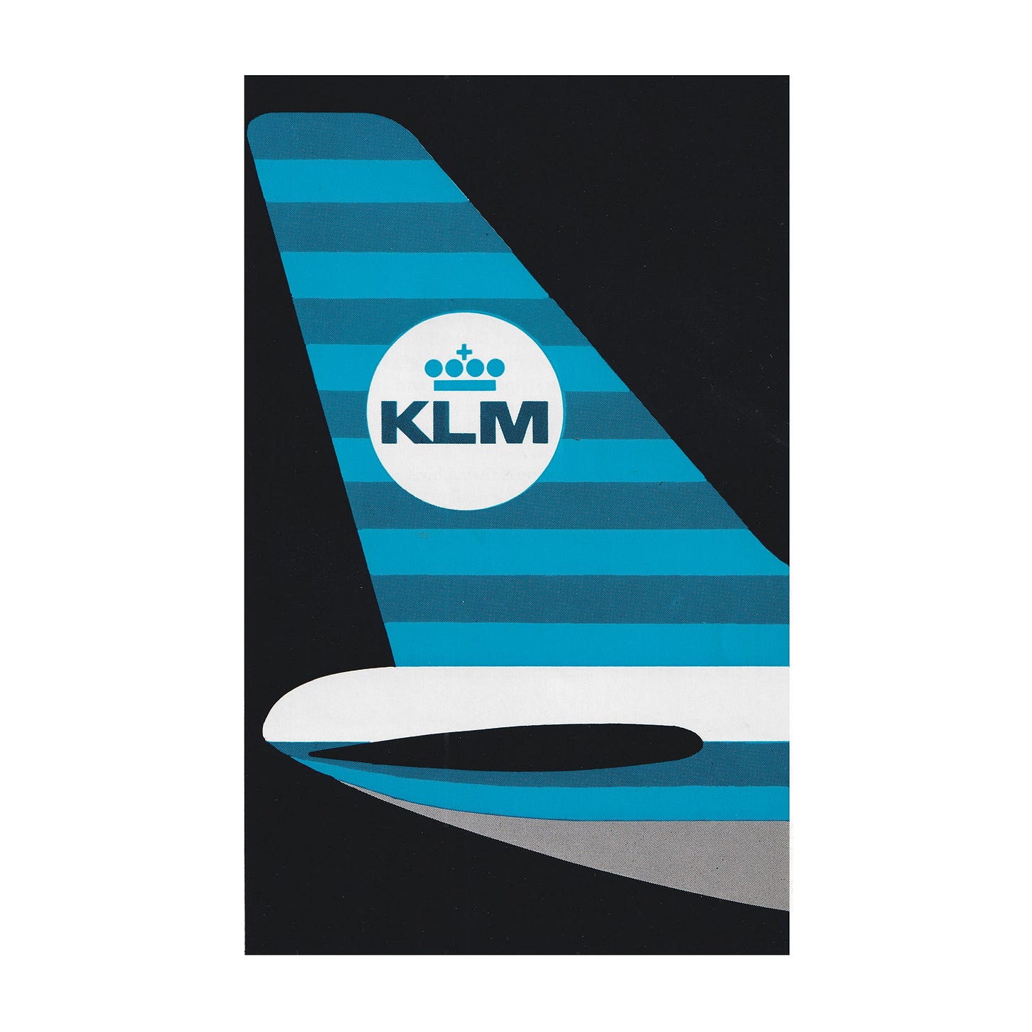
Uniform and restricted colour palettes and precise and consistent typography, and logos that not only scaled well– from small pin badges to huge tail fin designs–expressed the spirit of a new age of speed, efficiency, elegance and modernity. While these form the basis of contemporary branding, the swift move away from illustrative realism and ornate typography felt pronounced and exciting at the time.

The sheer scale of these operations, the extended visibility of brands on an international stage, the increased functional requirements and available budgets created space (alongside manufacturing) for commercial art to evolve into the formal practice of corporate identity design.
More airline Logo Histories:

Colour palettes were reduced down and formalised. Typography reflected an era of efficiencies and the need for cross platform and cross border legibility and consistency. Logos became simplified, dynamic and sleek, often abstracted to simple geometric forms to work across more contexts. Birds, arrows and planes were reduced to just a few lines, rendered with formalised geometry to make them easy to reproduce anywhere in the world. Logos and identities became far more immediate in an increasingly competitive landscape; a ticket office across the concourse and a tail fin on the runway.
If you enjoyed reading Logo Histories also check out these projects:
Brand Archive (Beta) – Research tool for brand designers.
LogoArchive Website – Searchable modernist logo archive & research tool.
LogoArchive Shop – Vintage design books & LogoArchive Zines.
BP&O – Contemporary design editorial.


