Flying a flag for Great Britain
The British European Airways corporate identities by Mary de Saulles (1960) and FHK Henrion (1967)
Since its founding in 1946, British European Airways (BEA) had had a long history of using modern communications design: Theyre Lee-Elliott (1903-1988) who created the “Key to Europe” BEA symbol and Jozef Müller-Brockmann (1914-1996) both provided strong posters promoting air travel to the Continent of Europe. BEA was also the first airline to roll out pioneering corporate identity programmes across two generations.
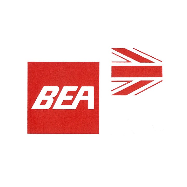
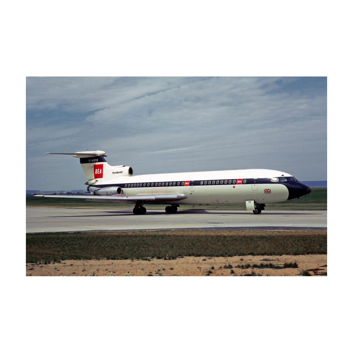
The first, arising from a need to better distinguish the airline from competing European airlines, was designed in 1956 by Mary de Saulles (1925-2020), an industrial designer and architect by training. With an extremely simple and functional paint scheme it was totally different from all other European airline liveries. The white vertical stabilizer containing a bright red square with italic white typography.
This new visual identifier was part of an early example of a ‘total design’ strategy applied to an airline: because of Mary de Saulles’ industrial design background she clearly understood the importance of consistency throughout a complex organisation such as an airline. The design program was a collection of both three-dimensional (aircraft, crockery, glassware, tractors, baggage carts, check-in desks, trucks, buses, signage) and two-dimensional (print, forms, ticket covers, advertisements) information carriers.
By creating a modular identification system, she succeeded in combining clarity, functionality and beauty to establish a corporate identity fit for the Jet Age.
At airports throughout Europe the visual appearance of BEA stood out among the other check-in desks. And the unique livery of the newly introduced aircraft, the Hawker Siddeley Tridents, with wings painted red, were a sensation at the aprons of all airports throughout BEA’s network.
More airline Logo Histories:
Eastern
KLM
Swissair
United
Austrian Airlines
Northwest Orient
The second generation design policy was introduced a little over a decade after the De Saulles red square.
By 1967, it had become clear that the standard of competition had risen both among airlines and corporations in general, and on the other hand there were inherent difficulties in using the old identification elements, with the silhouette aircraft symbol being considered outdated. There were also significant changes starting to take place in the early sixties in Great Britain. It had transformed itself from a post-war recovering industrial nation to the swinging sixties, almost over night. Changes in the law, national politics and overall media coverage reflected a new individualism and expanding appetite to live in a more liberal society. People began to express themselves in new ways.

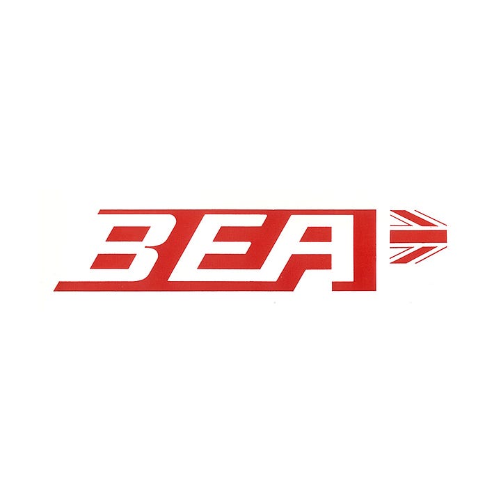
Virtually no airline had utilized a national flag as an insignia for aircraft livery before. And this why the new program by FHK Henrion was so unique. The Union Jack, the official flag of the United Kingdom of Great Britain and Northern Ireland, was cropped at the same angle as the leading edge of the vertical stabilizer to create a striking new form.
To create an attractive contrast, the background was painted in a dark blue with a slight hint of green. This new symbol called the ‘Speedjack’ and this projected a more dynamic character and a feeling of velocity.


The BEA logotype required a different approach and configuration that would address the limitations of Saulles’ square. A more horizontal arrangement would have a much larger visual impact across the predominately long and low spaces of shopfronts, airport desks, buses and aircraft. By eliminating the straight-forward italic Gothic typeface, formalising and making consistent the angles of the letters and trimming the square down, a unique logotype was created. This added further character to the overall programme and addressed the issues of usability throughout the BEA network.
After the new programme was approved, a two volume, elaborate identity design manual was produced to ensure proper implementation throughout the European network. This implementation was carried out rapidly but within normal replacement and repainting cycles, with over 100 aircraft, 1000 vehicles, 183 buildings all over Europe updated to reflect the new look and .
Both the designs of Mary de Saulles and FHK Henrion were clever in their concept and implementation and, at the time, unique when put next to their competition. It is interesting to note that Henrion’s programme retained the red wings of Mary de Saulles’ design.


