Not so bad
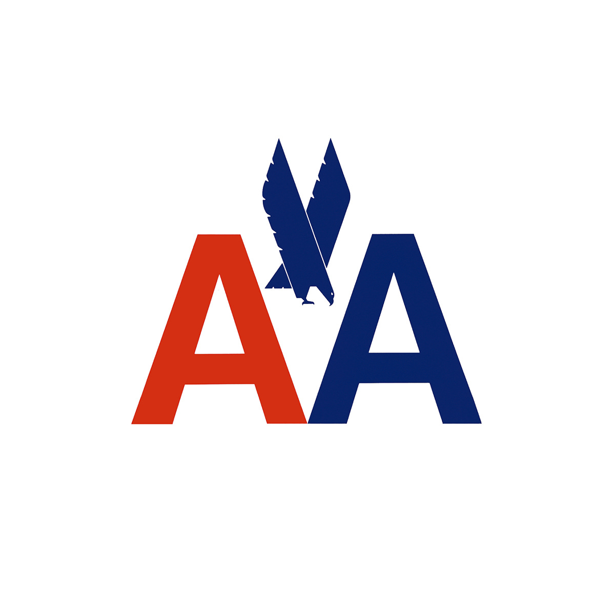
Massimo Vignelli, Heiz Weibl & Henry Dreyfuss’ 1967 logo for American Airlines.
This post is supported by LogoArchive – The home of historical logos. Discover over 4500 of history’s greatest designs from the world’s finest designers. Always find the logo inspiration you need for your next project here.
The growth of commercial international air travel afforded countries the opportunity to project aspects of their culture into foreign lands. This was particularly true for those national airlines known as ‘flag carriers’. Through these, nations could share their values and character. This accounted for many of the iconic motifs of freedom, power and efficiency seen in logos. These included birds (JAL), crowns (KLM) flags (BEA) and a variety of arrows (Austrian Airlines). American Airlines (American) opted for a bold image of a bald eagle soaring over a depiction of a globe, flanked by double A’s.
What was often common to many of the airlines through the 1930s to mid-1950s was their literal depictions, motifs brought to life illustratively. These, however, were somewhat incongruous with the coming of the jet age in the 1960s, which was characterised by sleek (but increasingly wide-bodied jets), as well as modernised services, lounges and check-in desks.
Further, as airlines expanded, new requirements for the use of corporate image emerged. These included the need for standardisation across the globe, the employ of economies of scale and a new flexibility that would accommodate many different services and surfaces.
Airlines such as Polish flag carrier LOT, Swissair and KLM had undergone pioneering rebrands by the mid 1960s and had led the way, simplifying their logos and rationalising their identities; formalising corporate colours, typefaces and their applications. At the same time, American had invested heavily in new aircraft, and introduced the first electronic booking system. This commitment to modernisation also expand to its corporate identity. American would be introduced to Massimo Vignelli (Unimark International) through Henry Dreyfuss, the design consultant and industrial designer who was hired to develop the interior of the planes.


