


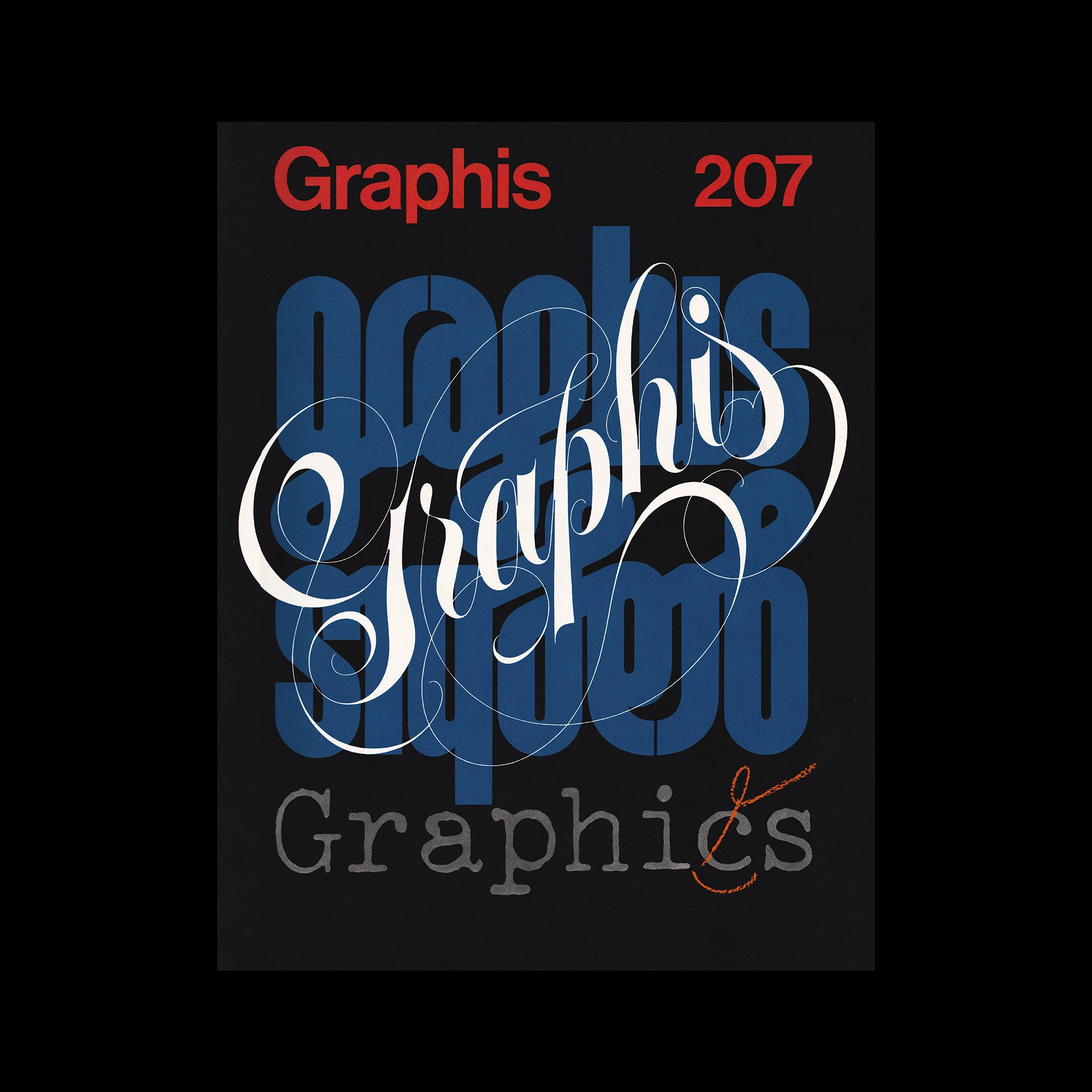
The following is an article published in Graphis 207, 1979. In it, Stanley Mason writes about the proposed new official Olympic sports pictograms.

The signs for Olympic events used at Munich in 1972, designed by Otl Aicher (see GRAPHIS 160 or the pictogram review in the book Archi-graphia), were retained with certain modifications for the games in Montreal but dropped for the 1980 games in Moscow. In the meantime, however, the International Olympic Committee has decided to take this matter in hand and standardize a set of signs which it will be able to issue to licensees, thereby obtaining a source of income which will help to defray the organization's expenses.
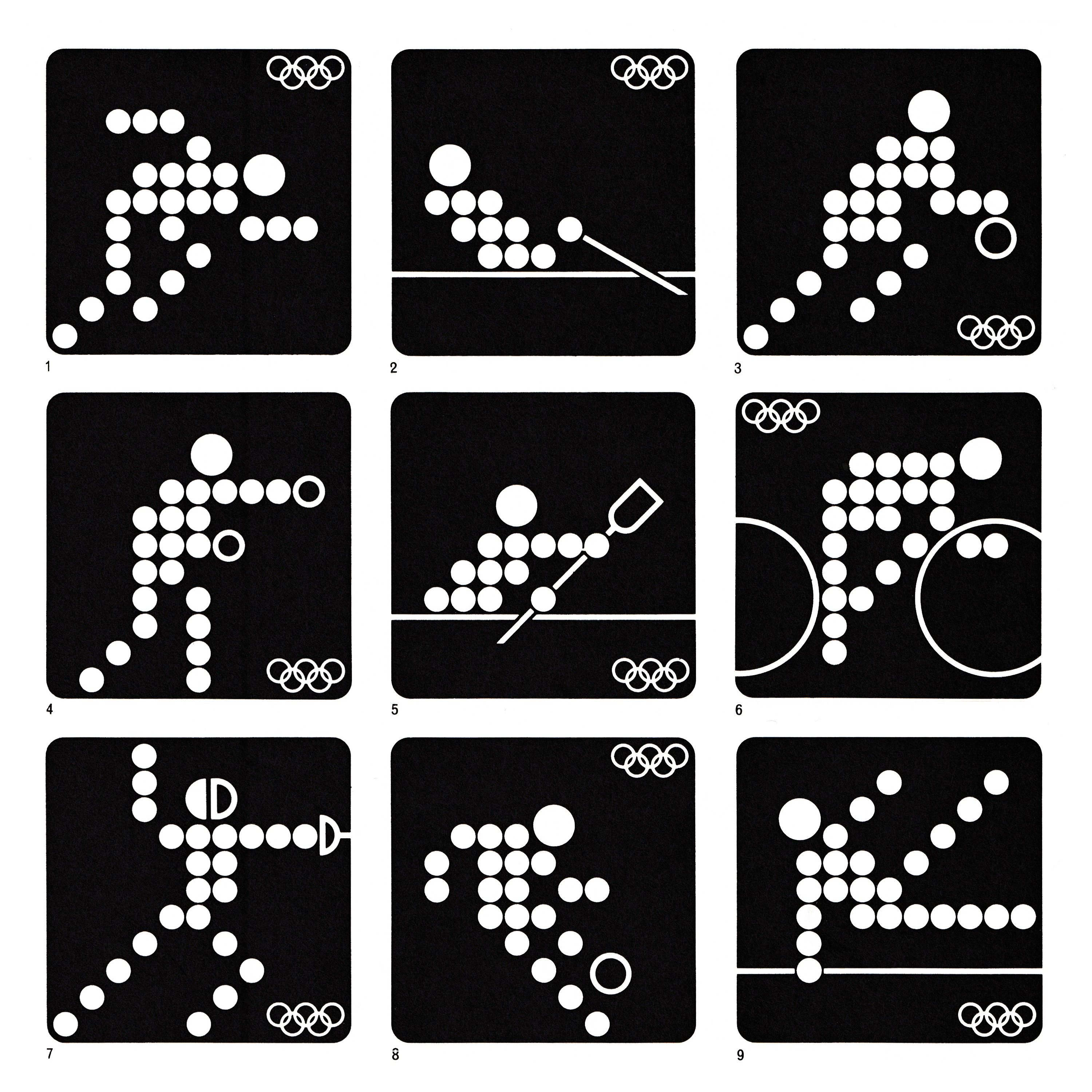
When Julien van der Wal of Geneva was asked by the Intelicense Corporation to submit proposals for the new pictograms, he was not at first enthusiastic, as he considered the existing signs very good. It was only when he realized that the pictograms had so far been unaffected by the immense progress of media electronics that he saw new and worthwhile avenues of advance. His first researches revealed the fascination of the task, and he spent 400 hours designing a set of signs for the Summer Olympics which have now been accepted by the IOC and which, if all goes to plan, will be the standard for many years to come.
Explore more like this in Olympic Logos →
Go behind the logos. Explore 200+ in-depth and meticulously researched logo histories revealing the designers, design decisions and ideas behind the world’s most iconic logos and important brand identities.
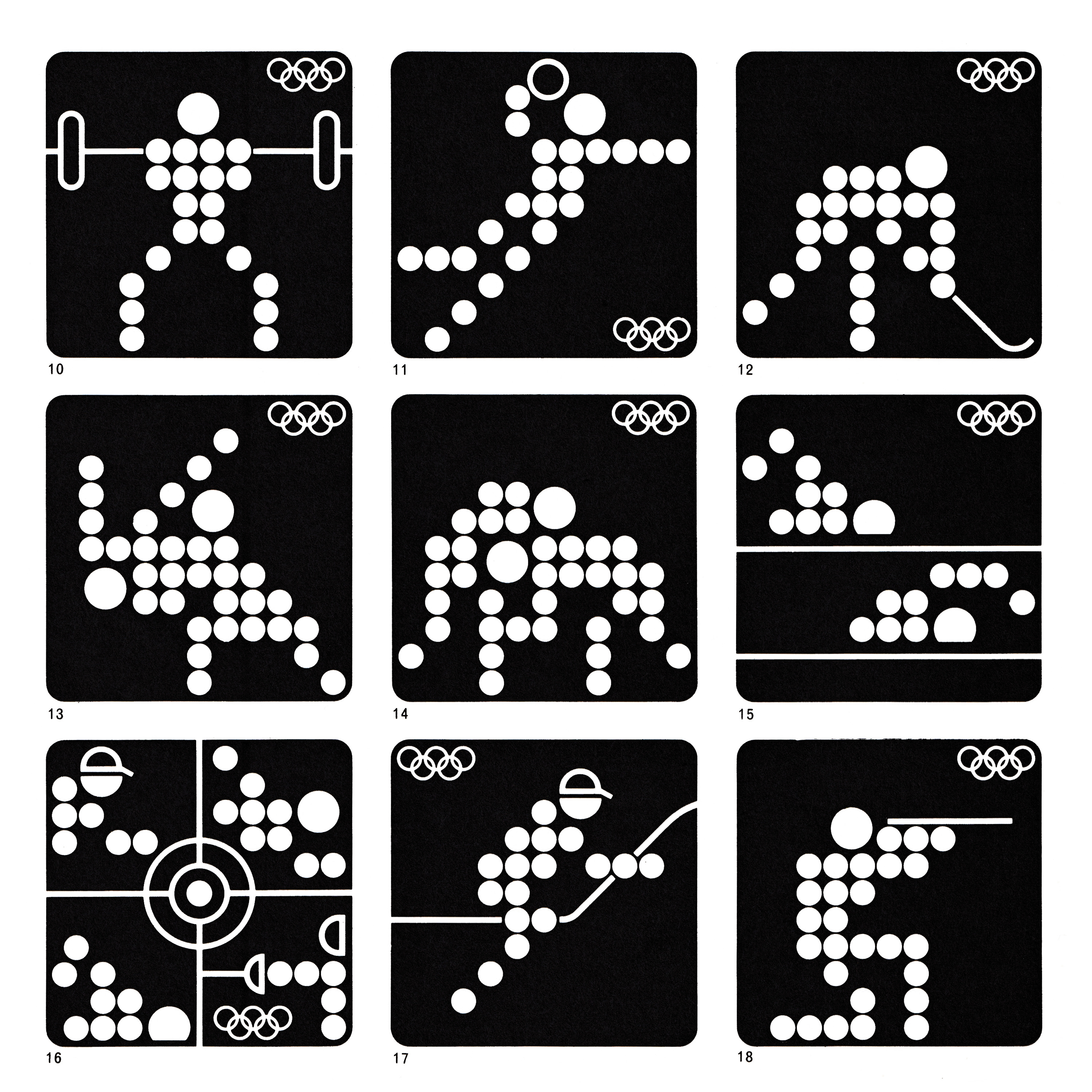
The essential innovation in the new signs is that they are built up of points which may also be the points of light used in illuminated panels or in kinetic presentations in film and television. Julien van der Wal is a successful Swiss graphic designer who also created, for instance, the UNICEF symbol. The Intelicense Corporation SA of Geneva is responsible for granting licences for the use of the new standard pictograms.
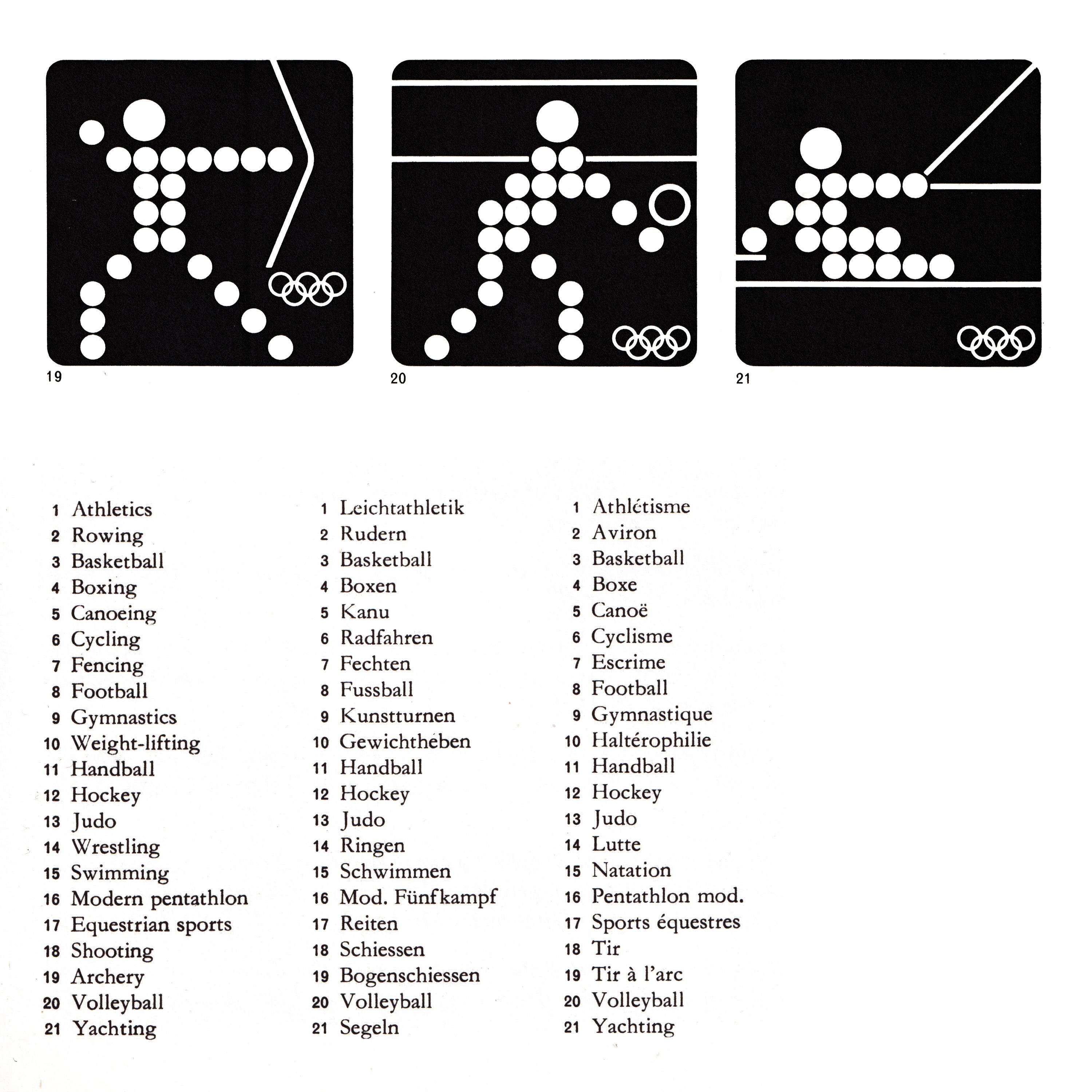
Although the new pictograms, like Aicher's signs, use a 'body alphabet', they are not based on the older version but are an entirely new development. They employ a grid of 11 X 11 = 121 points which may be points of light in film or TV presentations or may appear on electronically controlled panels used for showing letters or figures (the straight-lined or curved elements would be incorporated on a second plane). The new designs stand up well to reduction but may not equal the old ones in definition. They are already available and are to be in general use by the Olympic Games of 1984 - Editor.
Want more in-depth articles? Check out LogoHistories’ other articles on Olympic logos and design →


Thank you for subscribing to Logo Histories. If you enjoy reading this short you may also enjoy these resources from the same team:
Brand Archive – Research tool for brand designers.
LogoArchive Website – Searchable modernist logo archive & research tool.
LogoArchive Shop – Vintage design books & LogoArchive Zines.
BP&O – Contemporary design editorial.